Empty states
Empty states are moments in an app where there is no data to display to the user. They are most commonly seen the first time a user interacts with a product or page, but can be used when data has been deleted or is unavailable.
- Overview
- Anatomy
- Designing with empty states
- Types of empty states
- In-depth alternatives
- Accessibility
- Related
- References
- Feedback
Overview
Empty states are a simple yet extremely powerful way to keep a user informed, supported, and on a productive path. They provide opportunities to communicate what the user would see if they had data, while providing constructive guidance about next steps.
With just enough contextual guidance, empty states ensure a smoothness of experience, especially when things aren’t working as expected.
Most people are familiar with the basic empty state page that explains what data would normally appear on a page. However, it’s not always a one size fits all.
This pattern explores the following approaches:
- Basic empty states for first use, user action confirmation, and error management
- In-depth supplements and alternatives for first use empty states, including in-line documentation, onboarding, and starter content
Anatomy
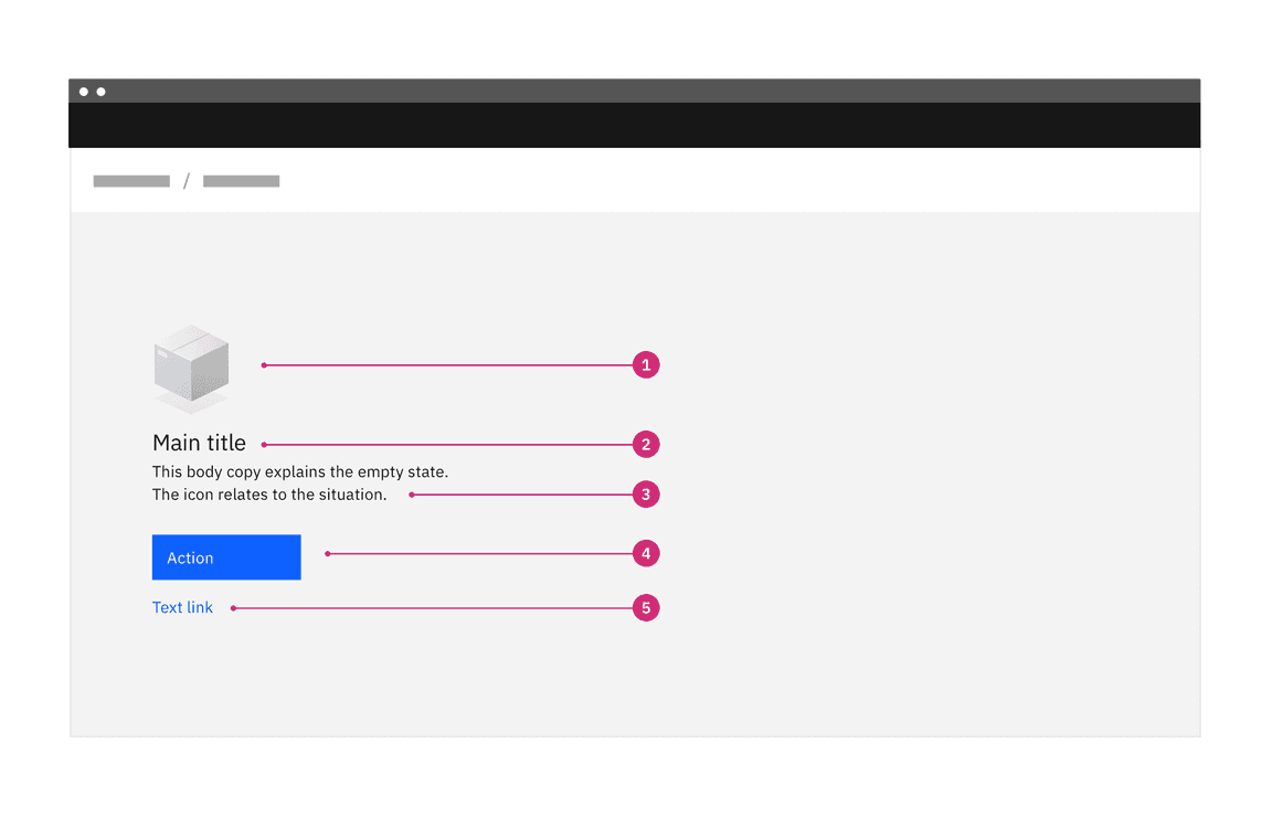
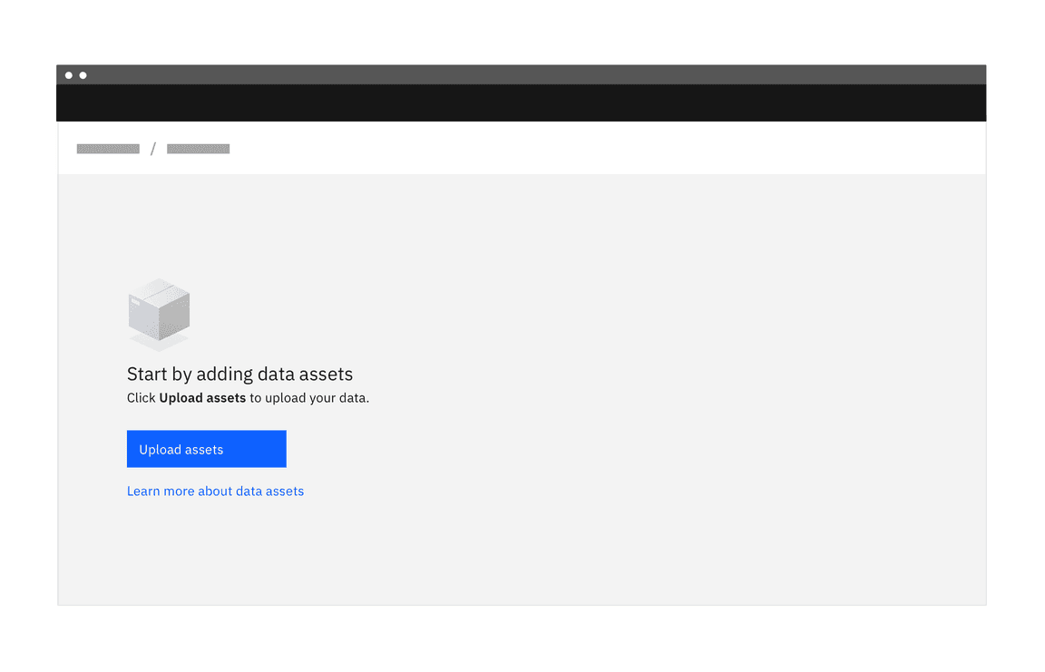
Basic empty state with primary action button
- Image (optional): A non-interactive image that relates to the situation (optional).
- Title: A short and concise explanation. Where possible, write this as a positive statement. In this example, “Start by adding data assets” feels more positive than “You don’t have any data assets.” Alternatively, you could say “You don’t have any data assets yet”.
- Body: Explain clearly the next action to populate the space. You may also
explain why the space is empty and include the benefit of taking this step.
There are three options for explaining the primary action:
- Direct the user to a primary action button positioned underneath the copy
- Include a primary action link in the copy
- Direct the user to the UI element—see the example below. This has the benefit of teaching the user where elements are and how they will perform tasks in the future.
- Primary action—button or link in copy (optional): The primary call to action referenced in the body copy above.
- Secondary call to action (optional): If there is a secondary action, such as referencing documentation for further reading, include it as a link below the copy.
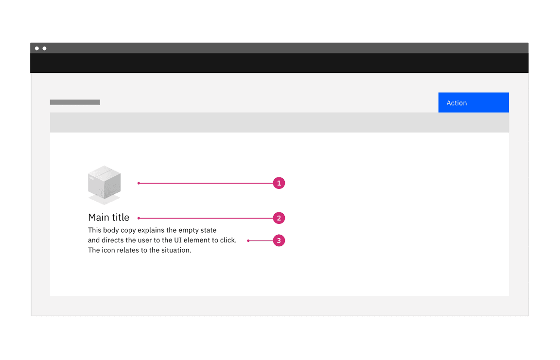
Basic empty state with instruction to click UI element
Designing with empty states
Empty states are often treated as an afterthought. When designed thoughtfully, they become an essential part of a smooth user experience, providing just enough information, in context, to allow users to continue working in a productive way.
During the design process, ask yourself these questions:
- What will the pages, tiles, data tables, and side panels look like without content?
- What are all of the steps a user can take to address the situation?
- Is there any useful content that might be available to show?
- How can I turn this situation into something that is engaging and helpful?
During the design phase, explore the full range of options with your team to ensure that the most appropriate and helpful content is created for each empty space.
When to use
Empty states happen for a variety of reasons, and can require different treatments.
Strive for a balance between the situation and the content you’re providing. More content doesn’t necessarily mean it’s a better solution as there is a cognitive cost for having more content on the page. This is especially true when users first engage with your product, so save the more involved educational moments for primary features and more complex situations.
The following table suggests different approaches for empty states to match the needs of the user in different situations.
| Type | Use cases | Goal of the empty state | When to use |
|---|---|---|---|
| No data empty states | First time use, no data yet | User understands what will be available on the page when data has been added or is available. They understand how to add data themselves. | For simpler situations, or for secondary features where bite-sized pieces of information are preferable. |
| User action empty states | Provides feedback based on some user action. For example:
| User understands how to adjust search terms or filters to continue their search. User understands that they’ve successfully completed a process. | User understands that they’ve successfully completed a process. When you need to provide feedback to the user based on an interaction. |
| Error management empty states |
| User understands the problem and if there are corrective actions available, knows what action to take or has options to correct the issue. | When something is amiss or some level of intervention or troubleshooting is required, a higher level of detail and specificity will better support the user. |
Where to use
Empty states always appear in the otherwise empty space, in the context of the data that’s missing. They can occur anywhere your app can display data, including but not limited to dashboards, data tables, tiles, full pages, and side panels.
The approach and layout you choose will depend on the situation, and what is the most appropriate based on the page layout and context.
Visual guidelines for smaller empty spaces
For small tiles and side panels, follow these guidelines and use the layouts shown below.
Alignment of elements
Empty state elements should be left-aligned as a block. The one exception to this rule is an empty state in a small tile. In this case the image should be centered above the left-aligned text and primary action, as shown in the example below. This exception was made to prevent the empty state looking too much like content, where it could be skipped over. The centered image in a smaller space helps to draw attention to a state that may require user action.
Image choice considerations
- The image choice should relate to the situation.
- The size of the space for the empty state should also guide the size of image. If space is limited, use just text.
Multiple empty states
In situations where there could be multiple empty states showing at once, we recommend using a tertiary button for the call to action. This avoids scenarios with multiple primary action buttons in the UI.
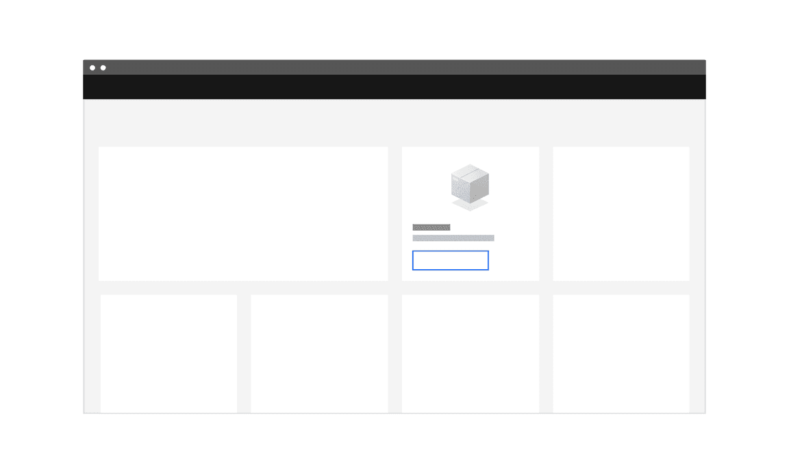
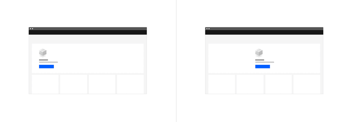
Layout for empty state in a small tile
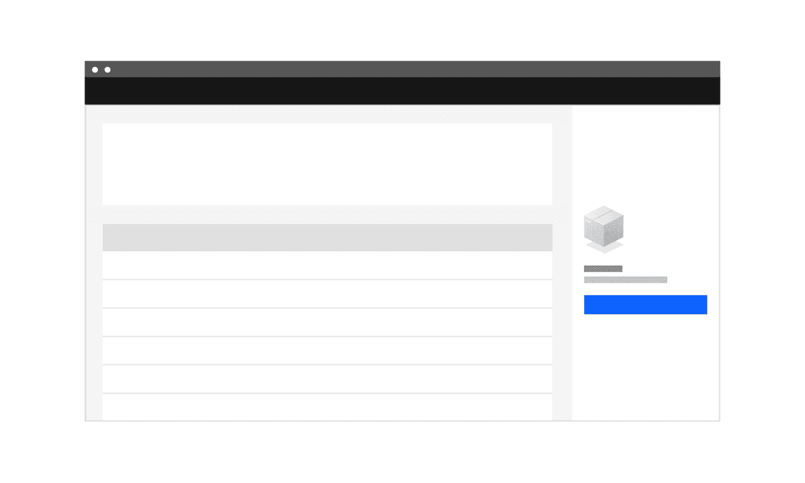
Layout for empty state in a side panel
Visual guidelines for larger empty spaces
For larger spaces, you have some flexibility with laying out the larger empty states. Follow these guidelines, review the examples, and use your judgment as to what is best for the situation.
Alignment of elements
Empty state elements should be left-aligned as a block. Depending on the image you’re using, there are different arrangements available.

Layout/positioning options
You have two options for positioning the block in the larger empty states:
- Use a wider left margin
- Block center the left-aligned group in the empty space
Image position options
You have two options for positioning the image in the larger empty states:
- Above the empty state title—generally better for wider images
- To the left of the element block—generally better for taller images
Image choice considerations
- The image choice should relate to the situation.
- The size of the space for the empty state should also guide the size of image. If space is limited, use just text.
Layout options for empty states in large tiles—wide margin or centered block
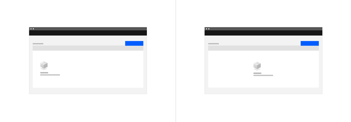
Layout options for empty states in tables—wide margin or centered block
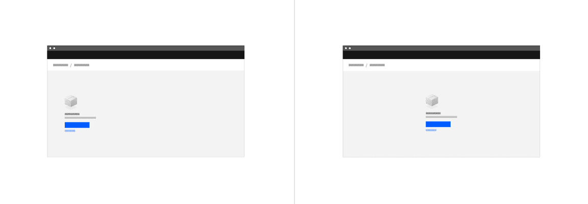
Layout options for full page empty states—wide margin and centered block
Best practices
-
Empty states should replace the element that would ordinarily show. For example, an empty state for a table would replace the table and the column headers and footer should not be present. This practice avoids having a screen reader read the entire table before getting to the message that there is no content in the table. Likewise, if you search for something and there are no results, any underlying content should be replaced by the empty state message.
-
Consider how many empty states may appear in a space. If you have a dashboard with a number of widgets and there is a failure for multiple widgets to load, the repetition of the empty state may not have the same impact if you use illustrative icons. In this case, an empty state that uses just text may be preferable.
Types of empty states
No data empty states
These are the most recognizable first use empty states, explaining what will be in the space once it is populated with data, and providing guidance for the next step the user can take to populate the space.
Basic empty state with primary action button

Basic empty state with instruction to click UI element
Do:
- Use basic empty states for simpler situations, or secondary features, where bite-sized pieces of information are preferable.
- Be specific about what will be available in the space when data is there.
- Keep words to a minimum so they are fast to read and act upon.
- If there is an actionable next step, include a direct link in your message copy or a primary action button to make that action fast. Alternatively, guide them to what they need to click.
Don’t:
- Don’t cover multiple options in one empty state. If there are multiple things a user can do, pick the most important and keep the focus on that action.
- Don’t use product-specific terms that the user may not yet understand.
- Don’t include content that is about other areas of the app. Be contextual.
- As a general rule, don’t lead the user into a dead end. If there are useful next steps, include them.
User action empty states
These empty states occur as a result of a user action. For example:
- A message showing there are no search results
- A success confirmation for completion of a process or set of tasks
Explain the reason for seeing the message and providing any follow up steps to guide the user. For example, if there are no search results suggest adjusting the search or filters. Links to documentation may also be appropriate as a secondary call to action.
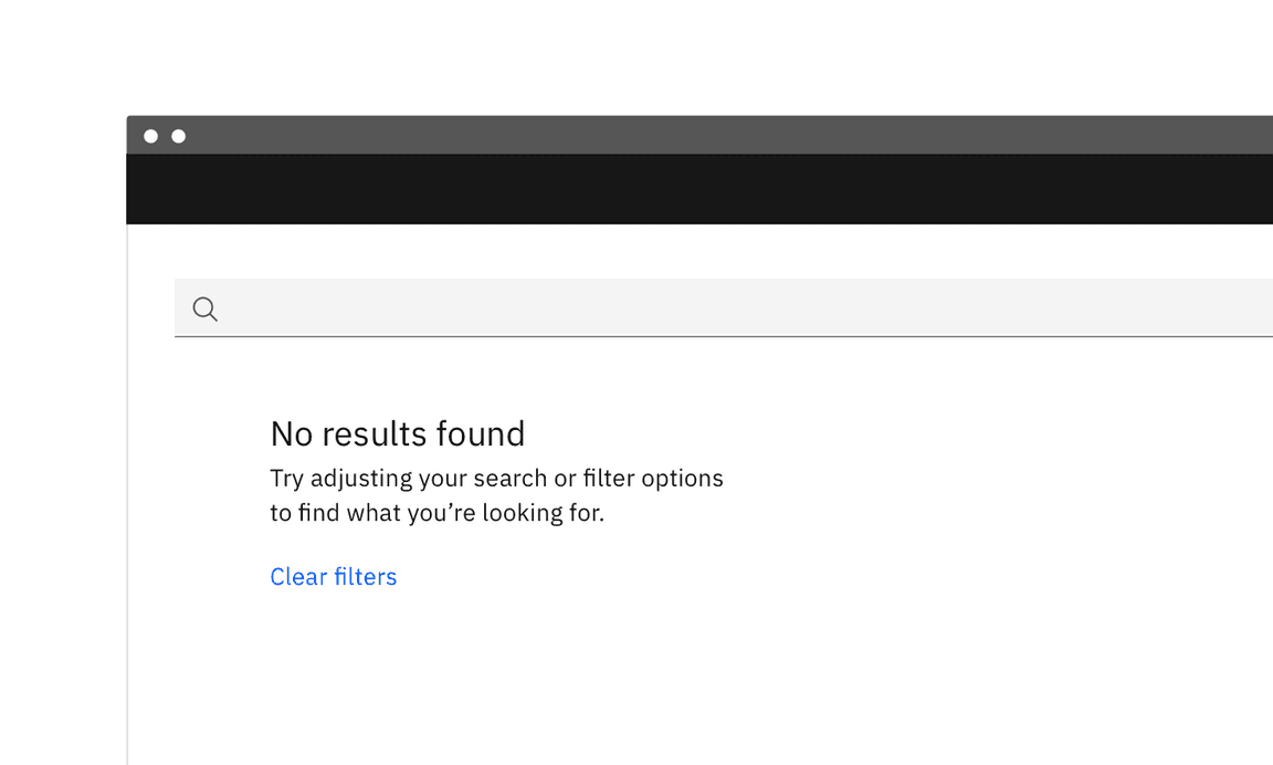
A message showing there are no search results
There may be situations where next steps are not possible or supplementary text is not required, so use your judgment about what is useful to include. For example, if your user has configured alerts and nothing has been triggered, it’s not a case of alerts not being set up but that there is nothing that requires the user’s attention. In this case, supplementary text is not necessary.
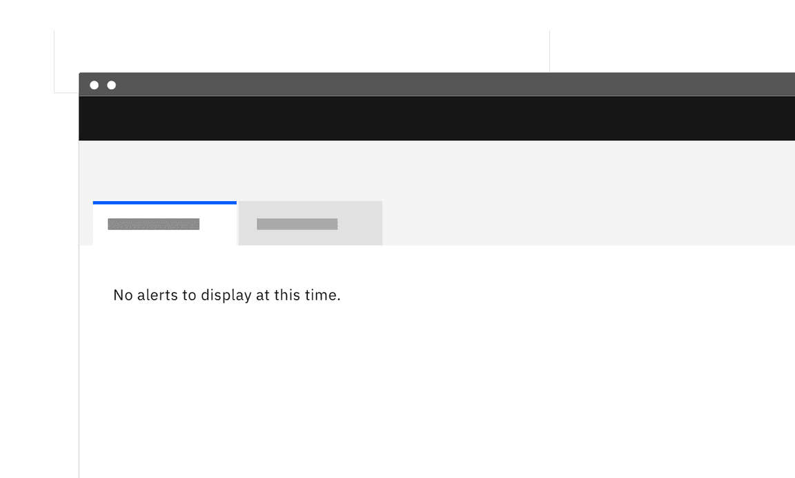
Basic empty state where next steps are not required
Error management empty states
Empty states can also occur when there is data but it cannot be surfaced for some reason. A higher level of specificity is helpful here, with the aim that the user will be able to address the issue comfortably themselves.
Provide guidance about why there is no data, and either what the user can do to address the lack of data, or the circumstances under which the data would appear. And use plain language. Following this fulfills Jakob Nielsen’s ninth usability heuristic: Help users recognize, diagnose, and recover from errors.
Error messages should be expressed in plain language (no codes), precisely indicate the problem, and constructively suggest a solution.
- 10 Usability Heuristics for User Interface Design, Jakob Nielsen
Here are some error management situations that may be addressed with the basic empty state solution.
| Error type | Explain why there is no data | Explain what the user can do |
|---|---|---|
| Permissions issue | The user does not have permission to view the data. | Suggest steps or process to request access. |
| Systems issue | Problems with a related system are preventing the data from being supplied. | Explain steps the user can take to learn what has happened. For example, viewing an activity log. |
| Configuration required | Further configuration may be needed to access the data. | Provide an explanation and the first step for the user to take for the required configuration. |
| Action not supported | For example, the user attempts to upload an unsupported file type. | Explain what file types are supported. |
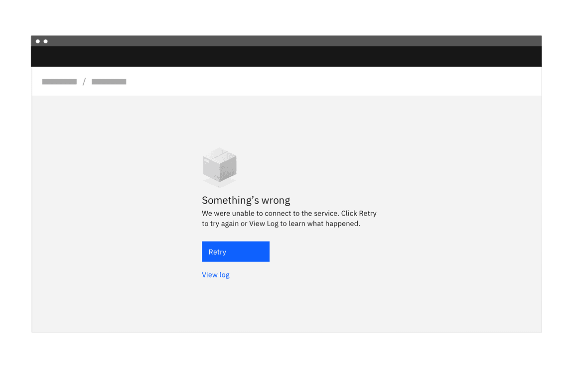
Example of an error management empty state for a systems issue
Do:
- Consult with your team to explore what information is available.
- If there are corrective actions, give the user an actionable next step. Include a direct link in your message copy or a primary action button to make the next action fast. Alternatively, guide them to the element they need to click.
- Use direct, plain language to describe the situation.
- Be respectful of the user and don’t joke or use flippant language.
- Any images used should reflect the situation and be sensitive to what could be a serious situation.
Don’t:
- Don’t include content that is about other areas of the app. Be contextual.
- Don’t lead the user into a dead end. Always aim to provide a path to a solution.
- If there are multiple things for the user to try, be sure to include a hierarchy so that it’s clear which option would be the primary action.
For more detailed information about writing error messages, see the Nielsen Norman group’s Error Message Guidelines.
A pattern providing guidance for error states is currently being planned. If you would like to contribute, please see our guidelines for contributions.
In-depth alternatives
Educational content that helps users get oriented and started is another option for turning an otherwise empty space into a positive and productive experience for first time users.
When deciding on approaches, a good rule of thumb is that a primary resource on a page could benefit from a more educational approach, while basic empty states may suffice for secondary resources.
| Type | Use cases | Goal of the empty state | When to use |
|---|---|---|---|
| In-line documentation |
| Detailed overview of page so the user understands more about the feature and is given at least one call to action to get started. | When introducing a primary feature, there is an opportunity to showcase the benefit of usage. More educational detail could help to drive engagement. |
| Onboarding | First time use | Starting from an empty state, users have an opportunity to launch a contextual onboarding flow to gain deeper understanding about that area of the app. | When introducing a primary feature that may require more detailed explanation of concepts, a step-through of a workflow sequence, or other information that enhances productivity. Usually onboarding flows are optional for users, therefore they need to be used in conjunction with basic empty states. |
| Starter content | First time use | User can interact with data and learn the system by tinkering. User gets a jump-start to productivity with basic setup tasks being taken care of for them. | For complex situations, starter content can be a good choice as it saves users a lot of time both in learning and in configuring setups. |
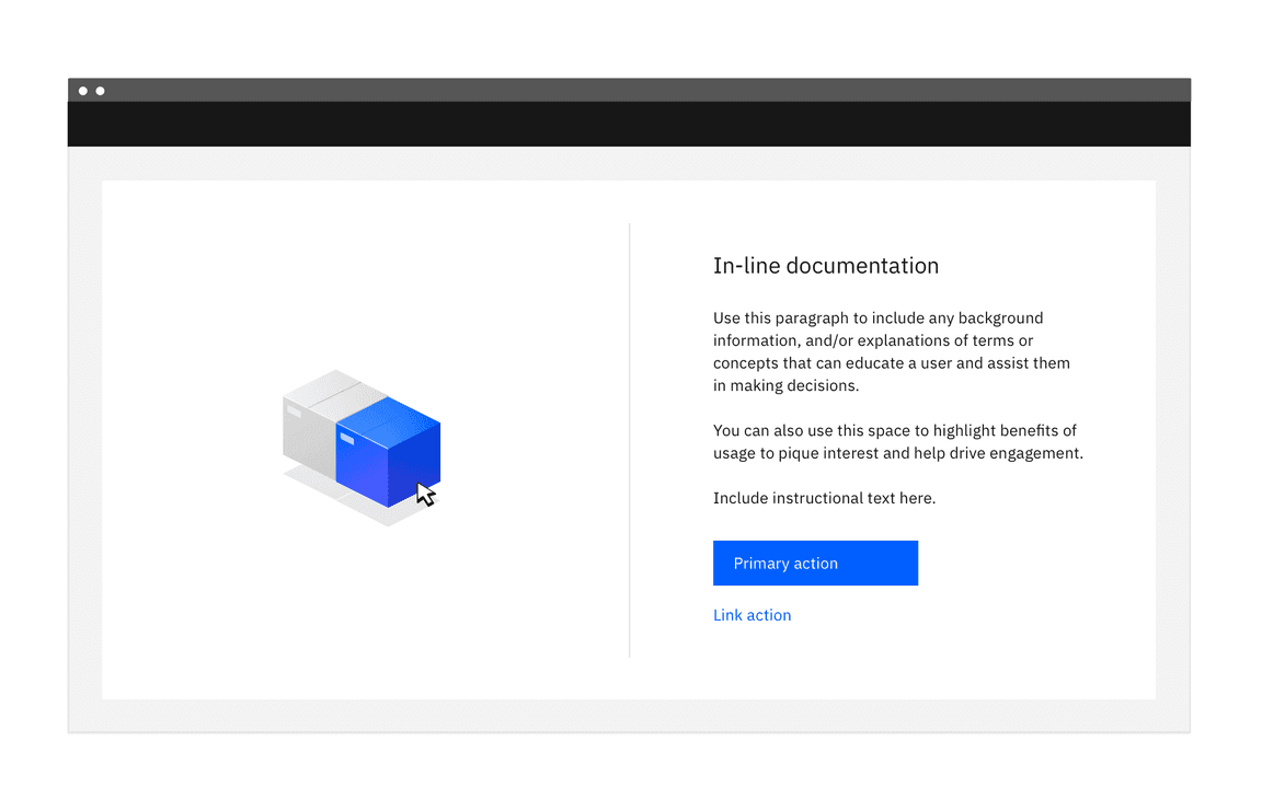
In-line documentation
In-line documentation is an extension of the basic empty state for first time use. It can be most helpful when a primary feature is first introduced, providing more detail and highlighting any benefits. Including an image of the space populated with data may help trigger interest and usage. Following a progressive disclosure model, it could provide links out to more detailed documentation.
Considerations for in-line documentation
- If testing results show that users do not understand the feature or concept, more detail may encourage usage.
- This approach may require a higher level of maintenance than a basic empty state if using product images as images will need to be kept up to date. If your app is translated, there could be extra work in providing localized images.
- Keep the content limited to one feature. Do not talk about other areas of the app. If there are multiple things a user could do, pick the most important and keep the focus on that.
Onboarding
Onboarding services provide various options for contextual in-app guidance that can enhance or direct a user through an empty state.
Stepping users through workflows with information that supplements the empty state messages can get the user to a place of comfort quickly. Tours can point out the location of features, provide more detail for key tasks, and highlight benefits. Because onboarding flows are optional for users, they need to be used in conjunction with basic empty states.
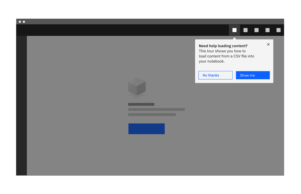
Considerations for onboarding
- If metrics are showing that users are not attempting to use a feature, even with an empty state, you may need supplementary information. An empty state can be used as a launching point for an onboarding sequence, to help users get through a process.
- When using an onboarding third party service, metrics can be viewed at any time, and adjustments to content can be made and deployed immediately.
- Usually onboarding flows are optional for users, therefore they need to be used in conjunction with basic empty states.
- Another aspect to consider is maintenance and the level of commitment required to maintain it.
A pattern providing guidance for onboarding is currently being planned. It will include a framework for matching user needs with design solutions, tips for writing copy, and general best practices. If you would like to contribute, please see our guidelines for contributions.
Starter content
Another strategy for addressing an otherwise empty space is to provide pre-built content that allows new users to get started with an app quickly and without any concern.
Pre-built content for apps
Starter content can provide the opportunity for users to dive in and learn about primary features and functions with sample data. Users can tinker, examining and deleting content without serious consequences. If it’s possible to include some personalization here, that adds to the positive experience.
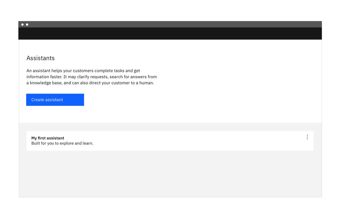
Creating a chatbot is easy when you have a starting place with pre-built content.
When someone feels like she can explore an interface and not suffer dire consequences, she’s likely to learn more—and feel more positive about it—than someone who doesn’t explore. Good software allows people to try something unfamiliar, back out, and try something else, all without stress.
-Jenifer Tidwell, Designing Interfaces, (O’Reilly Media, 2011), 9.
Pre-configured kits and workflows
Other options for starter content are pre-configured kits and workflows. Pre-configured kits containing code and API credentials can offer a fast path to getting started.
Starter content can also take the form of pre-configured workflows, where the configuration of services is automated, saving users from the tedium of a long setup process.
Considerations for starter content
- Requires upfront planning with the full product team to determine workflow pre-configurations that would most benefit users.
- If your starter content can be deleted by your user, you will need a basic empty state as a back up.
Accessibility
As most empty state illustrations are considered decorative, they should be skipped by screen readers.
A decorative image is one that does not serve any practical or informational purpose, and is included to fill a visual void. Do not include any informational content in your decorative image.
Web Content Accessibility Guidelines require that decorative images are given either an empty
alt
role
presentation
alt
role
presentation
Related
Components
Patterns
- Error states (future)
- Onboarding (future)
References
- Jakob Nielsen, Error Message Guidelines (Nielsen Norman Group, 2001)
- Jakob Nielsen and Page Labuheimer, Top 10 Application-Design Mistakes (Nielsen Norman Group, 2019)
- Jenifer Tidwell, Designing Interfaces (O’Reilly Media, 2nd edition, 2011)
- Web Content Accessibility Guidelines (W3C, 2018)
- Kathryn Whitenton, 3 Guidelines for Search Engine “No Results” Pages (Nielsen Norman Group, 2014)
Feedback
Help us improve this pattern by providing feedback, asking questions, and leaving any other comments on GitHub.