UI shell right panel
The right panel is part of the Carbon UI shell. A shell is a collection of components shared by all products within a platform. It provides a common set of interaction patterns that persist between and across products.
Live demo
This live demo contains only a preview of functionality and styles available for this component. View the full demo on Storybook for additional information such as its version, controls, and API documentation.
Accessibility testing statusFor every latest release, Carbon runs tests on all components to meet the accessibility requirements. These different statuses report the work that Carbon has done in the back end. These tests appear only when the components are stable.
For every latest release, Carbon runs tests on all components to meet the accessibility requirements. These different statuses report the work that Carbon has done in the back end. These tests appear only when the components are stable.
Resources
General guidance
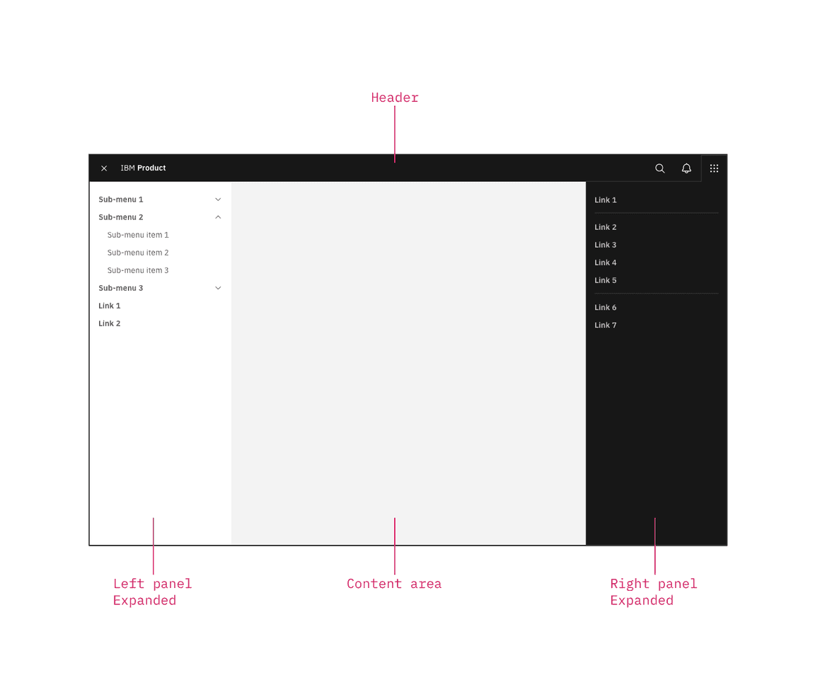
The UI shell is made up of three components: The header, the left panel, and the right panel. All three can be used independently, but the components were designed to work together.
| Shell UI component | |
|---|---|
| Header | The highest level of navigation. The header can be used on its own for simple products or be used to trigger the left and right panels. |
| Left panel | An optional panel that is used for a product’s navigation. |
| Right panel | An optional panel that shows additional system level actions or content associated with a system icon in the header. |
UI shell components
Anatomy
The right panel is invoked by icons on the right side of the header, and remains anchored to that icon. Right panels have a consistent width, span the full height of the viewport, and are flush to the right edge of the viewport.
Note that the switcher also lives in a right panel.

The right panel configured as an empty header panel (left) and a switcher (right).
Switcher item
A switcher item is anything that changes what product, offering, or property occupies the UI shell. Consider moments in a product when you switch from a calendar to a mailbox, from Kubernetes to Catalog. These items belong in the switcher.
Switcher divider
A switcher divider groups similar switcher items. You can use a divider to set apart a parent domain, group child domains similar in hierarchy to the parent, and set apart additional resources. The divider should not be used to separate every switcher item.
Switcher
The far right header icon is reserved for the switcher icon. The switcher icon and the switcher panel should only be used together.

Positioned the switcher to the far right.

Do not position other icons to the right of the switcher.

Do not use another icon for the switcher.
Behavior
Expansion
Right panels always float over page content, and always remain anchored to their associated icon. You can have multiple right panels, but only one can be expanded at any time.
Dismissal
Once expanded, the panel’s associated icon is outlined, with its bottom border flowing into the panel. To dismiss the panel, a user must select an item, or click or tap the header icon.
Selected state
There is no selected state for right panel items. Even if a user is currently within one of the panel items, the item remains unselected.