Search
Search enables users to specify a word or a phrase to find relevant content without navigation.
Live demo
This live demo contains only a preview of functionality and styles available for this component. View the full demo on Storybook for additional information such as its version, controls, and API documentation.
Accessibility testing statusFor every latest release, Carbon runs tests on all components to meet the accessibility requirements. These different statuses report the work that Carbon has done in the back end. These tests appear only when the components are stable.
For every latest release, Carbon runs tests on all components to meet the accessibility requirements. These different statuses report the work that Carbon has done in the back end. These tests appear only when the components are stable.
Overview
Search offers users a way to explore a website or application using keywords. Search can be used as the primary means of discovering content or as a filter to aid the user in finding content.
When to use
- To help users find data more efficiently within a complex or large data set.
- Use at a global level when searching an entire site.
- Use at a page level when searching through content on one page specifically.
- Use at a component level when searching data in a component, like a data table.
When not to use
- Do not use when there is small or limited amounts of data.
- Do not use when the information is simple and can be found easily within one view.
Formatting
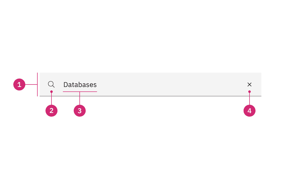
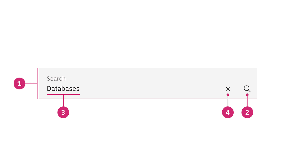
Anatomy
- Field: The place where a user enters their search query.
- Search icon: Signifies a search field. The magnifying glass icon is a universal way to indicate search.
- Field text: Inputted search text by the user. Placeholder text is visible before the user types into the field.
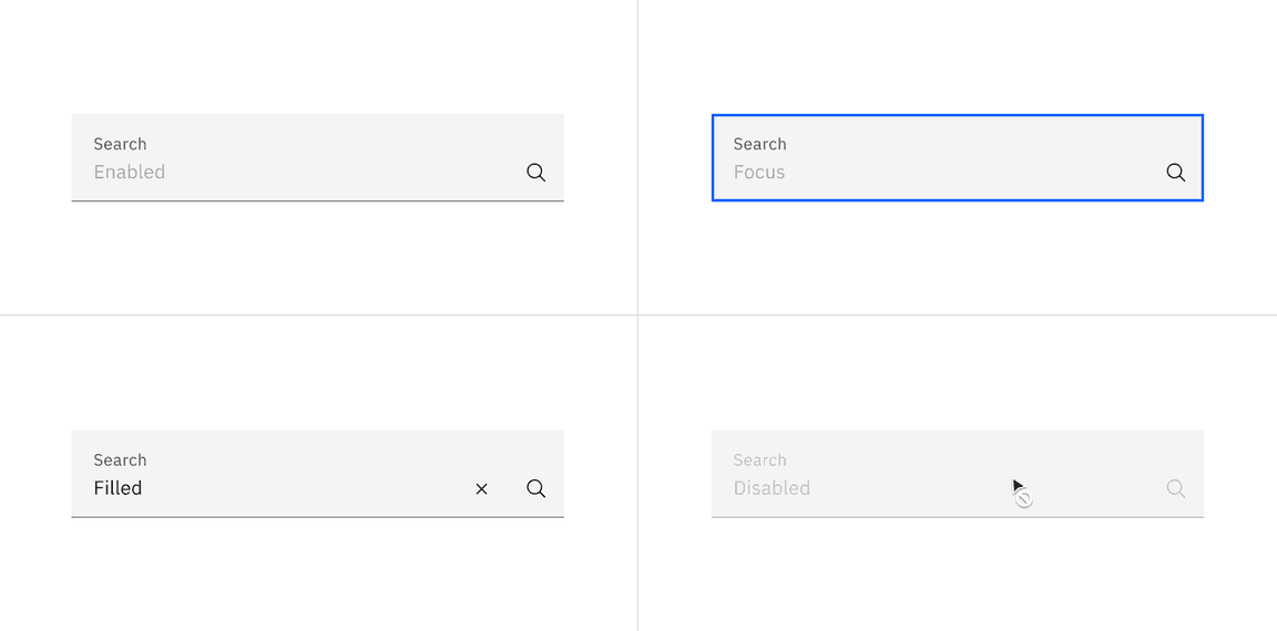
- Close icon: Appears after the user has actively typed into the search field. Acts as a function to clear the search field.
Styling
There are two styles of search, default and fluid. They share the same functionality but look visually different, influencing where to use them.
| Style | Appearance | Use case |
|---|---|---|
| Default | A traditional style where there is no label indicated. | Use when white space is needed between components. For example, a default search style is typically used at a global or page level. |
| Fluid | An alternative style where a label is placed inside of the search field and is stacked inline with the user input field text. | Use in expressive moments, fluid forms, and contained spaces. |
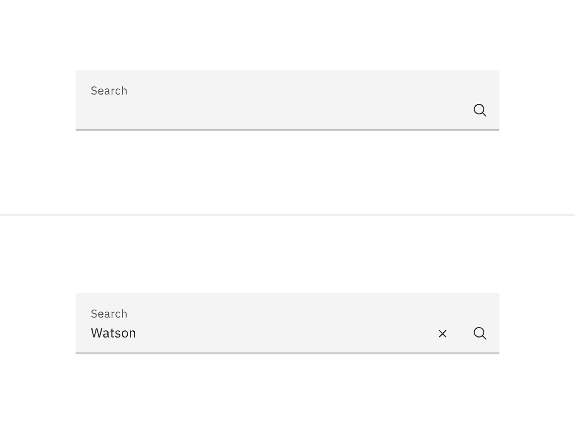
A default style input is shown on the top and fluid style is on the bottom.
Sizing
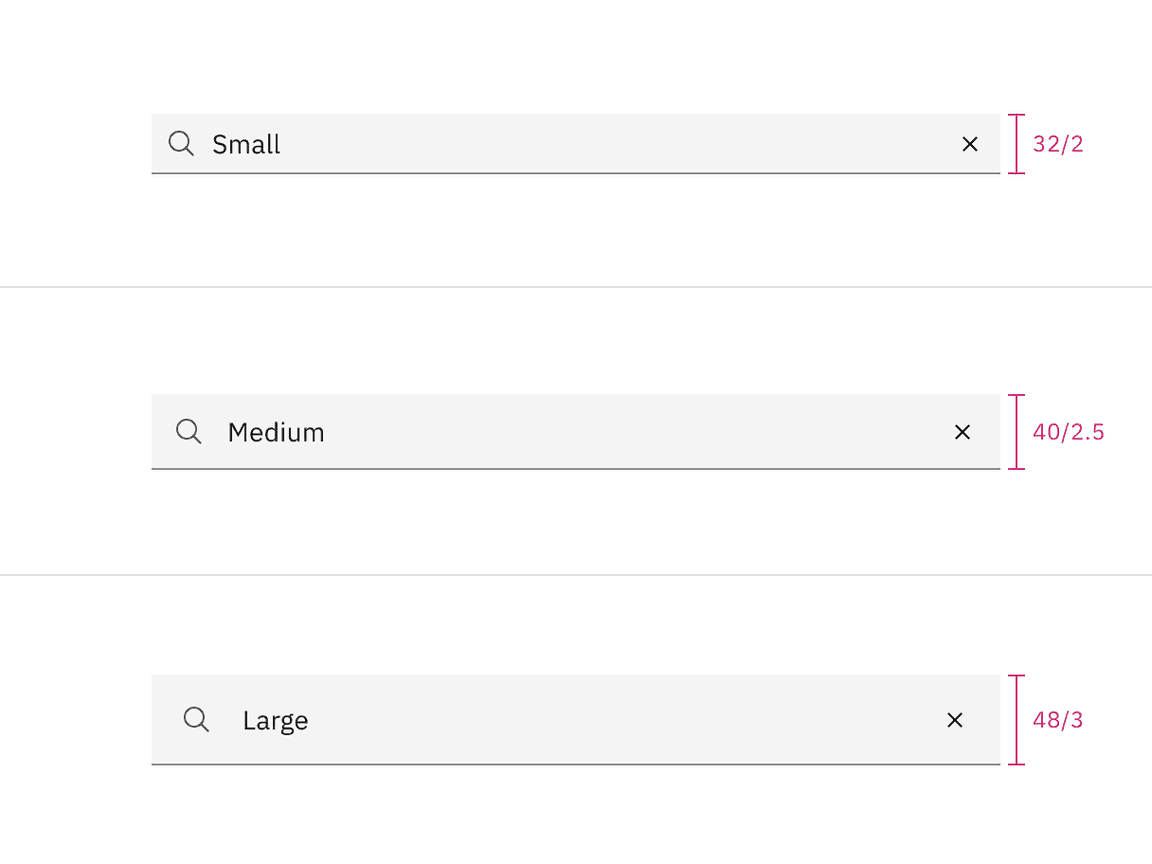
Default input heights
There are three default search height sizes: small, medium, and large. The width varies in size based on content, layout, and design. Supporting three different search sizes gives you more flexibility when structuring layouts.
| Size | Height (px/rem) | Use case |
|---|---|---|
| Small (sm) | 32 / 2 | Use when space is constricted within a design. |
| Medium (md) | 40 / 2.5 | This is the default size and the most commonly used size. When in doubt, use the medium size. |
| Large (lg) | 48 / 3 | Use when there is a lot of space to work with. The large size is typically at a global level when the user is searching content within a page view. |
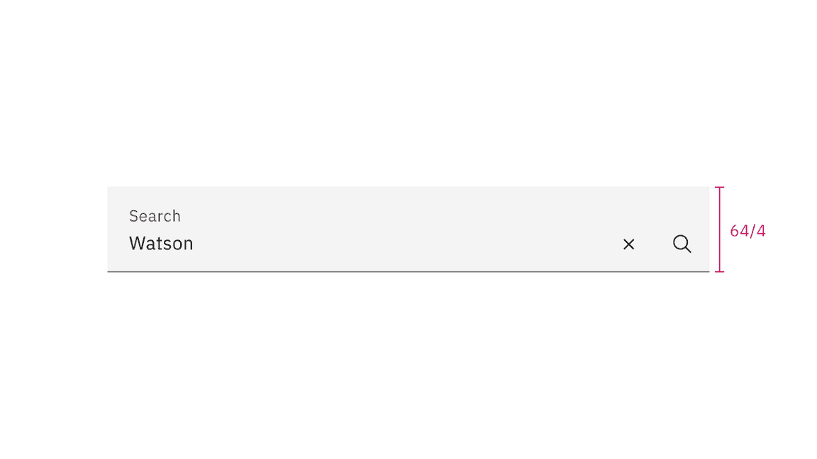
Fluid input height
There is only one input height at 64px and it is visually larger than the default heights.
Placement
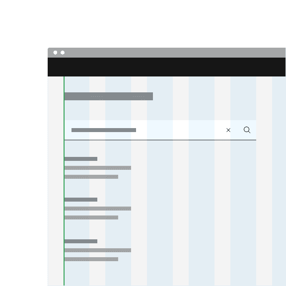
Place the search component within a user interface where users expect to find it and where it is appropriate for how it is being used in context, whether at a global level, page-specific level, or within a component.
The default search can be arranged on the grid to align the container with other components containers. Search can also hang to align with other hanging component containers on the same page, depending on the use case.
Do align the default search container vertically with other text on the page.
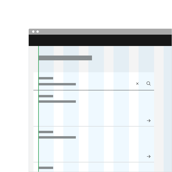
Do hang the fluid search container with other hanging components.
Content
Main elements
Placeholder text
Useful and short text hinting at what the user can search for. For example, “Search for networks or devices.”
Field text
- Key words entered by the user to find a search result.
- Keep the field text concise and relate the field text as closely to the result you want to find.
Further guidance
For further content guidance, see Carbon’s content guidelines.
Behaviors
States
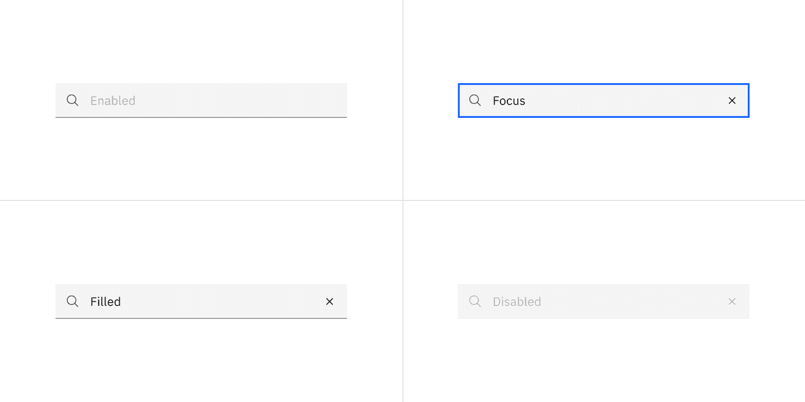
The search component has four states: enabled, focus, filled, and disabled.
Interactions
Mouse
Click on the search field input to start typing. Once a user starts typing, a close icon (‘x’) will appear and provides a way to clear the input field by clicking on the Close icon.
Keyboard
Press
Enter
Esc
Space
Enter
Related
Components
Feedback
Help us improve this component by providing feedback, asking questions, and leaving any other comments on GitHub.