Overflow content
Overflow content is text, such as a paragraph or a text string, that exceeds a desired space. It also applies to a series of components that surpass a given space. Overflow content is typically reduced to fit a space or reduce repetition. Truncation and “Show more” buttons are two ways to indicate that overflow content is continued elsewhere or below the fold.
Truncation
Truncation, or shortening, is typically used for static text or links that exceed the size of their container. Truncated items are represented by an ellipsis
...
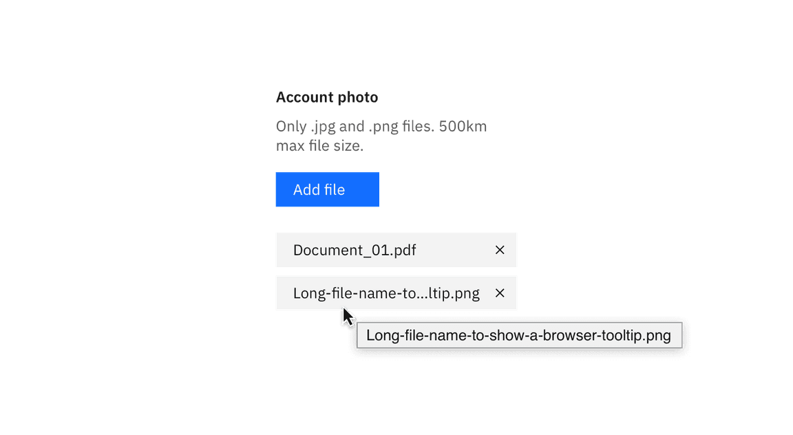
Example of a browser tooltip being used for truncation.

Example of end-line truncation for a paragraph.
Usage
Good use cases for truncation include:
- Breadcrumbs
- Pagination
- Long URL links
- Paragraph of text (i.e. a description paragraph)
- Shortening of a long item name (user- or platform-generated)
Truncation should not be used on page headers, titles, labels, error messages, validation messages, or notifications.
Variations
There are three types of truncation: front-line, mid-line, and end-line.
| Type | Purpose | Default | Truncated | |
|---|---|---|---|---|
| Front-line | Used at the beginning of a text string to indicate the text is continued from a previous location. |
|
| |
| Mid-line | Used when several text strings have different beginnings and/or endings but the exact same middle characters. Can also be used to shorten a phrase or text string when the end of a string cannot be truncated by an ellipsis. |
|
| |
| End-line | Used at the end of a character string or paragraph to indicate that there is more content in another location, to show that the pattern in a sequence continues, or to shorten a long text string. |
|
|
Ellipses alone
An ellipsis on its own may also represent condensed content. This type of truncation requires an overflow menu on hover instead of a browser tooltip.

Example of a truncated breadcrumb utilizing an ellipsis with an overflow menu.
Code
To use front- and end-line truncation, enter the appropriate class below and add
title
width
| Type | Class |
|---|---|
| Frontline |
|
| End-line |
|
Example Usage
<div class="container"><span title="123456789" class="cds--front-line">123456789</span></div>
.container {width: 65px;}
.cds--front-line {width: 100%;display: inline-block;direction: rtl;text-overflow: ellipsis;white-space: nowrap;overflow: hidden;}
Result

Mid-line truncation
Mid-line truncation does not have its own class as it requires JavaScript. This example in CodePen shows how it is implemented.
“Show more” buttons
The “Show more” button is used when there is a significant amount of overflow content. Implementing a “Show more” button gives a user the ability to see the content in more digestible chunks, as opposed to all at once. A “Show more” button is used in place of scrolling, gradients, or fades as they are more prominent and actionable. If needed, a “Show less” can be used to again hide the content the user opened. “Show more” can also be presented as “Load more” in cases where performance is a concern. See the Loading section for additional details.

Example of the “Show more” button in context.