Text input
Text inputs enable users to enter free-form text data. You can use them for long and short-form entries.
- Live demo
- Overview
- Text input
- Text area
- Formatting
- Content
- Universal behaviors
- Modifiers
- AI Presence
- Related
- Feedback
Live demo
This live demo contains only a preview of functionality and styles available for this component. View the full demo on Storybook for additional information such as its version, controls, and API documentation.
Accessibility testing statusFor every latest release, Carbon runs tests on all components to meet the accessibility requirements. These different statuses report the work that Carbon has done in the back end. These tests appear only when the components are stable.
For every latest release, Carbon runs tests on all components to meet the accessibility requirements. These different statuses report the work that Carbon has done in the back end. These tests appear only when the components are stable.
Overview
Text inputs enable users to enter free-form text data. The type of text field used should reflect the length of the content you expect the user to enter. The default text input is for short, one-line content, whereas text area is for longer, multi-line entries.
When to use
- A user needs to input unique information that cannot be predicted with a preset of options.
- A user needs to input memorable data that can be entered more quickly in a free-hand format versus a more complex control.
When not to use
- If a user can only enter an option from a predefined list then avoid using a free-form text input as it is likely to result in an error. Consider using a selection control such as a dropdown, select, or radio button group instead.
Variants
| Variant | Purpose |
|---|---|
| Text input | When the expected user input is a single line of text. |
| Text area | When the expected user input is more than a few words that could span multiple lines. |
Text input
Use a text input when the expected user input is a single line of text. Text inputs have a fixed height and are used to enter simple free-form data entries with any combination of letters, numbers, or symbols. There are two styles of text input, default and fluid, which share the same functionality but look visually different. The context of how or where the component is used will dictate which style to use.
| Style | Purpose |
|---|---|
| Default | Default is the most commonly used text input style with the label and helper text outside the field. Use when white space is needed between input components or in productive moments where space is at a premium, and smaller components are needed. |
| Fluid | Fluid is an alternate styling for text input used in more expressive moments. Use in fluid forms, contained spaces, or attached to complex components, like a toolbar. Fluid components always sit flush with components around them. |
Anatomy
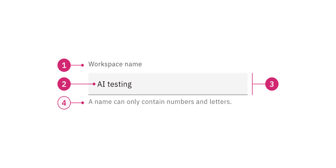

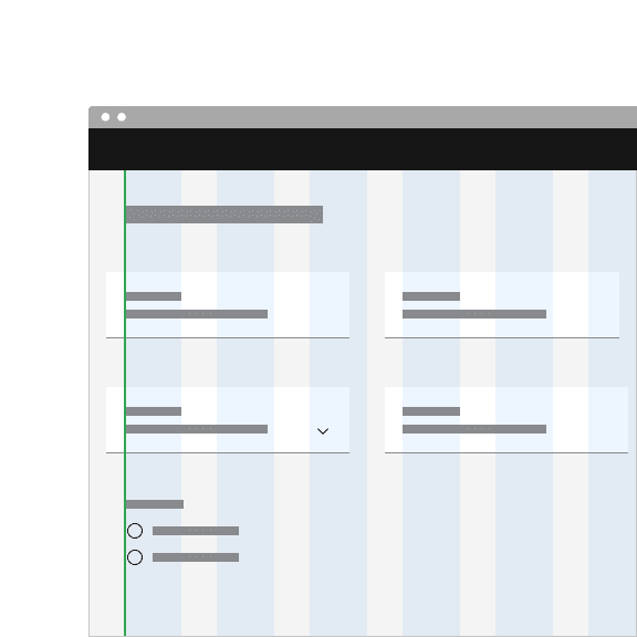
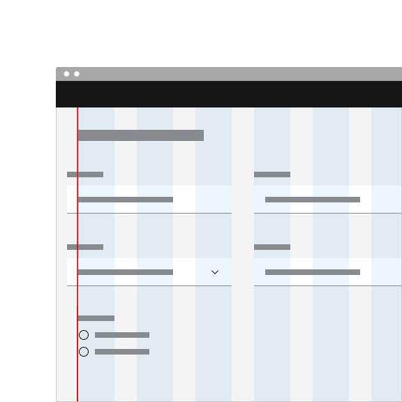
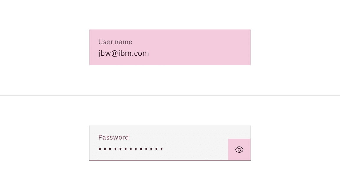
- Label: Text that informs the user about the content they need to enter in the field. It is required unless you get an approved accessibility exemption.
- Value: The content the user has entered into the field.
- Field: The container in which a user enters data. Must meet 3:1 non-text contrast requirements.
- Helper text (optional): Assistive text that can provide additional aid or context to the user. Often used to explain the correct data format. It is positioned below the field in the default style and surfaced through a tooltip in the fluid style.
Sizing
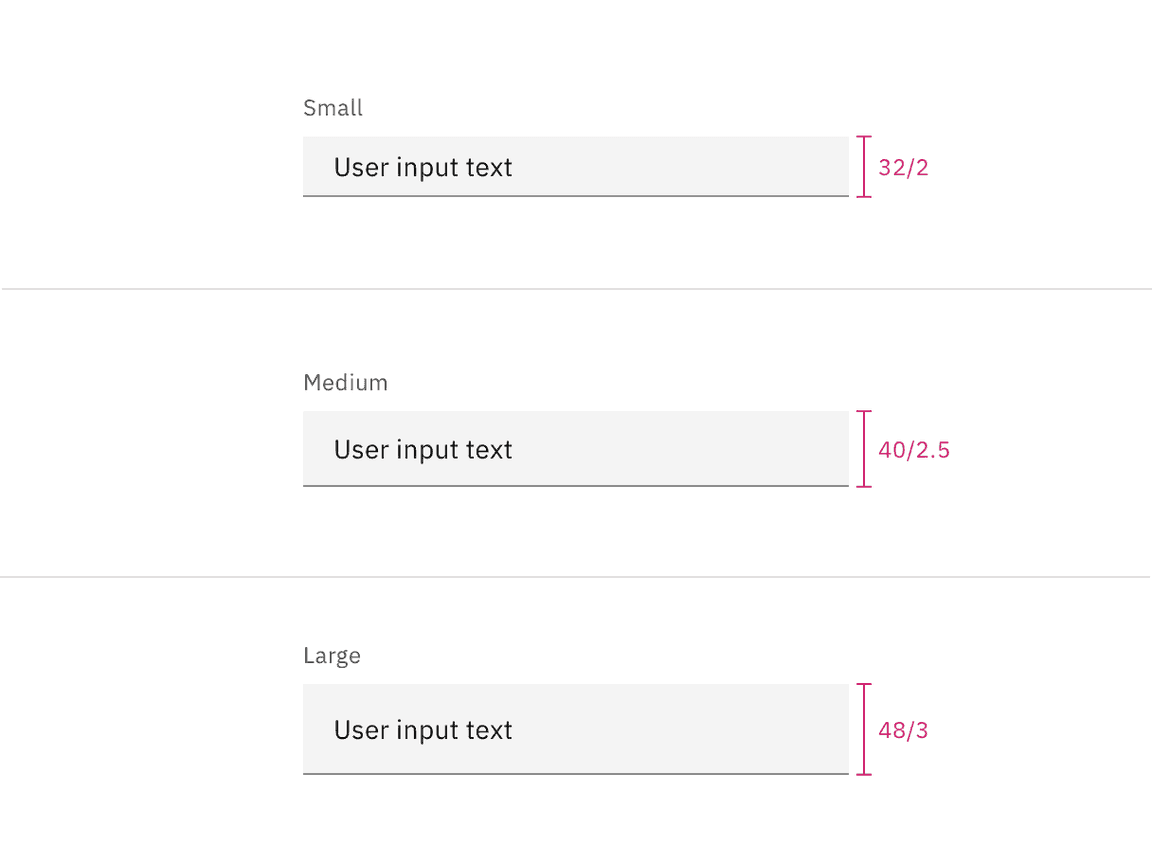
Default input heights
There are three text input height sizes: small, medium, and large. Supporting three sizes gives you more flexibility in structuring layouts. Be sure to use a consistent field height when pairing form components on the same page.
| Size | Height (px/rem) | Use case |
|---|---|---|
| Small (sm) | 32 / 2 | Use when space is constricted or when placing a text input in a form that is long and complex. |
| Medium (md) | 40 / 2.5 | This is the default size and the most commonly used size. When in doubt, use the medium size. |
| Large (lg) | 48 / 3 | Use when there is a lot of space to work with. The large size is typically used in simple forms or when a text input is placed by itself on a page. |
Fluid input heights
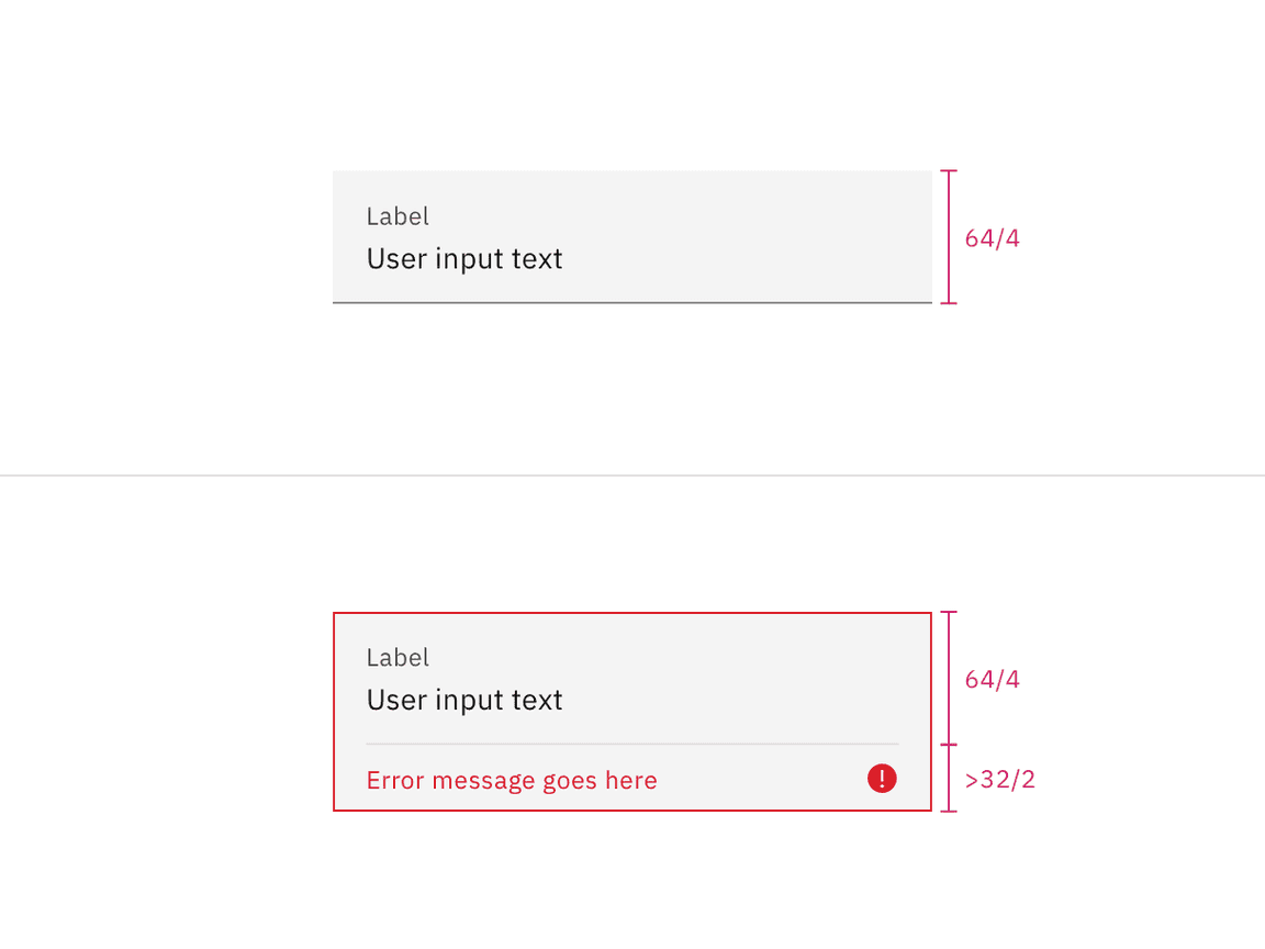
There is only one fluid input height and it is visually larger than the default heights. The input is a set height expect for when a warning or error message has been added to the bottom.
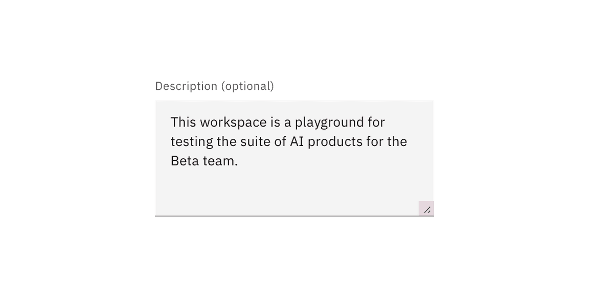
Text area
Use a text area when the expected user input is more than a few words and could span multiple lines. It is commonly used for features like user commentary or descriptions. It supports all the same states and functionality as text input except for the password functionality. Text area has several unique functionalities not included in the text input, like the resize handle, word counter and character counter.
| Style | Purpose |
|---|---|
| Default | Default is the most commonly used text area style with the label and helper text outside the field. Use when white space is needed between input components or in productive moments where space is at a premium, and smaller components are needed. |
| Fluid | Fluid is an alternate styling for text area used in more expressive moments. Use in fluid forms, contained spaces, or attached to complex components, like a toolbar. Fluid components always sit flush with components around them. |
Anatomy
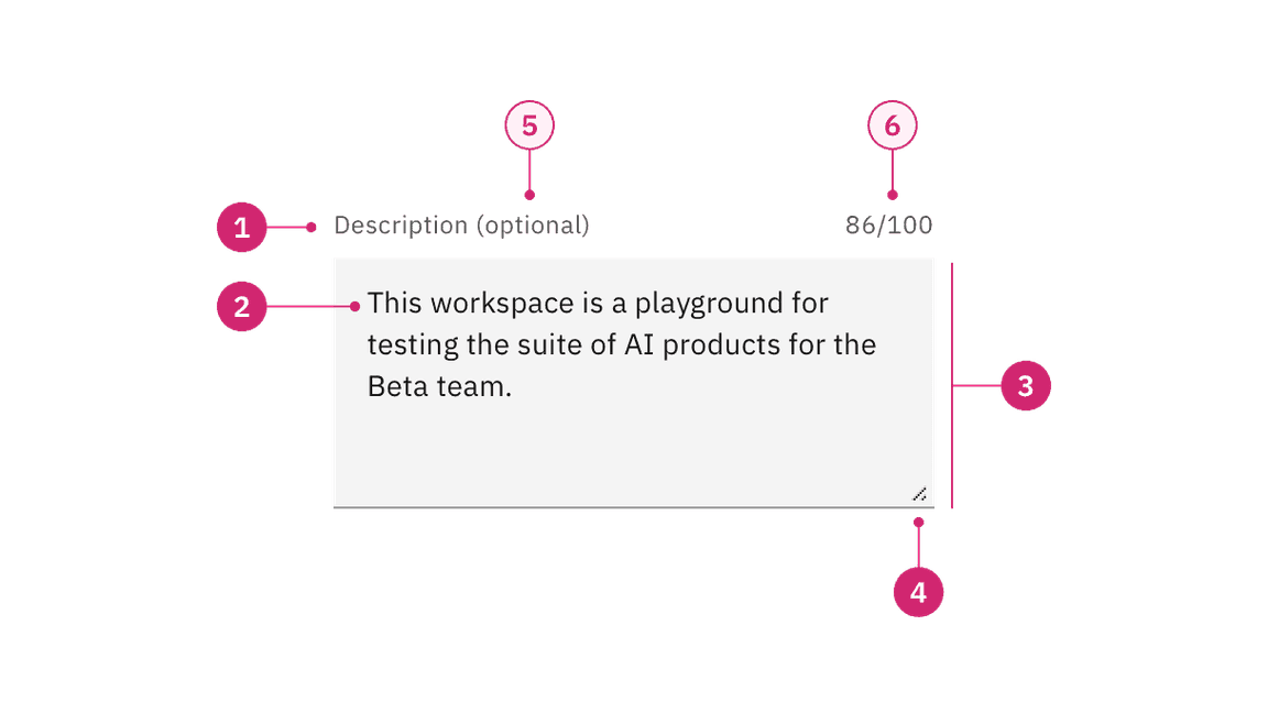
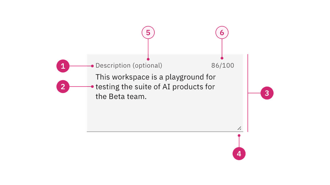
- Label: Text that informs the user about the content they need to enter in the field. It is required unless you get an approved accessibility exemption.
- Value: The content the user has entered into the field.
- Field: The container in which a user enters data. Must meet 3:1 non-text contrast requirements.
- Resize handle: Allows a user to manipulate the field height by making it longer or shorter.
- Optional versus required indicator (optional): This label indicates if the field is optional or required for the user to complete.
- Counter (optional)
- Character counter: Indicate the number of characters being entered and the total number of characters allowed.
- Word counter: Indicate the number of words being entered and the total number of words allowed.
Sizing
Text area has a variable height that can be lengthened or shortened by the user using the resize handle in the bottom right of the field. By default, text area has a minimum height of 40px/2.5rem but no maximum height.
Resize handle
Included by default in both default and fluid text area is the resize handle. It allows a user to manipulate the field height by making it longer or shorter. The resize handle has no effect on the width of the text area container, it only effects the height. If the user makes the field size shorter than the content inside the field then a vertical scroll will become available.
Formatting
Alignment
Input labels should vertically align to the grid and with other type elements on the page. The alignment of the input container will differ based on the style of text input you are using. Default inputs are always flush to the columns and fluid inputs will hang into the gutters.
Align default input containers to the grid so the input label aligns with other type of the page.
Hang fluid input containers into the gutters so the input label aligns with other type of the page.
Placement
The field widths of both text input and text area should reflect the intended length of the content while still aligning to the grid columns or mini unit grid. Unlike the height, the width of the text area cannot be controlled by the user. There are no minimum or maximum widths but you should avoid excessively wide fields that are disproportionate to the intended data being collected.
Do make text input widths proportional to the content and align to grid columns.
Do not make text inputs excessively wide just to fill in space.
Alignment
Labels and field containers should vertically align to the grid and with other form components on a page.
Do align field containers to the grid.
Do not align field text to the grid and hang the field in the gutter.
Content
Main elements
Labels
Effective labeling helps users understand what information to enter into a text input. Text fields should always have a label. There are rare instances were the context of an input negates the need for a visible label but we advise you consult an accessibility expert before proceeding with a label-less design.
- Use sentence-style capitalization for all labels, except for product names and proper nouns.
- Keep the label short and concise.
- Do not use colons after label names.
Helper text
Optional helper text is pertinent information that assists the user in correctly completing a field. It is often used to explain the correct data format.
- Use sentence-style capitalization, and in most cases, write the text as full sentences with punctuation.
- When used, helper text appears persistently underneath the field, except when an error or warning message replaces it.
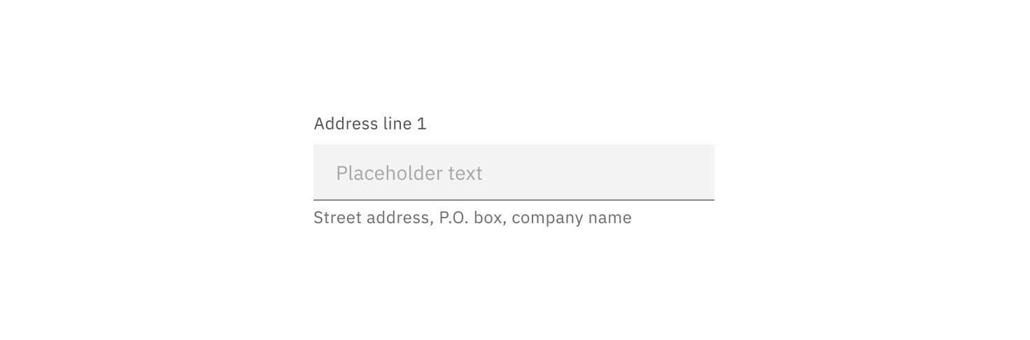
Placeholder text
Optional placeholder text provides hints or examples of what to enter. Placeholder text disappears after the user begins entering data into the input. As such, it should not be used as a replacement for a persistent label nor should it contain crucial information.
- Use sentence-style capitalization, and in most cases, write the text as a direct statement without punctuation.
- Placeholder text is not required and by default not shown in text input fields.
- Placeholder text can be harmful to user interactions and should only be added when necessary.
Overflow content
Overflow in a text input
If a user’s content is unexpectedly too long for the single line of a text input then the value content can horizontally scroll inside the field container when moving the cursor from one end of the value to the other.
Overflow in a text area
If a user’s content exceeds the vertical space of the variable text area then a user can either expand the field container using the resize handle or they can vertically scroll the content inside the set field container.
Further guidance
For further content guidance, see Carbon’s content guidelines.
Universal behaviors
The behaviors listed in this section are universal across all variants. For behaviors that are unique to each variant, see each of the component variant sections below.
States
The text input and text area have multiple interactive states: enabled, active, focus, error, warning, disabled, skeleton, and read-only. For more details on text input and text area interactive states, see the style tab.
| State | When to use |
|---|---|
| Enabled | When a text input or text area is live but a user is not directly interacting with it. This is commonly referred to as the default or normal state of the component. An enabled text input field can contain no content, placeholder text, or user generate content. |
| Active | When a user is actively typing content into the field. |
| Focus | When a user
|
| Error | When the user input is invalid or a required text input or text area has not been filled in. It can also be triggered due to a system error. This state requires a user response before data can be submitted or saved. |
| Warning | When you need to call the user’s attention to an exception condition. The condition might not be an error but can cause problems if not resolved. |
| Disabled | When the user cannot interact with a component and all interactive functions have been removed. Unlike read-only states, disabled states are not focusable, are not read by screen readers, and do not need to pass visual contrast, making them inaccessible if they need to be interpreted. |
| Skeleton | Use on an initial page load to indicate that the text input or text area has not yet fully loaded. |
| Read-only | When the user can review but not modify the component. This state removes all interactive functions like the disabled state but can still be focusable, accessible by screen readers, and passes visual contrast for readability. |
Validation
Real-time validation helps streamline the process and keep data clean when the user fills out forms. Otherwise, validate the text input data when the user submits the associated form. For complete guidance on error and validation, see the form pattern.
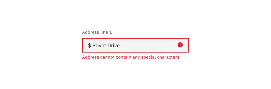
Invalid
An error state is triggered if the data is invalid or a required field is left empty. Error states have three visual indicators to signify invalid content: a red border, an error icon indicator, and an error message.
Required versus optional
Text inputs can be labeled as either optional or required depending on the depending on the circumstance. For more guidance on requirement labeling, see the form pattern.

If the majority of the fields are required, mark only the optional field labels with (optional).
If the majority of the fields are optional, mark only the required field labels with (required).
Interactions
Mouse
Users can activate a text input by clicking on the field container. A separate click is required to activate any additional actions associated with the text input such as a password visibility toggle.
Keyboard
For additional keyboard interactions, see the accessibility tab.
| Key | Interaction |
|---|---|
| Tab | Brings focus to the text input. |
| Enter or Space | Opens any associated actions added to the input, such as a password visibility toggle. |
| Esc | Closes any associated actions added to the input. |
| ctrl or opt + left/right arrows | Moves you word by word inside the field. |
| ctrl or opt + up/down arrows | Relocates you to the start or end of the input content. |
Modifiers
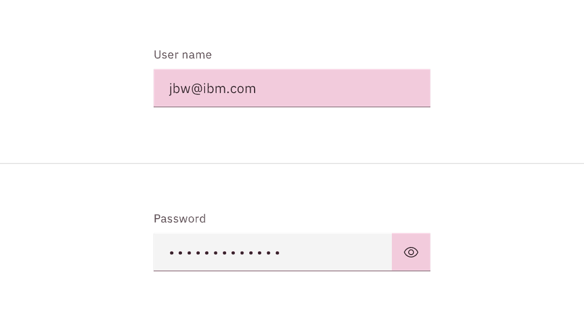
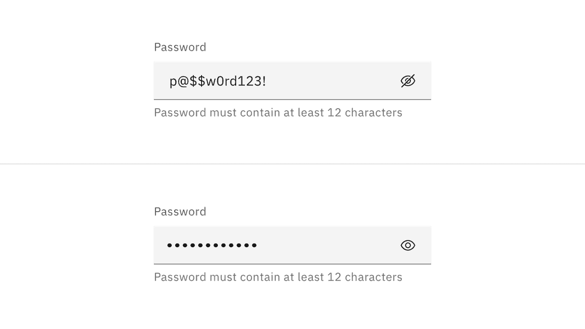
Password input
Password input is a sub-variant of text input. It is used to collect private data and will hide the characters as a user enters them. A user can choose to toggle on the character visibility by clicking the view icon on the far right of the input field. When using a password input be sure to provide detailed helper text listing any requirements related to the data format, such as types of characters allowed or date structure.
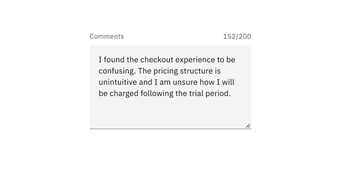
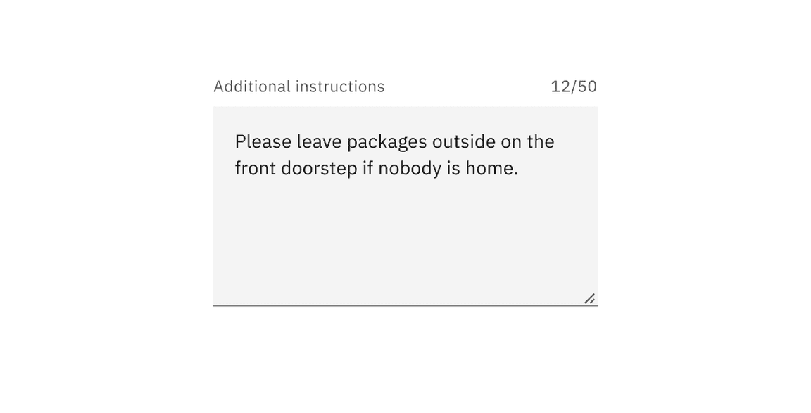
Character counter
A character counter can be added to text area to indicate both the number of characters being entered and the total number of characters allowed. Once the max number of characters is reached the text area should prevent the user from entering any additional character and provide messaging to the user that a limit has been met.
Word counter
A word counter can be added to text area to indicate both the number of words being entered and the total number of words allowed. Once the max number of words is reached the text area should prevent the user from entering any additional character and provide messaging to the user that a limit has been met.
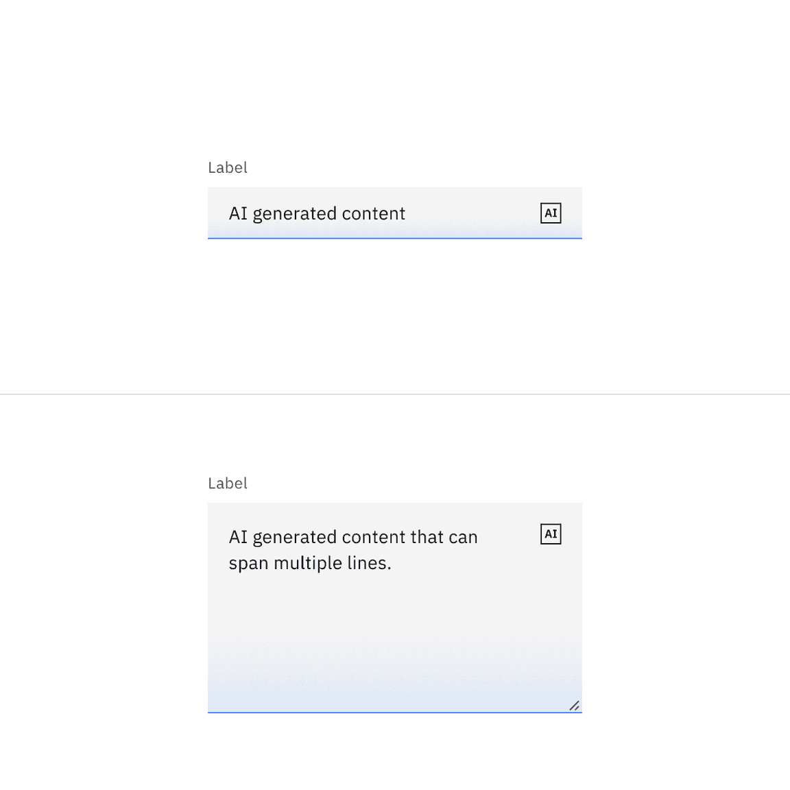
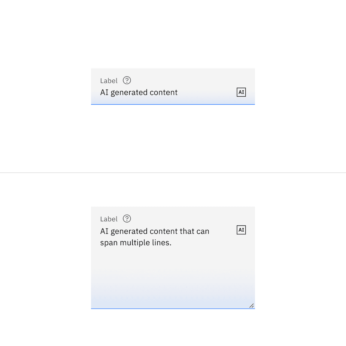
AI presence
Text input and text area have a modification that takes on the AI visual styling when the AI label is present in the input. The AI variant functions the same as the normal version except with the addition of the AI label which is both a visual indicator and the trigger for the explainability popover.
For more information on designing for AI, see the Carbon for AI guidelines.
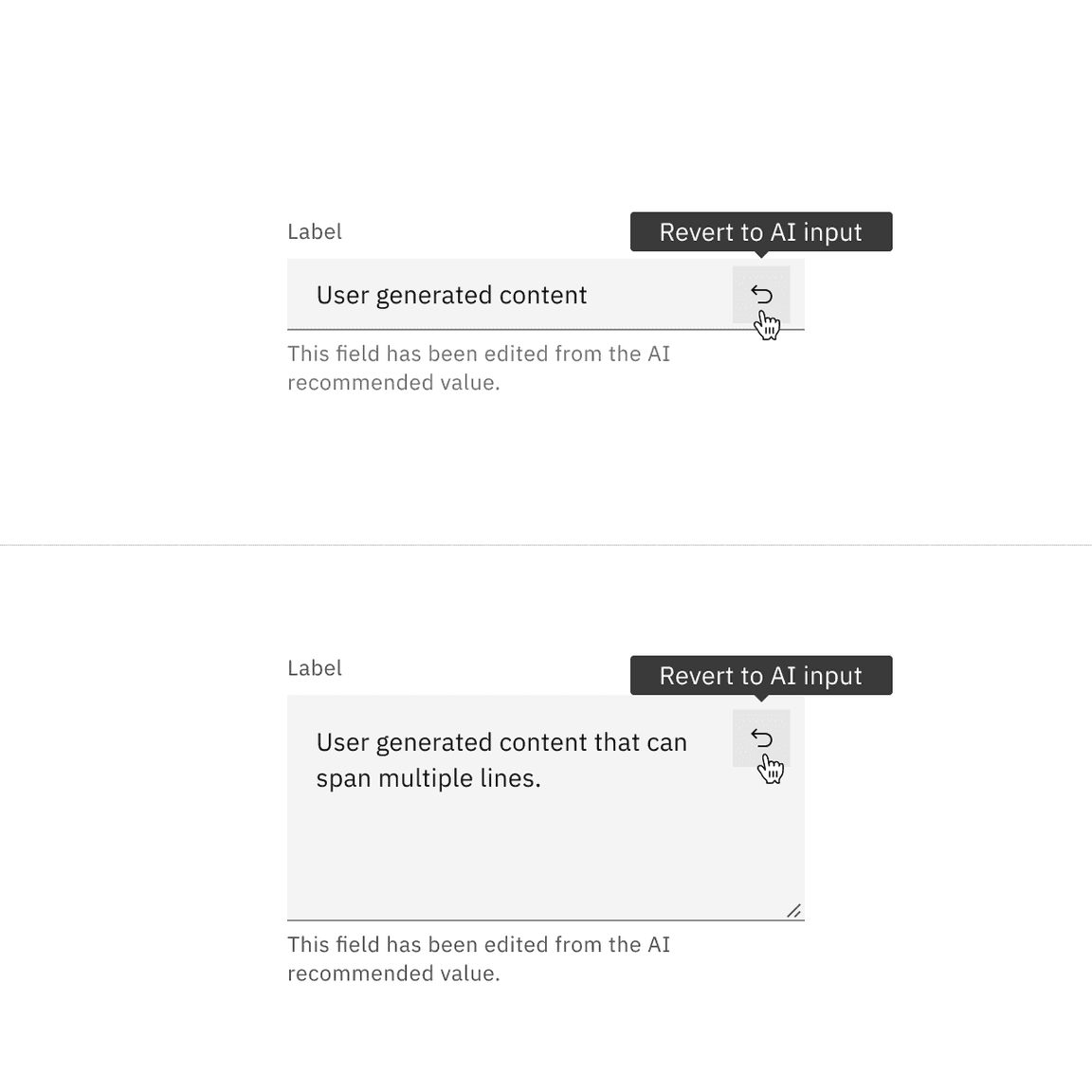
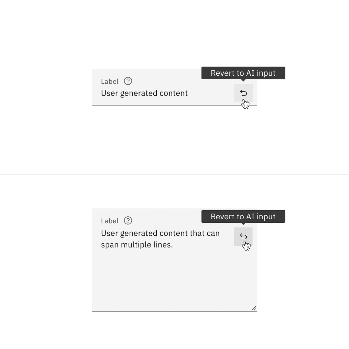
Revert to AI
The text input and text area can toggle between the AI variant and the non-AI variant depending on the user’s interaction. If the user manually overrides the AI-suggested content then the input will change from the AI variant to the non-AI variant. Once edited, the user should still be able to switch back to the initially AI generated content via a revert to AI button.
Related
Feedback
Help us improve this component by providing feedback, asking questions, and leaving any other comments on GitHub.