Tag
Use tags to label, categorize, or organize items using keywords that describe them.
- Live demo
- Overview
- Formatting
- Content
- Behaviors
- Read-only tag
- Dismissible tag
- Selectable tag
- Operational tag
- Modifiers
- AI presence
- References
- Feedback
Live demo
This live demo contains only a preview of functionality and styles available for this component. View the full demo on Storybook for additional information such as its version, controls, and API documentation.
Accessibility testing statusFor every latest release, Carbon runs tests on all components to meet the accessibility requirements. These different statuses report the work that Carbon has done in the back end. These tests appear only when the components are stable.
For every latest release, Carbon runs tests on all components to meet the accessibility requirements. These different statuses report the work that Carbon has done in the back end. These tests appear only when the components are stable.
Overview
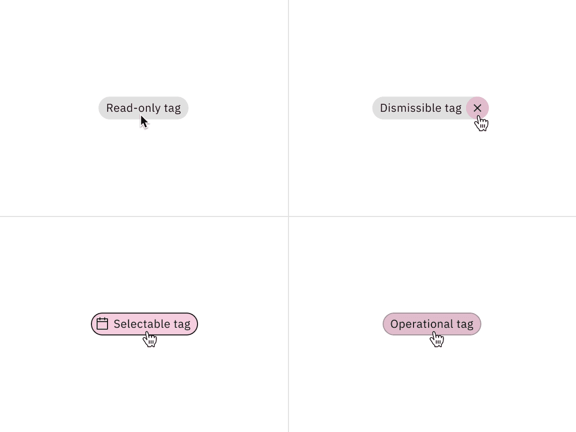
Tags are components that are often used to label different items, create categorization, filter data, select or deselect options, and include functionality to disclose several related tags in another view. To support these different use cases, tags come in four variants—read-only, dismissible, selectable, and operational.
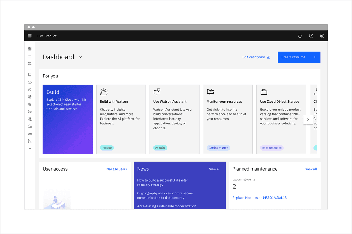
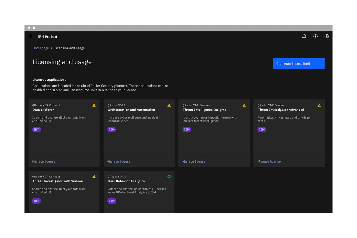
Tags being used in context of a product UI.
When to use
Use tags when content is mapped to multiple categories, and the user needs a way to differentiate between them.
When to use
- Use for categorizing, labeling, or read-only situations
- Use as a method of filtering data on a page, within a component, or in conjunction with search capabilities
- Use in a chat flow to make decisions and advance the chat
- Use for creating user-generated custom labeling and use when needing to remove created labels
- Use to view an overflow of multiple tags, like in a popover, modal, or detail view
When not to use
- Do not use tags as links that direct you to an entirely different page or launch you from a current experience to a separate tab
- Avoid using tags with multiple functions to prevent confusion and reduce accidental clicks
Variants
| Variant | Purpose |
|---|---|
| Read-only tag | Tags that have no interactive functionality and are commonly used for categorizing and labeling. |
| Dismissible tag | Tags that can be dismissed, closed, or removed. These tags are typically used for filtering and creating user-generated content. |
| Selectable tag | Tags that can be selected or deselected and are frequently used as selections that filter data in the context of a page. They also can be used in chat flows to make decisions to advance the chat. |
| Operational tag | When interacted with, these tags can disclose additional or overflow tags, like in a popover, modal, or breadcrumb detail view. |
Formatting
Anatomy
Read-only, dismissible, selectable, and operational tags are all comprised of a container, a text title, and the option to add a decorative icon. Dismissible tags include an additional close icon to filter or dismiss a tag. Selectable and Operational tags include a container border to indicate at a glance that these variants have increased interactivity and function differently.
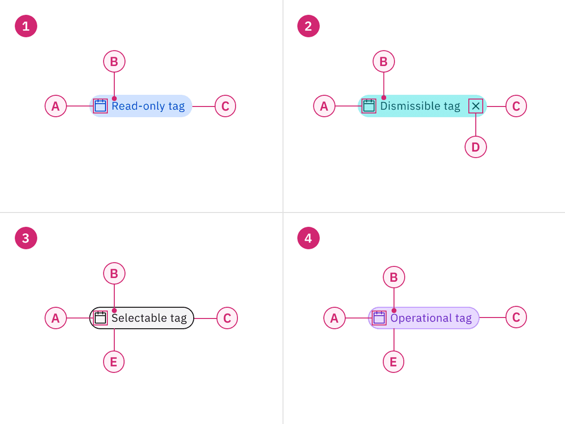
Anatomy of read-only, dismissible, selectable, and operational tags.
1. Read-only tag
A. Decorative icon (optional)
B. Title
C. Container
3. Selectable tag
A. Decorative icon (optional)
B. Title
C. Container
E.
Border
2. Dismissible tag
A. Decorative icon (optional)
B. Title
C. Container
D.
Close icon
4. Operational tag
A. Decorative icon (optional)
B. Title
C. Container
E.
Border
Sizing
There are three different tag sizes — small, medium, and large. Use small tags in condensed or inline spaces. The medium tag size is the default size and is most commonly used. Use large tags when they are used as a primary task of the page or focal point, when you have more screen real estate at your disposal, or if the tag lives near other components that are also 32px in height.
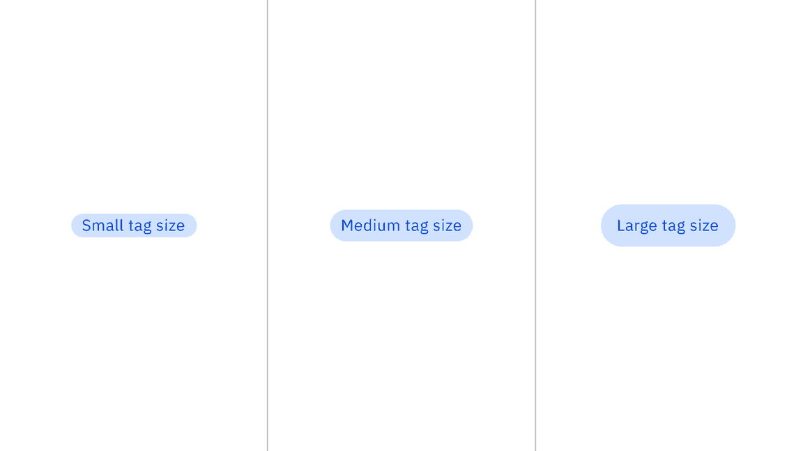
Tags shown in small, medium, and large sizes.
Placement
Vertically align the tag’s container to the other components or text near it. Do not hang tag containers into grid gutters to vertically align the tag’s titles with other text on the page. When tags are placed in groups, it is recommended to have 8px of space between them on the top, bottom, left, and right.
Vertical alignment of a group of tags with other components and text.
Content
Main elements
Title
- Tag titles should be concise and informative.
- Tag titles should describe the tag in a few words or be under 20 characters when possible.
- Only include long title content in tags when necessary, for instance, when there are user-defined names of categories, system-generated strings of text, etc.
Overflow content
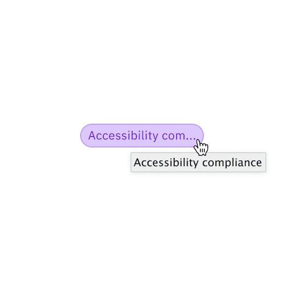
When the tag’s title is too long to fit within the available space of the tag container, the title can be truncated with an ellipsis. By mouse, the full title is disclosed in a browser tooltip on hover. By keyboard, the full title is disclosed on focus in a tooltip. Truncation should be set at the title’s start, middle, or end, depending on what is best for the given use case.
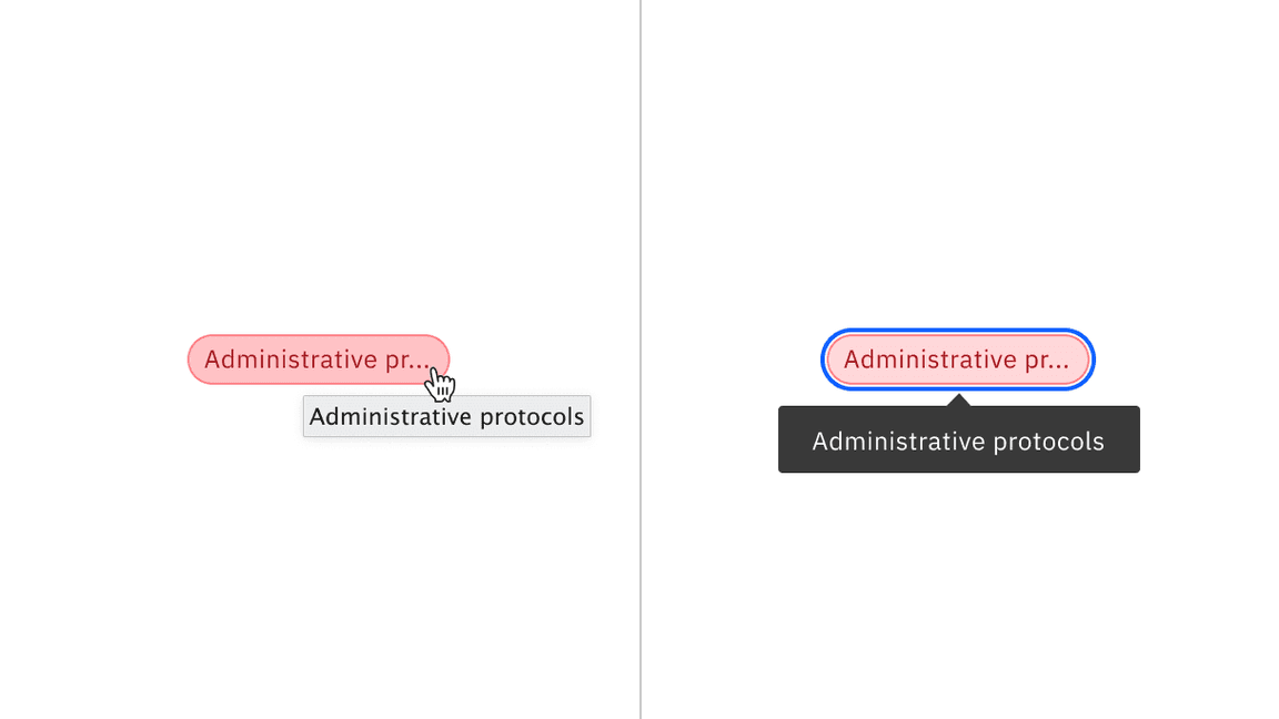
Truncated tag title disclosed in a tooltip on hover by mouse and on focus by keyboard.
Avoid having long tag titles wrap to multiple lines within the tag container. This can construe the shape of the tag and integrity of a traditional tag shape, which should be compact in form. It can also create misalignment with other tags if they are placed within a group.
Do use a browser tooltip to show the full length of overflow tag title text.

Do not wrap overflow tag title text to multiple lines.
Further guidance
For further content guidance, see Carbon’s content guidelines.
Behaviors
States
The four tag variants have different states:
- Read-only tags: enabled, disabled, and skeleton
- Dismissible tags and operational tags: enabled, hover, focus, on click, disabled, and skeleton
- Selectable tags: enabled, hover, focus, selected, disabled, and skeleton
For more information on tag states, see the style tab.
| State | When to use |
|---|---|
| Enabled | When a tag is live but a user is not directly interacting with it. This is commonly referred to as the default or normal state of the component. |
| Hover | When a user is hovering over the tag with the mouse cursor to interact with it (except read-only tags). |
| Focus | When a user presses tab or clicks on the tag, it becomes focused, indicating the user has successfully navigated to the component (except read-only tags). |
| On click | When a user presses enters, space, or clicks on the tag to either dismiss it or disclose a list of additional tags. |
| Selected | When a user presses enter, space, or clicks on the tag to select it or deselect it. |
| Disabled | When a user is not allowed to interact with the tag due to either permissions, dependencies, or pre-requisites. The disabled state completely removes the interactive function from a component. The styling is not subject to WCAG contrast compliance. |
Interactions
Mouse
Read-only tags: Do not get mouse functionality besides a mouse cursor on hover and do not have interactive functionality.
Dismissible tags: Receive a mouse cursor when hovering over the title area of the tag. When hovering over the close icon, the icon gets a background color change and a mouse pointer. Once the close icon area is clicked, the tag will be dismissed, closed, or removed.
Selectable tags: Receive a full background color change and mouse pointer on hover. Clicking anywhere on the tag will put it in a selected state. Once in the selected state, clicking anywhere on the tag again will deselect it.
Operational tags: Receive a background color change and mouse pointer on hover. Clicking anywhere on the tag will disclose a way of viewing more related tags in either a popover, modal, or breadcrumb view.
Keyboard
Read-only tags: Can not be operated by a keyboard and have no interactive functionality.
Dismissible tags: Receive focus on the close icon area by pressing the
Tab
Enter
Space
Selectable tags: The container receives focus by pressing the
Tab
Enter
Space
Tab
Operational tags: The container receives focus by pressing the
Tab
Enter
Space
Clickable areas
Read-only tags are not clickable and can not be interacted with. Dismissible tags have a clickable area around the close icon to dismiss or close the tag. Selectable and operational tags containers are clickable to either select the tag or view more tags.
Read-only, dismissible, selectable, and operational tags with their clickable areas.
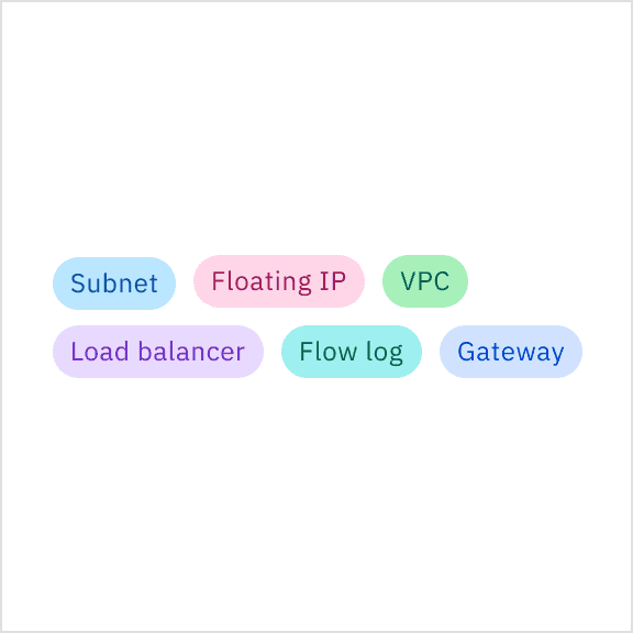
Read-only tag
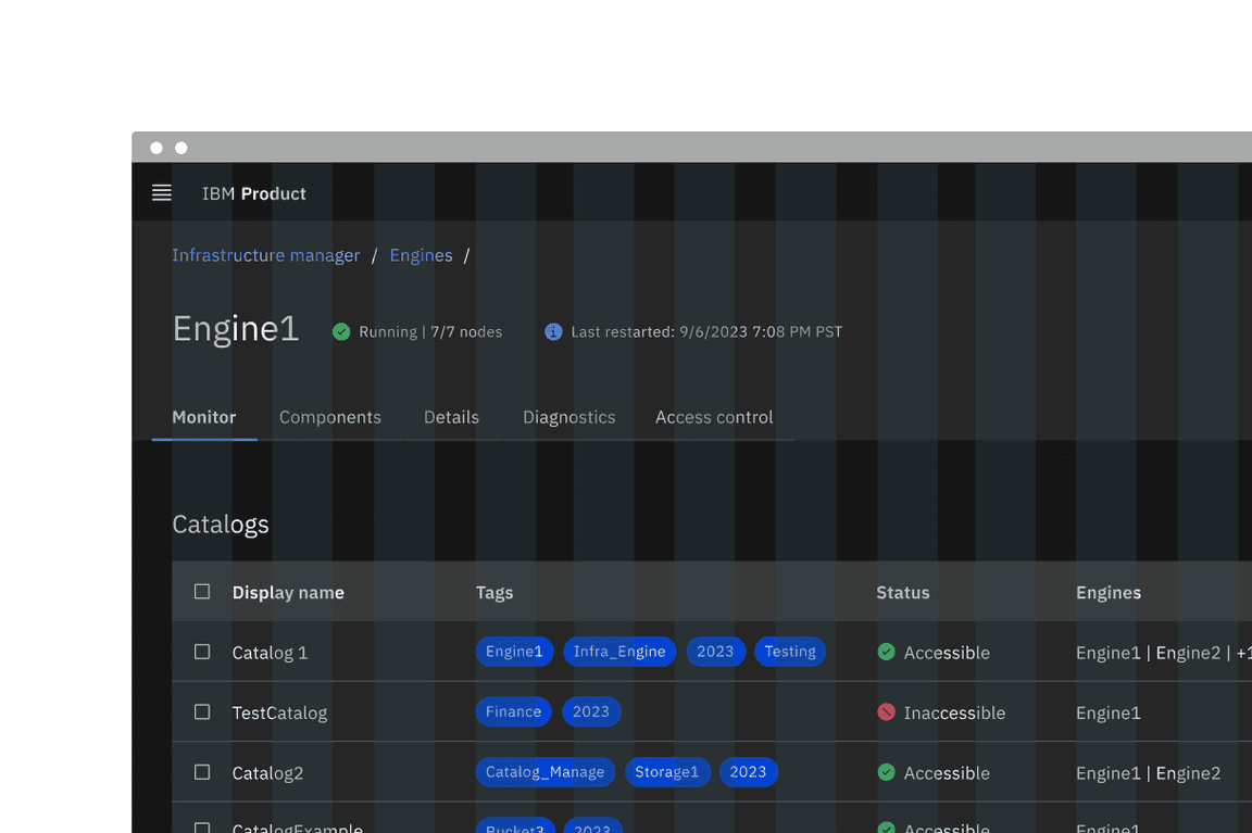
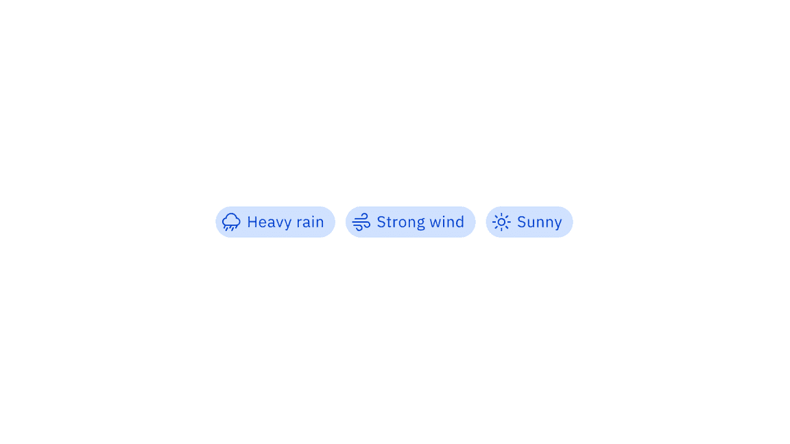
Read-only tags are used to categorize, are used for labeling, and do not have interactive functionality. Read-only tags come in several color choices and can use optional decorative icons to delineate between multiple categories.
Read-only tags in the context of a product UI.
If your design intends to use tags as labels or for categorization, use modifiers like colors or icons to help indicate this differentiation.
Do use colors to help distinguish between different tag labels or categories for easier scanning.
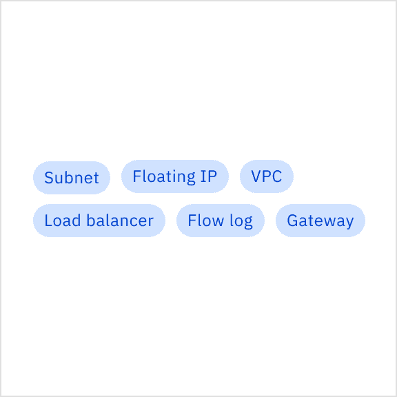
Do not use the same color for every tag if they are supposed to be used as labels or categories.
Dismissible tag
Dismissible tags allow users to dismiss, close, or remove a tag. Dismissible tags are commonly used with the search component to search or filter keywords on a page or within sections of a page.
Dismissible tags can also be used as user-generated labels that are applied to instances and can be removed later if needed. Do not use a dismissible tag if the intention for it is to remain persistent at all times since they can be closed or dismissed by the user.

Dismissible tags in the context of a product UI.
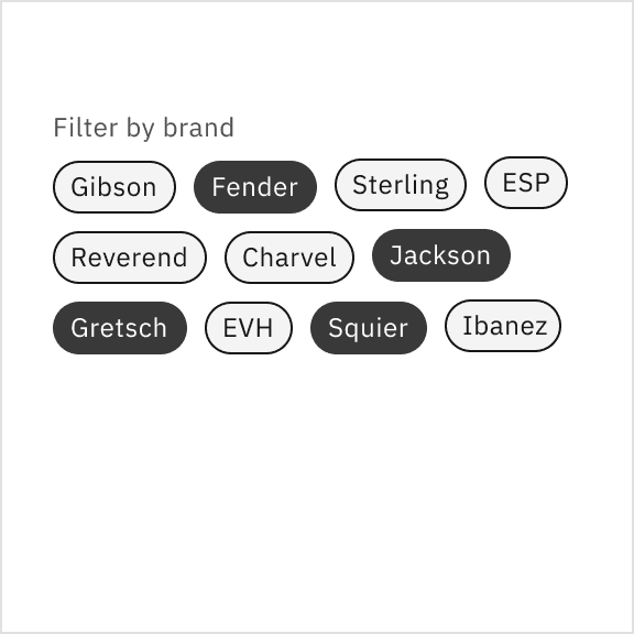
Selectable tag
Selectable tags give users the ability to select or deselect them. They can be used in a form containing only tags as the selection method, in a chat to make decisions and forward the chat, and can be used as selections to filter content on a page or within a component.
In some cases, selectable tags can be an alternative to traditional form components when the entire form consistently uses tags as its form selection style. Selectable tags can be used for multi-selection or single-selection use cases. These tags should always remain in high contrast to ensure a noticeable difference between selected and unselected tags.

Selectable tags in the context of a product UI.
When selectable tags are in groups, we recommend using horizontal alignment for easier scanning when there are only a few tags. Keep groups of tags horizontally on one line when there are six tags or less. Horizontal alignment is not recommended when there are many tags to select from in a group. Tags should wrap to form another line if there are too many to arrange horizontally on one line. If the number of tags exceeds five lines of wrapping, consider using a different component for your use case, like a multi-select dropdown.
Do wrap tags in a group to a few multiple lines.
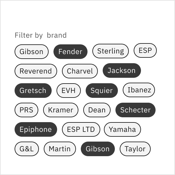
Do not wrap tags in a group of more than five lines.
Operational tag
Operational tags enable the user to see a more comprehensive view of all tags disclosed in a popover, or breadcrumb detail view. Do not use tags as links that direct you to an entirely different page or launch you from a current experience to a separate tab.
Operational tags in the context of a product UI.
Modifiers
Decorative icons
Decorative icons lead before the tag title. Decorative icons are optional and are often used to support the tag title visually. We recommend not using decorative icons in the small tag size where there is compact spacing, which could create possible visual tension between some icon shapes and tags with borders.
Tags with decorative icons.
Tag colors
Read-only, dismissible, and operational tags come in a variety of different colors, with values from the IBM Design Language color palette using component tokens. It is recommended to use multiple colors to denote different categories or labels. Selectable tags are unavailable in these colors; instead, they use core tokens.
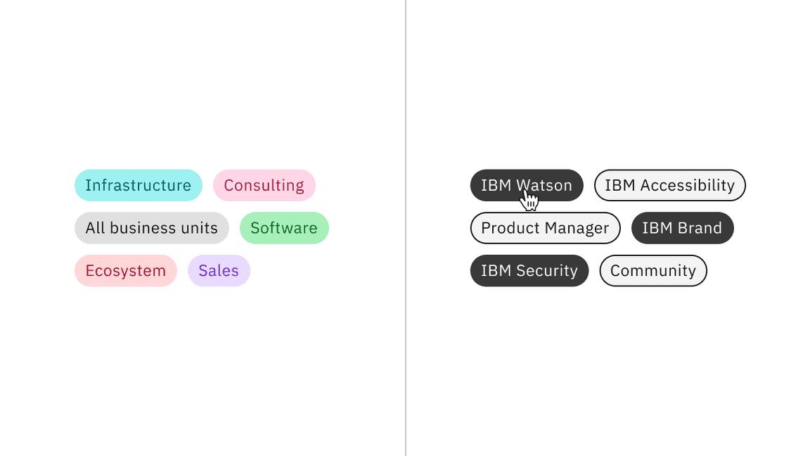
Read-only using component color tokens and selectable tags using core color tokens.
AI presence
Tag has a modification that embeds the AI label when AI is present in the component. The AI variants function the same as the normal versions except with the addition of the inline AI label which is both a visual indicator and the trigger for the explainability popover. Read-only and dismissible tags are the only tag variants that allow for the interactive AI label.
For more information on designing for AI, see the Carbon for AI guidelines.
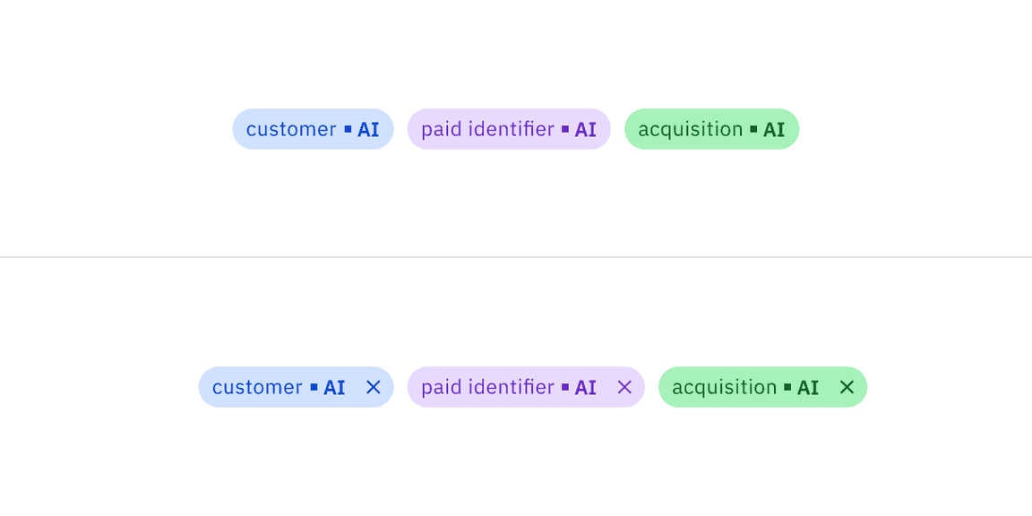
Read-only AI tag (top), dismissible tag (bottom)
Feedback
Help us improve this component by providing feedback, asking questions, and leaving any other comments on GitHub.