Toggle
A toggle is used to quickly switch between two possible states. They are commonly used for “on/off” switches.
Live demo
This live demo contains only a preview of functionality and styles available for this component. View the full demo on Storybook for additional information such as its version, controls, and API documentation.
Accessibility testing statusFor every latest release, Carbon runs tests on all components to meet the accessibility requirements. These different statuses report the work that Carbon has done in the back end. These tests appear only when the components are stable.
For every latest release, Carbon runs tests on all components to meet the accessibility requirements. These different statuses report the work that Carbon has done in the back end. These tests appear only when the components are stable.
Overview
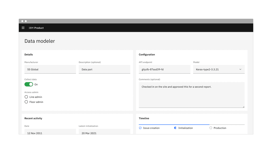
Toggle is a control that is used to quickly switch between two possible states. Toggles are only used for these binary actions that occur immediately after the user “flips the switch”. They are commonly used for “on/off” switches.
Example of the toggle component in a UI
When to use
- To turn off and on a single option that affects the system or page settings.
- Ideal for settings or preferences that can be immediately applied.
- Recommended for actions where the change is reversible without additional confirmation.
When not to use
- Avoid using toggles if the action requires immediate feedback or confirmation, such as deleting a file.
- Don’t use toggles for more than two options; instead, use a dropdown, radio button, or checkbox.
- Avoid using toggles for settings that aren’t binary in nature or don’t provide instant application; instead use a different UI component, like a checkbox, in combination with a button.
Variants
| Variant | Purpose |
|---|---|
| Default toggle | Use the default toggle when you need to specify a label text in addition to the toggle state text. Default toggles appear in forms or within full pages of information. |
| Small toggle | Use the small toggle when you do not need to specify label or state text. Small toggles are more compact in size and are used inline with other components. |
Feature flags
A feature flag has been added to the toggle to adjust its label spacing and changes its visual appearance, not its functionality. For code-specific feature flag information, refer to the Code tab. The current toggle is not being deprecated, but teams are encouraged to use the feature flag toggle for their products moving forward. Once the next major release (v12) is released in the future, this feature flag will become the default version of the component.
The following is the feature flag change made to the toggle.
- The spacing between the toggles label and its container is now 8px instead of 16px to improve consistency across our label spacing in other components.
- This change applies to both the default and small toggles.

Formatting
Anatomy
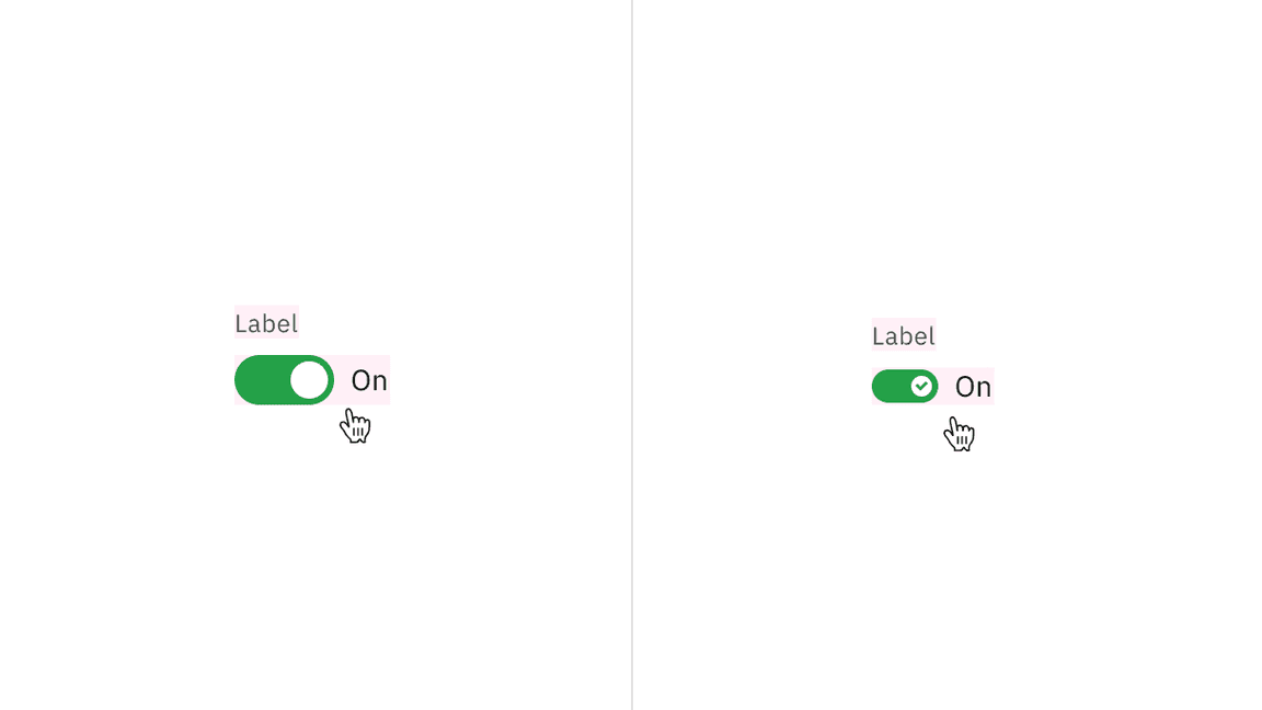
Default and small toggles are both comprised of a label text, a toggle button, and a state text. Default toggles are required to display a component label and state text, unlike the small toggle, where both these elements are optional. The small toggle displays a checkmark tick in the “on” state to ensure the toggle is still accessible when label and state text are unavailable.
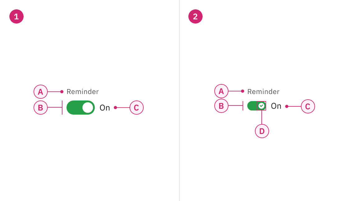
Anatomy of default and small toggle
1. Default toggle
A. Label text
B. Toggle
C. State text
2. Small toggle
A. Label text (optional)
B. Toggle
C. State text (optional)
D. Checkmark tick (on state)
Sizing
The toggle component is available in two sizes: default and small.
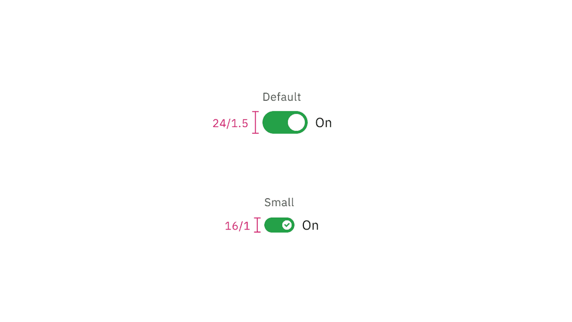
Sizes of toggle
Content
Label text
The label text must accompany the toggle to provide additional context and clarify its state. However, the label text is optional for small toggle.
State text
Use the state text to describe the binary action of toggle so that the action is clear. It must be three words or less and is displayed on the side of a toggle. The state text is optional for small toggle.
Language
Use adjectives rather than verbs to describe actions and the state of the object affected.
Further guidance
For further content guidance, see Carbon’s content guidelines.
Behaviors
States
The default and small toggle have two main states: on and off. Other interactive states are focus, disabled, read-only, and skeleton. For more information on toggle states, see the Style tab.
| State | When to use |
|---|---|
| On | When a user clicks or uses the arrow keys to switch on the component. |
| Off | When a user clicks or uses the arrow keys to switch off the component. |
| Focus | When a user presses tab or clicks on the toggle, it becomes focused, indicating the user has successfully navigated to the component. |
| Disabled | When a user is not allowed to interact with the toggle due to either permissions, dependencies, or pre-requisites. The disabled state completely removes the interactive function from a component. The styling is not subject to WCAG contrast compliance. |
| Read-only | When the user can review but not modify the component. This state removes all interactive functions like the disabled state but can still be focusable, accessible by screen readers, and passes visual contrast for readability. |
| Skeleton | Use on an initial page load to indicate that the toggle has not yet fully loaded. |
Interactions
Mouse
Toggle component is triggered on
Click
Keyboard
For keyboard navigation, users can focus the toggle using the
Tab
Enter
Space
Clickable areas
The toggle component has two clickable areas: the toggle switch itself and the label associated with it. Users can click either area to change the toggle’s state.
Clickable areas of default and small toggle
Default toggle
The default toggle is larger in size than the small toggle. They are commonly used in forms and can appear within full pages of information that are not restricted in space. Default toggles are required to display a visible label and a state text.
Default toggle has an available feature flag.

Small toggle
The small toggle is often used in condensed spaces and appear inline with other components or content. The label and state text are optional for the small toggle.
Small toggle has an available feature flag.
Unlike the default toggle, the small toggle is more compact in size and displays a checkmark tick in the on state to ensure the toggle is still accessible without requiring visible label or state text. For example, inside data table rows.
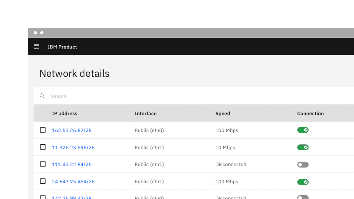
Example of a small toggle in context without a visible label or state text
Related
Feedback
Help us improve this component by providing feedback, asking questions, and leaving any other comments on GitHub.