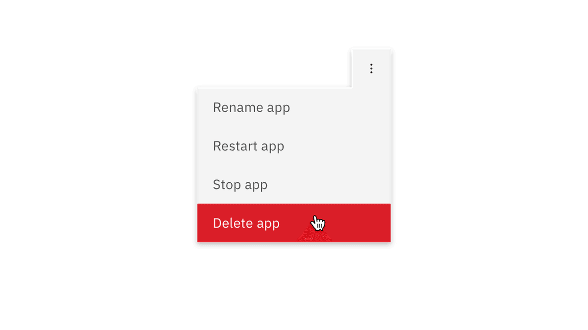
Overflow menu
Use the overflow menu component when additional options are available to the user but there is a space constraint.
Overview
Overflow menu is used when additional options are available to the user and there is a space constraint.
Live demo
This live demo contains only a preview of functionality and styles available for this component. View the full demo on Storybook for additional information such as its version, controls, and API documentation.
Formatting
Text
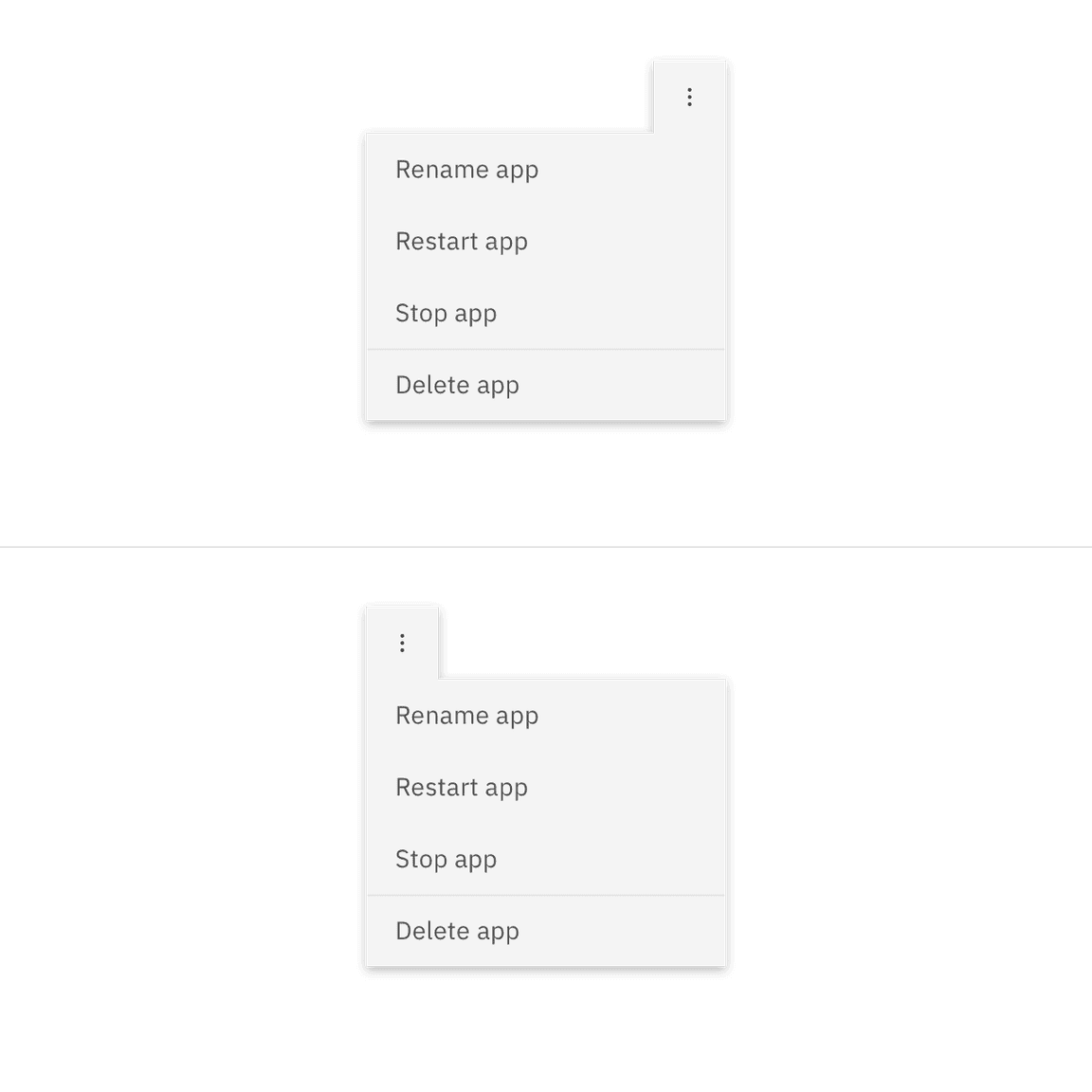
The text within an overflow menu should be direct so users can quickly decide on an action. Actions that could cause a significant change to the user’s data (delete app, delete service, etc.) are separated by a divider and live below the primary set of actions.

Placement
Depending on where the Overflow menu appears within the UI, the tab tip may appear on the left or right so it always remains visible.

Feedback
Help us improve this component by providing feedback, asking questions, and leaving any other comments on GitHub.