Information icons
A common challenge for forms is how to surface additional information to the user without making the form too dense. Carbon provides an information icon toggletip to ensure such information is predictable and keyboard accessible. The toggletip is a button, which is in the tab order. Both Space and Enter open the tip, and Esc dismisses it.
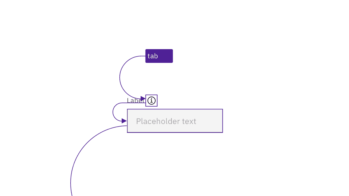
The toggletip pattern is used to make form help text keyboard accessible.
Identify requirements at the start of the form
Traditionally, a legend at the start of a form identifies the symbol (often an asterisk) used for required fields, and the symbol is repeated as part of the label for each appropriate field. This is still considered the most accessible implementation. However, as discussed in Optional versus required fields, Carbon allows for either the required or optional fields to be the inputs identified. Especially where only optional fields are indicated, an instruction should precede a form, providing the context for whether required or optional fields are indicated. The traditional phrasing is “All fields are required unless marked as optional” (or the reverse). See the Equal Access Toolkit topic Required fields for more information.
By convention, simple username/password login forms do not need such an instruction (or even to be marked as required), since the context is clear to users.
Development considerations
Keep these considerations in mind if you are modifying Carbon patterns or creating a custom form or input component.
- A form must be wrapped in a
<form>element. - Required fields must be identified programmatically, either via the label or with
aria-required. - Remember to supply an
aria-label,aria-labelledbyortitleto the component to comply with accessible naming - Helper text and other instructions should be surfaced to users via
aria-describedbyor other accessible techniques. See Programmatically associate inputs with labels. - See the ARIA authoring practices for more considerations.
Accessibility testing status
Latest version: 1.114.0 | Framework: React (@carbon/react)
| Component | Accessibility test | Status | Link to source code |
|---|---|---|---|
| Form | Test(s) that ensure the initial render state of a component is accessible. | Passes all automated tests with no reported accessibility violations. | GitHub link |
| Tests that ensure additional states of the component are accessible. This could be interactive states of a component or its multiple variants. | Automated or manual testing has been temporarily deferred. | ||
| Tests that ensure focus is properly managed, and all interactive functions of a component have a proper keyboard-accessible equivalent. | Test data is either not available or not applicable for this component state. | ||
| This manual testing ensures that the visual information on the screen is properly conveyed and read correctly by screen readers such as JAWS, VoiceOver, and NVDA. | A human has manually tested this component, e.g. screen reader testing. | ||
| Form Group | Test(s) that ensure the initial render state of a component is accessible. | Passes all automated tests with no reported accessibility violations. | |
| Tests that ensure additional states of the component are accessible. This could be interactive states of a component or its multiple variants. | Automated or manual testing has been temporarily deferred. | ||
| Tests that ensure focus is properly managed, and all interactive functions of a component have a proper keyboard-accessible equivalent. | Test data is either not available or not applicable for this component state. | ||
| This manual testing ensures that the visual information on the screen is properly conveyed and read correctly by screen readers such as JAWS, VoiceOver, and NVDA. | A human has manually tested this component, e.g. screen reader testing. | ||
| Form Label | Test(s) that ensure the initial render state of a component is accessible. | Passes all automated tests with no reported accessibility violations. | |
| Tests that ensure additional states of the component are accessible. This could be interactive states of a component or its multiple variants. | Passes all automated tests with no reported accessibility violations. | ||
| Tests that ensure focus is properly managed, and all interactive functions of a component have a proper keyboard-accessible equivalent. | Passes all automated tests with no reported accessibility violations. | ||
| This manual testing ensures that the visual information on the screen is properly conveyed and read correctly by screen readers such as JAWS, VoiceOver, and NVDA. | A human has manually tested this component, e.g. screen reader testing. | ||
| Fluid Form | Test(s) that ensure the initial render state of a component is accessible. | Passes all automated tests with no reported accessibility violations. | |
| Tests that ensure additional states of the component are accessible. This could be interactive states of a component or its multiple variants. | Automated or manual testing has been temporarily deferred. | ||
| Tests that ensure focus is properly managed, and all interactive functions of a component have a proper keyboard-accessible equivalent. | Test data is either not available or not applicable for this component state. | ||
| This manual testing ensures that the visual information on the screen is properly conveyed and read correctly by screen readers such as JAWS, VoiceOver, and NVDA. | A human has manually tested this component, e.g. screen reader testing. |
Feedback
Help us improve by providing feedback, asking questions, requesting features, or leaving any other comments on GitHub.