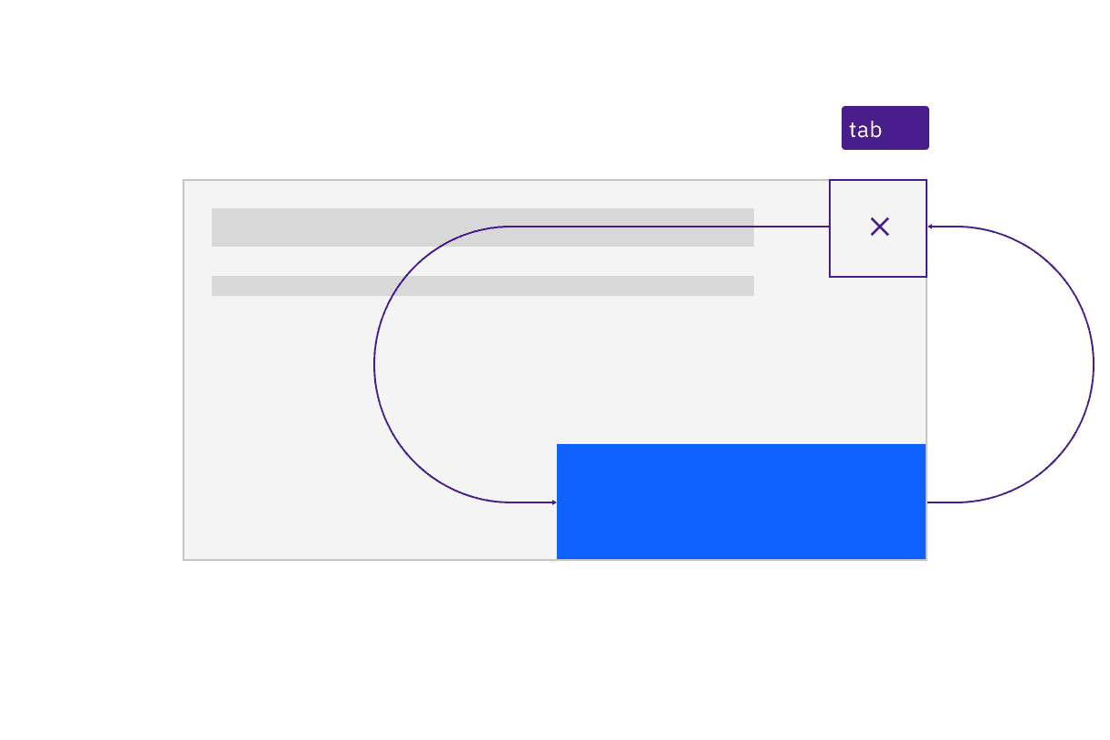
Keyboard navigation is constrained to the dialog. Tab cycles through the components that take focus.
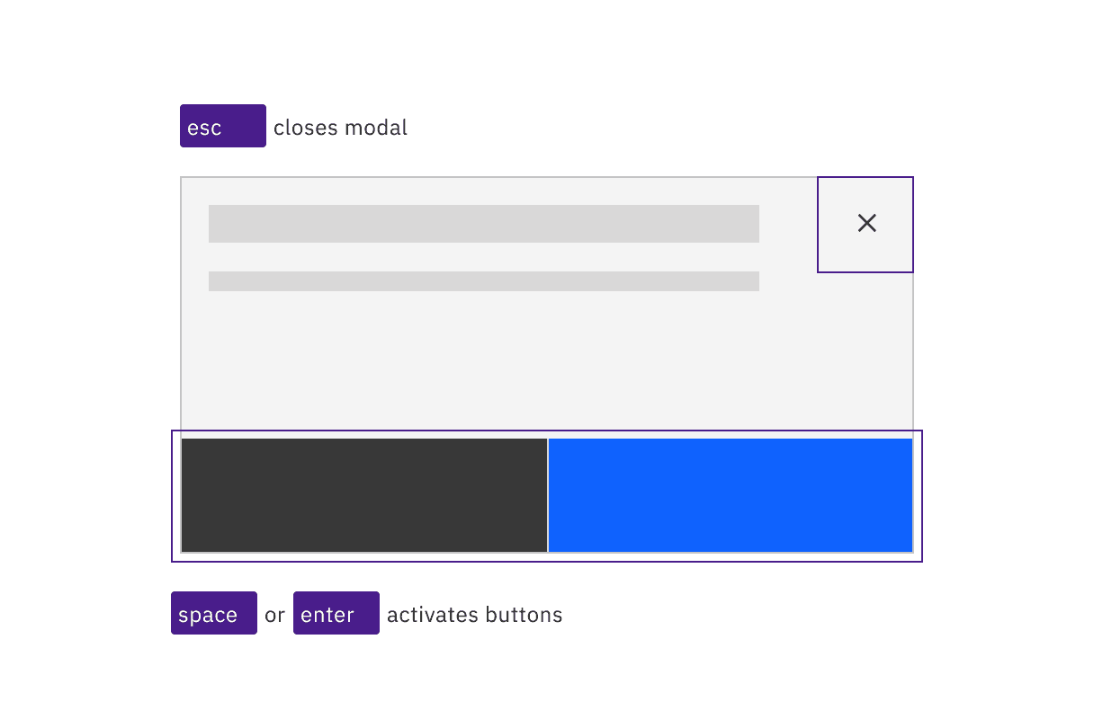
The dialog is resolved by the user pressing Esc or activating a button.
Focus handling
When the dialog appears, the first item that gets focus depends on the type of dialog. Passive dialogs only contain a close button (X), so that takes focus. For dialogs which prompt for confirmation or user decision, the primary button takes focus (regardless of number of buttons). For destructive interactions, the “cancel” button takes focus, not the red danger/delete button. The tab order should proceed left and down from whichever item has focus then wrap back to the close button (X).
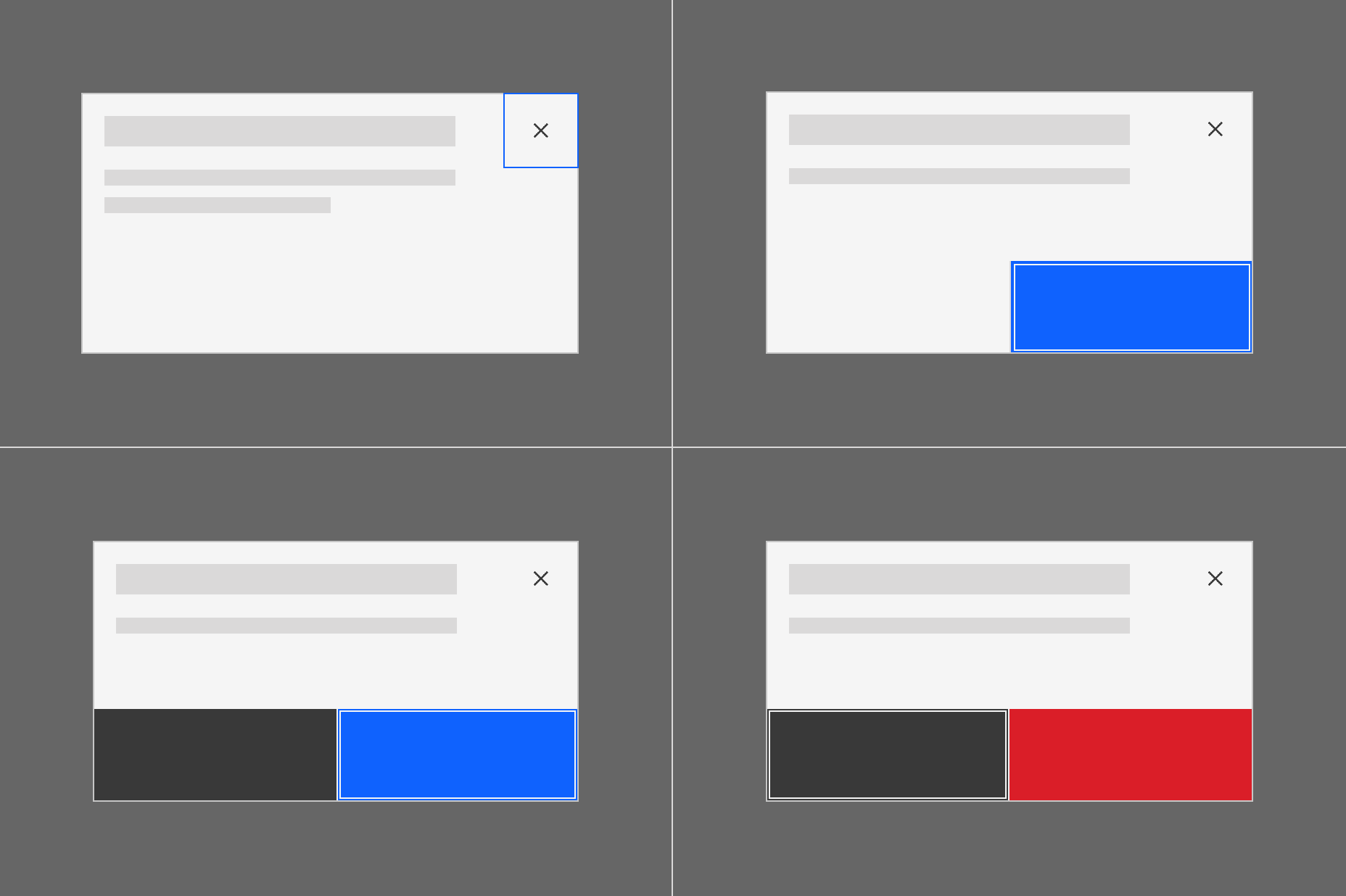
The first item with focus varies depending on dialog type.
Designate the input that takes focus in a transactional modal
The only time the starting focus would not be on a button is where a dialog contains input fields. For such transactional dialogs, designers should annotate that the first input field should receive focus. Note that text links are not considered a user input in this context.
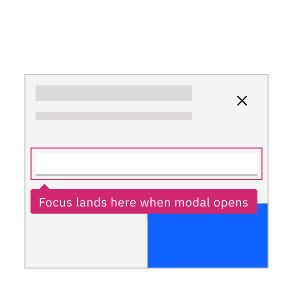
Annotate the starting input that should take focus on a transactional dialog.
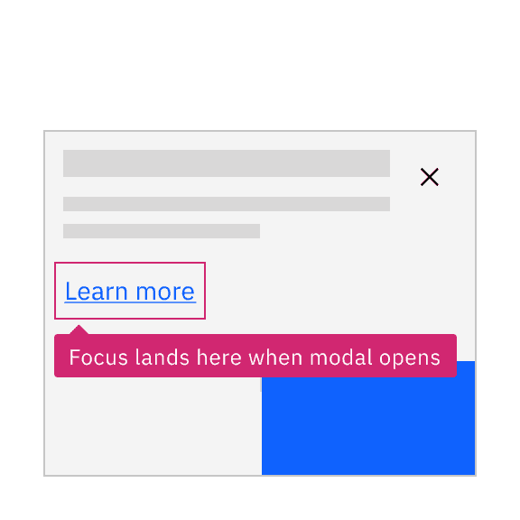
Do not give a link focus when a modal opens.
Development considerations
Keep these considerations in mind if you are modifying Carbon or creating a custom component.
- Carbon assigns the container a role of “dialog” and sets
aria-modalto"true". - The dialog is labelled via
aria-label, using the same string used for the modal’s title;aria-labelledbycould also be used to assign the title’s string. - See the modal pattern in the ARIA authoring practices for more considerations.
Accessibility testing status
Latest version: 1.114.0 | Framework: React (@carbon/react)
| Component | Accessibility test | Status | Link to source code |
|---|---|---|---|
| Modal | Test(s) that ensure the initial render state of a component is accessible. | Passes all automated tests with no reported accessibility violations. | GitHub link |
| Tests that ensure additional states of the component are accessible. This could be interactive states of a component or its multiple variants. | Automated or manual testing has been temporarily deferred. | ||
| Tests that ensure focus is properly managed, and all interactive functions of a component have a proper keyboard-accessible equivalent. | Passes all automated tests with no reported accessibility violations. | ||
| This manual testing ensures that the visual information on the screen is properly conveyed and read correctly by screen readers such as JAWS, VoiceOver, and NVDA. | A human has manually tested this component, e.g. screen reader testing. |
Feedback
Help us improve by providing feedback, asking questions, requesting features, or leaving any other comments on GitHub.