Keyboard interaction
The Carbon number input replicates the behavior of the stock HTML component. The number input takes a single tab stop. The + and - buttons, operable by pointer, are not in the tab order. When the input has focus, the arrow keys give keyboard users the same ability to incrementally adjust the values. As well, users can directly type numeric values in the input. Only numerals are allowed to be entered.
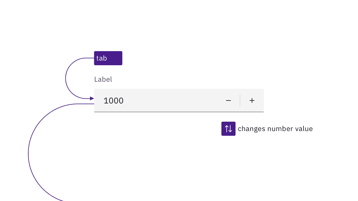
The number input is reachable by Tab and changed with the arrow keys or by directly entering a number.
Error handling
Carbon provides errors and warning messages to assistive technology. This is an improvement on the stock HTML number input, which simply prevents the typing of alphabetic characters without explanation. Carbon also adds an error or warning icon and puts error messages in red as a further visual cue.
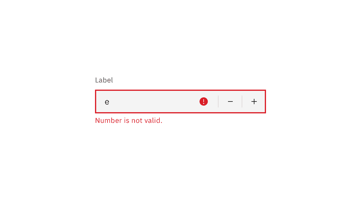
Messages are surfaced to assistive technologies, and color alone is not used to visually signal errors.
Cue users for value and step
Carbon offers the ability for the author to set minimum and maximum values for the input. When setting limits on number entry, designers should warn the user in advance, instead of users discovering limits through an error message. This is particularly the case if designers alter the step value, which determines the increment change when activating the +/- buttons or arrow keys. If a user directly enters a value that does not match the step increment, it will be disallowed for no apparent reason, so advanced warnings are crucial.
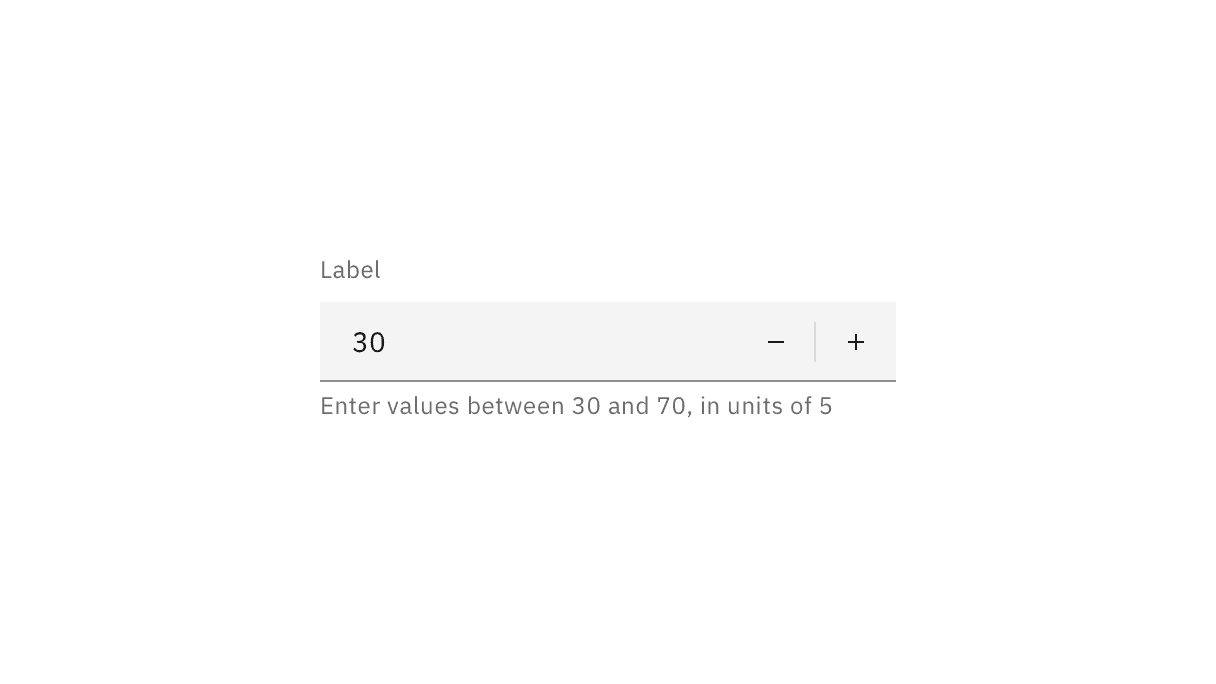
Notify users of allowable input ranges through helper text.
Accessibility testing status
Latest version: 1.114.0 | Framework: React (@carbon/react)
| Component | Accessibility test | Status | Link to source code |
|---|---|---|---|
| Number Input | Test(s) that ensure the initial render state of a component is accessible. | Passes all automated tests with no reported accessibility violations. | GitHub link |
| Tests that ensure additional states of the component are accessible. This could be interactive states of a component or its multiple variants. | Passes all automated tests with no reported accessibility violations. | ||
| Tests that ensure focus is properly managed, and all interactive functions of a component have a proper keyboard-accessible equivalent. | Passes all automated tests with no reported accessibility violations. | ||
| This manual testing ensures that the visual information on the screen is properly conveyed and read correctly by screen readers such as JAWS, VoiceOver, and NVDA. | A human has manually tested this component, e.g. screen reader testing. | ||
| Fluid Number Input | Test(s) that ensure the initial render state of a component is accessible. | Passes all automated tests with no reported accessibility violations. | |
| Tests that ensure additional states of the component are accessible. This could be interactive states of a component or its multiple variants. | Passes all automated tests with no reported accessibility violations. | ||
| Tests that ensure focus is properly managed, and all interactive functions of a component have a proper keyboard-accessible equivalent. | Passes all automated tests with no reported accessibility violations. | ||
| This manual testing ensures that the visual information on the screen is properly conveyed and read correctly by screen readers such as JAWS, VoiceOver, and NVDA. | A human has manually tested this component, e.g. screen reader testing. |
Feedback
Help us improve by providing feedback, asking questions, requesting features, or leaving any other comments on GitHub.