Actionable
Actionable notifications may contain interactive elements such as links and buttons. This component grabs and traps focus until an action is taken or the notification is dismissed. Users can navigate through the interactive elements using the Tab key, and actions like closing or activating buttons can be performed using the Enter or Space keys. Additionally, the notification can be optionally closed by pressing the Escape key.
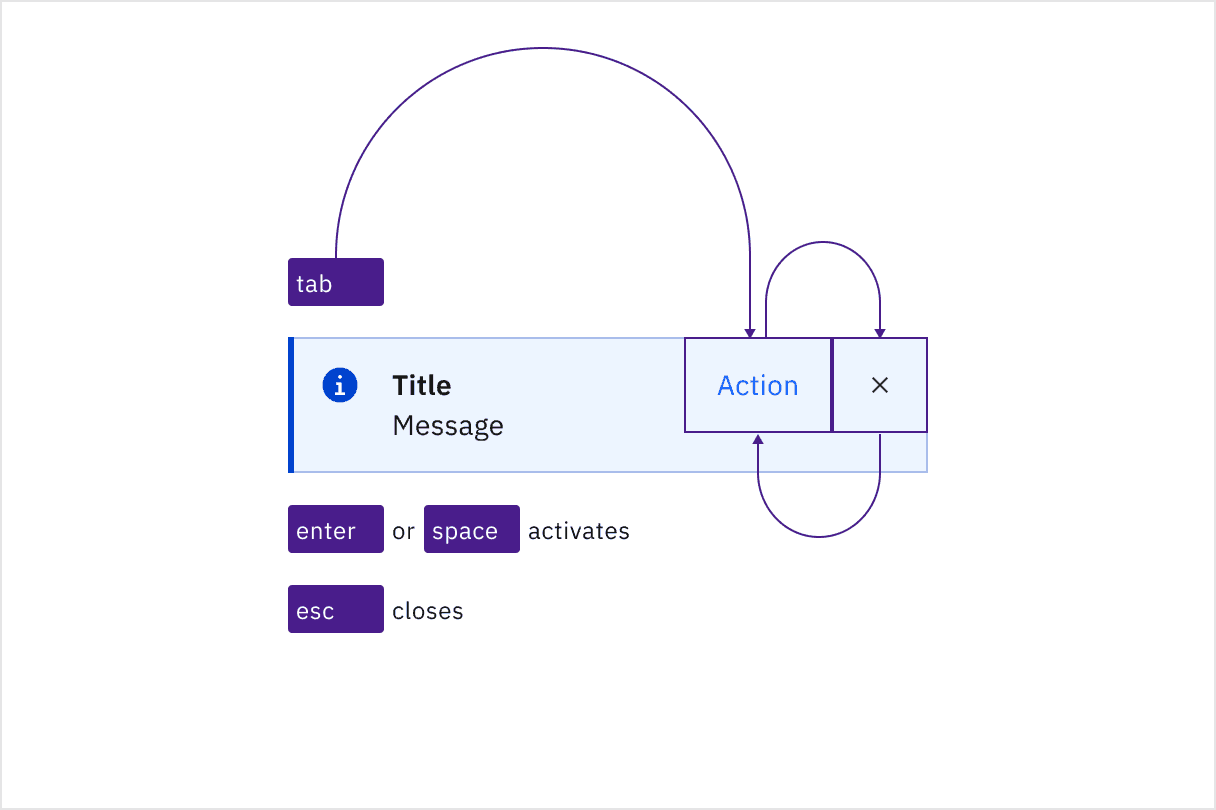
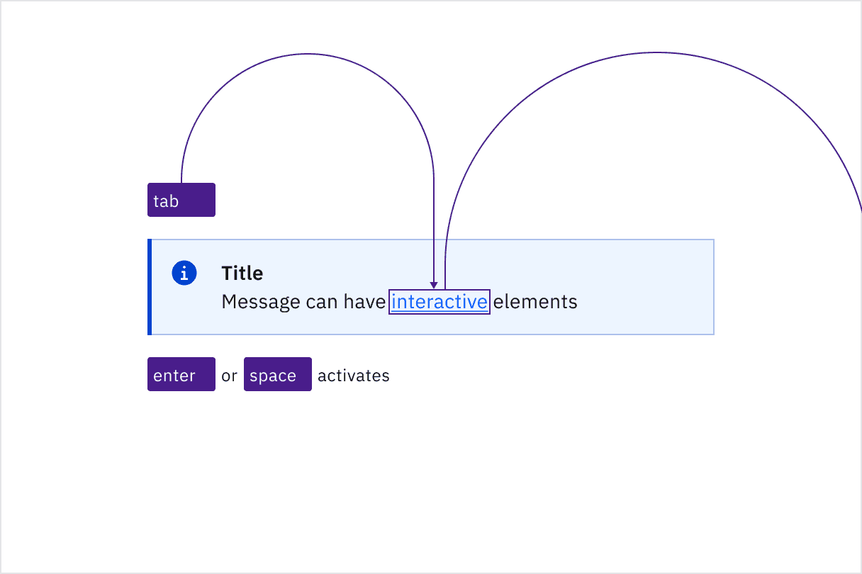
Navigating through interactive elements using the Tab key.
Development considerations
Keep these considerations in mind if you are modifying Carbon or creating a custom component.
- Use the roles
alert,log, orstatusfor notifications that do not require user action. - Use the role
alertdialogfor notifications that require user action. - Callouts do not have an aria-live attribute, and are not automatically announced by screen readers.
Special care should be given to focus management for notifications with interactive elements or actions. It is not recommended to venture beyond using the roles alert, log, status, or alertdialog for event-driven notifications, as this can present unique challenges. If you choose to do so, there are two known approaches you may want to research further:
- Collect notifications in a persistent area in your application for users to be able to navigate to and take action on notifications.
- Render notifications in an already-existing
regionthat can be accessed via a hotkey. Focus should jump to the notification region after the hotkey is invoked. Once the user has reached the end of the region, focus should return to the previously focused item in the document before the hotkey was invoked.
Neither approach is perfect, but in either case, ensure that notifications are properly announced, respect user timeout preferences, and are easily navigable by keyboard or screen reader for users to take action.
Accessibility testing status
Latest version: 1.113.0 | Framework: React (@carbon/react)
| Component | Accessibility test | Status | Link to source code |
|---|---|---|---|
| Notification | Test(s) that ensure the initial render state of a component is accessible. | Test data is either not available or not applicable for this component state. | GitHub link |
| Tests that ensure additional states of the component are accessible. This could be interactive states of a component or its multiple variants. | Automated or manual testing has been temporarily deferred. | ||
| Tests that ensure focus is properly managed, and all interactive functions of a component have a proper keyboard-accessible equivalent. | Test data is either not available or not applicable for this component state. | ||
| This manual testing ensures that the visual information on the screen is properly conveyed and read correctly by screen readers such as JAWS, VoiceOver, and NVDA. | A human has manually tested this component, e.g. screen reader testing. |
Feedback
Help us improve by providing feedback, asking questions, requesting features, or leaving any other comments on GitHub.