Number input
The following page documents visual specifications such as color, typography, structure, size, and AI presence.
Color
| Element | Property | Color token |
|---|---|---|
| Label | text color |
|
| Number | text color |
|
| Field | background-color |
|
| border-bottom |
| |
| Controls | svg color |
|
* Denotes a contextual color token that will change values based on the layer it is placed on.


Interactive states
| State | Element | Property | Color token |
|---|---|---|---|
| Hover | Controls | background-color |
|
| Focus | Field | border |
|
| Controls | border |
| |
| Invalid | Field | border |
|
| Error icon | svg |
| |
| Error message | text color |
| |
| Warning | Warning icon | svg |
|
| Warning message | text color |
| |
| Disabled | Label | text color |
|
| Field | background-color |
| |
| border-bottom (default) | transparent | ||
| border-bottom (fluid) |
| ||
| Number | text color |
| |
| Controls | svg color |
| |
| Read-only | Field | background-color (default) | transparent |
| background-color (fluid) |
| ||
| border-bottom |
| ||
| Number | text color (default) |
| |
| text color (fluid) |
| ||
| Controls | svg color |
|
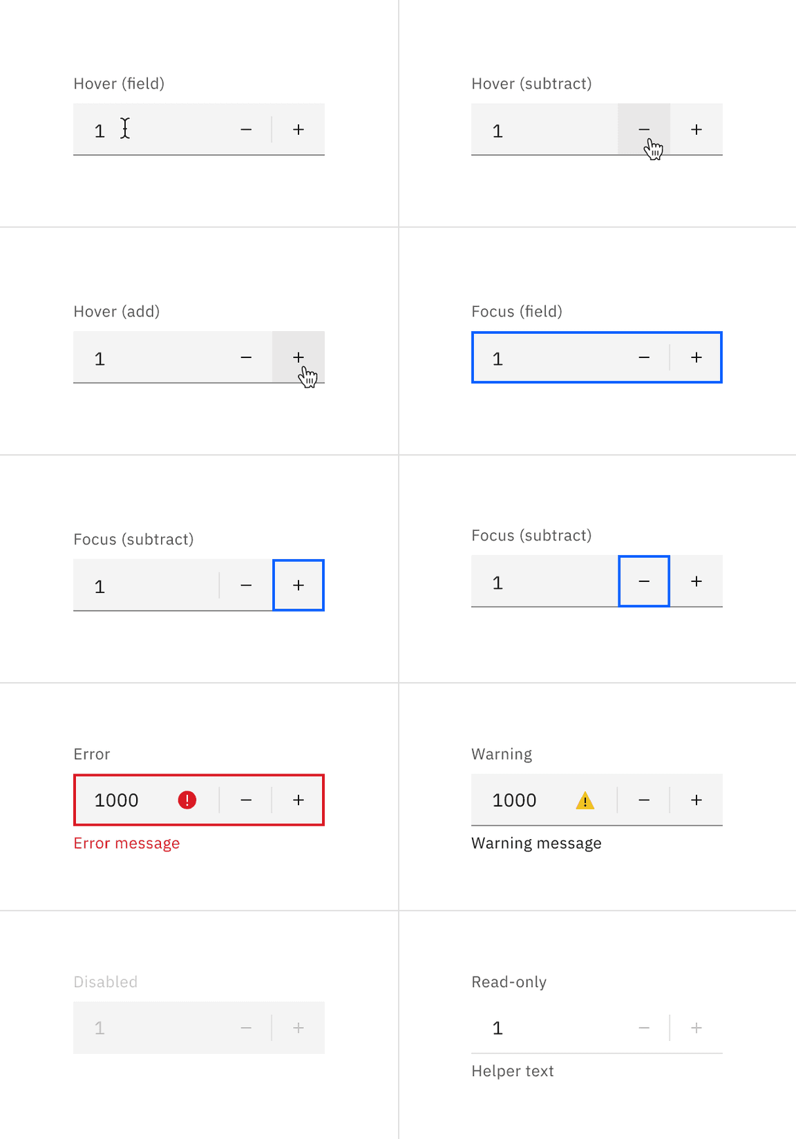
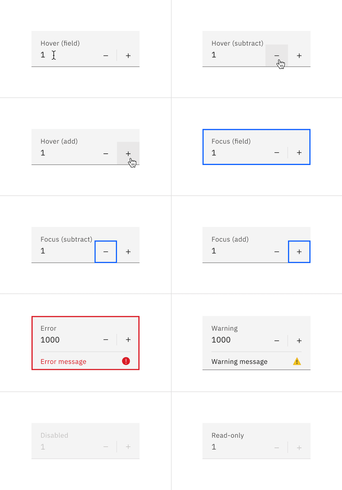
Number input states example.
Typography
Number input labels should use sentence case, with only the first word in a phrase and any proper nouns capitalized.
| Element | Font-size (px/rem) | Font-weight | Type token |
|---|---|---|---|
| Label | 12 / 0.75 | Regular / 400 |
|
| Field input | 14 / 0.875 | Regular / 400 |
|
| Error message | 12 / 0.75 | Regular / 400 |
|
| Warning message | 12 / 0.75 | Regular / 400 |
|
| Helper text | 12 / 0.75 | Regular / 400 |
|
Structure
Default input
The add and subtract icons can be found in the icons library.
| Element | Property | px / rem | Spacing token |
|---|---|---|---|
| Label | margin-bottom | 8 / 0.5 |
|
| Field (default) | height | 40 / 2.5 | – |
| border-bottom | 1px | – | |
| Number | padding-left | 16 / 1 |
|
| Controls | padding-left, padding-right | 16 / 1 |
|

Structure and spacing measurements for a default number input | px / rem
Fluid input
| Element | Property | px / rem | Spacing token |
|---|---|---|---|
| Label | padding-bottom | 4 / 0.25 |
|
| Field | height | 64 / 4 |
|
| padding-left, padding-right | 16 / 1 |
| |
| padding-top, padding-bottom | 13 / 0.8125 | – | |
| border-bottom | 1px | – | |
| Add or subtract icon | height, width | 16 / 1 | – |
| Focus | border | 2px | – |
| Error | border | 2px | – |
| padding-top, padding-bottom | 8 / 0.5 |
|

Structure and spacing measurements for a fluid number input | px / rem
Sizes
Default input heights
The height varies for each size variant and the width varies based on content, layout, and design.
| Element | Size | Height (px/rem) |
|---|---|---|
| Field | Small (sm) | 32 / 2 |
| Medium (md) | 40 / 2.5 | |
| Large (lg) | 48 / 3 |

Sizes for number input fields | px / rem
AI presence
The following are the unique styles applied to the component when the AI label is present. Unless specified, all other tokens in the component remain the same as the non-AI variant.
For more information on the AI style elements, see the Carbon for AI guidelines.
| Element | Property | Token / Size |
|---|---|---|
| Linear gradient | start |
|
| stop |
| |
| Field | border-bottom |
|
| background color |
| |
| AI label | size | mini |
* Denotes a contextual color token that will change values based on the layer it is placed on.

