A tooltip has two states: open and closed. The open state occurs when a user hovers or focuses on the UI elements, while the closed state means the tooltip is hidden. By default, the tooltip is hidden and inactive.
Element | Property | Color token |
|---|---|---|
Trigger (other UI elements) | – | – |
Trigger (definition label) | border |
|
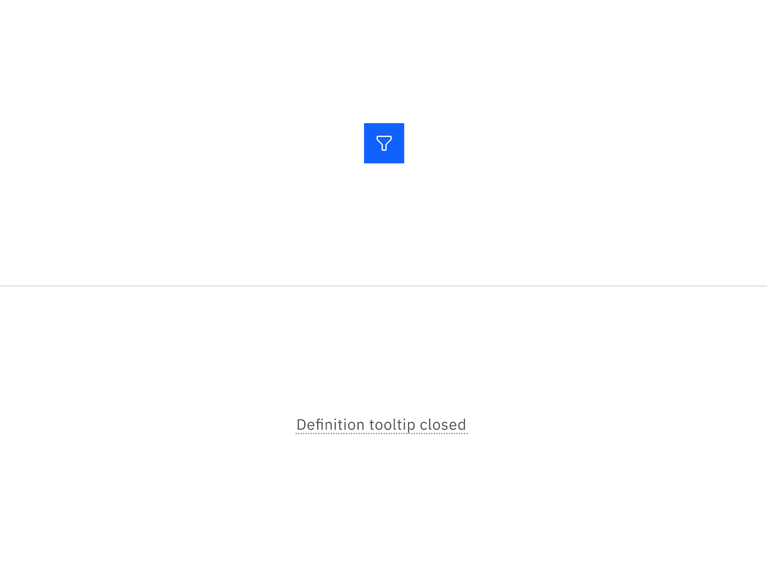
Example of an icon button and definition tooltip in the closed state.
The color table applies to the tooltip when the UI elements or definition label are triggered and in the open state.
State | Element | Property | Color token |
|---|---|---|---|
All components with tooltip: Open | Container | background-color |
|
Text | text-color |
| |
Definition tooltip: Open (hover) | Border-bottom | border |
|
Definition tooltip: Open (focus) | Border | border |
|
Border-bottom | border |
|
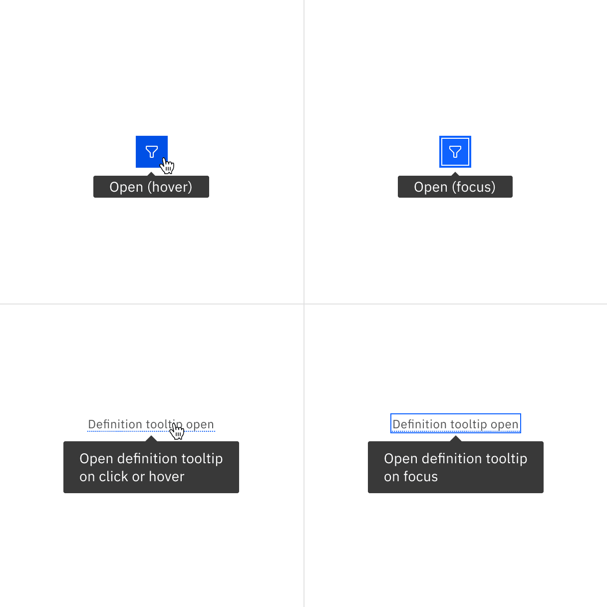
Example of an icon button and a definition tooltip in the open state with mouse and keyboard interactions
Tooltip containers vary in height based on their content. Tooltips are designed for both multi-line text, with 16px padding on all sides for better spacing, and single-line text, which is more compact since it typically contains only a few words and the text doesn't wrap to a second line.
Element | Property | px / rem | Spacing token |
|---|---|---|---|
Container (multi-line) | max-width | 288 / 18 | — |
padding | 16 / 1 |
| |
margin-top | 4 / 0.25 |
| |
Container (single-line) | max-width | 208 / 13 | — |
padding-left, padding-right | 16 / 1 |
| |
padding-top, padding-bottom | 2 / 0.125 |
| |
margin-top | 4 / 0.25 |
| |
Caret | popover-caret | 6 / 0.375 | — |
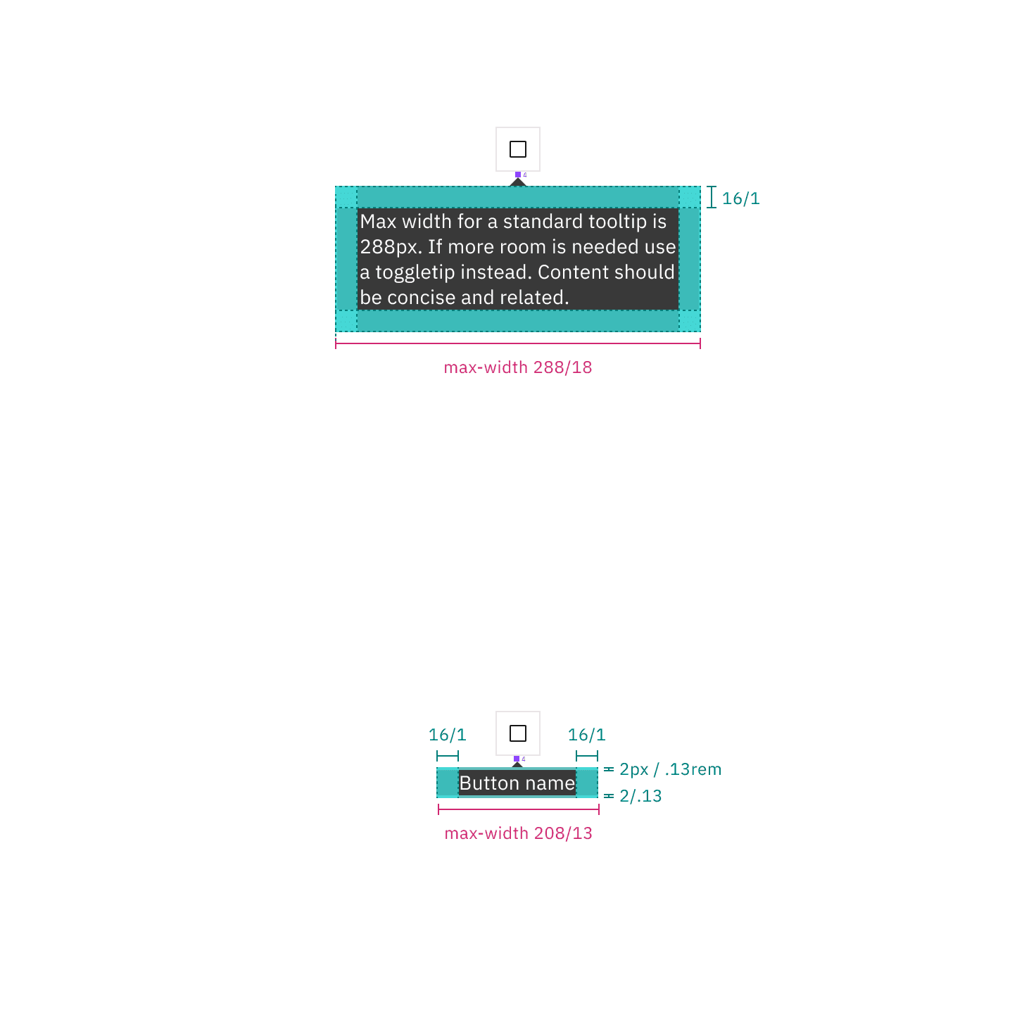
Structure and spacing measurements for multi-line and single-line text | px / rem
Element | Property | px / rem | Spacing token |
|---|---|---|---|
Container | max-width | 176 / 11 | — |
padding-left, padding-right | 16 / 1 |
| |
padding-top, padding-bottom | 8 / 0.5 |
| |
margin-top | 4 / 0.25 |
| |
Caret | popover-caret | 6 / 0.375 | – |
Trigger | border-bottom | 1 px, dotted | – |
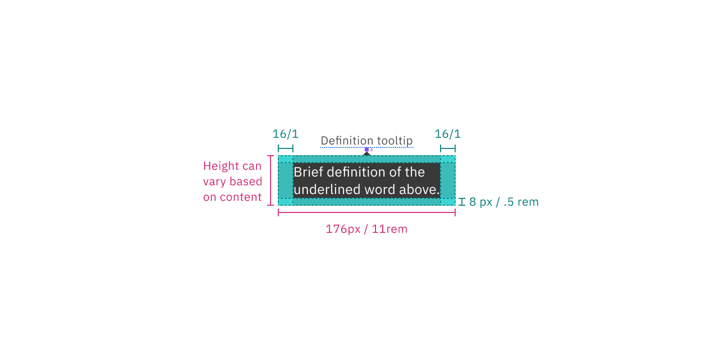
Structure and spacing measurements for a definition tooltip | px / rem
Default placement
Tooltip directions, by default, are set to auto. Upon opening, tooltips can detect the edges of the browser to be placed in view so the container does not get cutoff. Tooltips can instead use specific directions and may be positioned top, right, bottom, or left of the trigger item. Tooltips should be placed at least 16px / 1rem off of the bottom of the page and not bleed off page or behind other content. On mobile, tooltips can only appear below the tooltip icon.
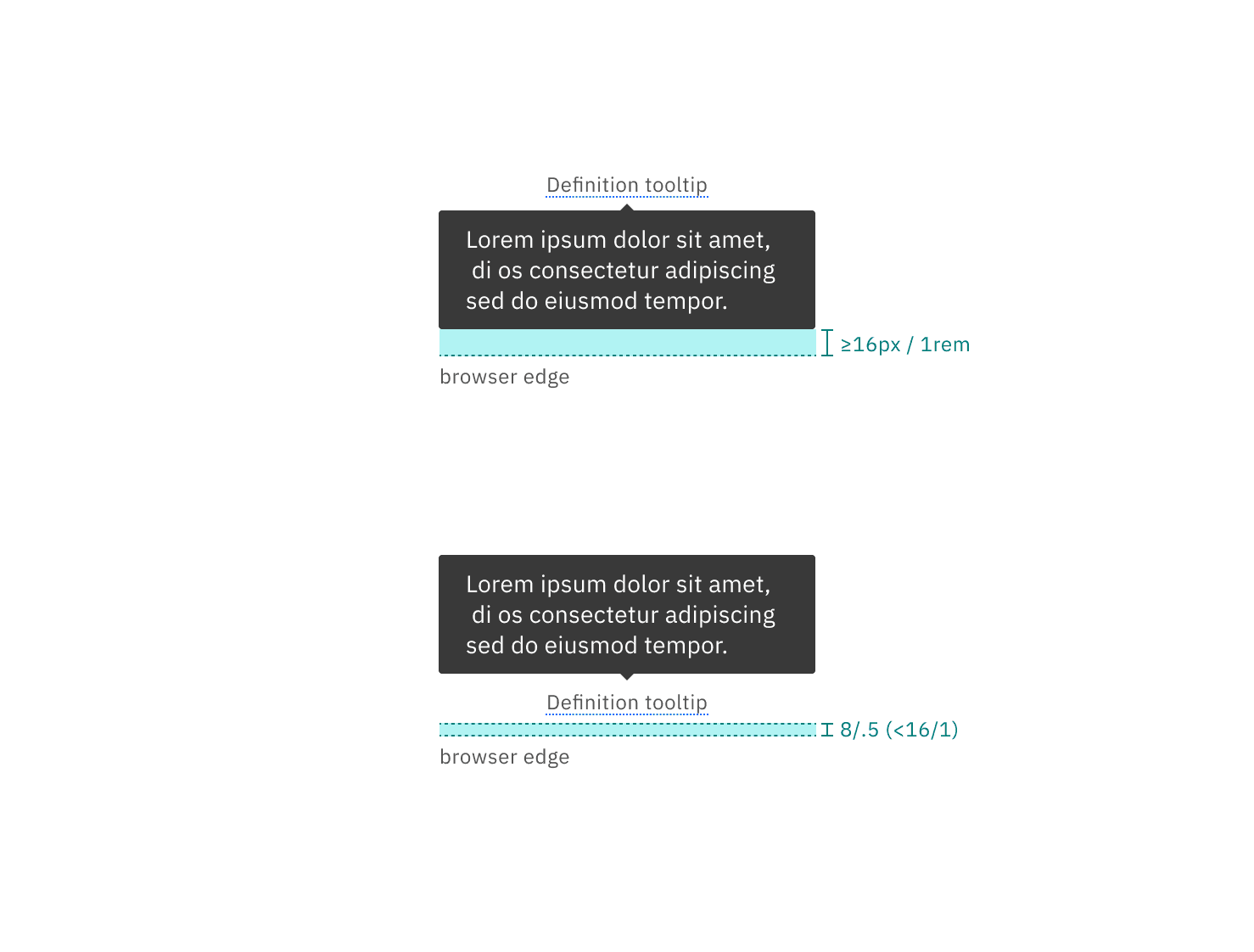
Placement examples for a tooltip
Feedback
Help us improve by providing feedback, asking questions, requesting features, or leaving any other comments on GitHub.