Keyboard interactions
The primary use of tooltips is to display the text labels of icon-only buttons. Since each button is in the page's tab order, the tooltip appears automatically when the button receives focus. Tooltips disappear when the user moves focus away from the button or by pressing Esc. The tooltips contain only text and are not interactive, so they do not have any other keyboard operations.
The definition tooltip provides information about a term or text phrase. The text that serves as the trigger has a dotted underline. When the trigger receives focus, the definition tooltip is displayed. Like the button tooltip, the definition can be dismissed by pressing Esc or navigating away from the trigger. Icon-only buttons retain their regular interaction. Icon-only buttons maintain their normal interaction and can be activated by clicking or pressing Enter or Space. A definition tooltip trigger only exists to take focus or hover and is otherwise not interactive.
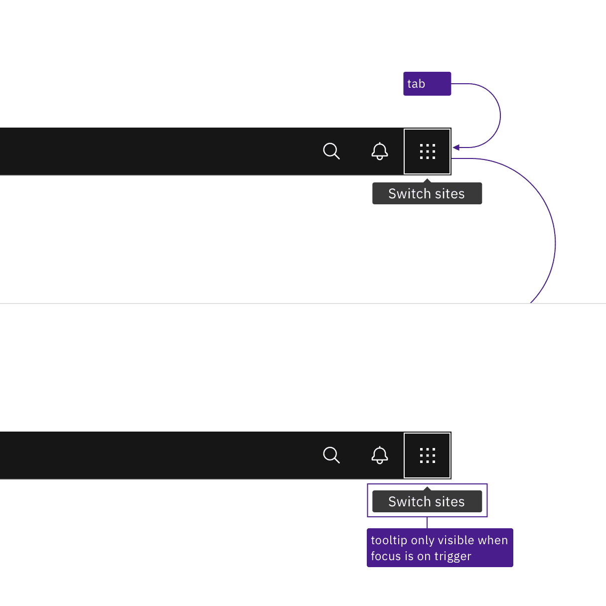
Tooltips appear when the trigger receives focus and disappear when tabbing away from the trigger.
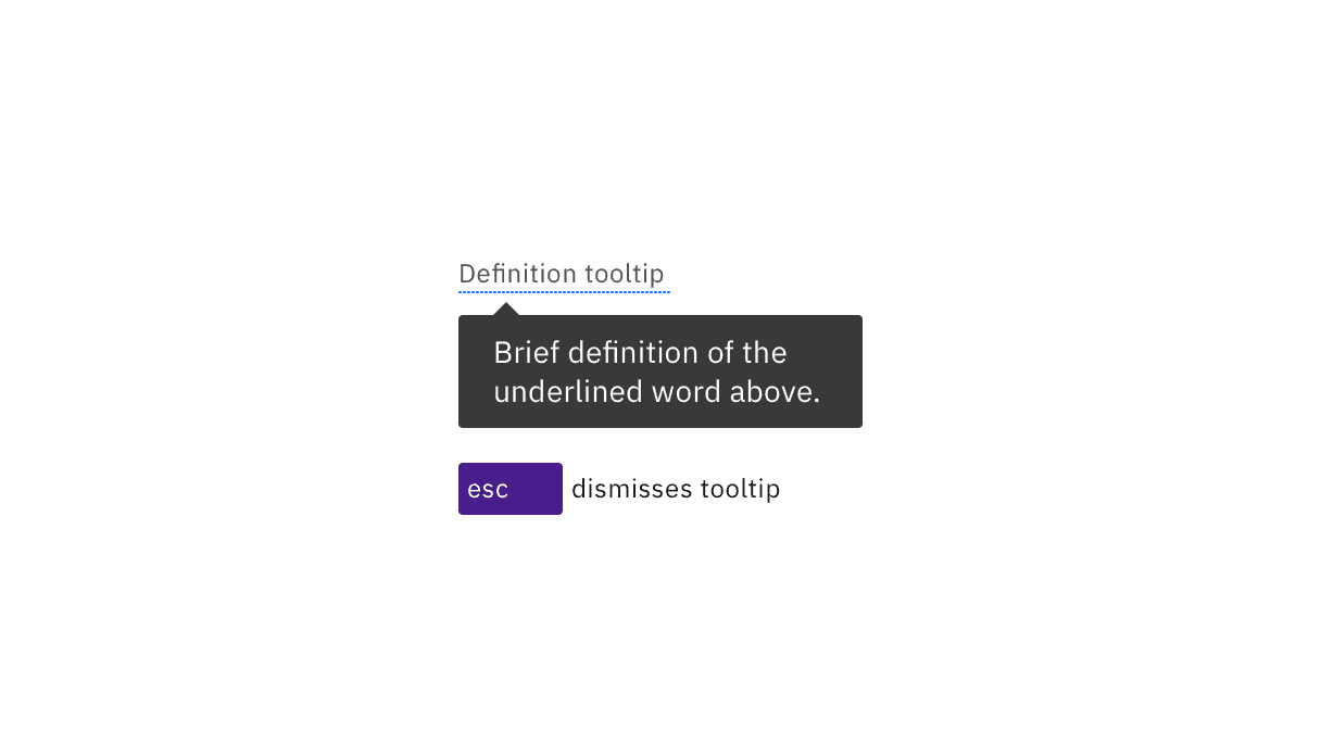
Both definition and icon-only button tooltips can be dismissed by pressing Esc.
Annotate the text for the tooltip
If designers do not specify the text, developers are less likely to implement tooltips. Every icon-only button needs a tooltip, except for icons with clearly established names or functions (such as Bold and Italics). Designers can provide the text by using a tooltip in their designs or simply annotating the icon-only button. For definition tooltips, see the usage guidance for information on the length and styling of tooltip content.
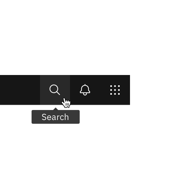
Do specify the text that will appear in the tooltip.
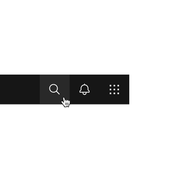
Do not use icon-only buttons with no tooltip or name annotated.
Development considerations
Keep these considerations in mind if you are modifying Carbon or creating a custom component.
- The span containing the tooltip has a role of
tooltipwitharia-hidden="true". - The trigger uses
aria-labelledbyto announce the tooltip text. - See the tooltip pattern in the ARIA authoring practices for more considerations.
Accessibility testing status
Latest version: 1.114.0 | Framework: React (@carbon/react)
| Component | Accessibility test | Status | Link to source code |
|---|---|---|---|
| Tooltip | Test(s) that ensure the initial render state of a component is accessible. | Passes all automated tests with no reported accessibility violations. | GitHub link |
| Tests that ensure additional states of the component are accessible. This could be interactive states of a component or its multiple variants. | Passes all automated tests with no reported accessibility violations. | ||
| Tests that ensure focus is properly managed, and all interactive functions of a component have a proper keyboard-accessible equivalent. | Passes all automated tests with no reported accessibility violations. | ||
| This manual testing ensures that the visual information on the screen is properly conveyed and read correctly by screen readers such as JAWS, VoiceOver, and NVDA. | A human has manually tested this component, e.g. screen reader testing. |
Feedback
Help us improve by providing feedback, asking questions, requesting features, or leaving any other comments on GitHub.