Element | Property | Color token |
|---|---|---|
Field | background-color |
|
border-bottom |
| |
Label text (fluid) | text color |
|
Placeholder text | text color |
|
Search icon | fill |
|
* Denotes a contextual color token that will change values based on the layer it is placed on
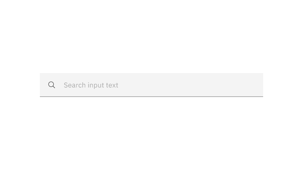
Example of search
State | Element | Property | Color token |
|---|---|---|---|
Focus | Field | border |
|
Filled | Field text | text-color |
|
Close icon | fill |
| |
Disabled | Field text | text-color |
|
Label text (fluid) | text-color |
| |
Search icon | fill |
| |
Field (fluid) | border-bottom |
|
* Denotes a contextual color token that will change values based on the layer it is placed on.
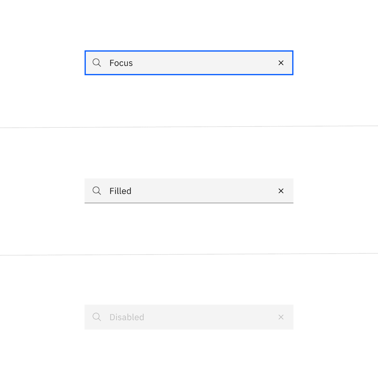
Element | Property | px / rem | Spacing token |
|---|---|---|---|
Search icon | height, width | 16 / 1 | – |
Close icon | height, width | 16 / 1 | – |
Extra small field | padding-left, padding-right | 24 / 1.5 |
|
Small field | padding-left, padding-right | 32 / 2 |
|
Medium field | padding-left, padding-right | 40 / 2.5 |
|
Large field | padding-left, padding-right | 48 / 3 |
|
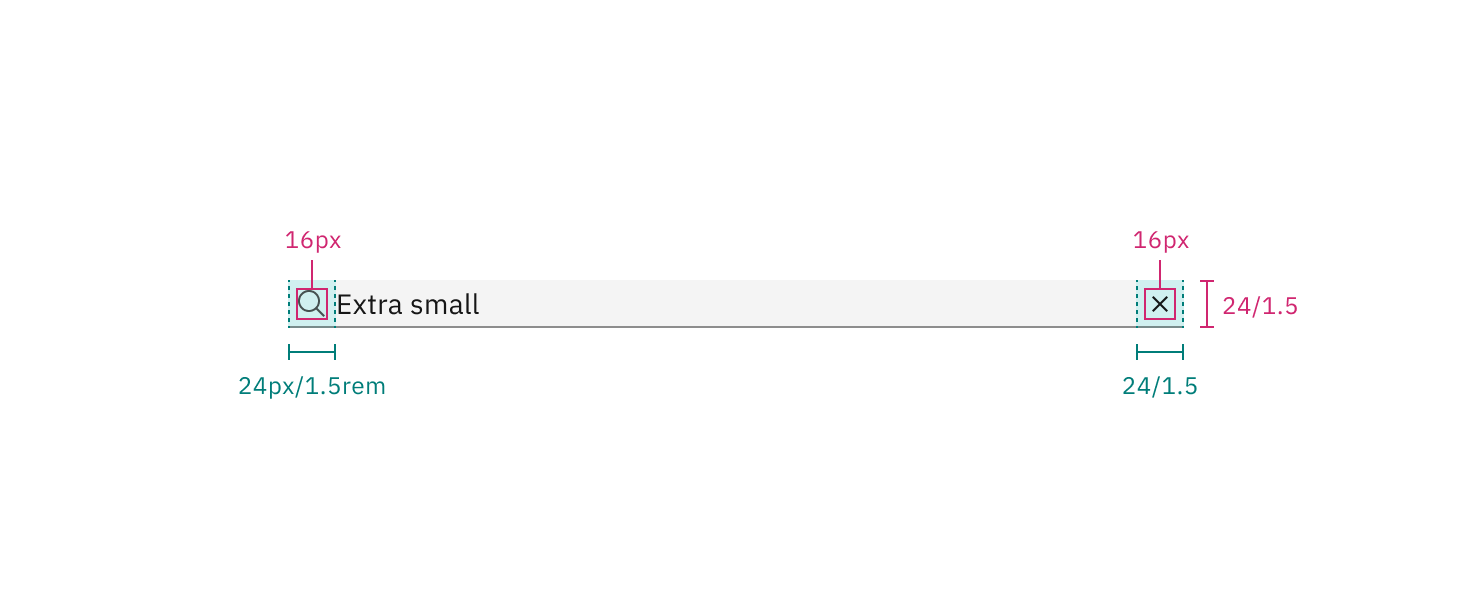
Structure and spacing measurements for default extra small search | px | rem
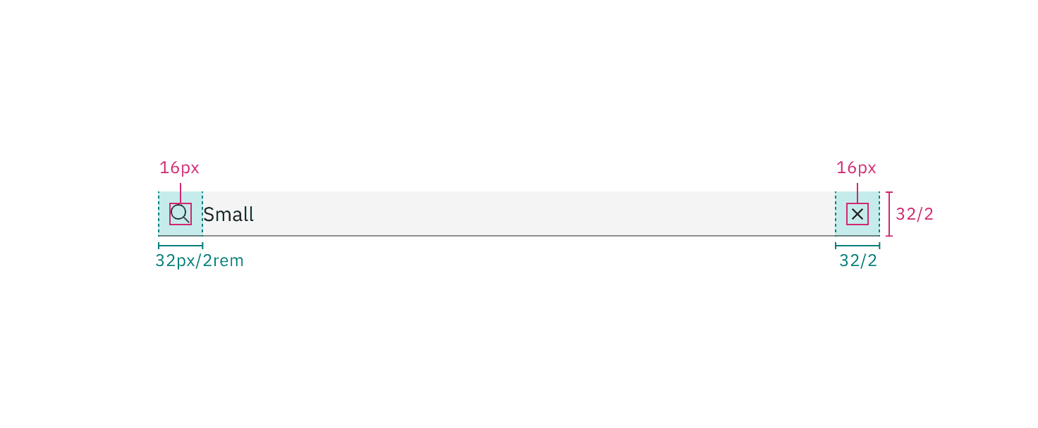
Structure and spacing measurements for default small search | px | rem
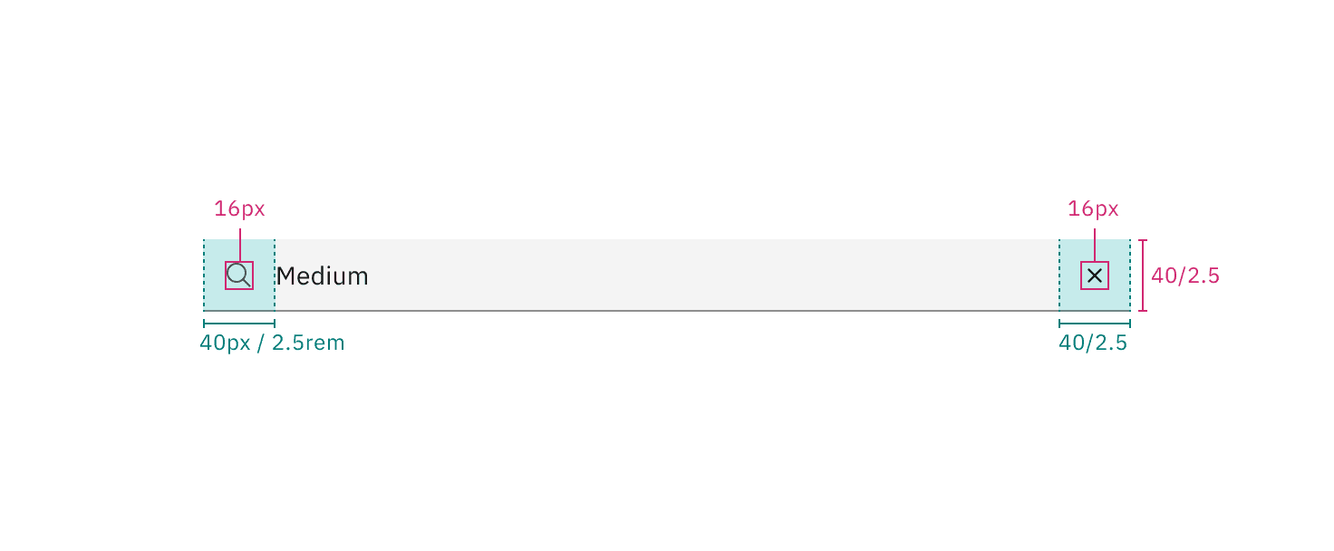
Structure and spacing measurements for default medium search | px | rem
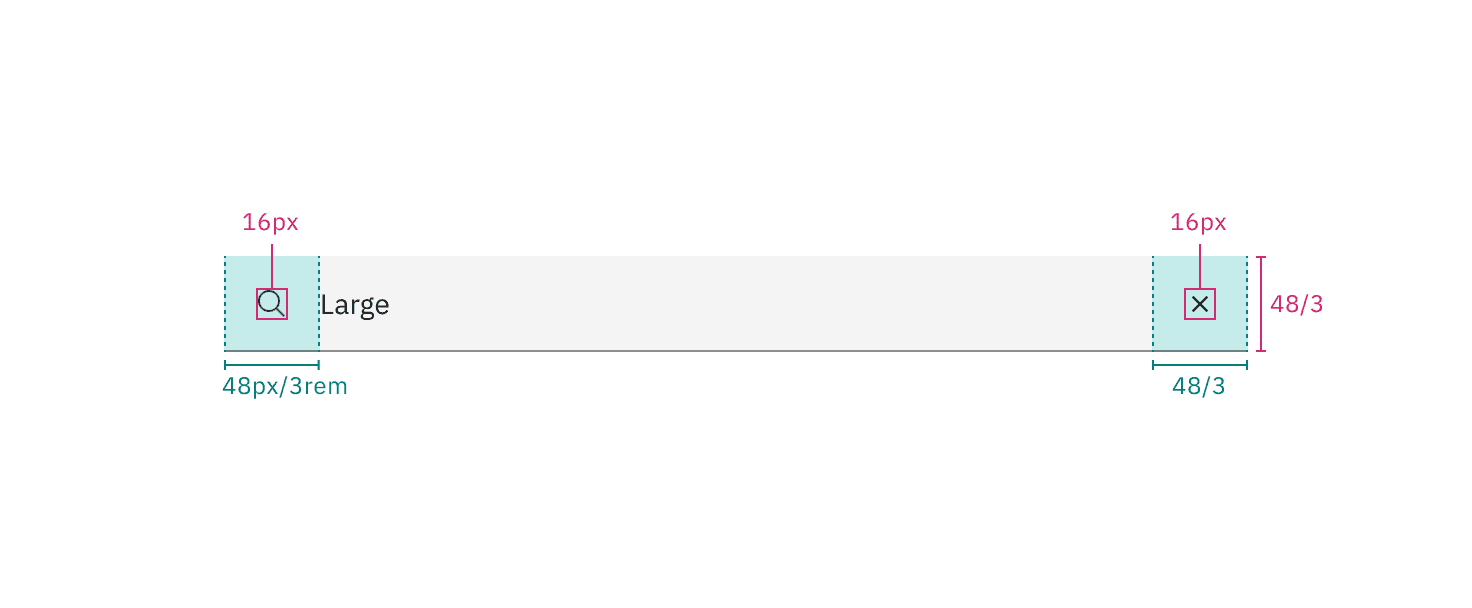
Structure and spacing measurements for default large search | px | rem
Element | Property | px / rem | Spacing token |
|---|---|---|---|
Label | margin-bottom | 4 / 0.25 |
|
Field | padding-left | 16 / 1 |
|
padding-right | 80 / 5 |
| |
border | 1px | – | |
margin-top, margin-bottom | 13 / .8125 | – | |
Close icon | padding-right, padding-left | 12 / .75 |
|
Search icon | padding-right, padding-left | 12 / .75 |
|
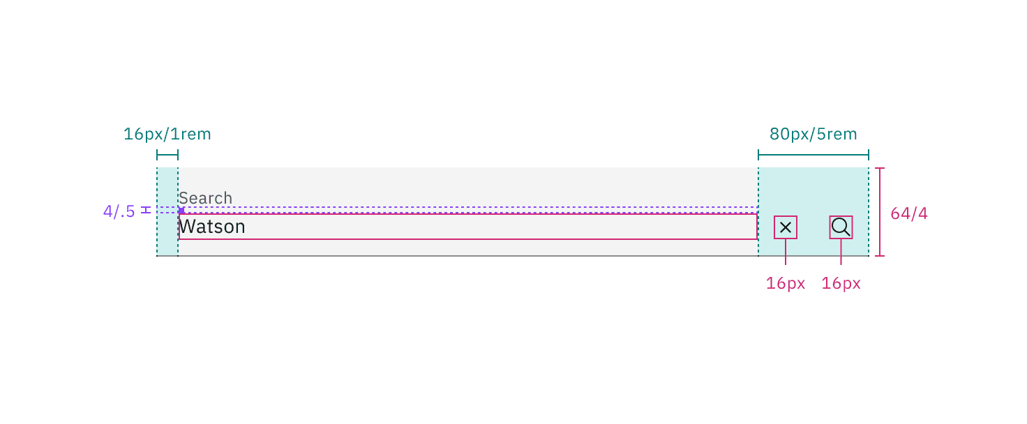
Structure and spacing measurements for fluid search | px | rem
Default input height
There are four sizes of search: extra small, small, medium, and large. Use consistent component sizes throughout a layout to maintain alignment and visual harmony.
Size | Height px / rem |
|---|---|
Extra small (xs) | 24 / 1.5 |
Small (sm) | 32 / 2 |
Medium (md) | 40 / 2.5 |
Large (lg) | 48 / 3 |
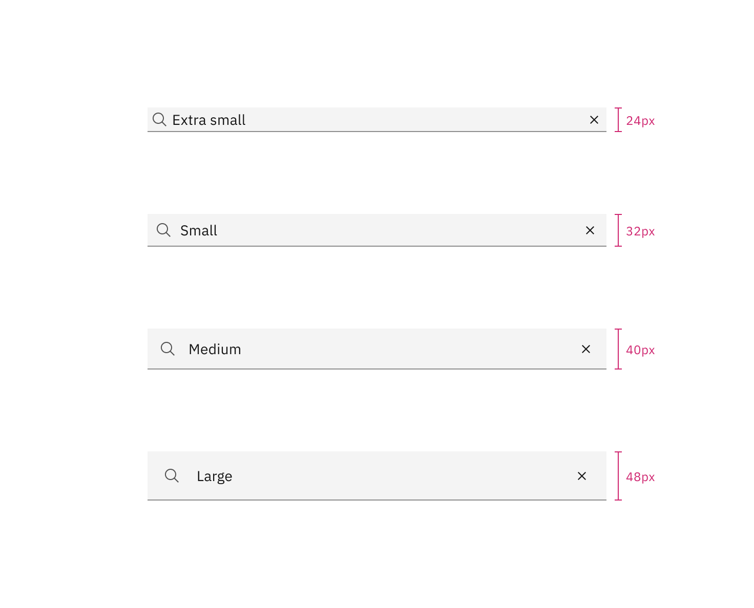
Sizes for search: extra small, small, medium, and large
Feedback
Help us improve by providing feedback, asking questions, requesting features, or leaving any other comments on GitHub.