What Carbon provides
Carbon’s search component provides the basic input mechanism for conducting a search. No accessibility annotations are needed for the input, but design annotations are needed to make the search messaging and results accessible.
Carbon bakes keyboard operation into its components, improving the experience of blind users and others who operate via keyboard. Carbon also incorporates other accessibility considerations, some of which are described below.
Keyboard interaction
The search component is in the tab order, and users can type directly into the search input on focus. Users press Enter to submit their text as a search term, or they can press Esc to clear it. Once users start typing, a Cancel icon ('x') will appear, which becomes the next tab stop and provides another way to clear the input field via click, Space or Enter keys.
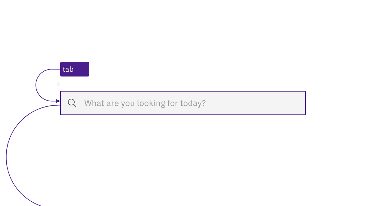
The search input is in the tab order just like any other input.
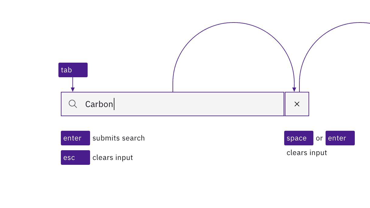
The user can clear the input by pressing Esc or activating the X button that appears inside the input.
Variations of the search component use a non-persistent text input that is hidden behind a magnifying glass icon. In one variation, the user activates the icon-only button to reveal and put focus into the search input. In another variation, as the icon receives focus it exposes the input and the focus is immediately placed into the search input. Once in the input, the interaction, described above, is the same for all variations.
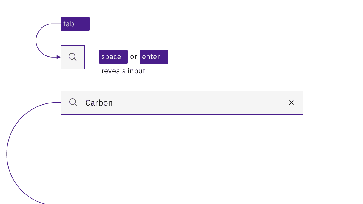
A variation where the search input is revealed by activating the magnifying glass icon.
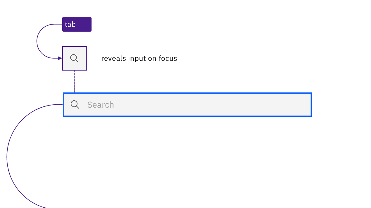
A variation where the search input is revealed when the magnifying glass receives focus.
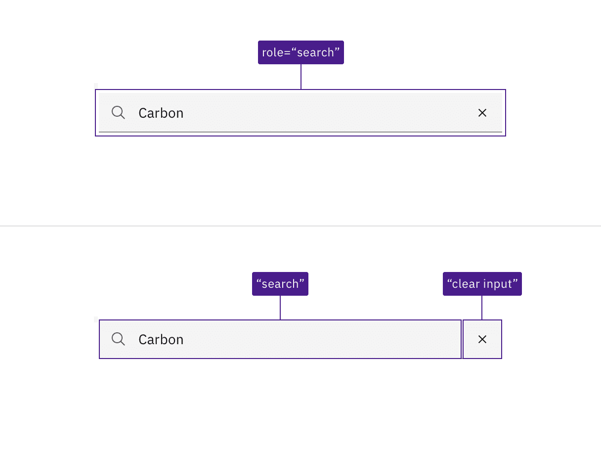
The search region, input name, and clear button are all incorporated by Carbon.
Design recommendations
Carbon provides a search pattern that outlines three search types: basic, active, and focused. Each of these types starts with the basic search input mechanism provided by Carbon's search component. However, each search type displays suggestions or results in different ways, which all have accessibility considerations. There are three broad areas that designers need to consider and annotate for accessibility:
Search suggestions and typeahead
Search outcomes and status (e.g., "25 results found", "no results found")
Results navigation
Future updates to this guidance will offer specific documentation on these accessibility needs.
The div containing the search function is given a
role="button".The hidden label for the input has a default value of "search".
The input is
type="text"with arole="searchbox"; usingtype="search"is equivalent and also valid.See the Mozilla search input documentation for more considerations.
Accessibility testing status
Latest version: 1.114.0 | Framework: React (@carbon/react)
| Component | Accessibility test | Status | Link to source code |
|---|---|---|---|
| Search | Test(s) that ensure the initial render state of a component is accessible. | Passes all automated tests with no reported accessibility violations. | GitHub link |
| Tests that ensure additional states of the component are accessible. This could be interactive states of a component or its multiple variants. | Passes all automated tests with no reported accessibility violations. | ||
| Tests that ensure focus is properly managed, and all interactive functions of a component have a proper keyboard-accessible equivalent. | Passes all automated tests with no reported accessibility violations. | ||
| This manual testing ensures that the visual information on the screen is properly conveyed and read correctly by screen readers such as JAWS, VoiceOver, and NVDA. | A human has manually tested this component, e.g. screen reader testing. | ||
| Fluid Search | Test(s) that ensure the initial render state of a component is accessible. | Passes all automated tests with no reported accessibility violations. | |
| Tests that ensure additional states of the component are accessible. This could be interactive states of a component or its multiple variants. | Passes all automated tests with no reported accessibility violations. | ||
| Tests that ensure focus is properly managed, and all interactive functions of a component have a proper keyboard-accessible equivalent. | Passes all automated tests with no reported accessibility violations. | ||
| This manual testing ensures that the visual information on the screen is properly conveyed and read correctly by screen readers such as JAWS, VoiceOver, and NVDA. | A human has manually tested this component, e.g. screen reader testing. |
Feedback
Help us improve by providing feedback, asking questions, requesting features, or leaving any other comments on GitHub.