Color
Element | Property | Color token |
|---|---|---|
Label | text-color |
|
Helper text | text-color |
|
Helper text: error | text-color |
|
Track | background |
|
Bar: active | background |
|
Bar: success | background |
|
Icon: success | fill |
|
Bar: error | background |
|
Icon: error | fill |
|
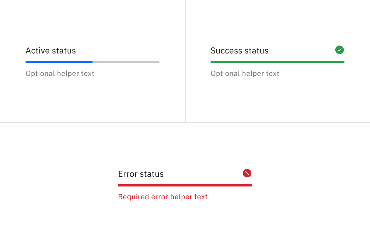
Progress bar statuses
Structure
Depending on the use case, the progress bar can use three text alignment options: default, inline, or indented. The width of a progress bar can be customized appropriately for its context. The minimum width of a progress bar is 48px. Keep its width to a maximum of six columns when possible.
Element | Property | px / rem | Spacing token |
|---|---|---|---|
Label (top aligned) | padding-bottom | 8 / 0.5 |
|
Helper text | padding-top | 8 / 0.5 |
|
Label (left aligned) | padding-right | 16 / 1 |
|
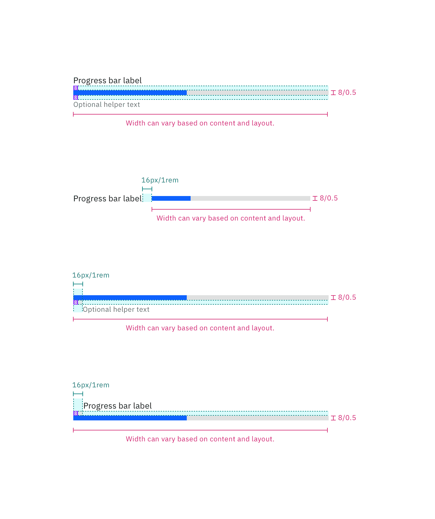
Structure and spacing measurements the progress bar | px / rem
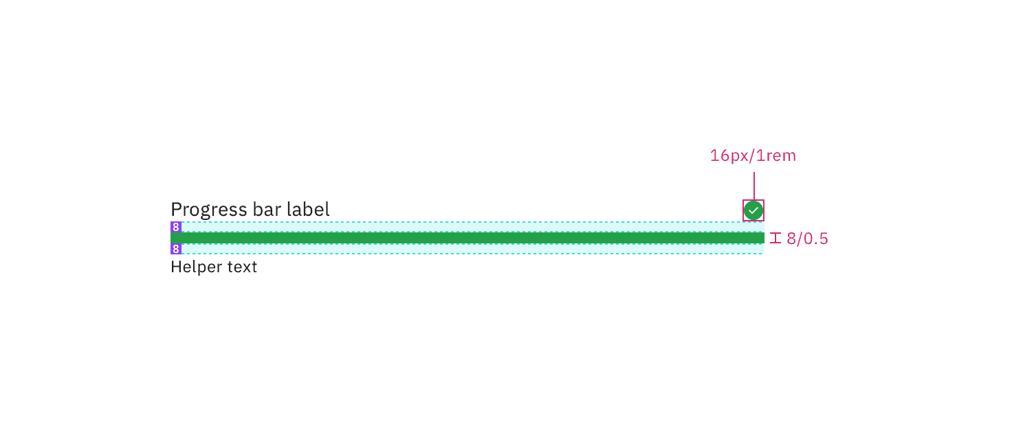
Structure and spacing measurements for the progress bar with an icon.
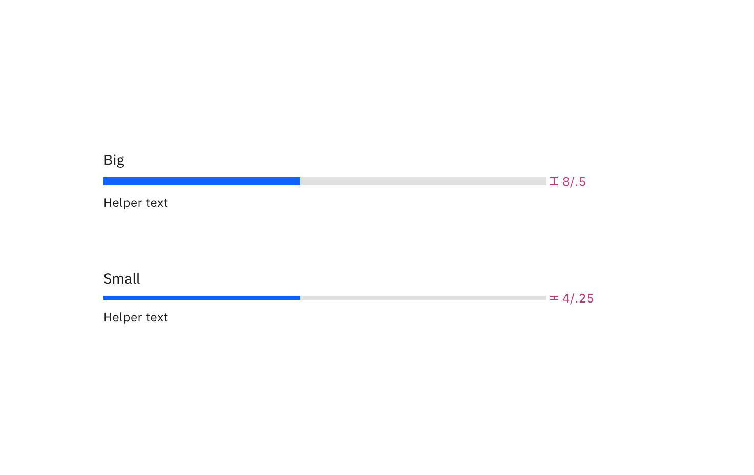
Feedback
Help us improve by providing feedback, asking questions, requesting features, or leaving any other comments on GitHub.