Keyboard interaction
The progress bar itself is not keyboard operable; however, when a progress bar is active, it may temporarily disable any dependent components. For example, if a progress bar is being used to upload a file, the Upload button is disabled until the progress bar state changes to either error or completed.
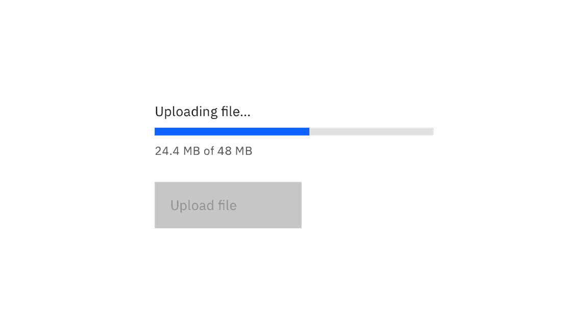
Progress bars are not interactive, but may temporarily disable dependent components.
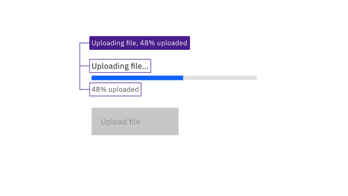
The label, the progress bar’s status, and the optional helper text underneath are all surfaced to assistive technologies.
Provide status for indeterminate and errored progress bars
The indeterminate progress bar does not measure progress, and so cannot programmatically inform the user when the process is complete. Also, neither variant of the progress bar can programmatically indicate to assistive technologies when it is in error. Information on both outcomes must be presented in the help text below the progress bar.
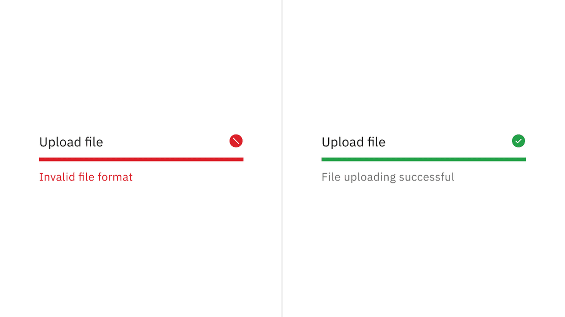
Helper text is required when a progress bar is in error or indeterminate.
Development considerations
Keep this in mind if you’re modifying Carbon or creating a custom component:
- The loading component is implemented using the ARIA 1.1 progressbar pattern. For determinate progress bar, it outputs an ARIA
role="progressbar"and usesaria-valuemin,aria-valuemax, andaria-valuenowto convey the loaded percentage to screen reader users. - If the progress bar shows the loading of a specific part or region of the application, set
aria-busy="true"andaria-describedby="[progressbar-id]"on the related element to ensure assistive technologies can correctly convey this relation to the user. - Only hide the label when it is absolute clear to the user which process the progress bar represents. Note that you are still required to pass an appropriate label which will be read by screen readers.
- Carbon uses
aria-valuemin,aria-valuemax,aria-valuenow, andaria-busyto provide status on the progress bar. Due to inconsistent support for these attributes, Carbon also assigns anaria-live="polite"to the container holding the helper text. - Carbon uses
aria-labelledbyandaria-describedbyto associate the label and helper text with the component. - The red error and green success SVG icons have
aria-hidden="true"set, since the helper text and aria attributes provide the same information.
Accessibility testing status
Latest version: 1.114.0 | Framework: React (@carbon/react)
| Component | Accessibility test | Status | Link to source code |
|---|---|---|---|
| Progress bar | Test(s) that ensure the initial render state of a component is accessible. | Passes all automated tests with no reported accessibility violations. | GitHub link |
| Tests that ensure additional states of the component are accessible. This could be interactive states of a component or its multiple variants. | Passes all automated tests with no reported accessibility violations. | ||
| Tests that ensure focus is properly managed, and all interactive functions of a component have a proper keyboard-accessible equivalent. | Test data is either not available or not applicable for this component state. | ||
| This manual testing ensures that the visual information on the screen is properly conveyed and read correctly by screen readers such as JAWS, VoiceOver, and NVDA. | A human has manually tested this component, e.g. screen reader testing. |
Feedback
Help us improve by providing feedback, asking questions, requesting features, or leaving any other comments on GitHub.