Element | Property | Color token |
|---|---|---|
Container | background-color |
|
Border | border-top |
|
Text: items per page | text-color |
|
Text: number of items | text-color |
|
Text: page range of total items | text-color |
|
Icon | fill |
|
* Denotes a contextual color token that will change values based on the layer it is placed on.
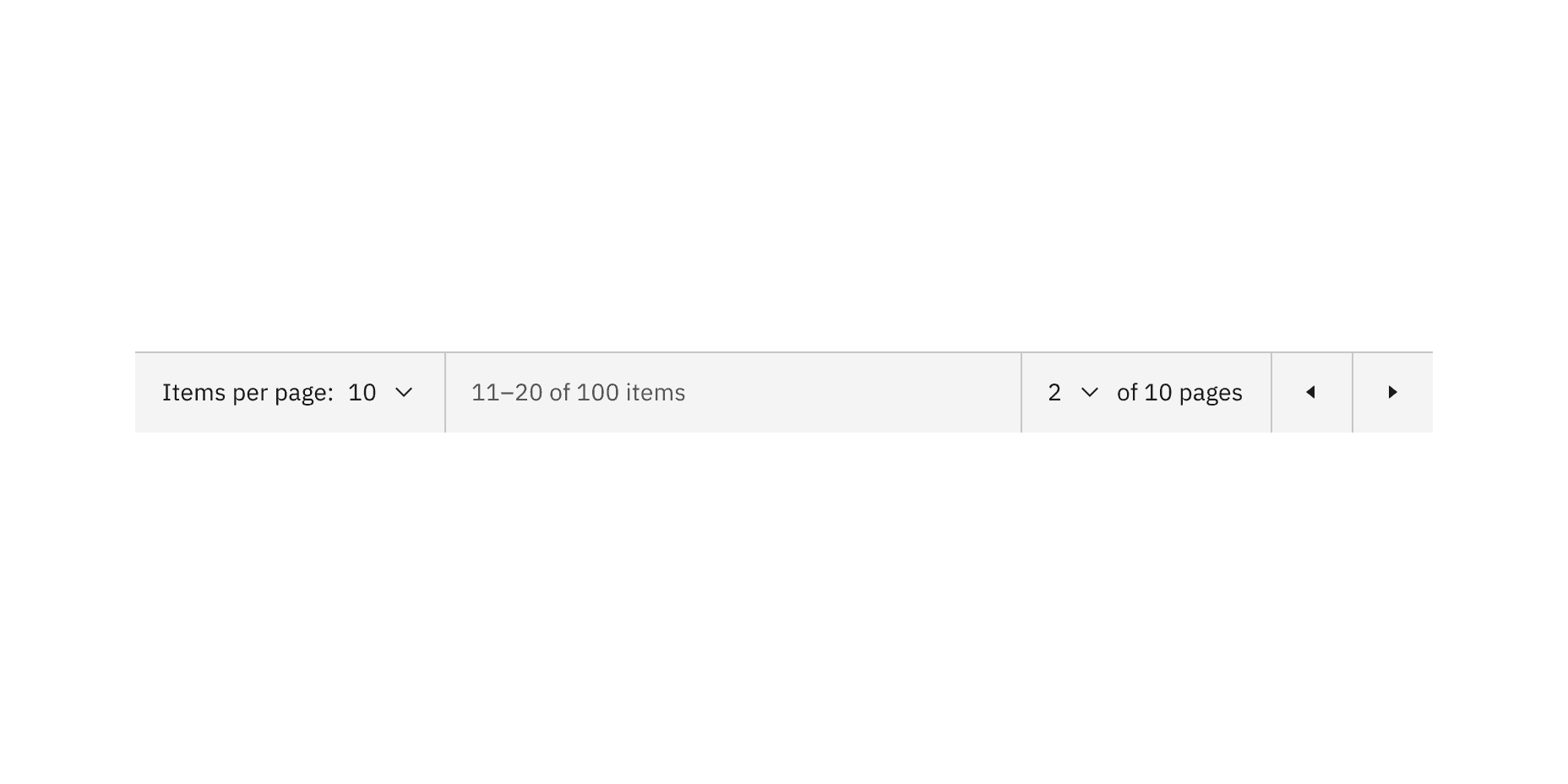
Example of pagination color
State | Element | Property | Color token |
|---|---|---|---|
Hover | Background | background-color |
|
Focus | Border | border |
|
Disabled | Text | text-color |
|
Icon | fill |
| |
Background | background-color |
|
* Denotes a contextual color token that will change values based on the layer it is placed on.
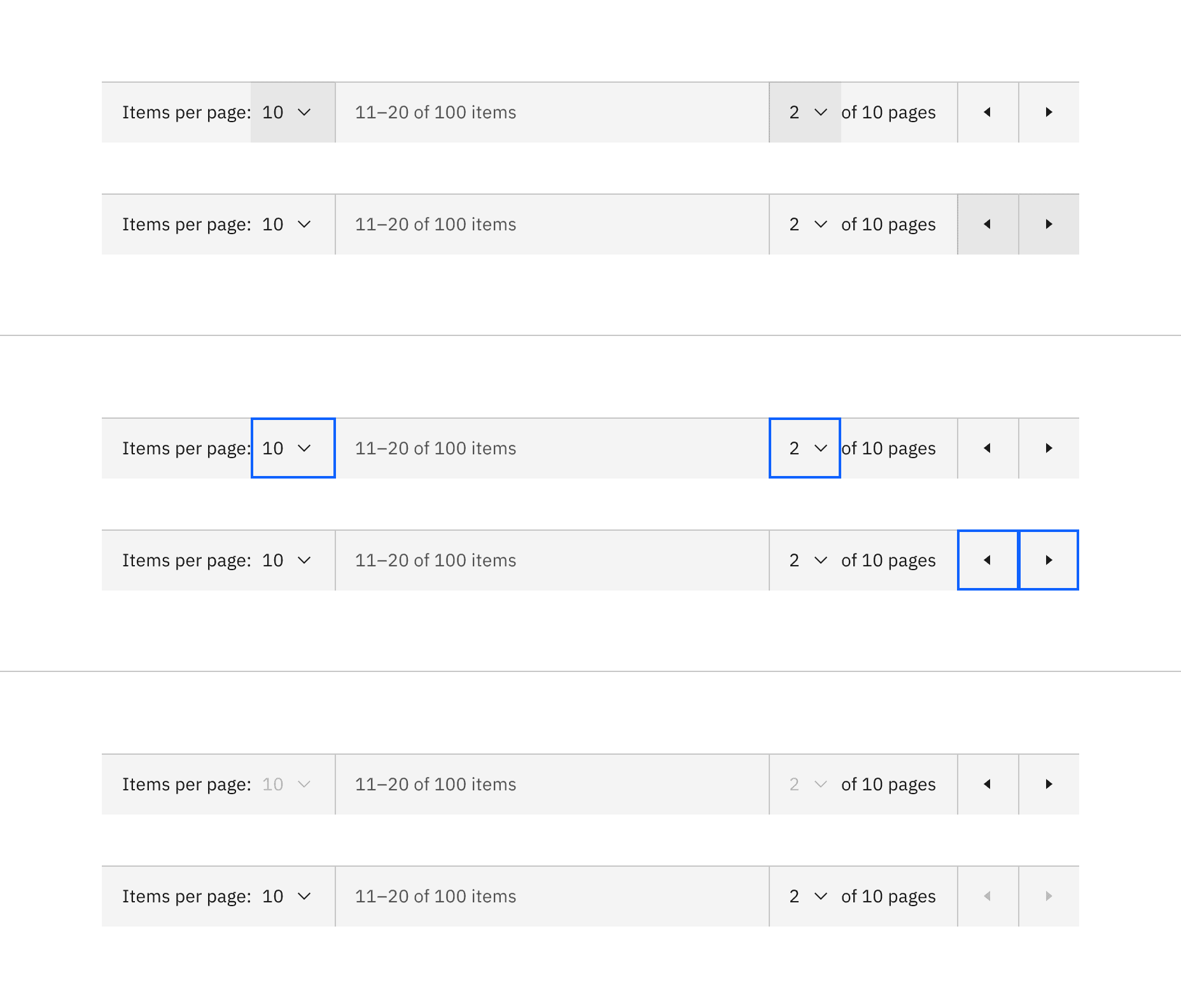
Example of pagination interactive state color
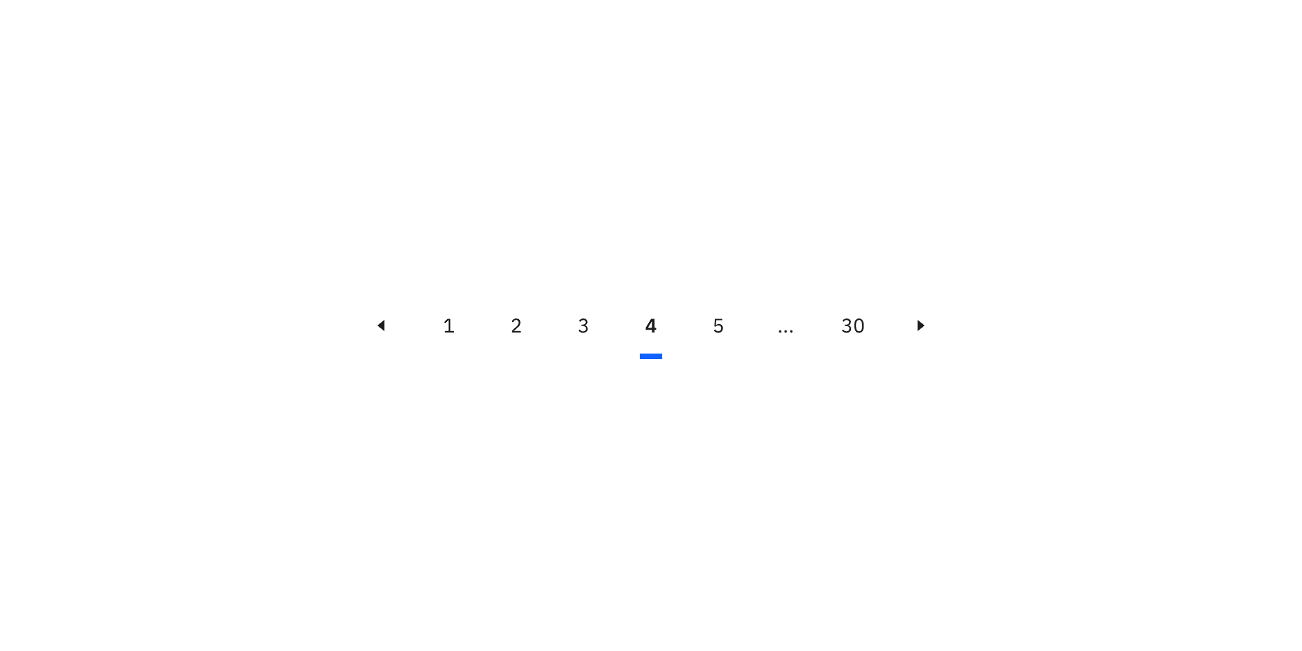
Example of pagination nav color
Pagination nav interactive state color
The pagination nav variant has nested ghost icon buttons with interactive states. See the button specifications tab for more information.
State | Element | Property | Color token |
|---|---|---|---|
Hover | Background | background-color |
|
Focus | Border | border |
|
Selected | Border | border |
|
Disabled | Text | text-color |
|
Icon | fill |
| |
Background | background-color | transparent |
* Denotes a contextual color token that will change values based on the layer it is placed on.
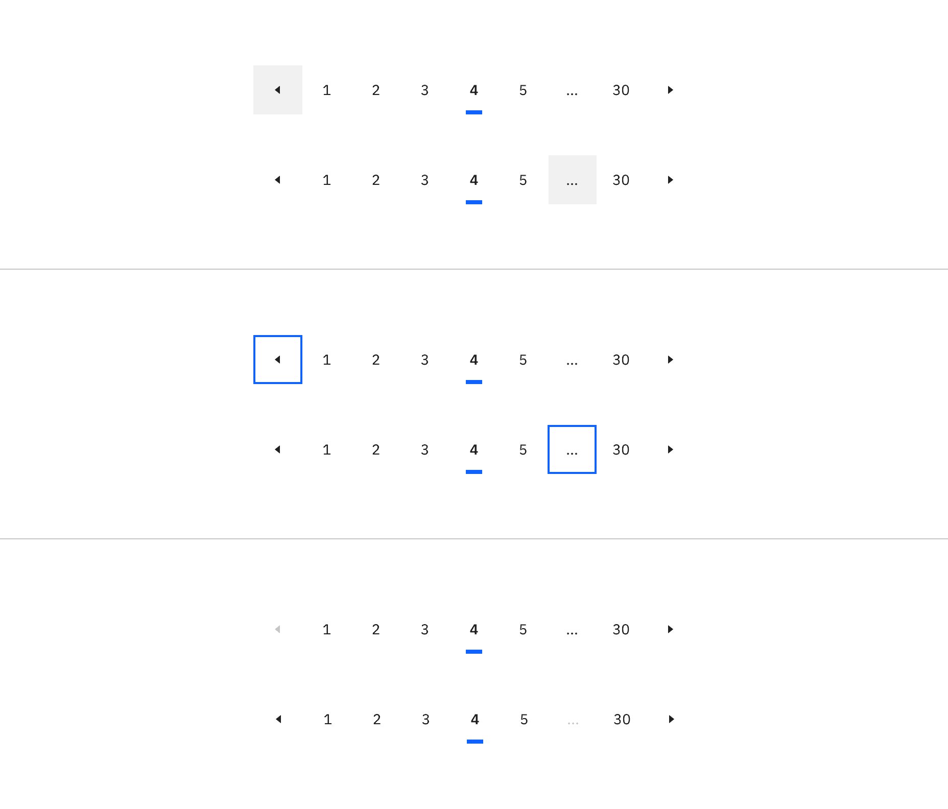
Example of pagination nav interactive state color
Element | Font-size (px/rem) | Font-weight | Type token |
|---|---|---|---|
Text | 14 / 0.875 | Regular / 400 |
|
Element | Font-size (px/rem) | Font-weight | Type token |
|---|---|---|---|
Text: unselected | 14 / 0.875 | Regular / 400 |
|
Text: selected | 14 / 0.875 | SemiBold / 600 |
|
Element | Property | px / rem | Spacing token |
|---|---|---|---|
Container | border | 1px | – |
padding-left, padding-right | 16 / 1 |
| |
Select control: items per page | padding-left | 8 / .5 |
|
padding-right | 16 / 1 |
| |
Select control: number of pages | padding-left | 16 / 1 |
|
padding-right | 8 / .5 |
| |
Chevron icon | svg | 16 x 16px | – |
Caret icon | svg | 16 x 16px | – |
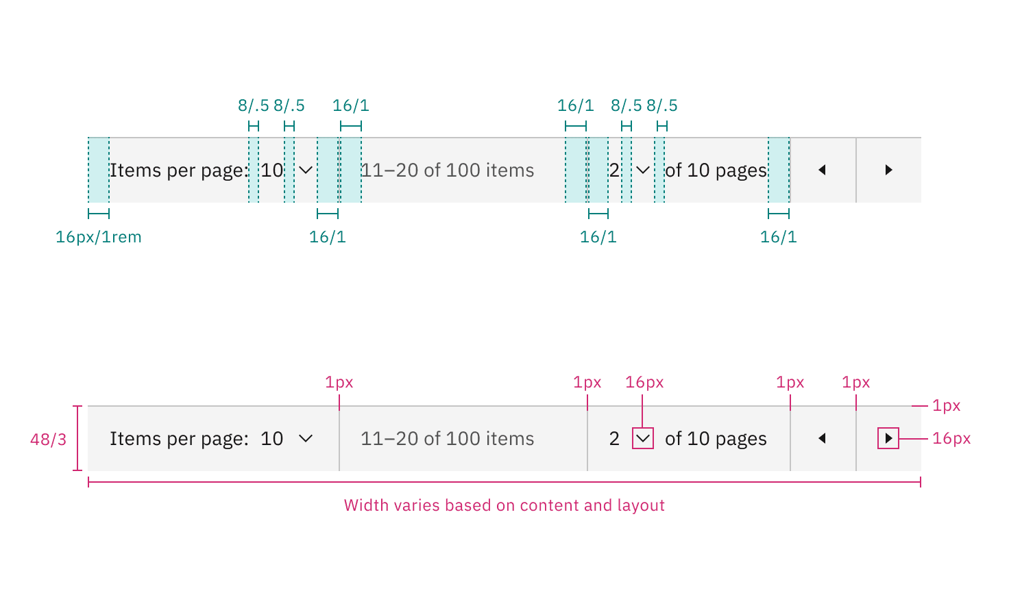
Structure and spacing measurements for pagination | px / rem
Element | Property | px / rem | Spacing token |
|---|---|---|---|
Border: selected | border | 4px | – |
Caret icon | svg | 16 x 16px | – |
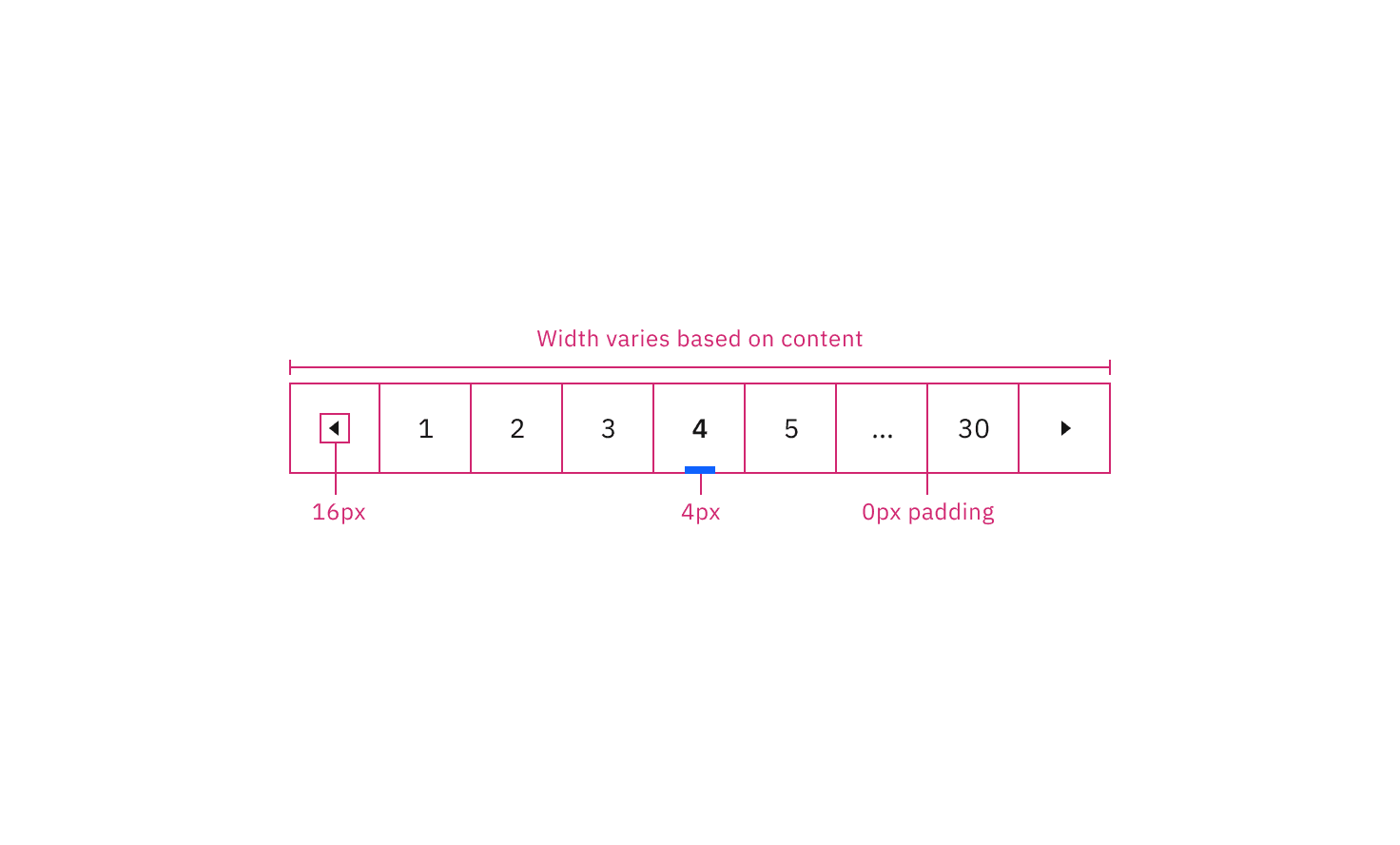
Structure and spacing measurements for pagination nav | px / rem
Element | Size | Height (px/rem) |
|---|---|---|
Container height | Extra small (sm) | 24 / 1.5 |
Small (sm) | 32 / 2 | |
Medium (md) | 40 / 2.5 | |
Large (lg) | 48 / 3 | |
Icon button | Extra small (sm) | 24 / 1.5 |
Small (sm) | 32 / 2 | |
Medium (md) | 40 / 2.5 | |
Large (lg) | 48 / 3 |
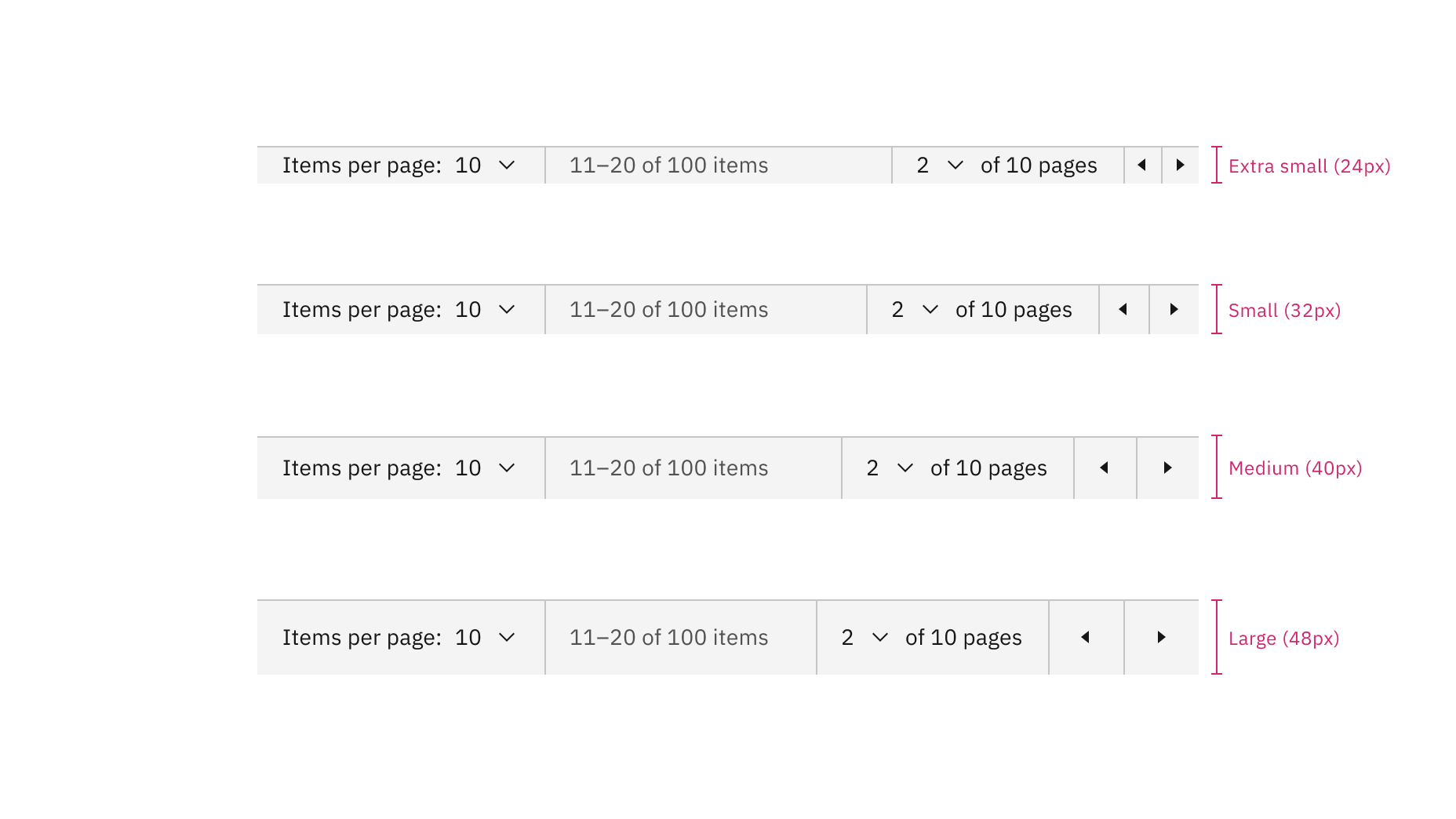
Sizes for pagination: extra small, small, medium, and large
Element | Size | Height (px/rem) |
|---|---|---|
Container height | Small (sm) | 32 / 2 |
Medium (md) | 40 / 2.5 | |
Large (lg) | 48 / 3 | |
Icon button | Small (sm) | 32 / 2 |
Medium (md) | 40 / 2.5 | |
Large (lg) | 48 / 3 |
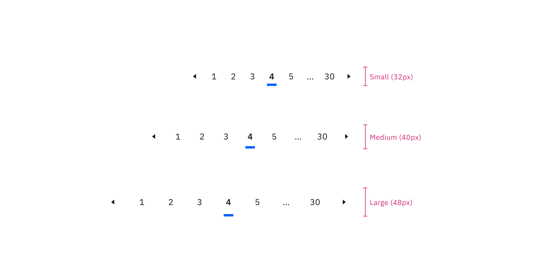
Sizes of pagination nav: small, medium, and large
Feedback
Help us improve by providing feedback, asking questions, requesting features, or leaving any other comments on GitHub.