What Carbon provides
Carbon bakes keyboard operation into its components, improving the experience of blind users and others who operate via the keyboard. Carbon incorporates many other accessibility considerations, some of which are described below.
No accessibility annotations are needed for pagination, but keep these considerations in mind if you are modifying Carbon or creating a custom component.
Pagination
The tab order goes from left to right through the controls in the pagination variant. On focus, the selects are opened with Space or with Up or Down arrows, which also cycle through the values. Both Space and Enter select a value and close the select. The select can also be closed by pressing Esc. The previous and next page arrow buttons are activated by pressing Space or Enter.
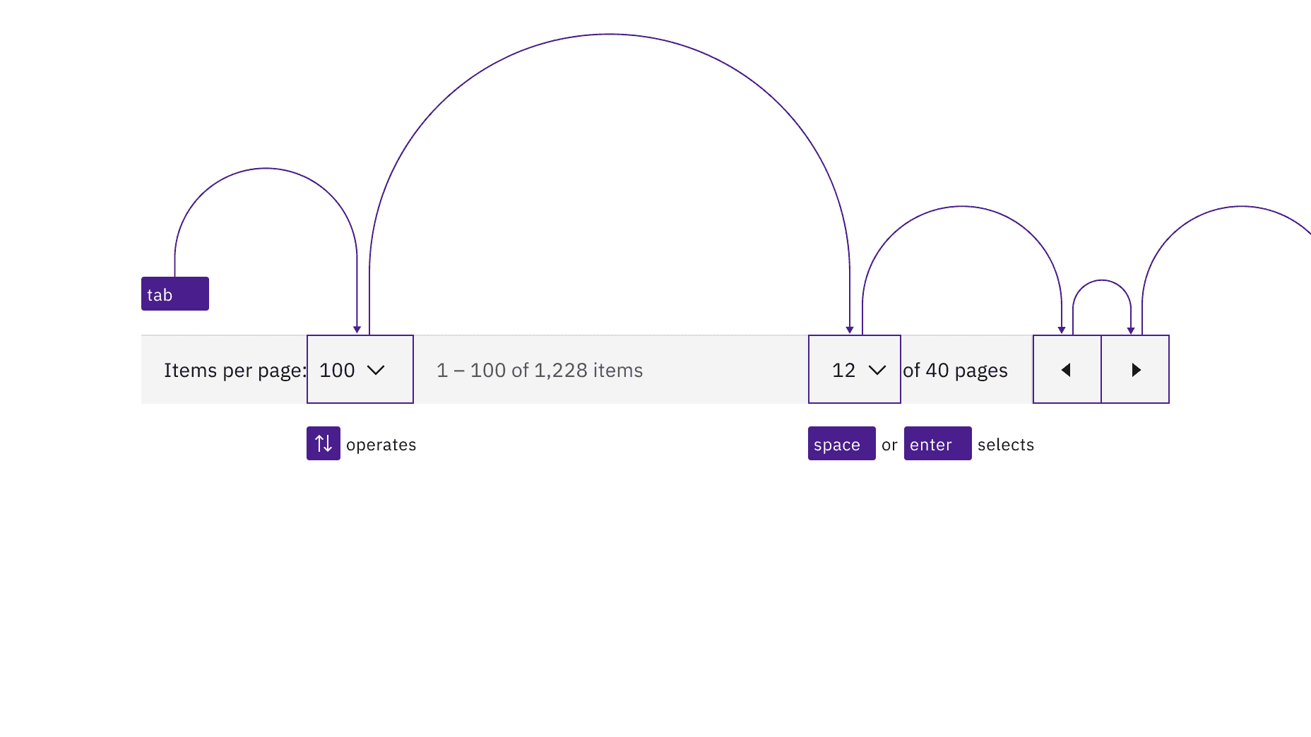
Interactive elements in pagination maintain their usual Carbon keyboard behaviors and tab order.
When the pagination is at either end of its range, one of the page navigation buttons becomes invalid. When that happens, the button is no longer navigable or operable, like any other disabled control.
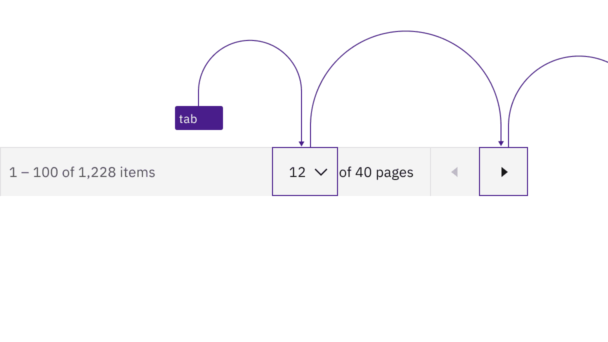
The prior page button is disabled and unreachable when the pagination is at the start of its range.
Pagination nav
The tab order goes left to right through the button controls in the pagination nav variant. When page buttons have focus, Space or Enter activates the page button and changes the current page to the button that currently has selection. When the previous and next page arrow buttons have focus, Space or Enter activates them.
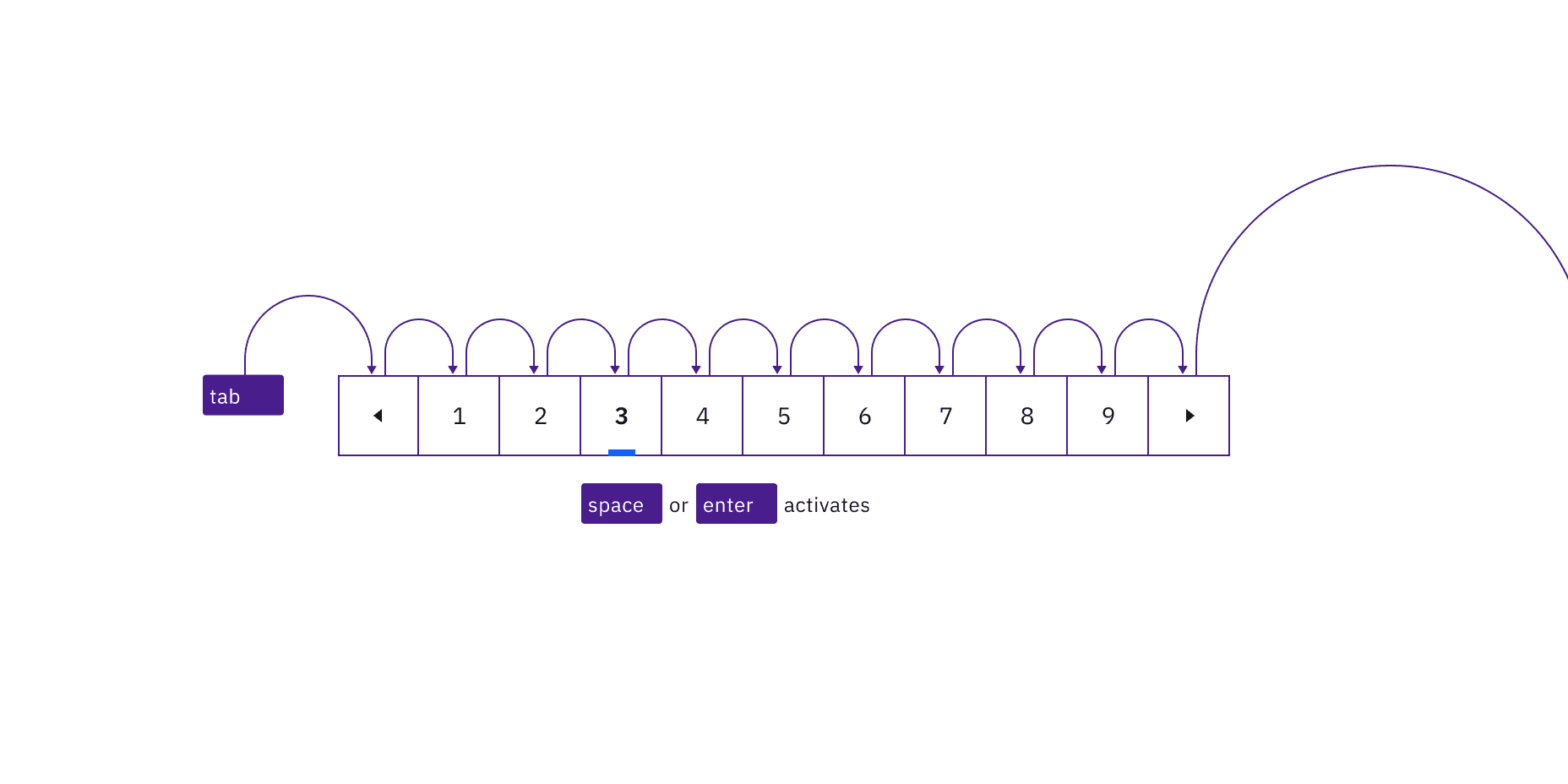
Interactive elements in pagination nav maintain their usual Carbon keyboard behaviors and tab order.
If an overflow ellipsis is present in the pagination nav, once focused, pressing Space, Up arrow, or Down arrow activates the select menu to choose an available page to navigate to. Up or Down arrows navigate between page options in the menu. Space or Enter selects a page from the menu and closes it. The menu can also be closed by pressing Esc.
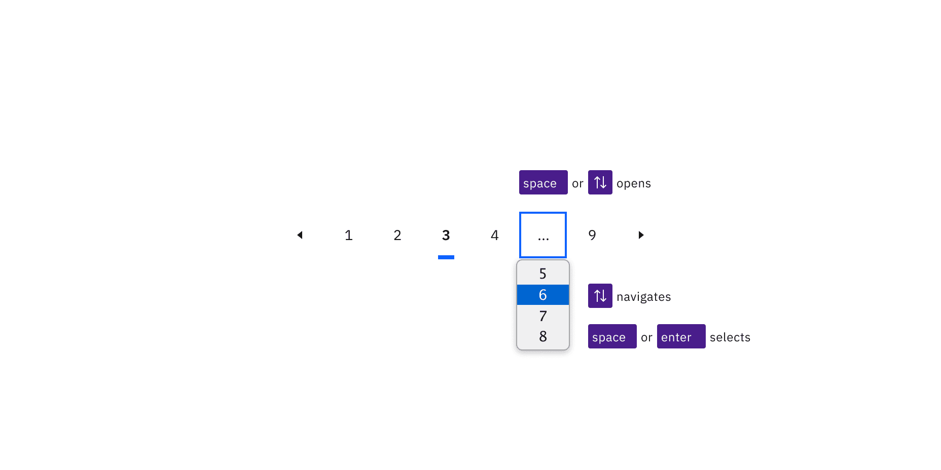
The menu opens by pressing Space, Up arrow, or Down arrow, and closes by pressing Space or Enter to select an item.
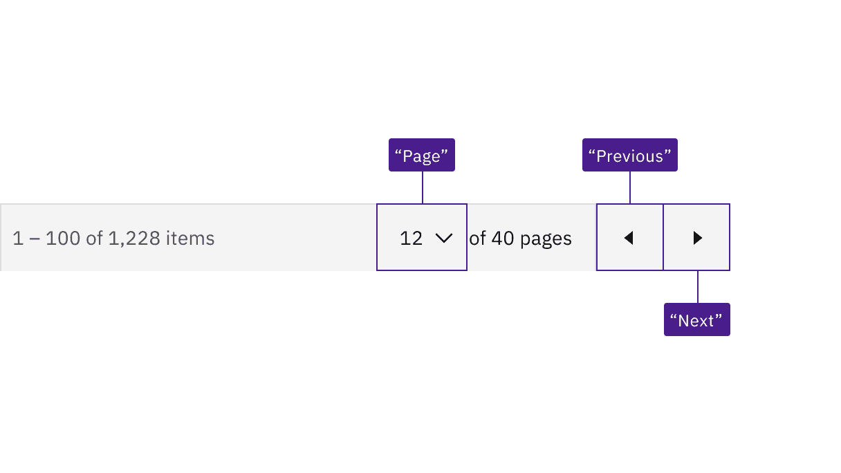
Carbon provides the accessible names "Page", "Previous", and "Next" for assistive technology.
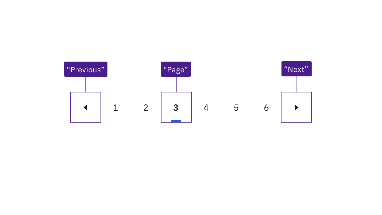
Carbon provides the accessible names "Page", "Previous", and "Next" for assistive technology.
Development considerations
Keep these considerations in mind if you are modifying Carbon or creating a custom component.
- Carbon uses
<select>elements for the dropdowns. - Consult the ARIA authoring practices for more considerations.
Accessibility testing status
Latest version: 1.114.0 | Framework: React (@carbon/react)
| Component | Accessibility test | Status | Link to source code |
|---|---|---|---|
| Pagination | Test(s) that ensure the initial render state of a component is accessible. | Passes all automated tests with no reported accessibility violations. | GitHub link |
| Tests that ensure additional states of the component are accessible. This could be interactive states of a component or its multiple variants. | Passes all automated tests with no reported accessibility violations. | ||
| Tests that ensure focus is properly managed, and all interactive functions of a component have a proper keyboard-accessible equivalent. | Passes all automated tests with no reported accessibility violations. | ||
| This manual testing ensures that the visual information on the screen is properly conveyed and read correctly by screen readers such as JAWS, VoiceOver, and NVDA. | A human has manually tested this component, e.g. screen reader testing. |
Feedback
Help us improve by providing feedback, asking questions, requesting features, or leaving any other comments on GitHub.