Element | Property | Color token |
|---|---|---|
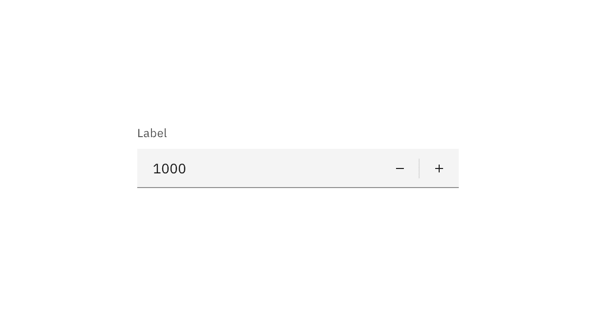
Label | text color |
|
Number | text color |
|
Field | background-color |
|
border-bottom |
| |
Controls | svg color |
|
* Denotes a contextual color token that will change values based on the layer it is placed on.
State | Element | Property | Color token |
|---|---|---|---|
Hover | Controls | background-color |
|
Focus | Field | border |
|
Controls | border |
| |
Invalid | Field | border |
|
Error icon | svg |
| |
Error message | text color |
| |
Warning | Warning icon | svg |
|
Warning message | text color |
| |
Disabled | Label | text color |
|
Field | background-color |
| |
border-bottom (default) | transparent | ||
border-bottom (fluid) |
| ||
Number | text color |
| |
Controls | svg color |
| |
Read-only | Field | background-color (default) | transparent |
background-color (fluid) |
| ||
border-bottom |
| ||
Number | text color (default) |
| |
text color (fluid) |
| ||
Controls | svg color |
|
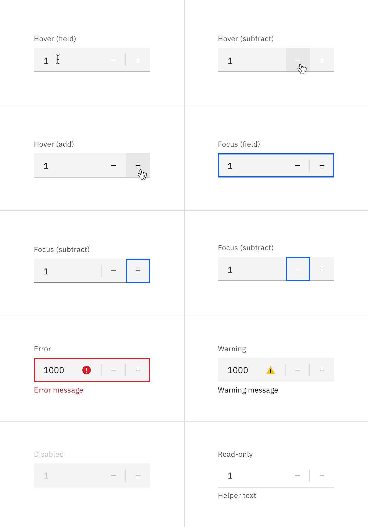
Number input states example.
Element | Font-size (px/rem) | Font-weight | Type token |
|---|---|---|---|
Label | 12 / 0.75 | Regular / 400 |
|
Field input | 14 / 0.875 | Regular / 400 |
|
Error message | 12 / 0.75 | Regular / 400 |
|
Warning message | 12 / 0.75 | Regular / 400 |
|
Helper text | 12 / 0.75 | Regular / 400 |
|
Default input
The add and subtract icons can be found in the icons library.
Element | Property | px / rem | Spacing token |
|---|---|---|---|
Label | margin-bottom | 8 / 0.5 |
|
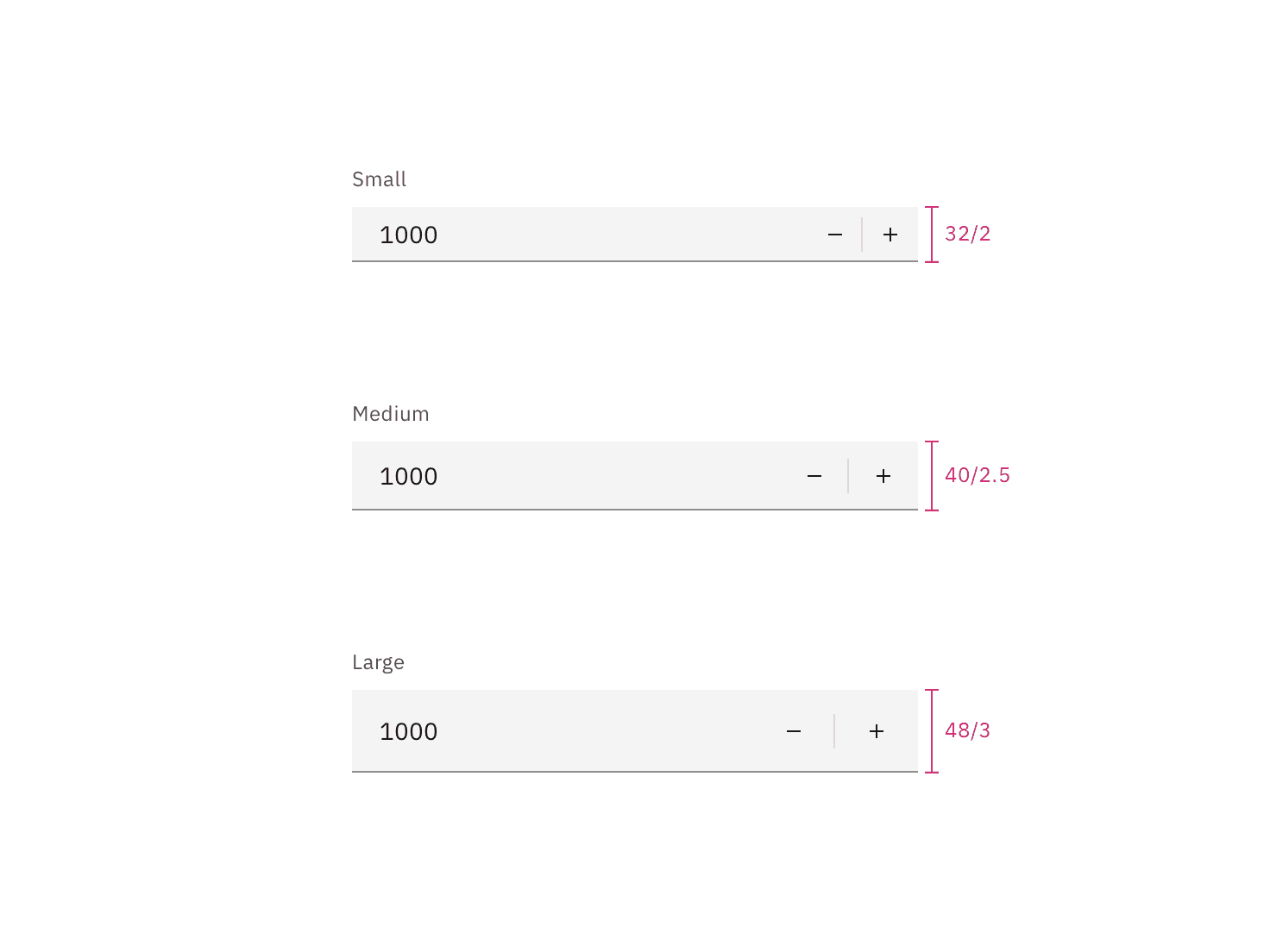
Field (default) | height | 40 / 2.5 | – |
border-bottom | 1px | – | |
Number | padding-left | 16 / 1 |
|
Controls | padding-left, padding-right | 16 / 1 |
|
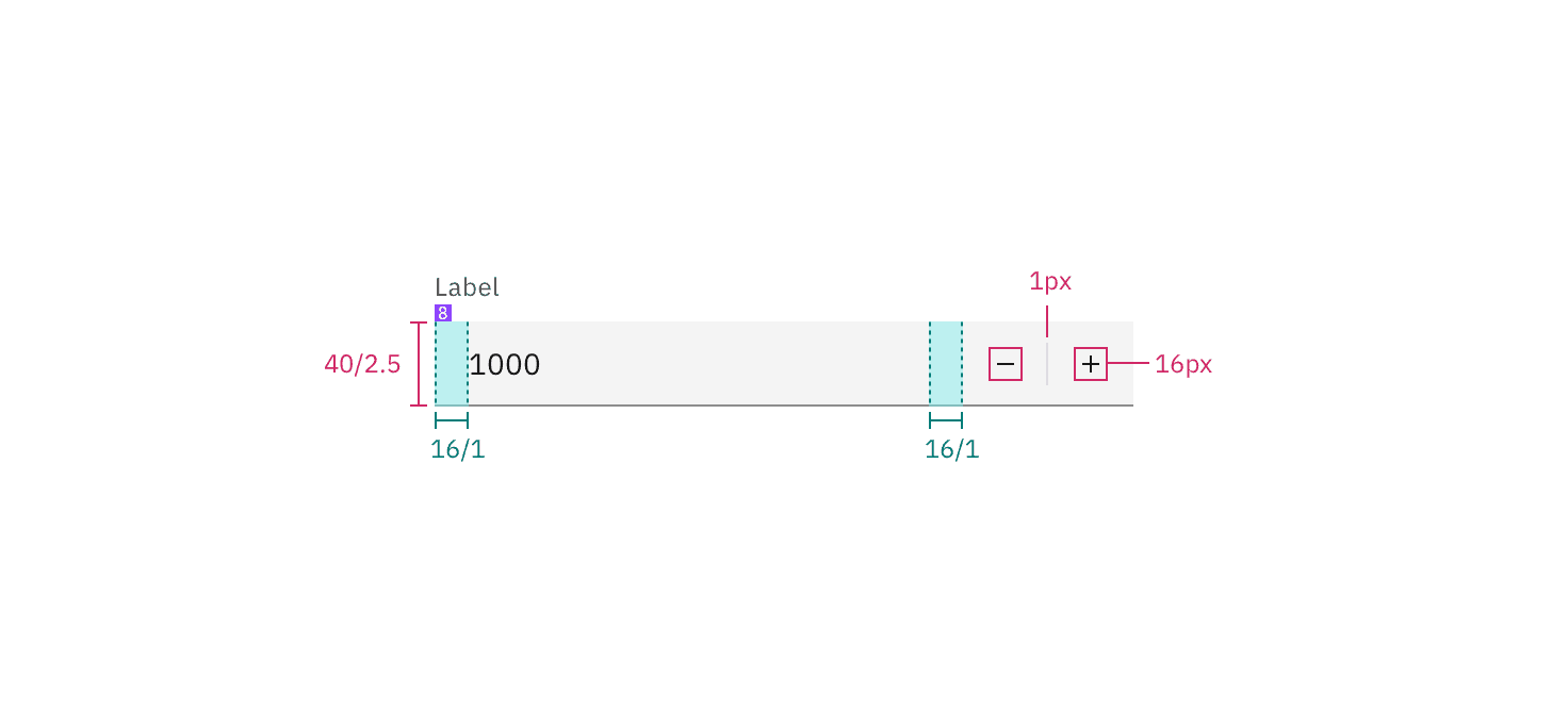
Structure and spacing measurements for a default number input | px / rem
Element | Property | px / rem | Spacing token |
|---|---|---|---|
Label | padding-bottom | 4 / 0.25 |
|
Field | height | 64 / 4 |
|
padding-left, padding-right | 16 / 1 |
| |
padding-top, padding-bottom | 13 / 0.8125 | – | |
border-bottom | 1px | – | |
Add or subtract icon | height, width | 16 / 1 | – |
Focus | border | 2px | – |
Error | border | 2px | – |
padding-top, padding-bottom | 8 / 0.5 |
|
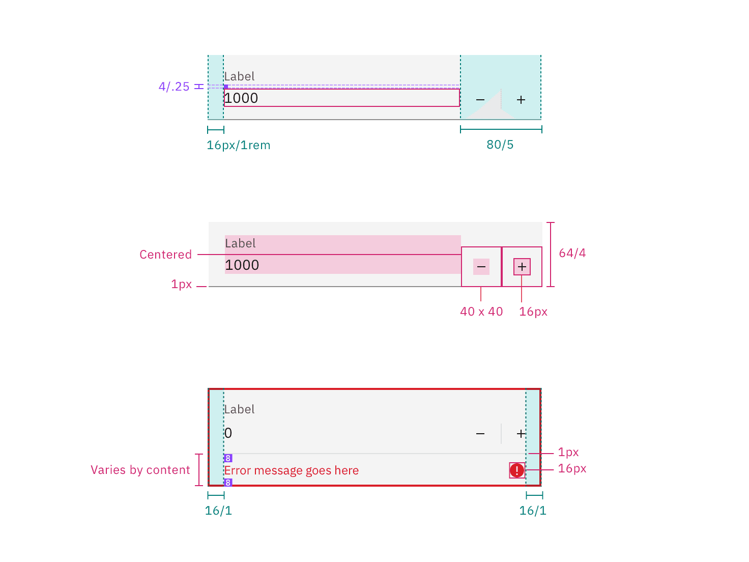
Structure and spacing measurements for a fluid number input | px / rem
AI presence
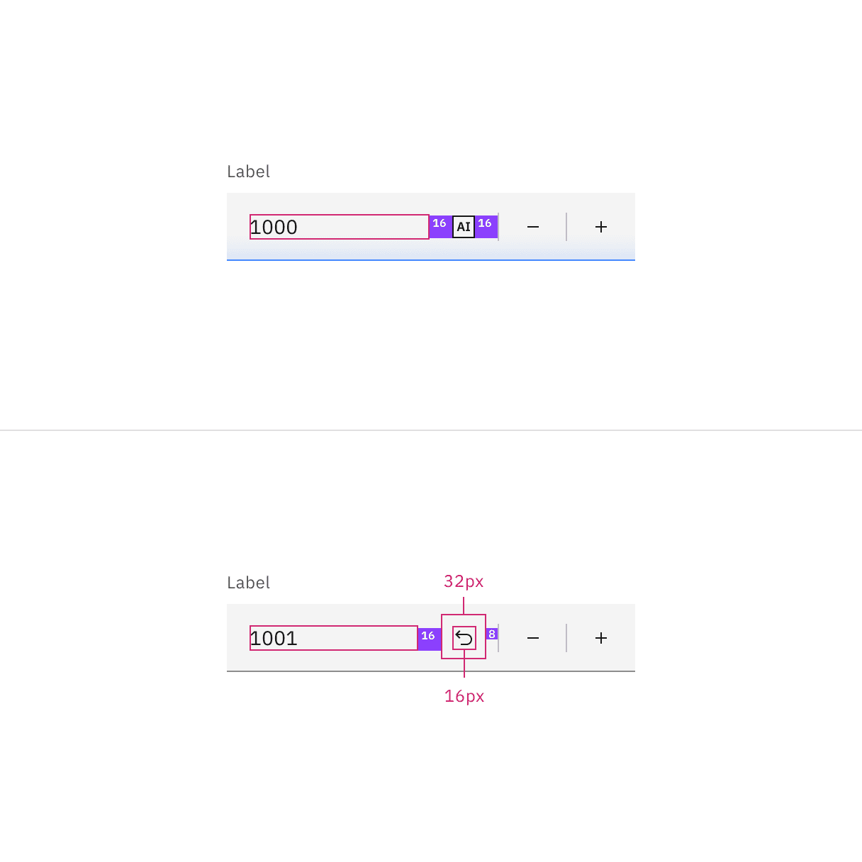
The following are the unique styles applied to the component when the AI label is present. Unless specified, all other tokens in the component remain the same as the non-AI variant.
For more information on the AI style elements, see the Carbon for AI guidelines.
Element | Property | Token / Size |
|---|---|---|
Linear gradient | start |
|
stop |
| |
Field | border-bottom |
|
background color |
| |
AI label | size | mini |
* Denotes a contextual color token that will change values based on the layer it is placed on.
Feedback
Help us improve by providing feedback, asking questions, requesting features, or leaving any other comments on GitHub.