Color
Refer to the button for primary and secondary button styling in the transactional modal.
Elements | Property | Color token |
|---|---|---|
Container | background-color |
|
Container | border |
|
Header label | text color |
|
Header | text color |
|
Content | text color |
|
Close icon | fill |
|
Close icon:hover | background-color |
|
Page overlay | color |
|
* Denotes a contextual color token that will change values based on the layer it is placed on.
Typography
Modal labels and headings should be set in sentence case. Keep all labels and headings concise and to the point. Modal labels are optional.
Element | Font-size (px/rem) | Font-weight | Type token |
|---|---|---|---|
Label | 12 / 0.75 | Regular / 400 |
|
Heading | 20 / 1.25 | Regular / 400 |
|
Content | 14 / 0.875 | Regular / 400 |
|
Structure
Element | Property | px / rem | Spacing token |
|---|---|---|---|
Container | border | 1px | – |
Close button | height, width | 48 x 48 | – |
Close icon | height, width | 16 x 16 | – |
Header label | margin-bottom | 4 / 0.25 |
|
Header | padding top, padding left | 16 / 1 |
|
margin-bottom | 16 / 1 |
| |
Content | padding-left | 16 / 1 |
|
padding-right | 20% | – | |
margin-bottom | 48 / 3 |
| |
Footer (fluid button group) | border | 1px | – |
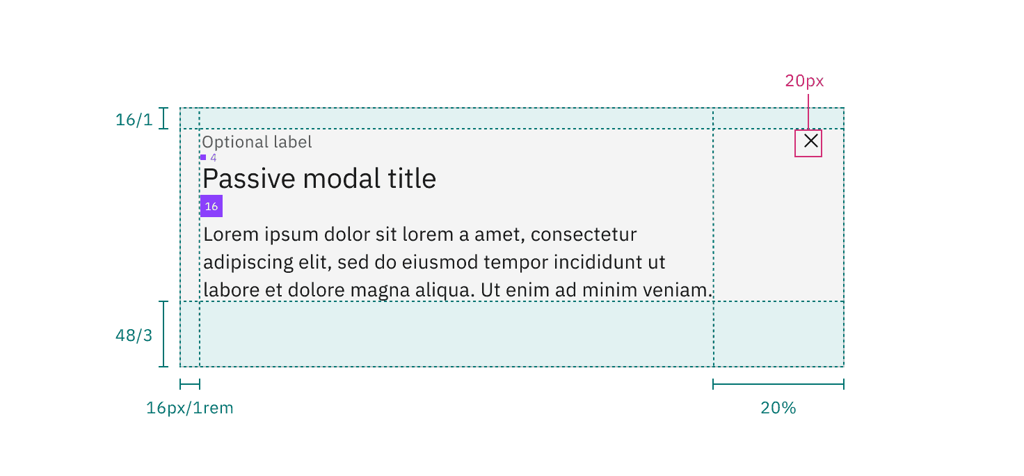
Structure and spacing measurements for a passive modal | px / rem
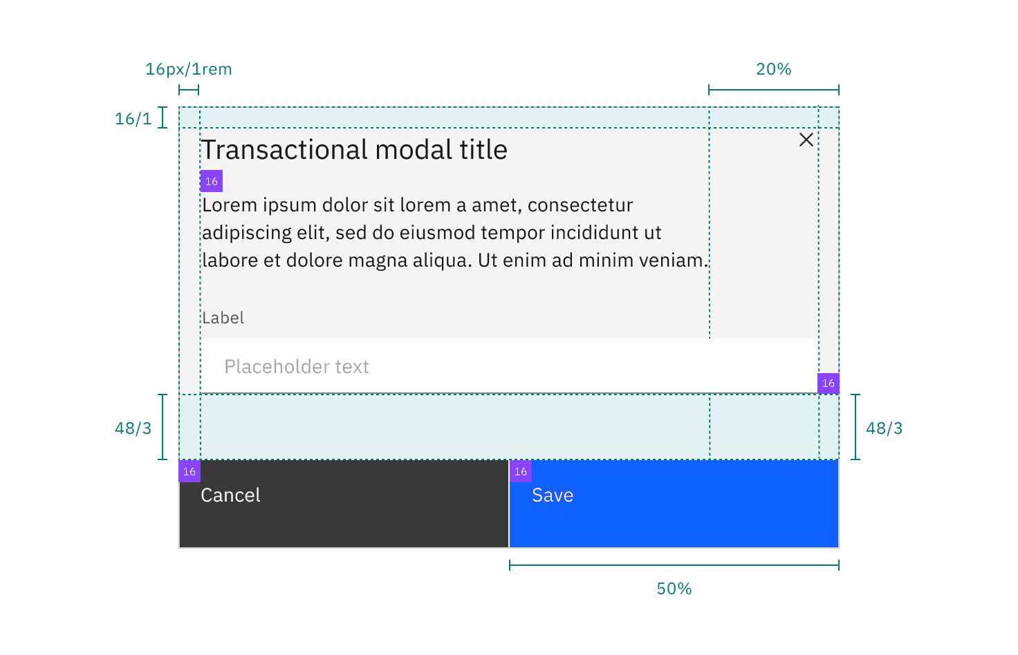
Structure and spacing measurements for a transactional modal | px / rem
Margin-right
Modals that are 36% width and larger have a margin-right: 20% (margin percentage is based off the width of the modal window). If the modal is smaller than 36% then it has a fixed margin-right: 16px/1rem. Body copy, including titles, in a modal always follows the 20% margin-right rule. However, inputs and other components may still expand to the full width of a modal window.
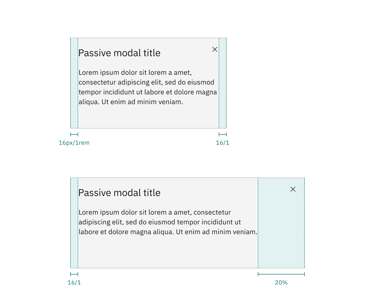
Margin-right for modals less than 36% (left) and greater than 36% (right).
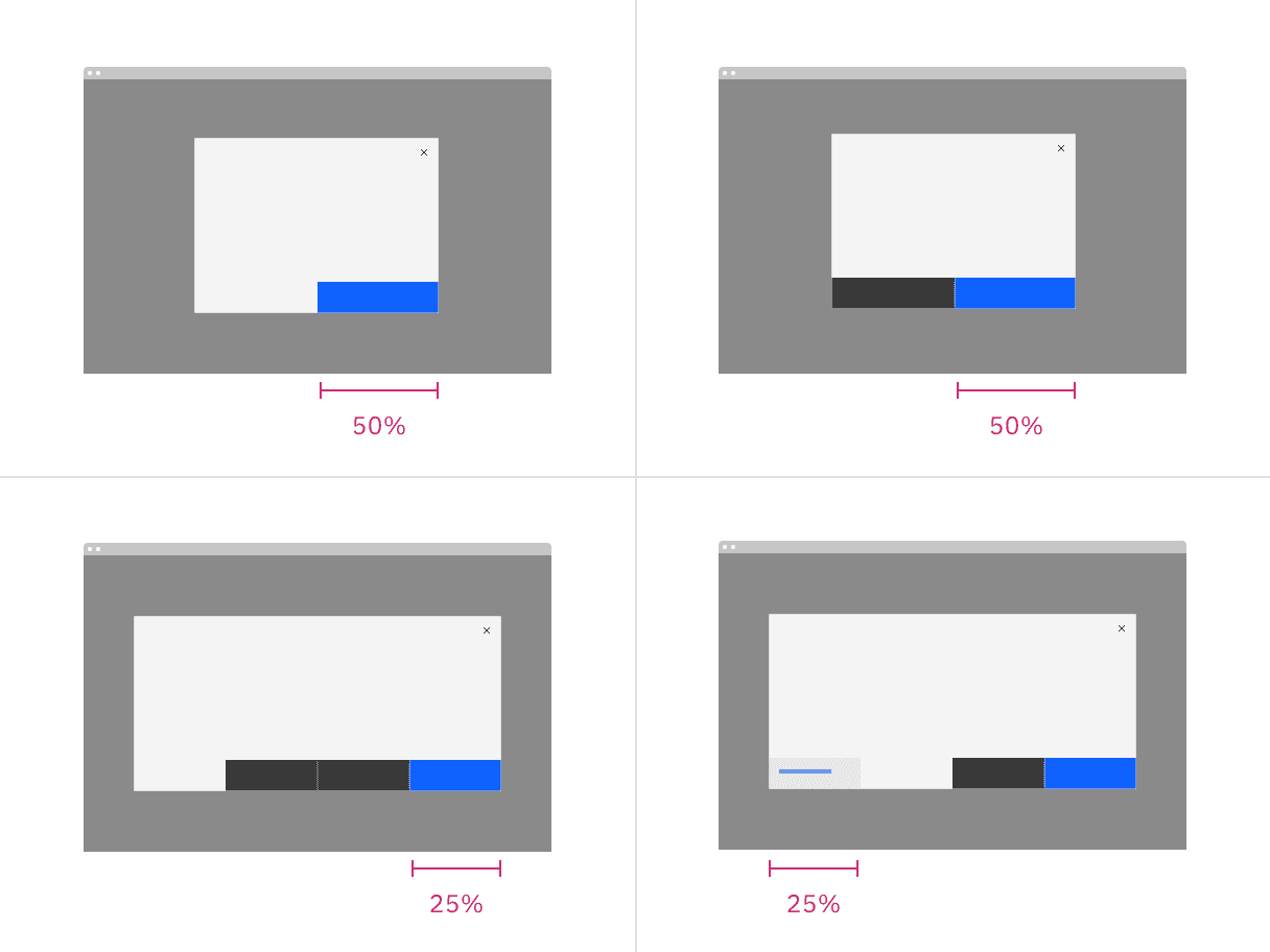
Sizes
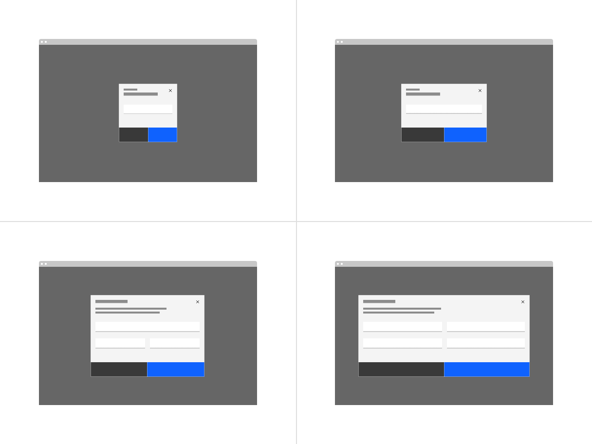
There are four modal sizes: extra small, small, medium, and large. Each modal size has a responsive width that changes based on the browser size. As the browser decreases, the modal width percentage increases thus maintaining a proper ratio between the modal and browser. Modal widths are defined as percentages of the browser but will still align to columns on the 2x grid.
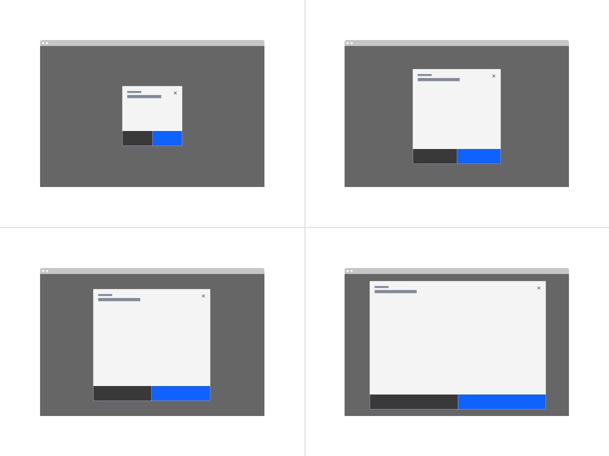
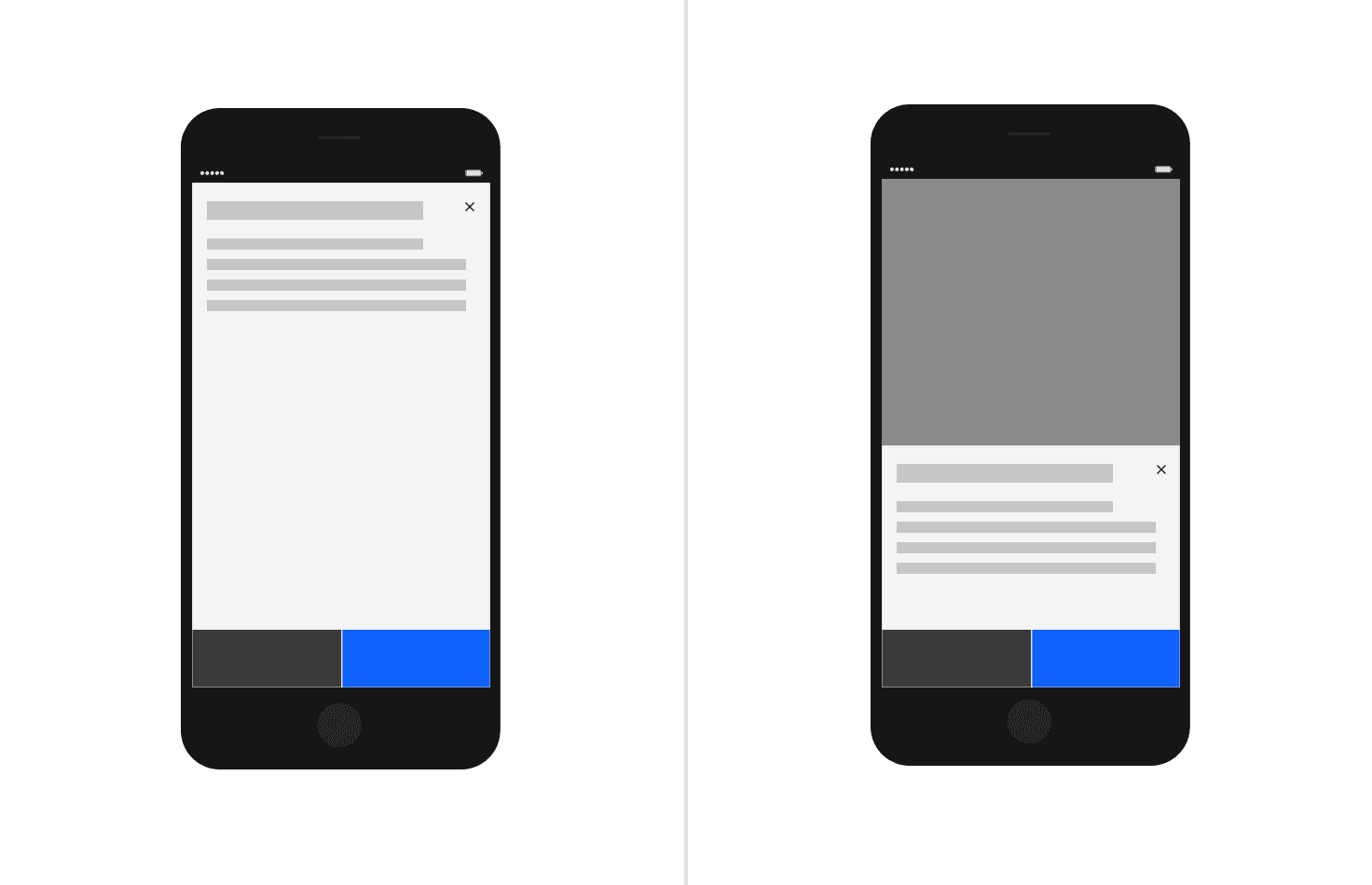
Modal max heights
AI presence
The following are the unique styles applied to the component when the AI label is present. Unless specified, all other tokens in the component remain the same as the non-AI variant. The AI styling spec of individual components inside of the modal can be found on their respective style tabs.
For more information on the AI style elements, see the Carbon for AI guidelines.
Element | Property | Token / Size |
|---|---|---|
Modal:background | background-color |
|
box-shadow |
| |
inner-shadow |
| |
Overlay | background-color |
|
Linear gradient:background | start |
|
stop |
| |
Linear gradient:border | top |
|
bottom |
| |
AI label | size | large |
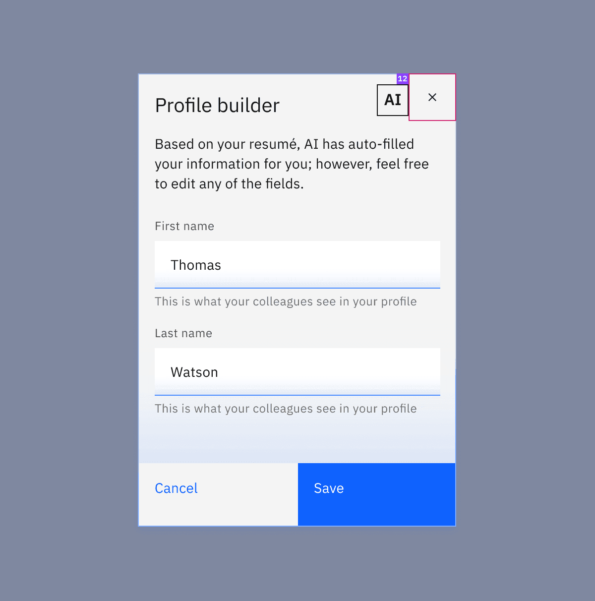
Structure and spacing measurements for an AI Modal.
Feedback
Help us improve by providing feedback, asking questions, requesting features, or leaving any other comments on GitHub.