Element | Property | Color token |
|---|---|---|
Heading | text-color |
|
Description | text-color |
|
Button | See primary button | |
Drop zone text | text-color |
|
Drop zone container | border |
|
File name | text-color |
|
File container | background-color |
|
Delete icon | svg |
|
* Denotes a contextual color token that will change values based on the layer it is placed on.
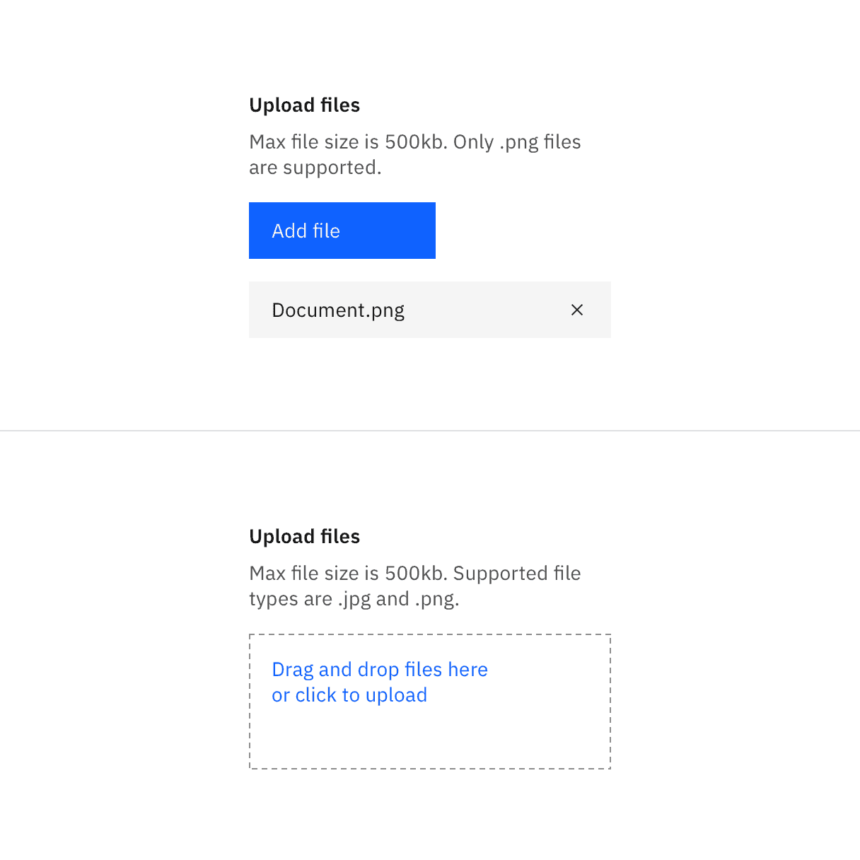
File uploader color
State | Element | Property | Color token |
|---|---|---|---|
Hover | Drop zone text | text-color |
|
Drop zone container | border |
| |
Focus | Delete icon | border |
|
Drop zone container | border |
| |
Loading | Loader | See inline loading | |
Uploaded | Checkmark icon | svg |
|
Invalid | File | border |
|
Error title | text-color |
| |
Error message | text-color |
| |
Warning icon | svg |
| |
Divider | border-top |
| |
Disabled | Label | text-color |
|
Description | text-color |
| |
Drop zone text | text-color |
|
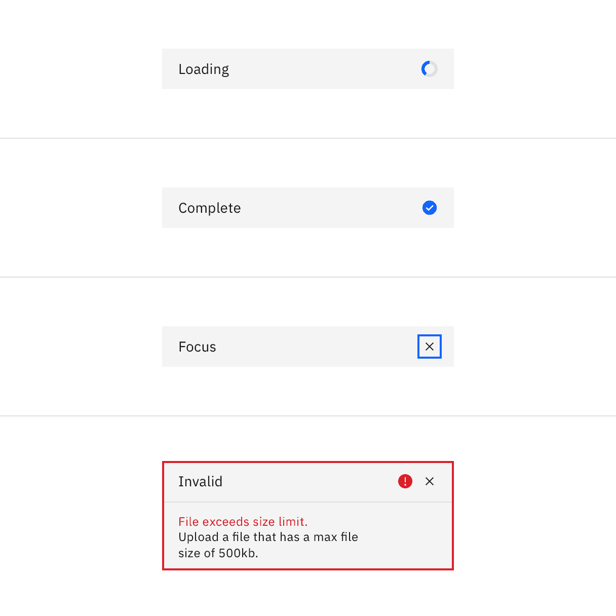
Selected file states: loading, complete, focus, invalid.
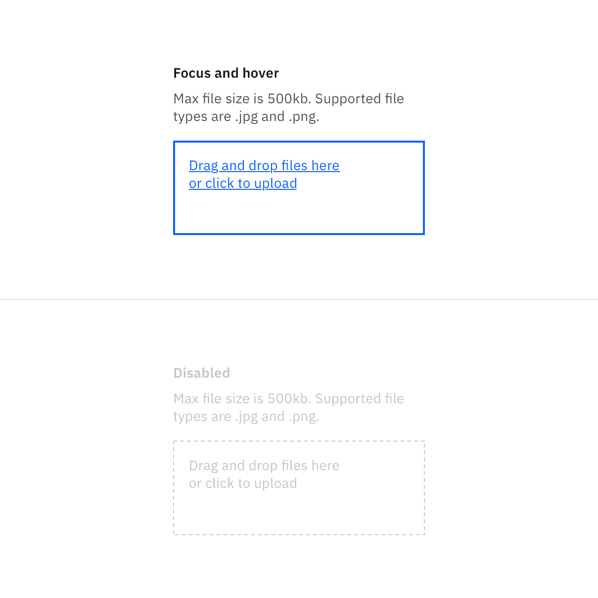
Drag and drop file uploader states.
Element | Font-size (px/rem) | Font-weight | Type token |
|---|---|---|---|
Heading | 14 / 0.875 | SemiBold / 600 |
|
Description | 14 / 0.875 | Regular / 400 |
|
Error message | 12 / 0.75 | Regular / 400 |
|
Drop zone text | 14 / 0.875 | Regular / 400 |
|
File name | 14 / 0.875 | Regular / 400 |
|
Element | Property | px / rem | Spacing token |
|---|---|---|---|
File | width | 288 / 18 | – |
padding-left | 16 / 1 |
| |
margin-bottom | 8 / 0.5 |
| |
padding-right | 16 / 1 |
| |
Delete icon | height, width | 16 / 1 | – |
margin-left, margin-right | 16 / 1 |
| |
Button | See primary button |
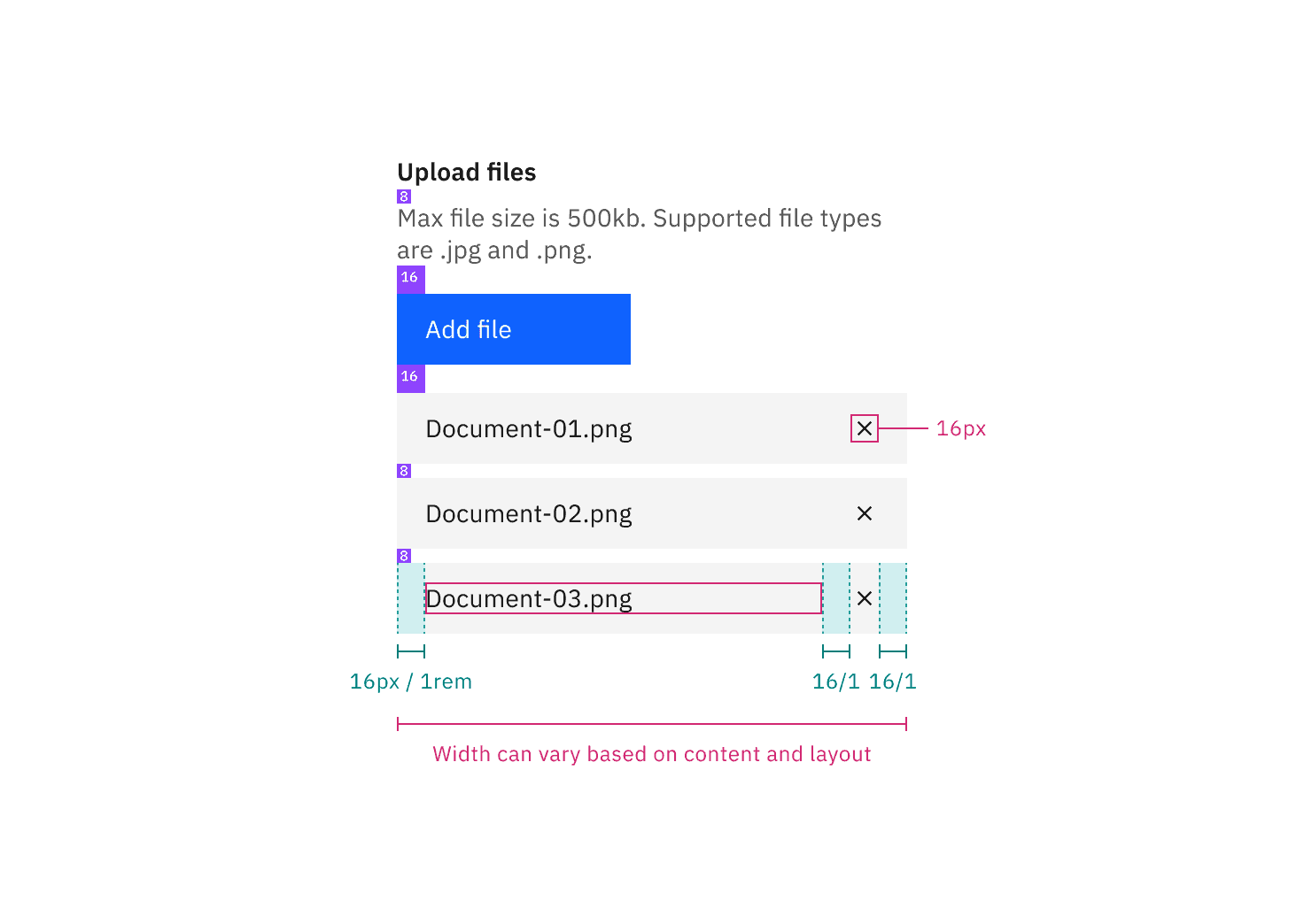
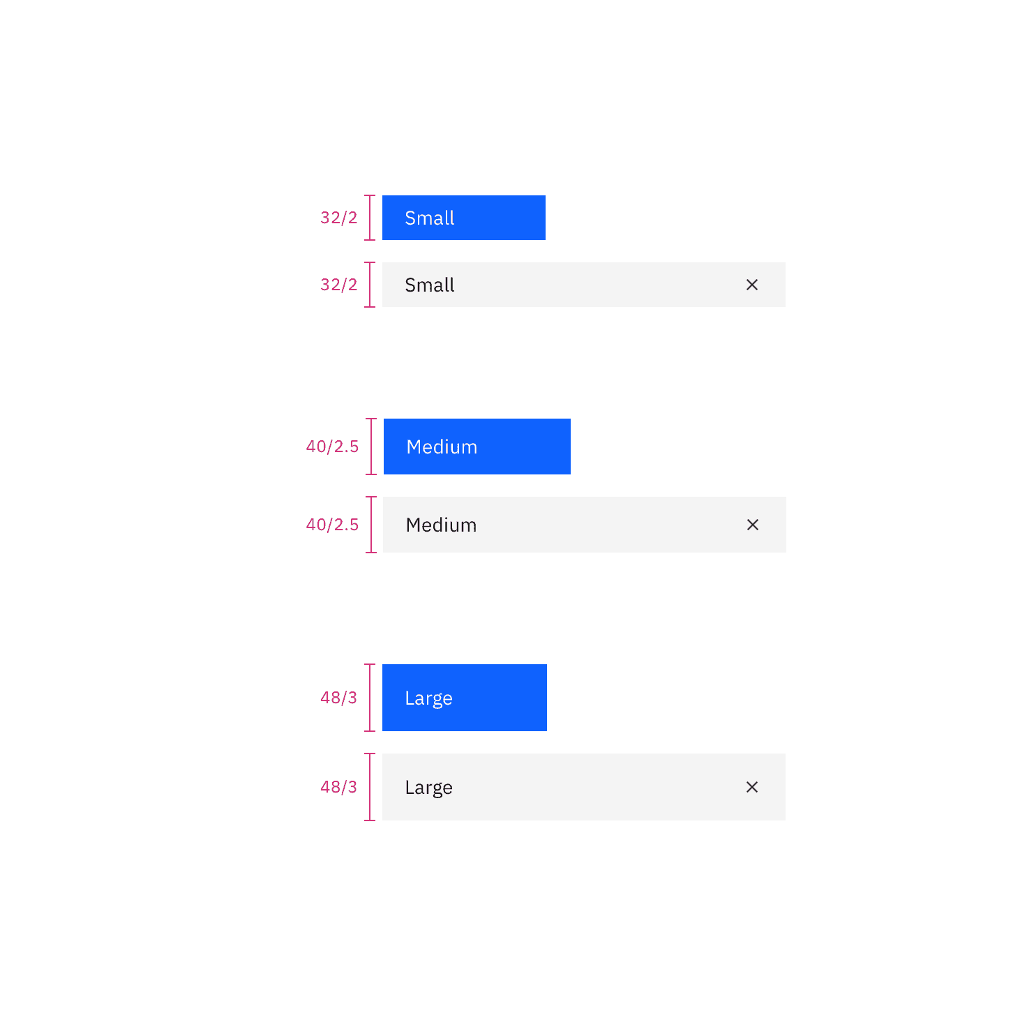
Structure and spacing measurements for file uploader | px / rem
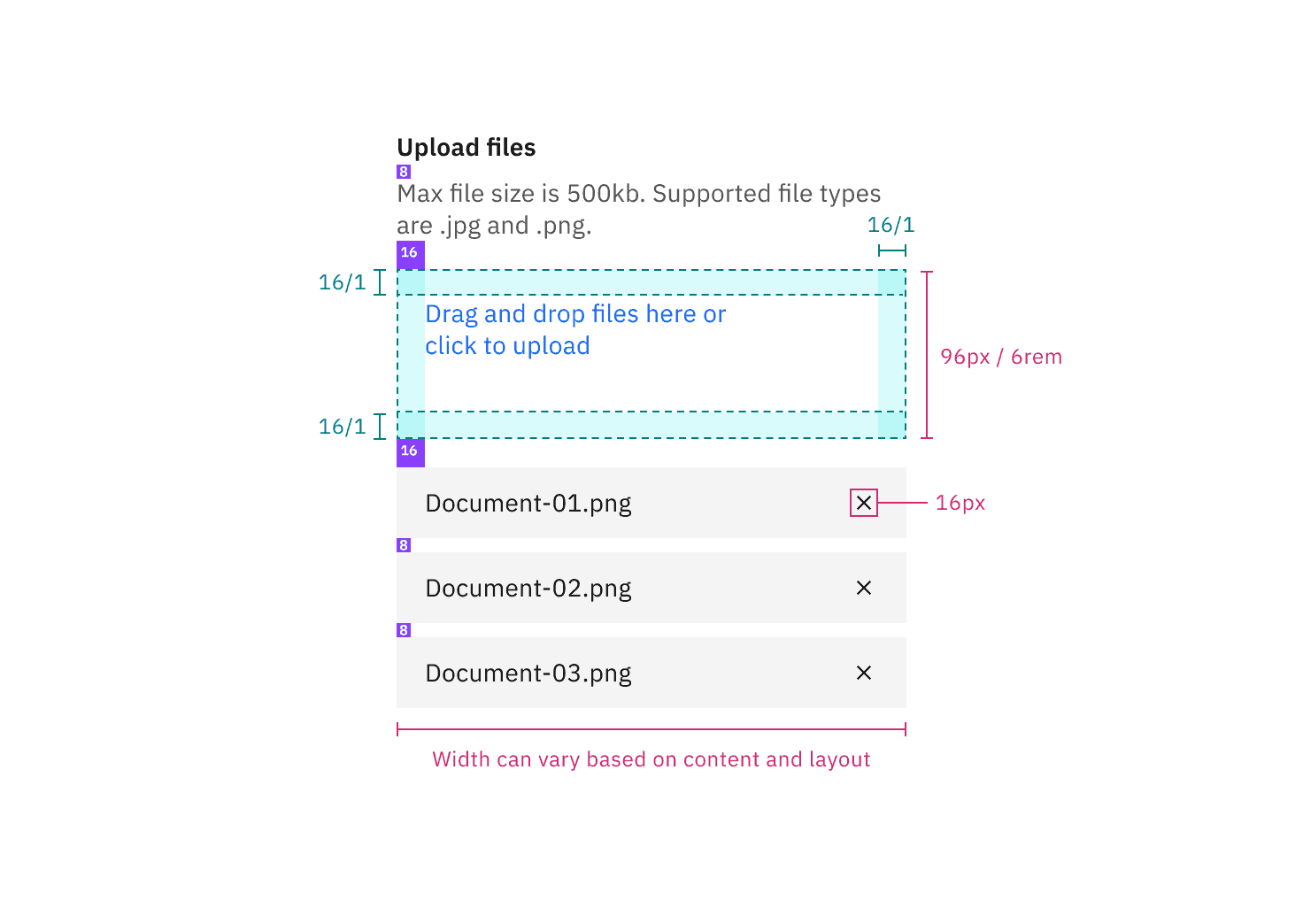
Structure and spacing measurements for drag and drop with multiple file upload functionality | px / rem
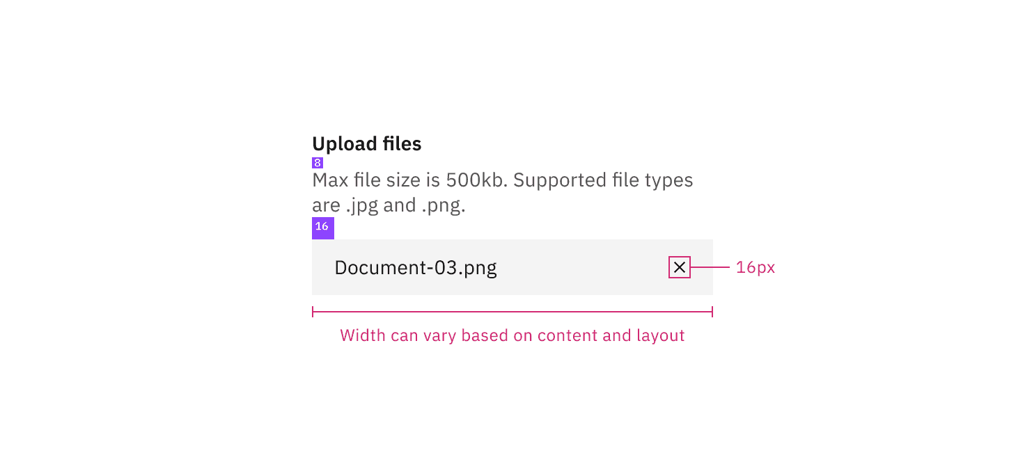
Structure and spacing measurements for drag and drop with single file upload functionality | px / rem
Feedback
Help us improve by providing feedback, asking questions, requesting features, or leaving any other comments on GitHub.