Pagination
Pagination splits content or data into several pages, with a control for navigating to the next or previous page.
Live demo
This live demo contains only a preview of functionality and styles available for this component. View the full demo on Storybook for additional information such as its version, controls, and API documentation.
Accessibility testing statusFor every latest release, Carbon runs tests on all components to meet the accessibility requirements. These different statuses report the work that Carbon has done in the back end. These tests appear only when the components are stable.
For every latest release, Carbon runs tests on all components to meet the accessibility requirements. These different statuses report the work that Carbon has done in the back end. These tests appear only when the components are stable.
Overview
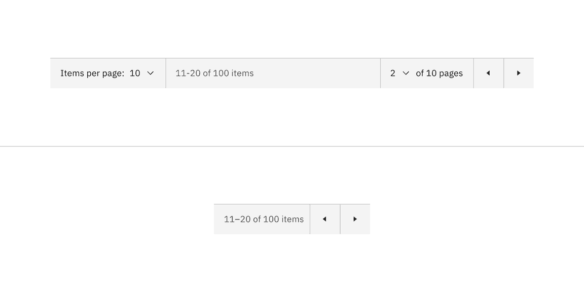
Pagination organizes and divides large amounts of content on separate pages and gives the user control over how much content they want to view on each page. Pagination can be used with a data table or on a page.
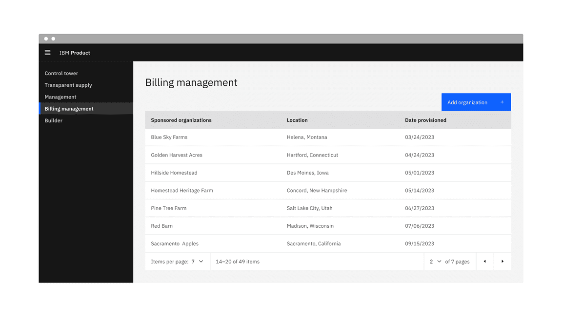
Example of the pagination component in a UI
When to use
- When it could take a considerable amount of time to load the available data at once or in a scrolling view
- When there is too much data to display on one page or within one view of a component
- To make large amounts of data more accessible to consume by users
- To optimize on-page real estate
- To give users more control over how they view large amounts of information
When not to use
- Do not use it to display linear journeys, for example, in a form progression. Instead, use the progress bar or button components to navigate forward and backward.
- Do not use pagination superfluously, and aim to use it to improve usability or performance.
Variants
| Variant | Usage |
|---|---|
| Pagination | The pagination variant is typically connected at the bottom of the data table component to help paginate large amounts of data. |
| Pagination nav | The pagination nav variant is mainly used in on-page situations to help paginate either a whole page or sections of a page. |
Formatting
Anatomy of pagination

Anatomy of the pagination variant
- Items per page: Shows the current number of items that appear per page.
- Range of items: Shows the current range of items and lists the total amount of items.
- Current page: Shows the current page the user is on and lists the total amount of pages.
- Previous and next buttons: Buttons that take you to the previous or next page.
- Container: The container bar of the whole pagination component.
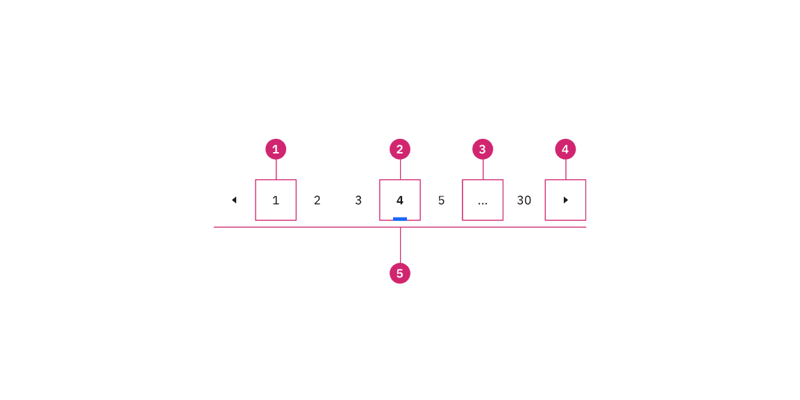
Anatomy of pagination nav
Anatomy of the pagination nav variant
- Unselected page button: A page the user could select and view.
- Selected page button: The current page the user is viewing.
- Overflow button: Contains available pages that can be navigated to but cannot be shown upfront in the component because of the current viewport.
- Previous and next buttons: Buttons that take you to the previous or next page.
- Container: The container of the whole pagination component.
Sizing
The pagination component is available in three sizes in both variants: large, medium, and small.

Sizes of pagination

Sizes of pagination nav
Data table size pairings
We recommend using the same height pagination as you do for the data table component rows to which it is connected. In some cases, the height sizes of these two components will not be the same because we do not offer extra small and extra large sizes for pagination. When using the extra large data table row height, use the large pagination. When using the extra small data table row height, use the small pagination.
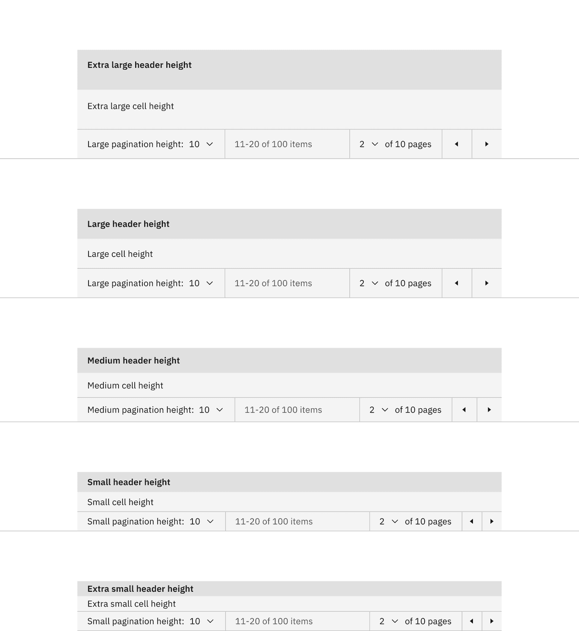
Size pairings of the pagination and data table components
Placement
Place the pagination near the related component or area of the page where the information will be paginated.
Placing pagination with data table
When using the pagination variant with a data table, the pagination should be stacked and below the table with no padding between them.

Placement of the pagination variant
Do stack the pagination component below the data table.

Do not stack the pagination component above the data table.
Placing pagination nav on a page
When using the pagination nav variant on a page, float it below the content to which it is paginating and related to. The pagination can be right aligned or left aligned to the content above it. When it doubt, choose right alignment.

Placement of the pagination nav variant
Content
Main elements
Label text
The label text in the pagination component should be concise and instructional. It describes the items per page and the number of pages or items. We recommend not modifying the label text unless necessary for specific use cases.
Select component option text
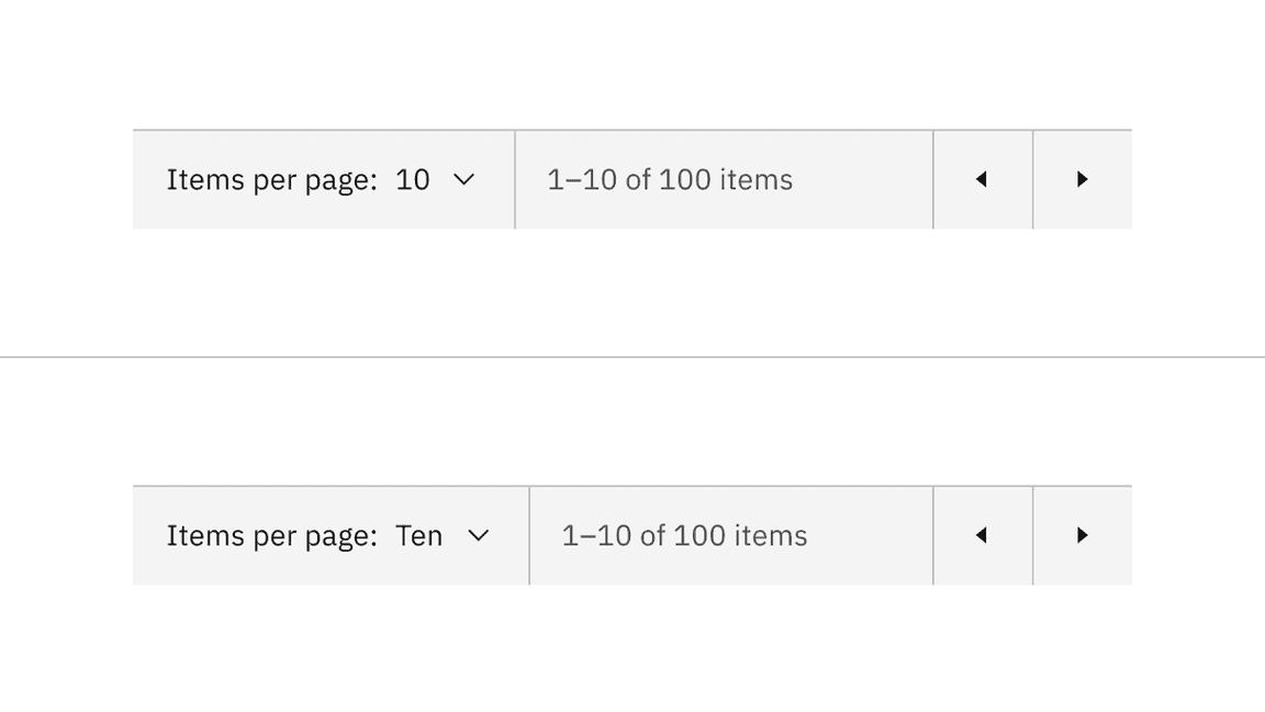
The select components option text is shown as a number, indicating the items per page and the current page. Alternatively, this can be indicated as a word for the “Items per page” selection instead of a number.
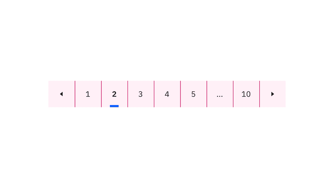
Overflow content
In the pagination nav variant, an ellipsis button appears between pages to indicate that there are numerous pages to navigate to within the ellipsis button menu. We recommend never placing the ellipsis button at the beginning or end of a series of pages in the pagination component.

Example of the ellipsis button for overflow content in the pagination nav variant
Further guidance
For further content guidance, see Carbon’s content guidelines.
Pagination
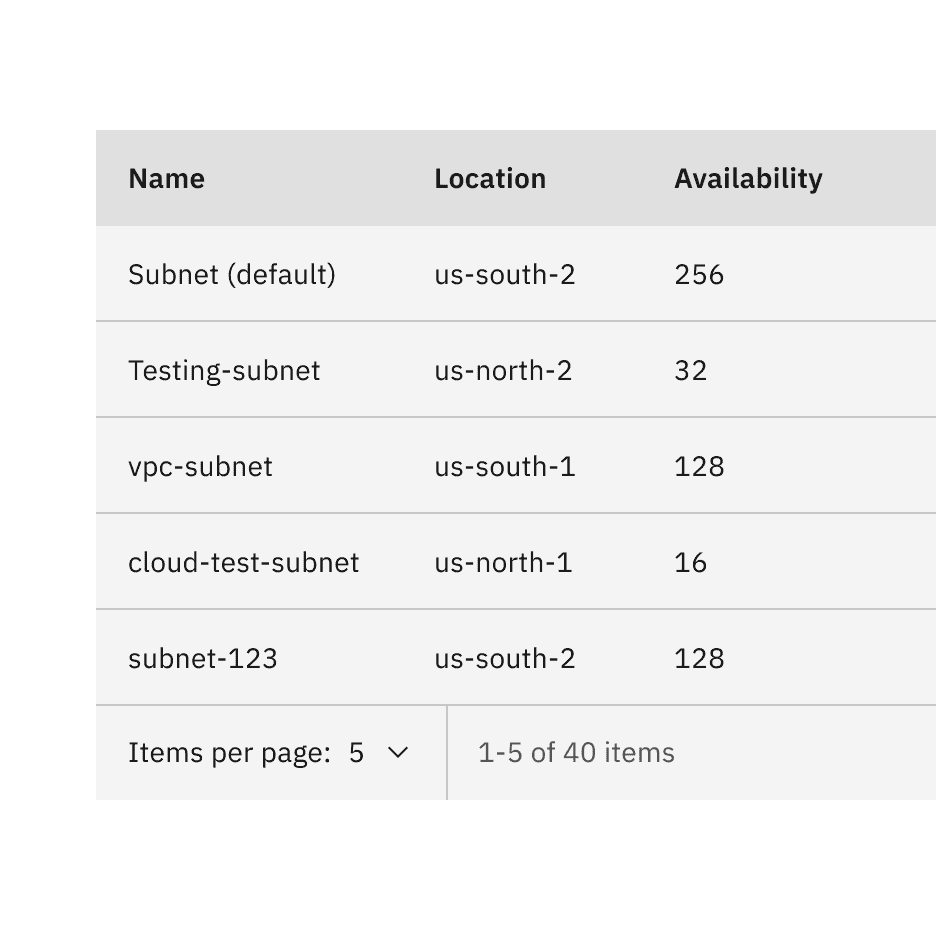
The pagination variant is typically a bar attached to the bottom of a data table to paginate its data.

Example of the pagination variant in a UI
States
The pagination variant has the select component and ghost icon button component nested within it and inherits their component states. For more information on these states, refer to the select and ghost icon button style tab guidance.
Interactions
Mouse
- Clicking on the select component will open the menu and reveal options.
- To close the menu, choose a different option or click outside the menu area.
- Clicking on a previous or next button will navigate you to the previous or next page.
Keyboard
- On focus, the select component menu is opened with pressing or withSpaceorUparrows which also cycle through the values.Down
- Pressing orSpaceselects a value and closes the menu.Enter
- The menu can be closed by pressing .Esc
- The previous and next ghost icon buttons are activated by pressing orSpace.Enter
Responsive behavior
The pagination variant retains all its content and nested components at every breakpoint except for the small breakpoint. The select components have been removed at the small breakpoint, but information on the total number of items, items being displayed, and previous and next buttons remain.
Pagination variant responsive behavior in all breakpoints versus the small breakpoint
Clickable areas
Within the pagination variant, there are four clickable areas. Two select components allow you to change the number of items per page and the page number. Two ghost icon buttons take you to the previous or next page.
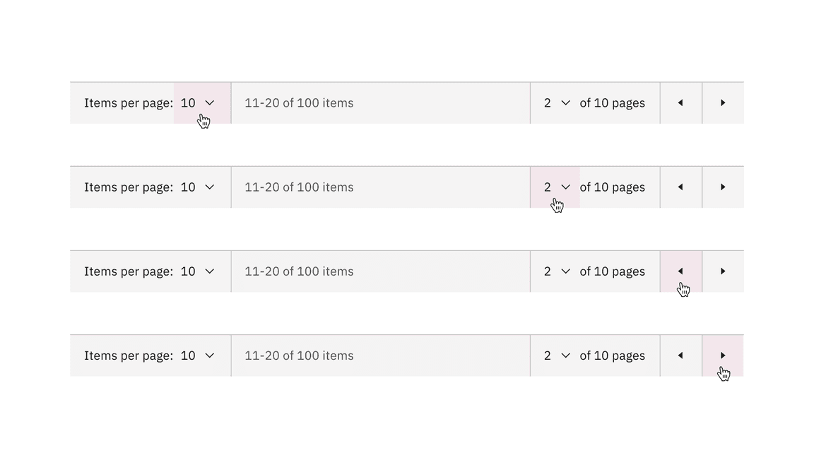
Pagination variant clickable areas
Pagination nav
The pagination nav variant is most commonly used to paginate full pages or sections of content on a page. It floats under and near the related content.
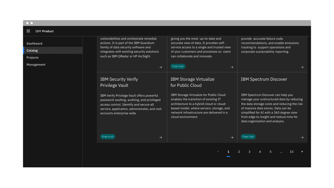
Example of the pagination nav variant in a UI
States
The pagination nav variant has the ghost icon button component and the
breadcrumb overflow button component nested within it that inherits their
component states. For more information on these states, refer to the
select and
breadcrumb overflow button
style tab guidance.
Interactions
Mouse
- Clicking on a button number will navigate you to that page.
- Clicking on a previous or next caret button will navigate you to the previous and next pages of the one you are currently viewing.
- Clicking on an overflow ellipsis button will open a select menu to choose a page to navigate to. Upon clicking on a page option from the menu, you will navigate to that page.
Keyboard
- The icon button receives focus and you can move between buttons by pressing
the orUparrows.Down
- The page number buttons are activated by pressing orSpace.Enter
- The previous and next buttons are activated by pressing orSpace.Enter
Responsive behavior
In small screens, the pagination nav variant can provide an ellipsis button to indicate there are more pages to navigate to within the ellipsis button menu.

Pagination nav variant responsive behavior in large versus small breakpoints
Clickable areas
Every button in the pagination nav variant is clickable. Two ghost icon buttons take you to the previous or next page. The rest of the page number buttons take you to that particular page.
Clickable areas within the pagination nav variant
Modifiers
Page looping
For the pagination nav variant, instead of turning off the previous or next caret buttons when you reach either the first or last page of the pagination component, you can enable the option to loop through the available pages continuously.
Page naming
By default, the select component option text is displayed as a number, showing items per page and the current page. However, we offer an alternative option to use a word instead of a number for the “Items per page” selection if that better meets your requirements.
Select components content alternative of numbers versus words
Related
Feedback
Help us improve this component by providing feedback, asking questions, and leaving any other comments on GitHub.