UI shell header
Design annotations are needed for specific instances shown below, but for the standard UI shell header component, Carbon already incorporates accessibility.
What Carbon provides
The Carbon header bakes in keyboard interaction, including a skip-to-main-content mechanism. Carbon also supports assistive technologies such as screen readers by setting labeling and page structure.
Keyboard interaction
Each element in the header can be reached by the
Tab
Enter
Space
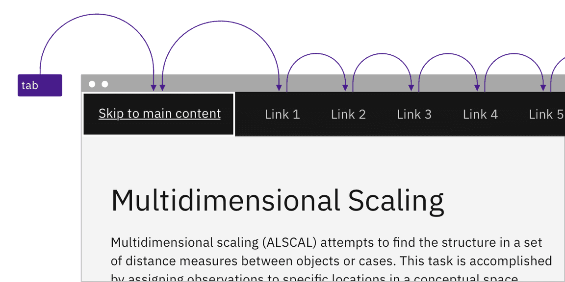
Pressing the Tab key reveals a ‘Skip to main’ link and then moves between other header elements.
Regions
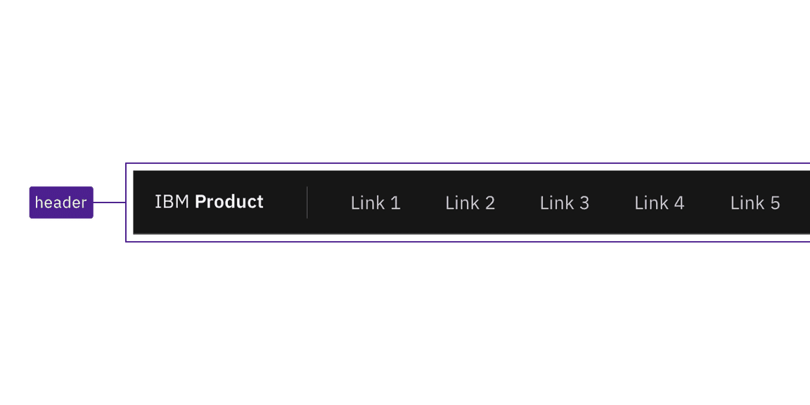
Carbon applies a header region around the whole UI shell header.
Labeling
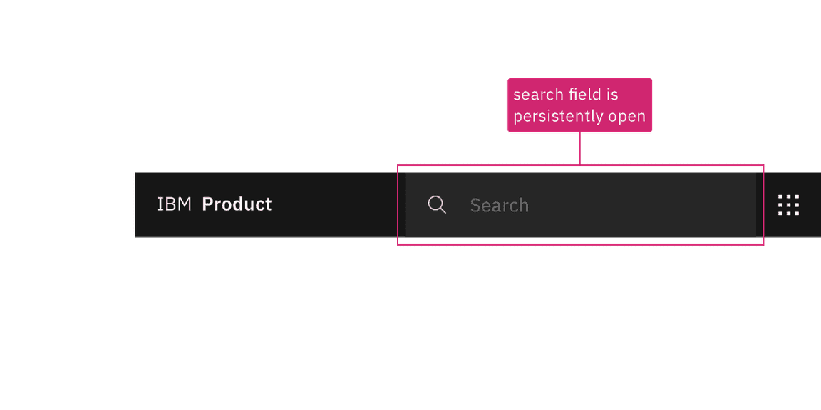
Carbon provides default names for each icon-only button in the header, and these names are revealed on hover or focus. Interactions for some header components are covered under other component topics such as search, notifications, and the UI shell right panel switcher.
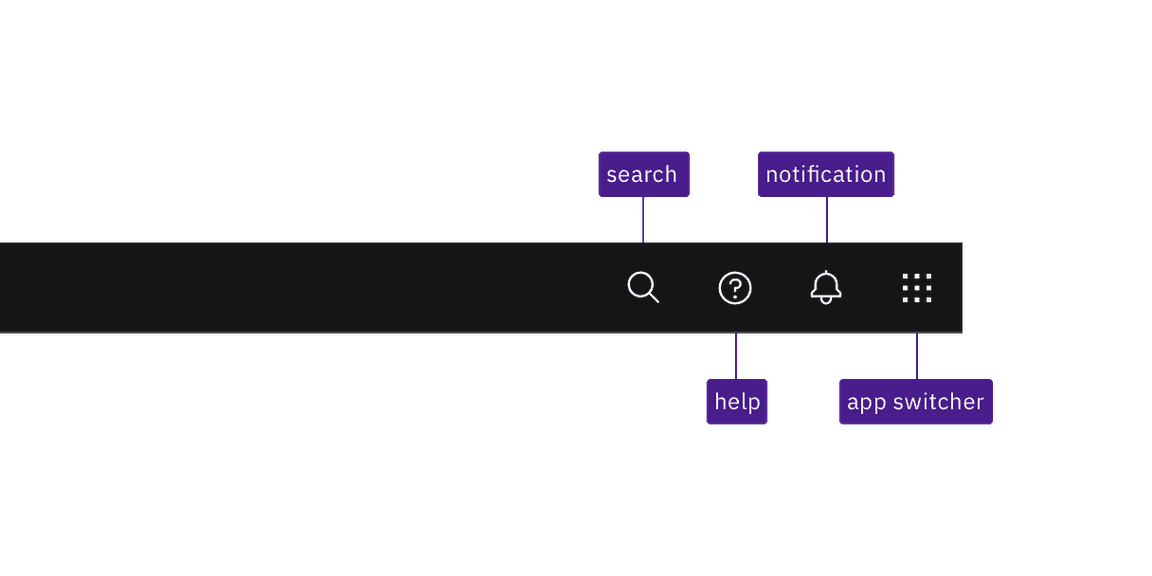
Carbon provides default names for its icon-only components and reveals them on hover or focus.
Design recommendations
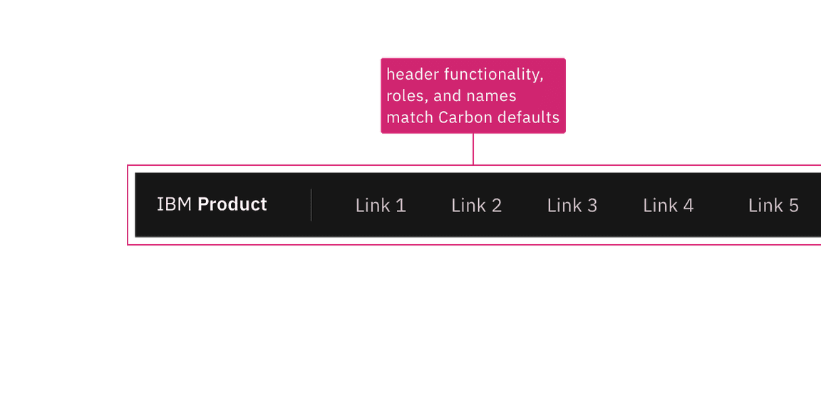
For every product, there should be a one-time design exercise to annotate the UI shell keyboard interaction. This is an important step to carry out, since header functionality and component names vary significantly between products, even though they appear similar until interacted with. Annotating expected behavior increases consistent implementation. Where the product does not deviate from the standard Carbon implementation, it can merely be annotated that the behavior matches what is in the ‘How Carbon works’ section.
Annotate the header, even if your design matches the default Carbon UI shell header behavior.
Once a product-specific header annotation exists, individual product pages only need to annotate the header if something differs.
Where the header deviates from the default Carbon behavior or labeling, it should be annotated. Such annotations could call out different labels for icons or indicate interaction changes such as keyboard navigation.
Annotate if the design modifies the default keyboard or component interaction.
Development considerations
Keep these considerations in mind if you are modifying Carbon or creating a custom component.
- Carbon uses the HTML 5 component instead of an ARIA landmark to set the region.header
- Carbon includes the “Skip to main content” link as the first item on the page
with a , but hides it through CSS until it receives focus.tabindex="0"
Accessibility testing statusFor every latest release, Carbon runs tests on all components to meet the accessibility requirements. These different statuses report the work that Carbon has done in the back end. These tests appear only when the components are stable.
For every latest release, Carbon runs tests on all components to meet the accessibility requirements. These different statuses report the work that Carbon has done in the back end. These tests appear only when the components are stable.
Latest version: | Framework: React (@carbon/react)
| Component | Accessibility test | Status | Link to source code |
|---|---|---|---|
| UI shell | Test(s) that ensure the initial render state of a component is accessible. | Passes all automated tests with no reported accessibility violations. | GitHub link |
| Tests that ensure additional states of the component are accessible. This could be interactive states of a component or its multiple variants. | Passes all automated tests with no reported accessibility violations. | ||
| Tests that ensure focus is properly managed, and all interactive functions of a component have a proper keyboard-accessible equivalent. | Passes all automated tests with no reported accessibility violations. | ||
| This manual testing ensures that the visual information on the screen is properly conveyed and read correctly by screen readers such as JAWS, VoiceOver, and NVDA. | A human has manually tested this component, e.g. screen reader testing. |