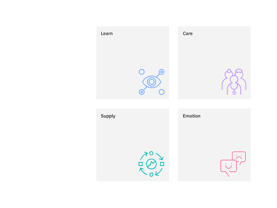
Productive versus expressive
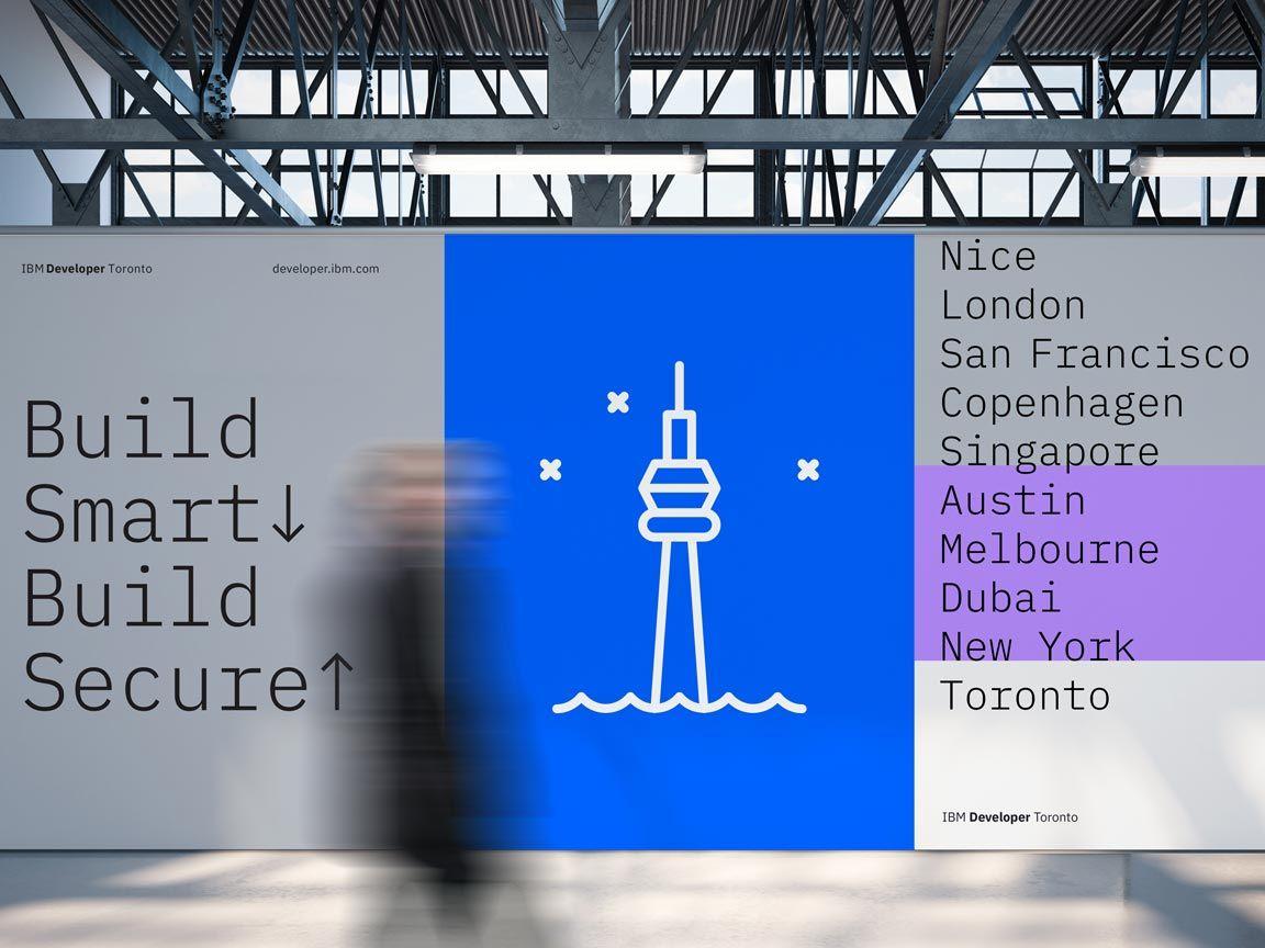
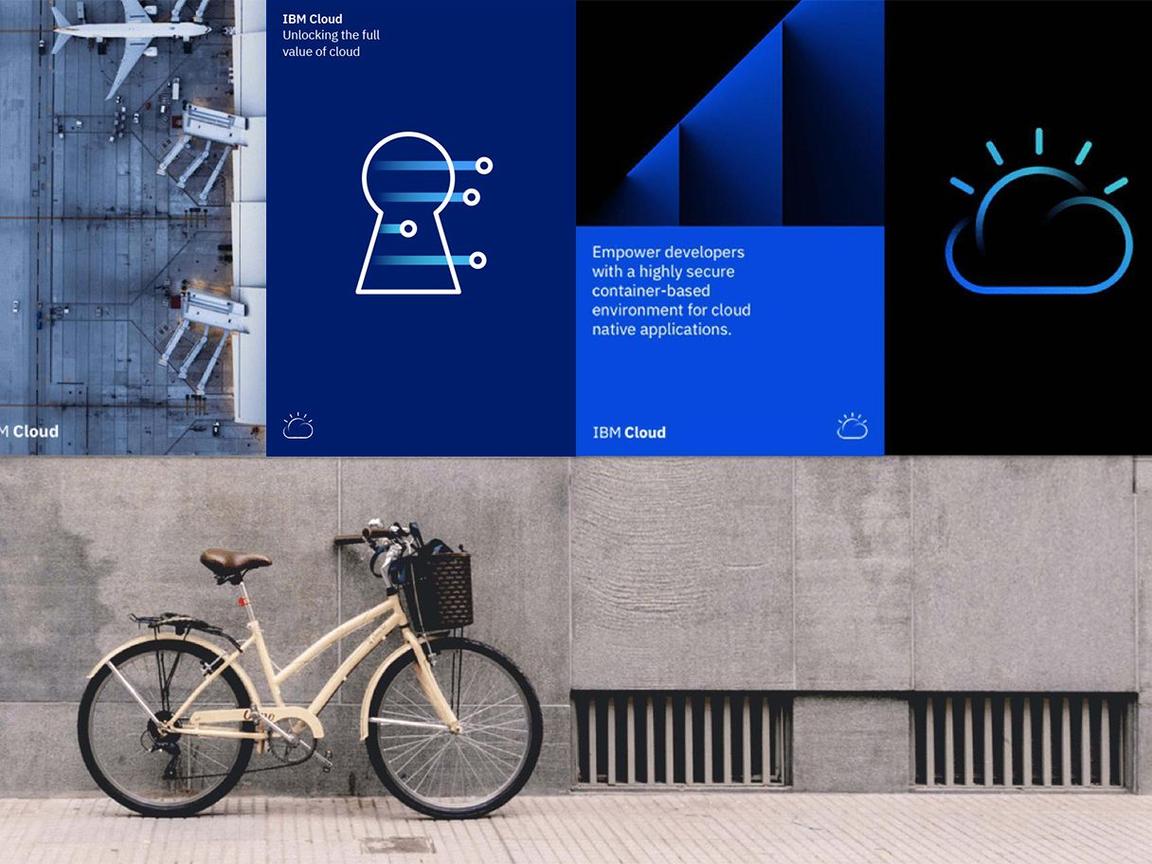
Productive and expressive pictograms are two distinct types of artwork that work best in different contexts. Productive pictograms are the go-to pictogram type for most contexts; they work across a variety of scales and environments whether physical or digital. They’re illustrative and simple, allowing for one or many to be used to convey complex ideas.
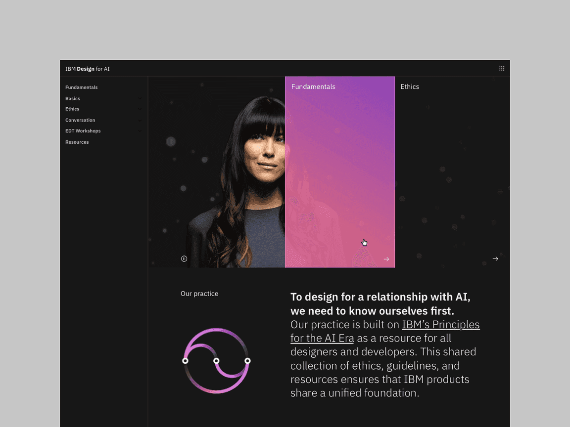
Expressive pictograms represent a more dynamic option to the standard pictogram, using gradients, layering and transparency to build a sense of depth and movement in the artwork. Due to their visual complexity, expressive pictograms should be used selectively and only in scenarios that call for a graphic with strong presence.

Productive pictograms in context
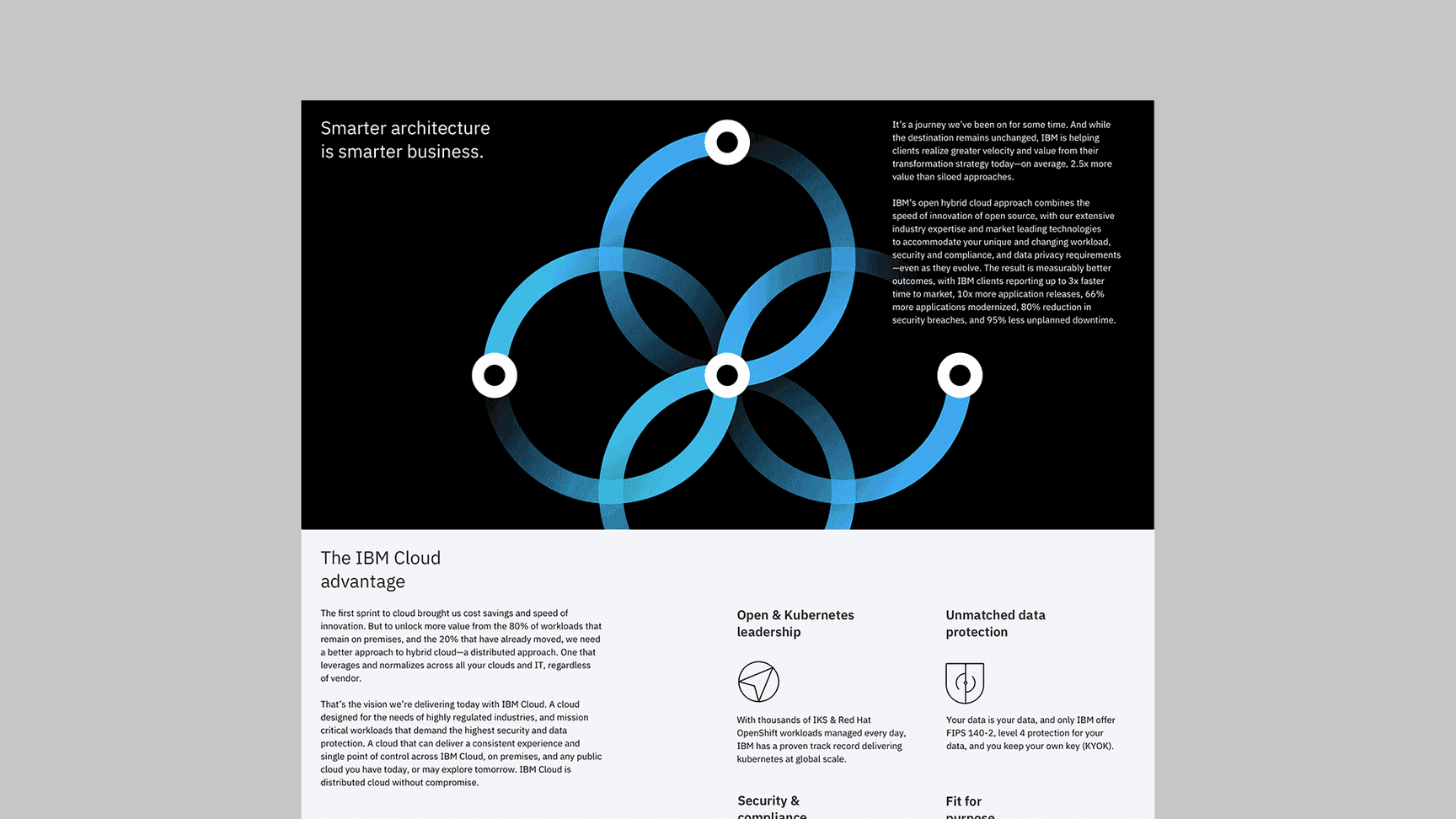
Expressive pictogram in context

Treat pictograms as illustrations with sufficient sizing.

Don’t use pictograms as a replacement for UI icons, that is not their purpose.

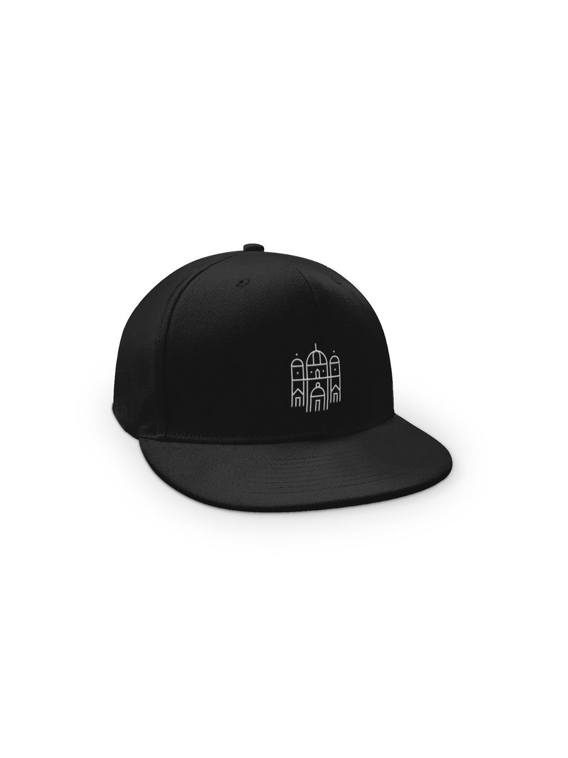
Don’t use productive pictograms as logos or in a lockup for product headers, merchandise or events.

Don’t use expressive pictograms as logos or in a lockup for product headers, merchandise or events.
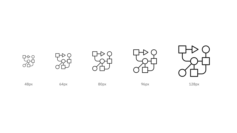
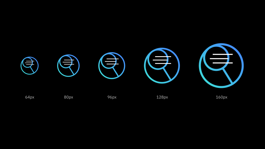

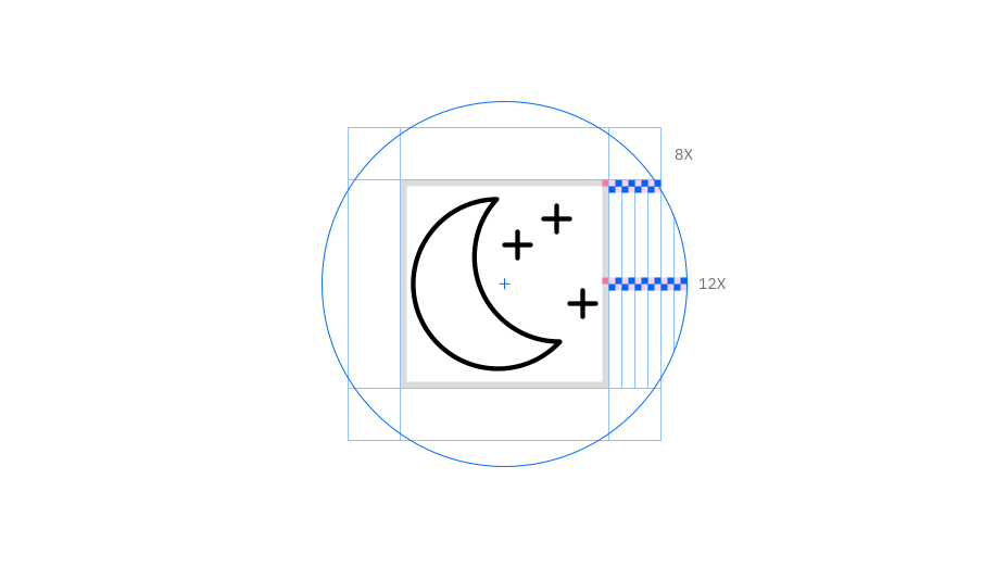
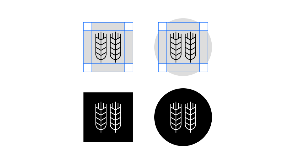
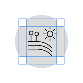
Keep pictograms at scale and optically center in container when necessary.
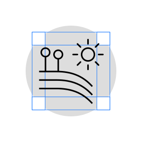
Don’t resize pictograms outside of accepted proportions.

Do use accepted shapes: circle or square for containers.

Don’t create new shapes for containers.

Always optically center align pictograms in their containers.

Don’t crop pictograms in container.
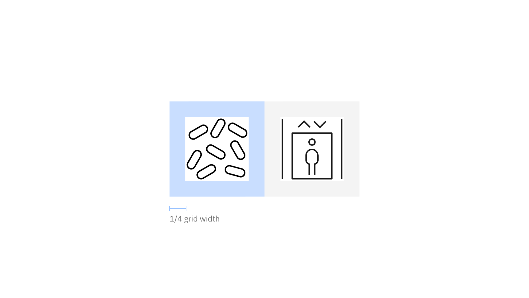
Padding and spacing rules apply whether using pictograms with or without containers.
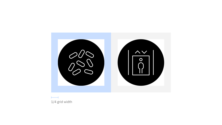
Padding starts at the edge of the container shape.
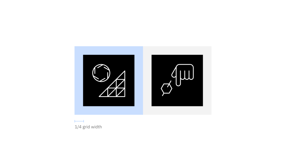
Padding is the same for both circle and square containers.

Follow the clearance rule to allow for legibility and touch.

Don’t collapse the pictogram clearance area.
Color
Pictograms on backgrounds must always pass color contrast requirements. When pairing pictograms with backgrounds, follow color family rules to ensure that the pictogram does not clash with or blend into the background. Dark background colors should range between values 70–100 while light backgrounds should not exceed values 10–20.


Follow the 5-step color rule and only match tones from the same color family or use grayscale backgrounds.

Follow gradient rules when placing them on backgrounds.

Don’t place dark tones on dark backgrounds.

Don’t place light tones on light backgrounds.

Don’t place gradient pictograms on backgrounds that are not 80 and above or 20 and below.

Don’t place gradient pictograms on gradient backgrounds.

Background color value | Pictogram theme |
|---|---|
White, 10–20 | Light |
30–50 | Monochromatic light (Black) |
50–70 | Monochromatic dark (White) |
80–100, Black | Dark |

Use dark-theme pictograms on dark backgrounds and light-theme pictograms on light backgrounds.

Don’t use light-theme pictograms on dark backgrounds or dark-theme pictograms on light backgrounds.

Don’t place expressive pictograms on backgrounds that aren't 80 and above or 20 and below.

Don’t place expressive pictograms on gradient backgrounds.