

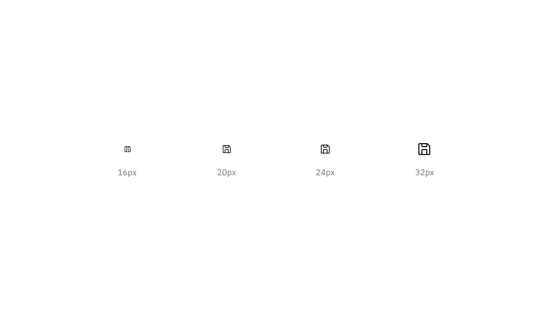
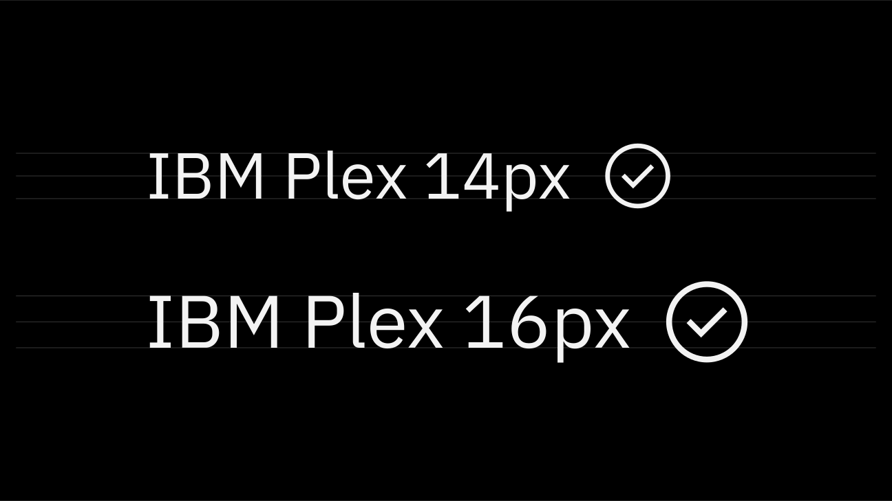
16px and 20px icons are optimized to feel balanced when paired with 14px and 16px IBM Plex. Use 24px and 32px when larger icons are needed.

Do use the correct icon size with IBM Plex.

Don’t alter the icon-text size ratio.

A 22px icon centered in a 48px touch target.
Color
Icons are always a solid, monochromatic color and need to pass the same color contrast ratio as typography (4.5:1). The color of the icon should reflect the importance of the icon’s action which should always be to help guide a user. For more information on color, see the Color guidelines.
It’s also important to note that Carbon v10 icons themselves do not have interaction states, only their backgrounds do.

Do match your icon color with your text color when pairing them.
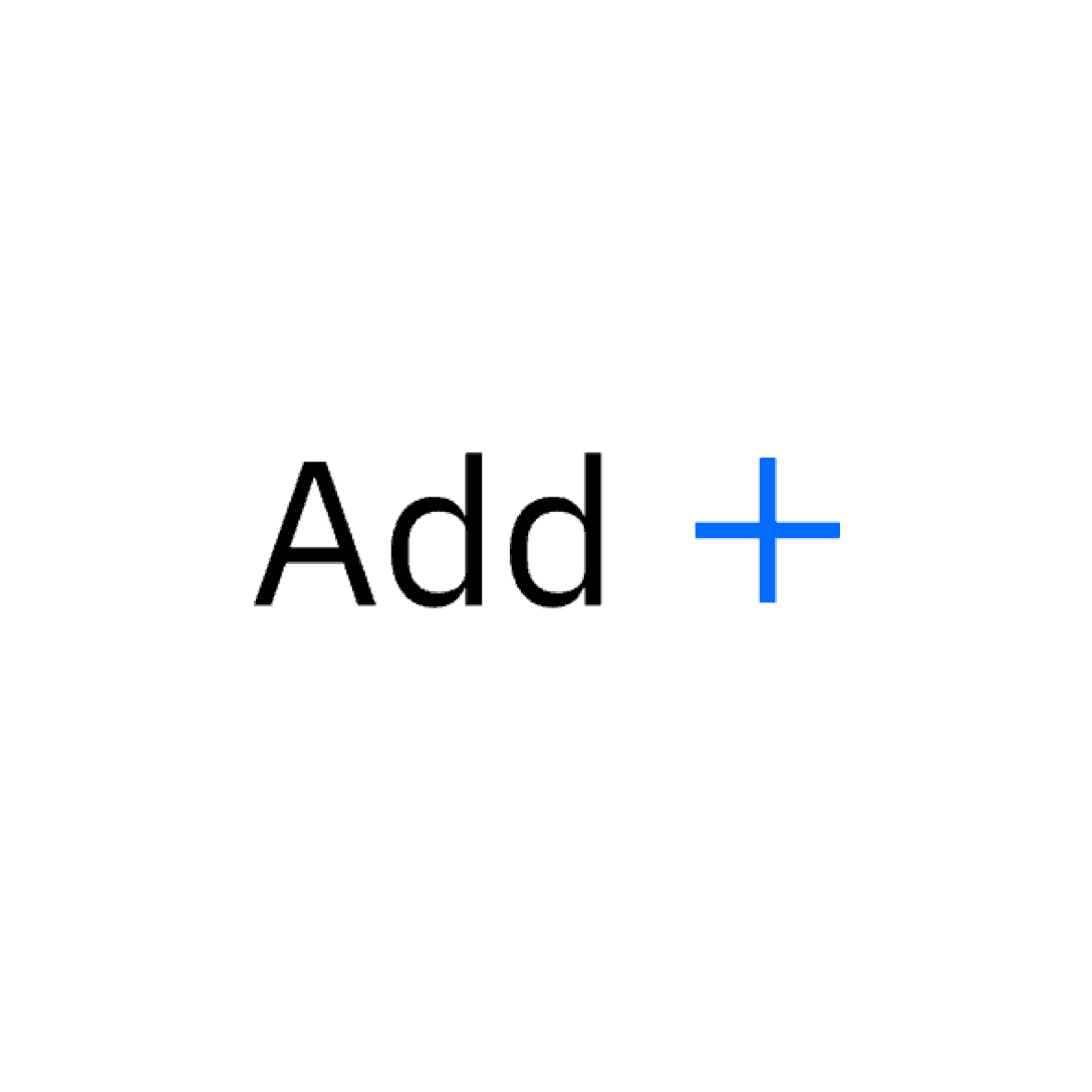
Don’t use different colors for text and icons.

Do center-align icons when they’re next to text.

Don’t baseline-align icons to the text.