Carbon Design System

UI shell header

Stable
Last updated Oct 2, 2026

The UI shell header is part of the Carbon UI shell, providing shared interaction patterns that create a consistent experience across products.

UI shell header

Color

The UI Shell can be customized to use any of the four IBM themes by applying an inline theme to the shell zone.

Element

Property

Color token

Header

background color

$background

border-bottom

$border-subtle

Product name

text color

$text-primary

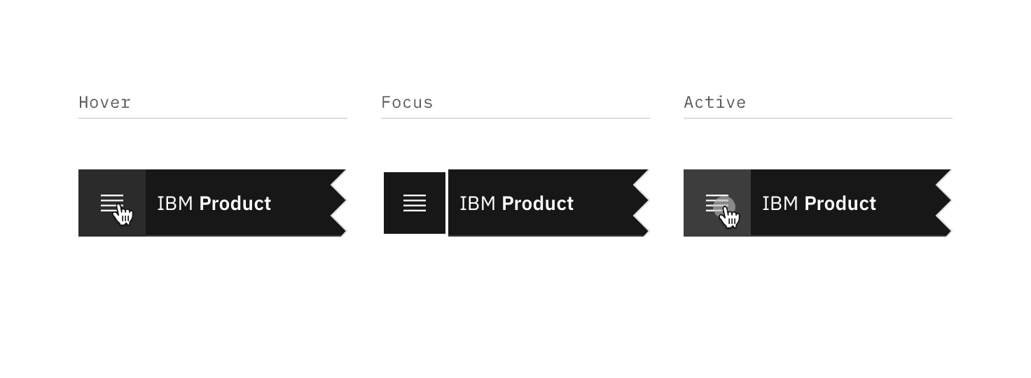
ui shell header

State

Property

Color token

Enabled

svg

$icon-primary

Hover

background color

$background-hover

svg

$icon-primary

Focus

border

$focus

Active

background color

$background-active

svg

$icon-primary

Menu trigger interactive states

Menu-trigger interactive states
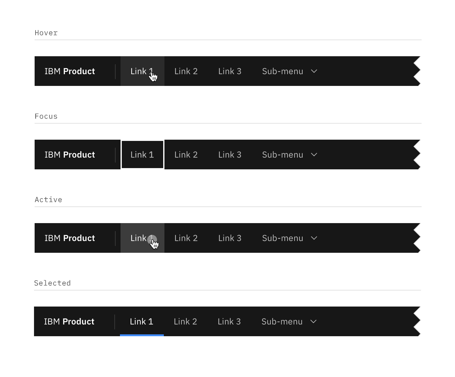
State

Property

Color token

Enabled

text color

$text-secondary

Hover

background color

$background-hover

text color

$text-primary

Focus

border

$focus

Active

background color

$background-active

text color

$text-primary

Selected

background color

$background

text color

$text-primary

border-bottom

$border-interactive

Menu item interactive states

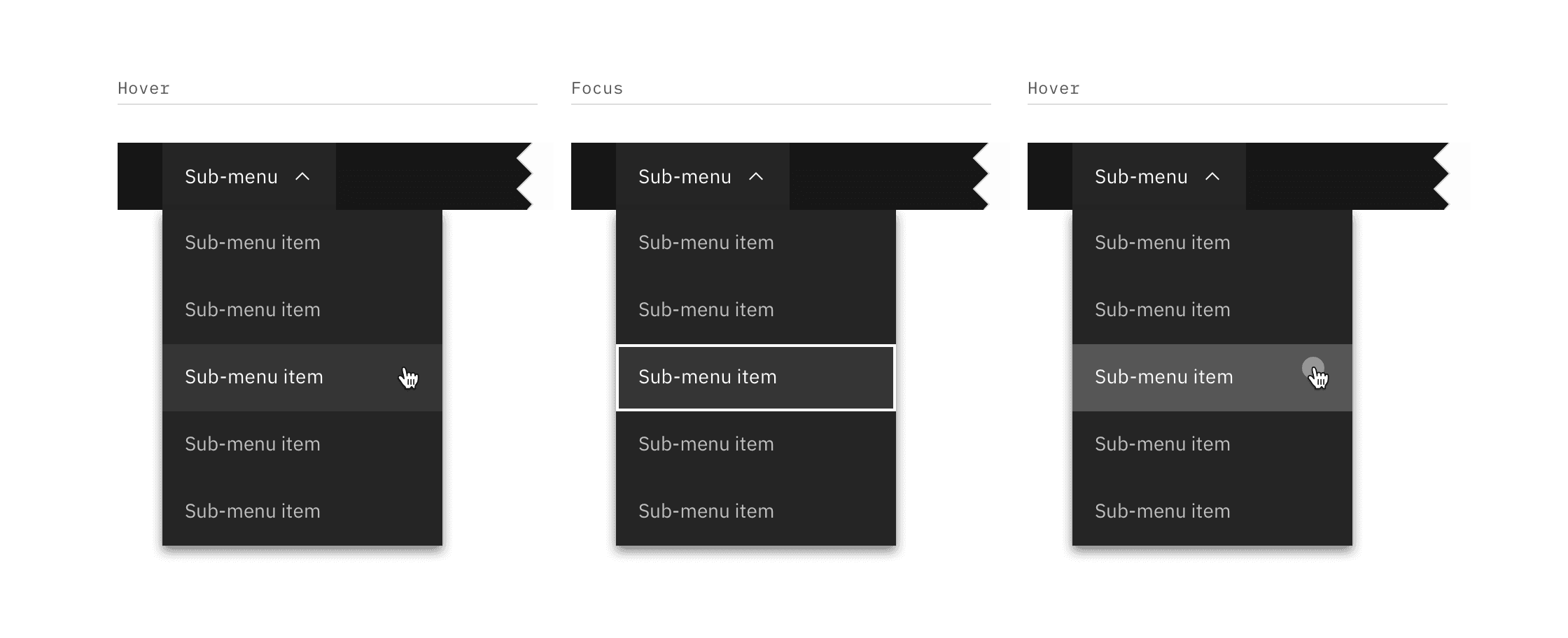
Sub-menu interactive states

Element

State

Property

Color token

Sub-menu

Enabled

background color

$background

text color

$text-secondary

svg

$icon-secondary

Hover

background color

$background-hover

text color

$text-primary

svg

$icon-primary

Focus

border

$focus

Active

background color

$background-active

text color

$text-primary

svg

$icon-primary

Selected

background color

$layer

text color

$text-primary

svg

$icon-primary

Item

Enabled

background color

$layer

text color

$text-secondary

svg

$icon-secondary

Hover

background color

$layer-hover

text color

$text-primary

svg

$icon-primary

Focus

border

$focus

Active

background color

$layer-active

text color

$text-primary

svg

$icon-primary

Selected

background color

$layer-selected

text color

$text-primary

svg

$icon-primary

border-left

$border-interactive

Sub-menu interactive states

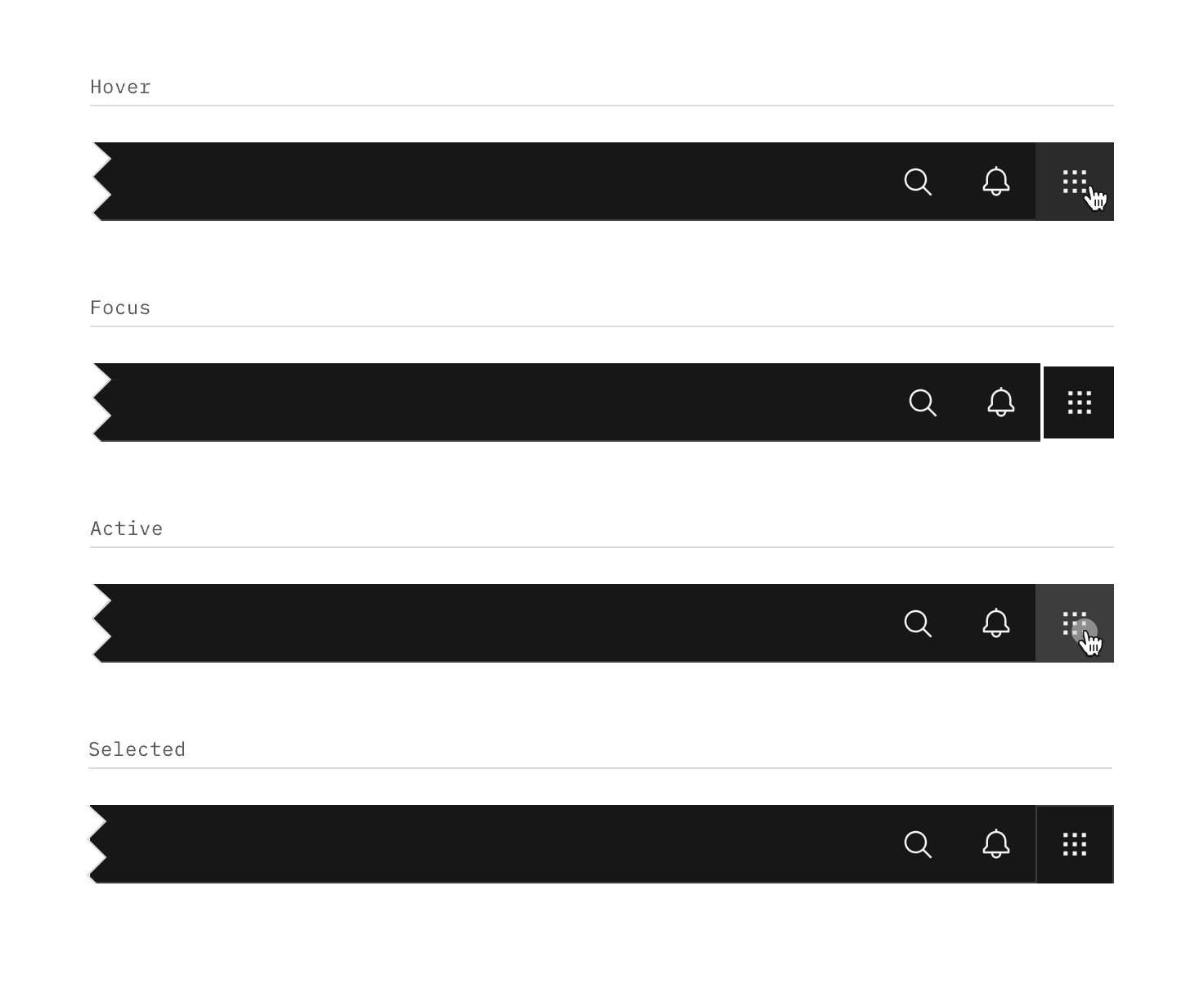
Header actions

State

Property

Color token

Enabled

svg

$icon-secondary

Hover

background color

$background-hover

svg

$icon-primary

Focus

border

$focus

Active

background color

$background-active

svg

$icon-primary

Selected

background color

$layer

border

$border-subtle

svg

$icon-primary

Header action interactive states

Header action interactive states

Typography

Menu labels and text should be set in sentence case.

Element

Font-size (px/rem)

Font-weight

Type token

Product name

14 / 0.875

SemiBold / 600

$heading-compact-01

Company prefix

14 / 0.875

Regular / 400

$body-compact-01

Header link

14 / 0.875

Regular / 400

$body-compact-01

Sub-menu

14 / 0.875

Regular / 400

$body-compact-01

Structure

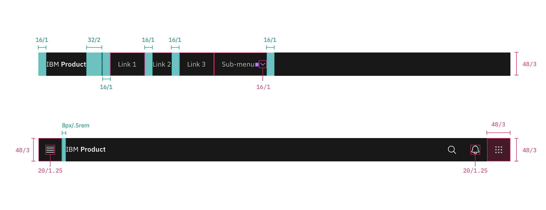
The header should span the full width of the browser window. The header can either stay sticky to the top of the browser or scroll away.

Element

Property

px/rem

Spacing token

Header

height

48 / 3

–

Menu

height, width

48 / 3

–

Product name

padding-left

16 / 1

$spacing-05

padding-right

32 / 2

$spacing-07

Link

padding-left, padding right

16 / 1

$spacing-05

Sub-menu

padding-left, padding right

16 / 1

$spacing-05

Chevron

padding-left

8 / 0.5

$spacing-03

Sub-menu item

padding-left, padding right

16 / 1

$spacing-05

Header action

height, width

48 / 3

–

ui shell header spec

Structure and spacing measurements for UI shell header | px | rem
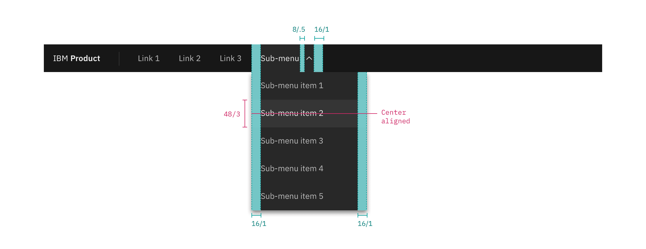
ui shell header submenu spec

Structure and spacing measurements for header submenu | px | rem
Responsive behavior

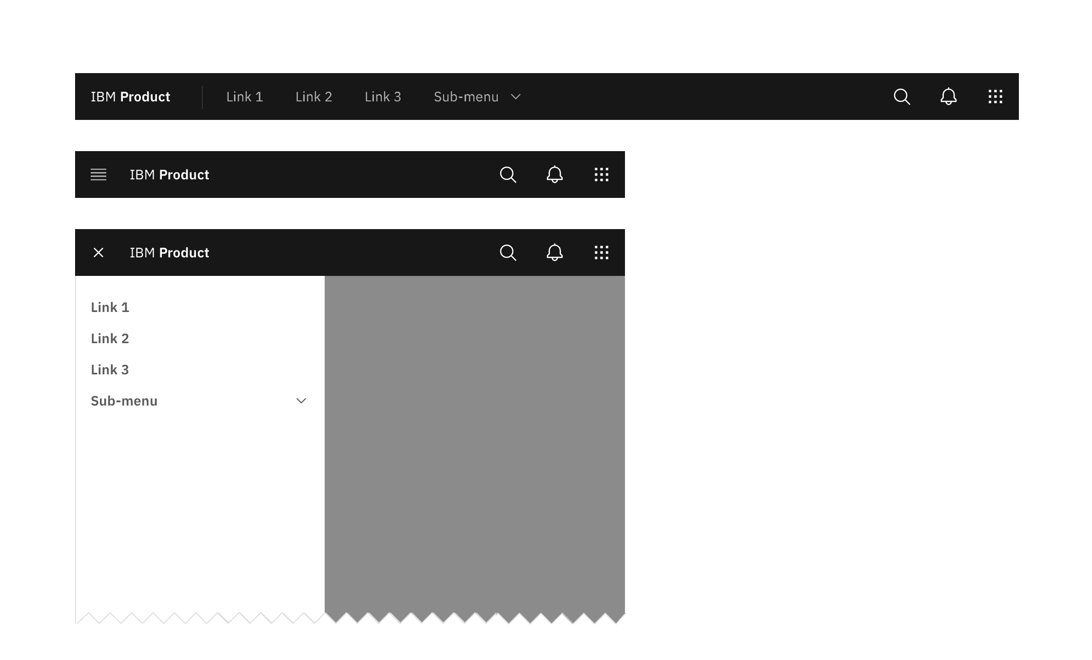
In smaller browser windows, menu items in the header should collapse into the left side nav menu. Items that were once in the header should stack at the top of the side nav panel if other items were already present in the panel.

responsive behavior example

Responsive behavior for UI shell header

Feedback

Help us improve by providing feedback, asking questions, requesting features, or leaving any other comments on GitHub.

UI shell header | Carbon Design System