Non-interactive and interactive tiles
A tile can serve as a non-interactive container that holds interactive elements or actions, such as buttons and links. Alternatively, it can be directly interactive—clickable, selectable, or expandable—without containing any interactive elements inside.
For non-interactive tiles, users can press Tab to navigate between actionable elements within a tile or tile group. After navigating through the last interactive element within a tile, users can press Tab to move outside of the tile—to the next tile in the group (if there is a group of tiles) or to the next component in the tab order.
For interactive tiles, users can press Tab to navigate between the tiles themselves. When tabbing through these tiles, a focus indicator appears around the currently selected tile, providing a visual cue that it is focused and ready to be interacted with. Users can press Enter to activate a clickable tile.
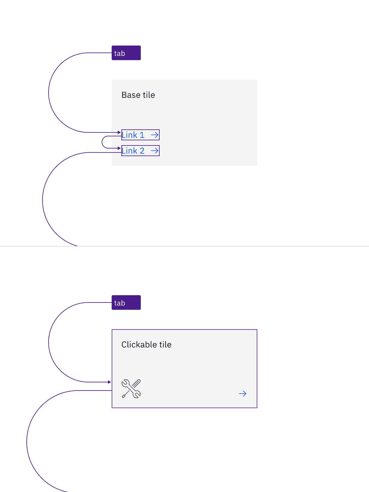
Example of tab stops for non-interactive tile with links and interactive tile without any other actions
Selectable tiles
Selectable tiles can be configured as either single-select or multi-select.
For single-select tiles, the group is treated as a single tab stop. By default, Carbon does not require any item to be pre-selected. If no selection is made, focus will land on the first item in the group. Users can navigate through the items using the arrow keys (up/down or left/right). Pressing Tab moves the focus out of the single-select tile group to the next component.
For multi-select tiles, each tile can be navigated pressing Tab and selected or unselected pressing Space or Enter.
These behaviors are based on radio button and checkbox components. This navigation difference is based on the principle that a checkbox represents one choice as a single element, while a group of radio buttons is treated as a single element because the buttons work together to form a mutually exclusive choice.
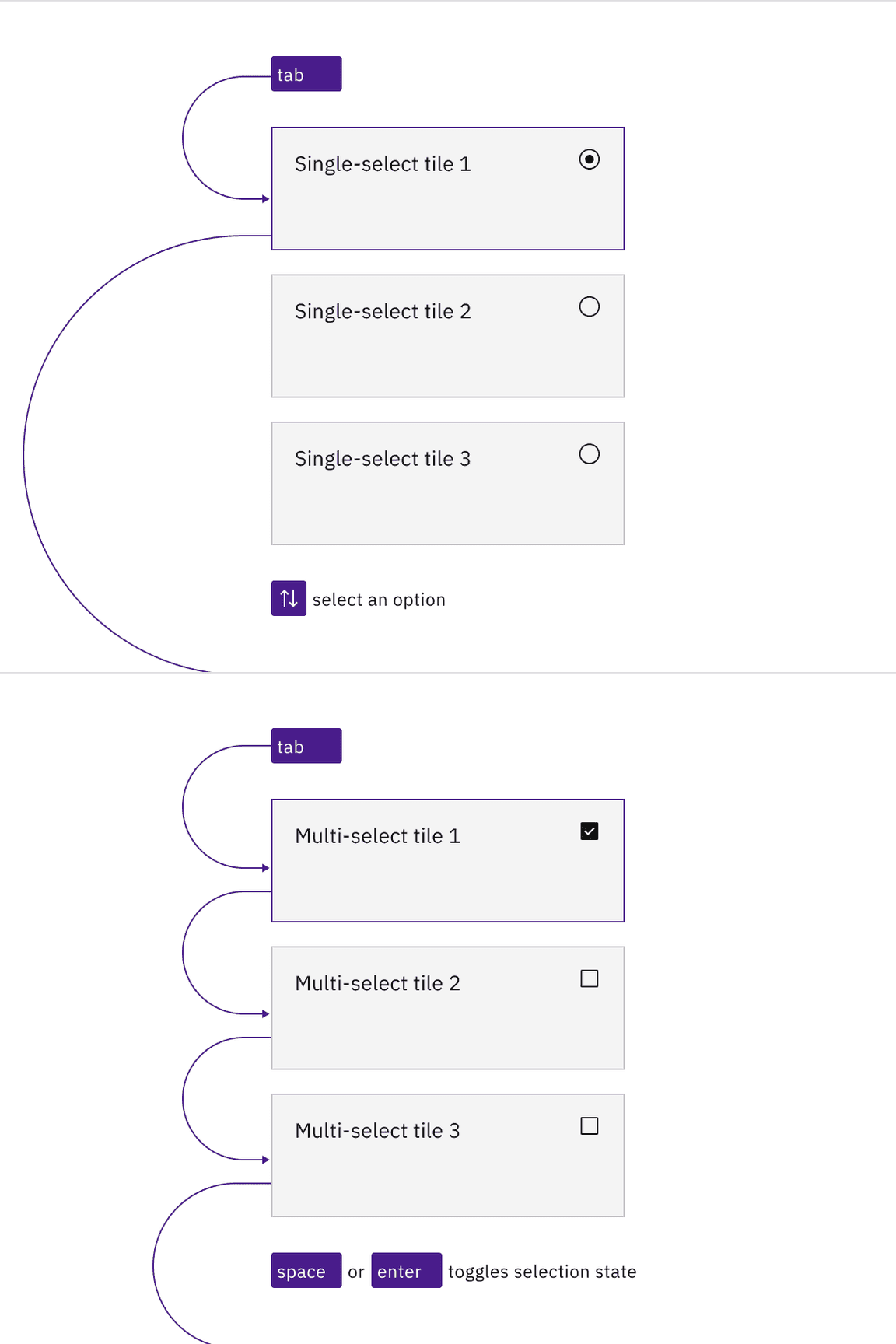
Example of tab stops and navigation of selectable tiles with single-select and multi-select functionality
Expandable tiles
Similar to non-interactive and interactive tiles, expandable tiles come in two types: those containing interactive elements and those without.
For non-interactive expandable tiles, users can Tab to navigate between interactive elements within the tile. Once users navigate to the expanding icon button, pressing Space or Enter expands or collapses the tile.
For interactive expandable tiles, users can press Space or Enter to expand or collapse the tile.
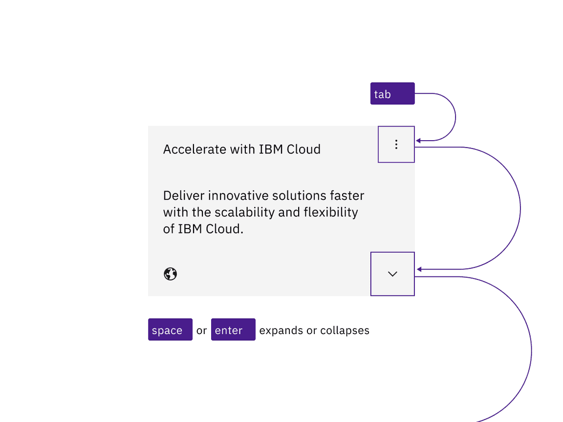
Example shows the tab stops of a non-interactive expandable tile
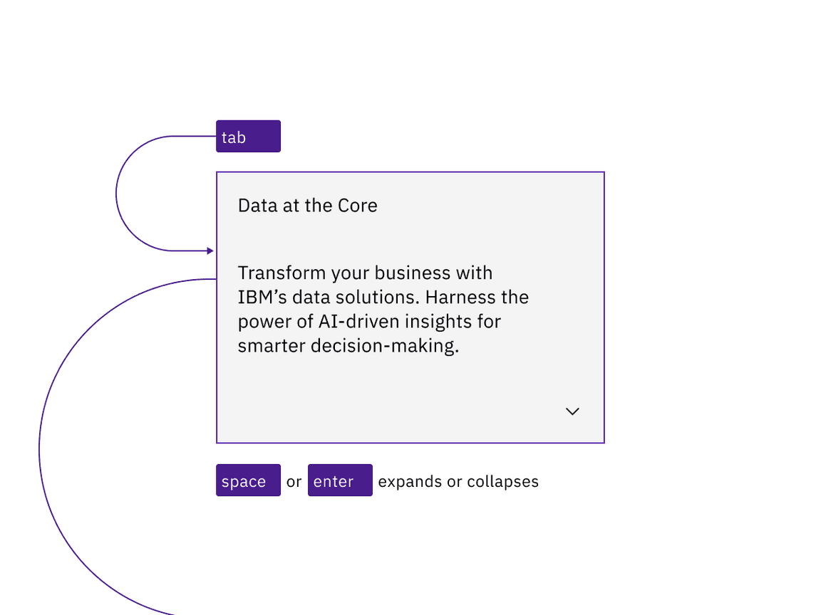
Example shows the tab stops of an interactive expandable tile
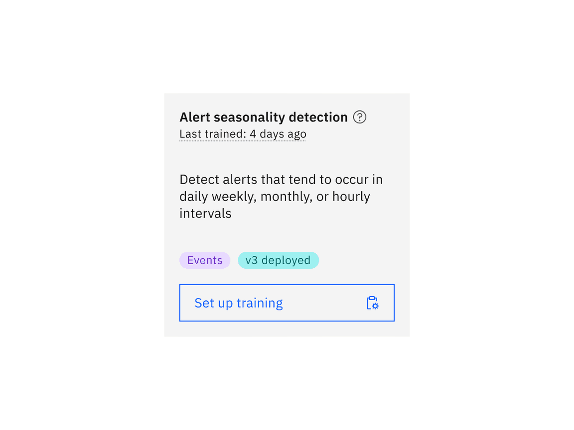
Example shows base tile with interactive elements such as a tooltip, definition tooltip, and a button
Development considerations
Keep these considerations in mind if you are modifying Carbon or creating a custom component.
- Include descriptive labels for interactive tiles to ensure their purpose is clear with. Provide an
aria-labeloraria-labelledbyto the tile component to comply with accessible naming. - Decorative images should have an empty
altattribute (alt="") while informative images should include descriptivealttext to convey their content. - See the ARIA authoring practices for more considerations.
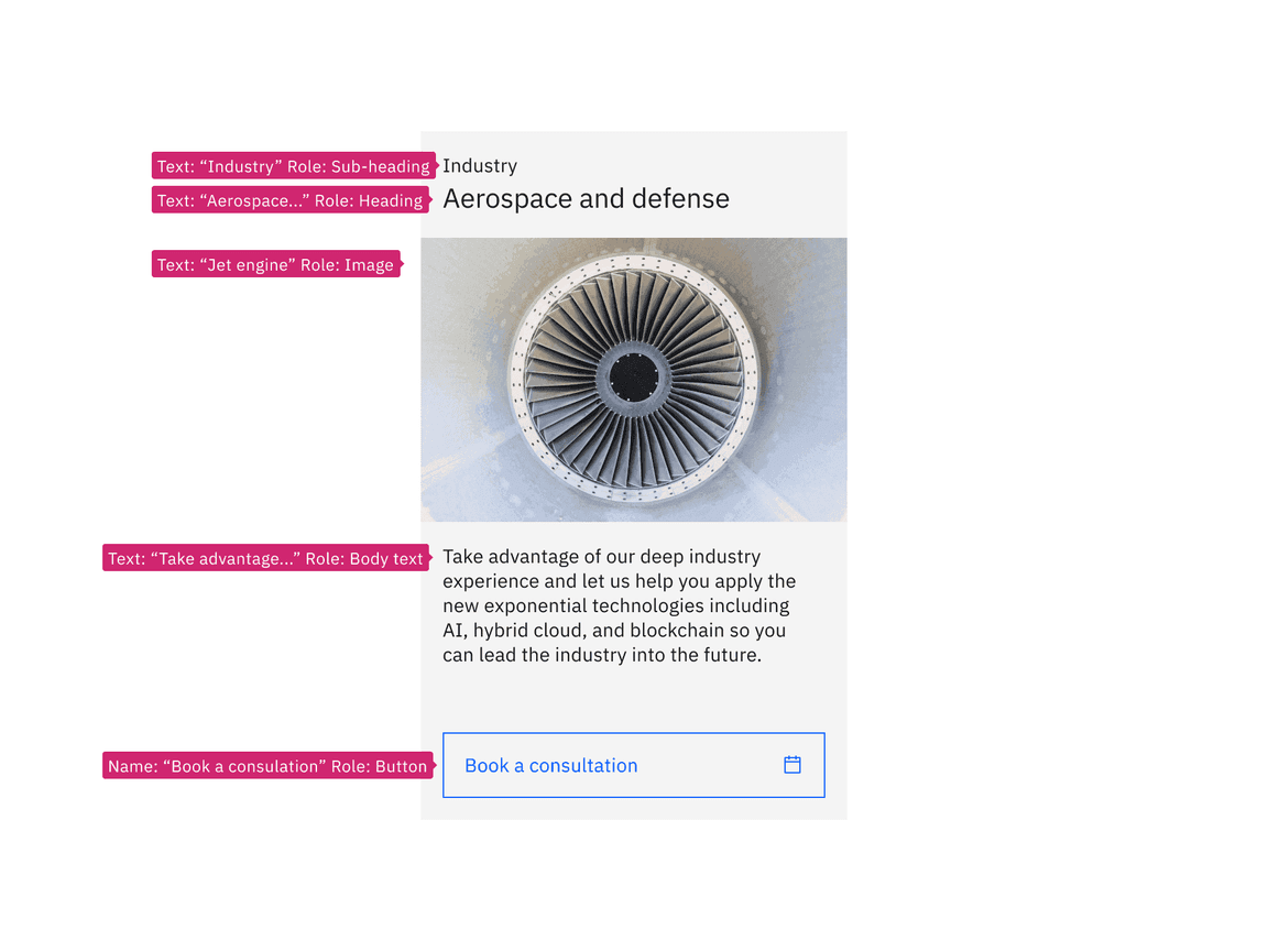
Example shows labeling annotation of a non-interactive tile with interactive elements
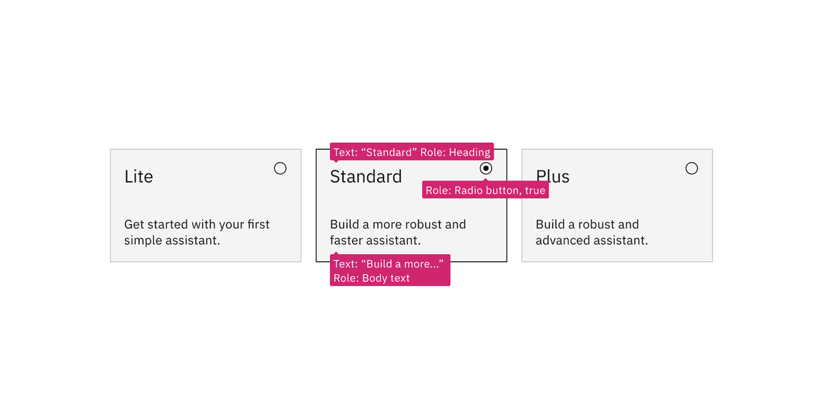
Example shows labeling annotation of a selectable interactive group of tiles
Accessibility testing status
Latest version: 1.114.0 | Framework: React (@carbon/react)
| Component | Accessibility test | Status | Link to source code |
|---|---|---|---|
| Tile | Test(s) that ensure the initial render state of a component is accessible. | Passes all automated tests with no reported accessibility violations. | GitHub link |
| Tests that ensure additional states of the component are accessible. This could be interactive states of a component or its multiple variants. | Passes all automated tests with no reported accessibility violations. | ||
| Tests that ensure focus is properly managed, and all interactive functions of a component have a proper keyboard-accessible equivalent. | Passes all automated tests with no reported accessibility violations. | ||
| This manual testing ensures that the visual information on the screen is properly conveyed and read correctly by screen readers such as JAWS, VoiceOver, and NVDA. | A human has manually tested this component, e.g. screen reader testing. |
Feedback
Help us improve by providing feedback, asking questions, requesting features, or leaving any other comments on GitHub.