Keyboard navigation
Carbon’s text inputs and text areas replicate the default HTML component operation. Each input field is a tab stop, as are any preceding information icons (which open with Enter/Space and close with Esc). For password inputs, Carbon provides a keyboard-operable ability to toggle the password value’s visibility using Enter or Space.
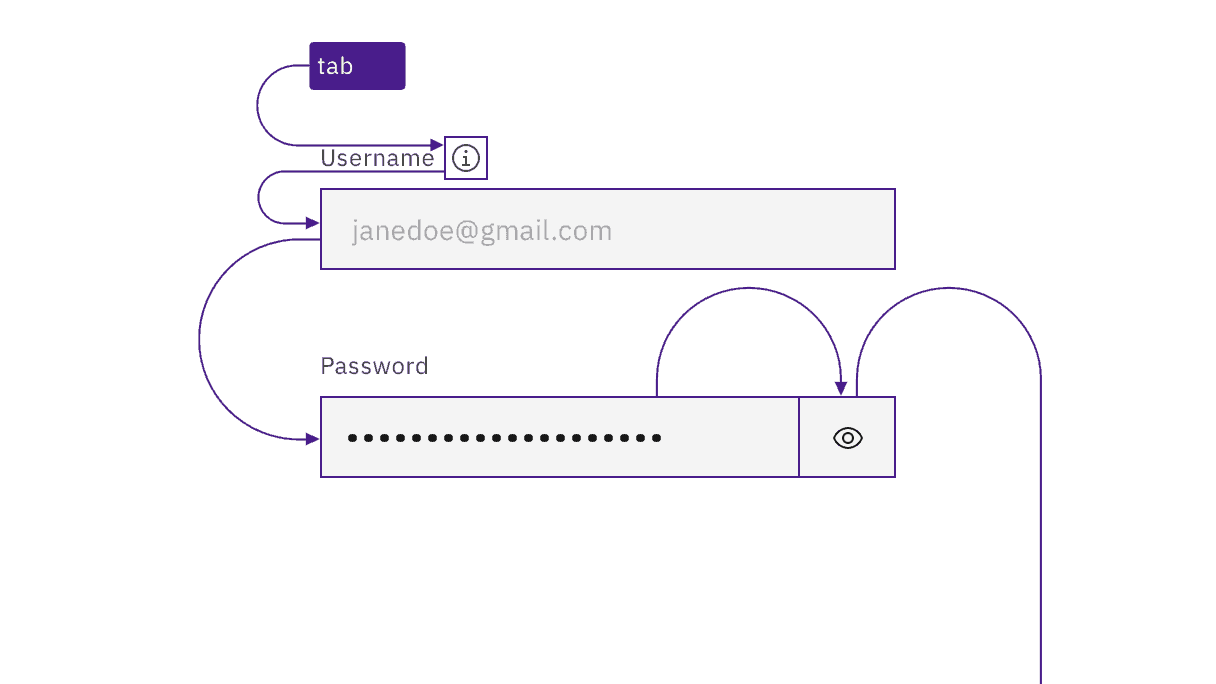
Each input is a tab stop, as are any information icons.
Keyboard interaction
On focus, users can type directly into the input field. Any existing text in the input is highlighted on focus and will be replaced when the user begins typing. (Existing text in a text area is not highlighted on focus; instead the cursor is placed at the start or the user’s prior point of interaction.) Users can interact inside text inputs and text areas using standard arrow keys and modifiers (Ctrl for Windows, Option for Mac).
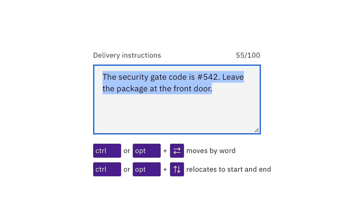
Users can move around in text inputs and text areas using arrows keys and modifiers.
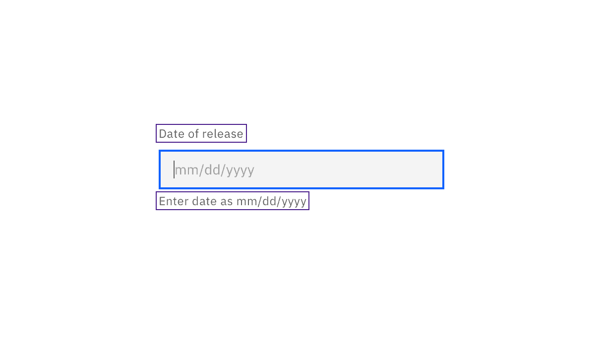
Labels and helper text are accessibly provided.
Accessibility testing status
Latest version: 1.114.0 | Framework: React (@carbon/react)
| Component | Accessibility test | Status | Link to source code |
|---|---|---|---|
| Text Input | Test(s) that ensure the initial render state of a component is accessible. | Passes all automated tests with no reported accessibility violations. | GitHub link |
| Tests that ensure additional states of the component are accessible. This could be interactive states of a component or its multiple variants. | Passes all automated tests with no reported accessibility violations. | ||
| Tests that ensure focus is properly managed, and all interactive functions of a component have a proper keyboard-accessible equivalent. | Passes all automated tests with no reported accessibility violations. | ||
| This manual testing ensures that the visual information on the screen is properly conveyed and read correctly by screen readers such as JAWS, VoiceOver, and NVDA. | A human has manually tested this component, e.g. screen reader testing. | ||
| Fluid Text Input | Test(s) that ensure the initial render state of a component is accessible. | Passes all automated tests with no reported accessibility violations. | |
| Tests that ensure additional states of the component are accessible. This could be interactive states of a component or its multiple variants. | Passes all automated tests with no reported accessibility violations. | ||
| Tests that ensure focus is properly managed, and all interactive functions of a component have a proper keyboard-accessible equivalent. | Passes all automated tests with no reported accessibility violations. | ||
| This manual testing ensures that the visual information on the screen is properly conveyed and read correctly by screen readers such as JAWS, VoiceOver, and NVDA. | A human has manually tested this component, e.g. screen reader testing. |
Feedback
Help us improve by providing feedback, asking questions, requesting features, or leaving any other comments on GitHub.