Keyboard interaction
Read-only tags are not in the tab order, are not interactive, and do not receive focus.
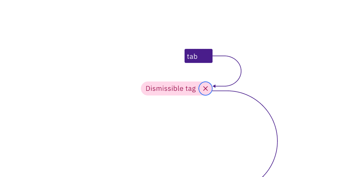
Dismissible tags are in the tab order and receive focus around the close icon. Pressing Enter or Space will dismiss the tag. Tabbing away from the tag will move focus to the next element in the tab order.
Selectable tags are in the tab order and focus is shown around each tag. Pressing Enter or Space toggles the selection on and off.
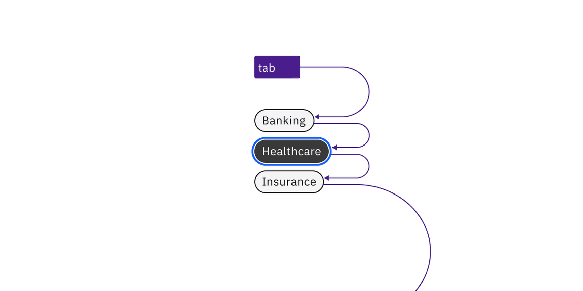
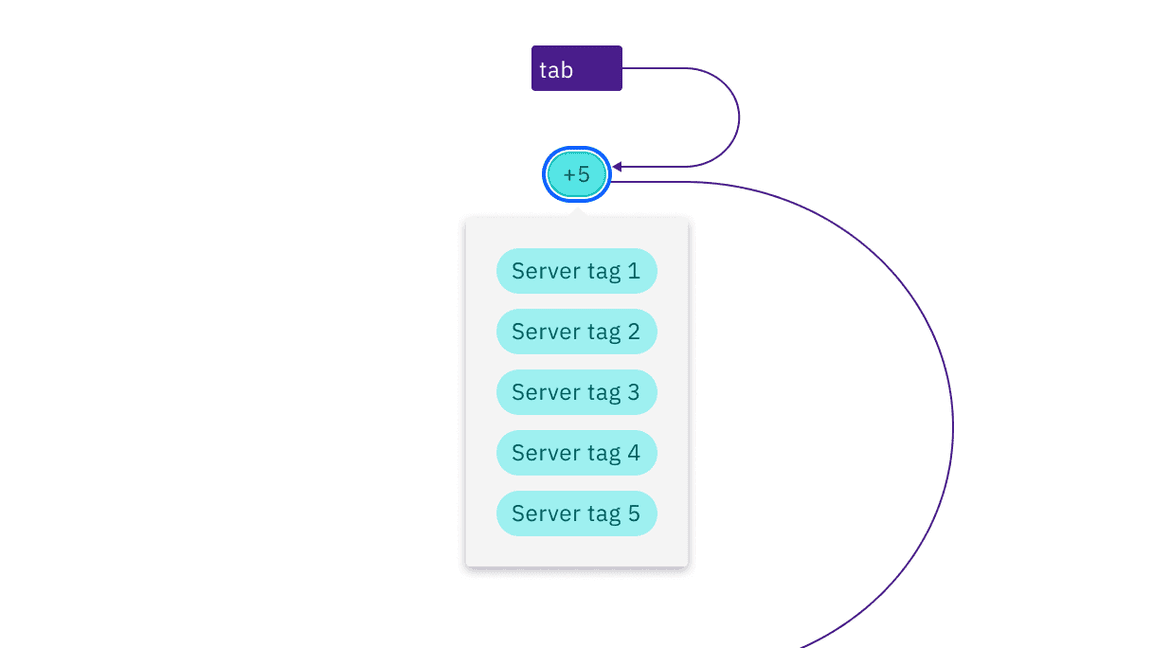
Operational tags are in the tab order and focus is shown around each tag. Pressing Enter or Space will disclose additional related tags.
Design recommendations
Design annotations are not needed, but keep the following point in mind.
When the tag’s title is too long to fit within the available space of the tag container, the title can be truncated with an ellipsis. By mouse, the full title is disclosed in a browser tooltip on hover. By keyboard, the full title is disclosed on focus in a tooltip. Truncation should be set at the title’s start, middle, or end, depending on what is best for the given use case.
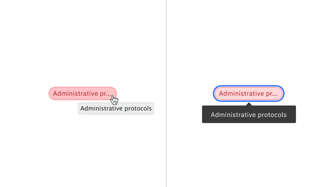
Truncated tag title disclosed in a tooltip on hover by mouse and on focus by keyboard.
Development considerations
Keep this in mind if you’re modifying Carbon or creating a custom component.
- Do not add an
onClickfunctionality to the dismissible tag, and only reserve interactions for the close icon in the tag. - Do not nest buttons within the operational tag. Consider using the
asprop to change an element tag to avoid nesting buttons.
Accessibility testing status
Latest version: 1.114.0 | Framework: React (@carbon/react)
| Component | Accessibility test | Status | Link to source code |
|---|---|---|---|
| Tag | Test(s) that ensure the initial render state of a component is accessible. | Passes all automated tests with no reported accessibility violations. | GitHub link |
| Tests that ensure additional states of the component are accessible. This could be interactive states of a component or its multiple variants. | Passes all automated tests with no reported accessibility violations. | ||
| Tests that ensure focus is properly managed, and all interactive functions of a component have a proper keyboard-accessible equivalent. | Passes all automated tests with no reported accessibility violations. | ||
| This manual testing ensures that the visual information on the screen is properly conveyed and read correctly by screen readers such as JAWS, VoiceOver, and NVDA. | A human has manually tested this component, e.g. screen reader testing. |
Feedback
Help us improve by providing feedback, asking questions, requesting features, or leaving any other comments on GitHub.