Element | Property | Color token |
|---|---|---|
Header | background-color | transparent |
Header: text | text color |
|
Row | background-color | transparent |
Row: text | text color |
|
Divider | border-bottom |
|
* Denotes a contextual color token that will change values based on the layer it is placed on.
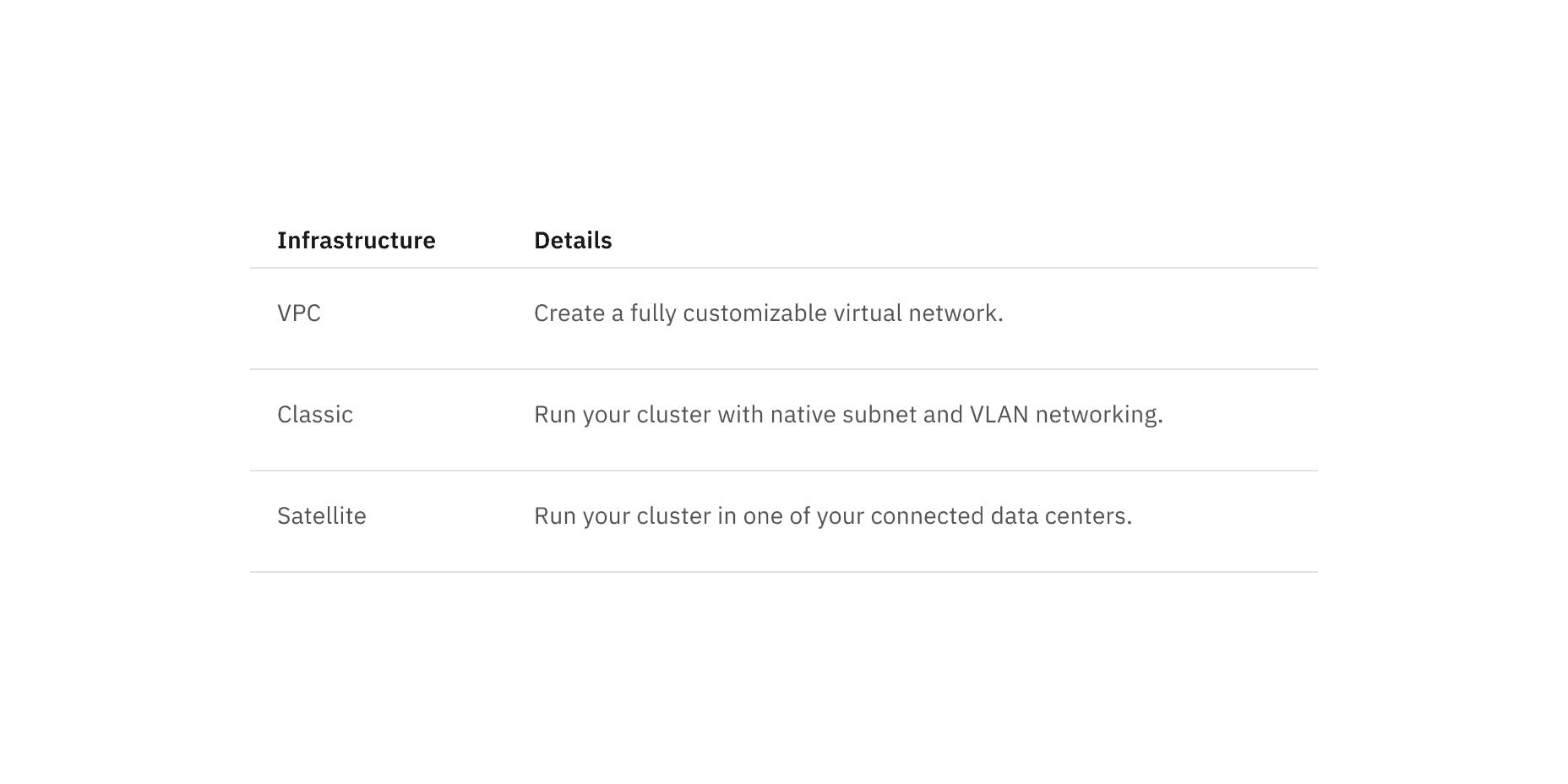
Default structured list color
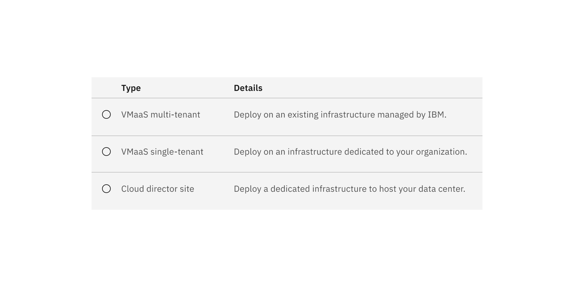
Selectable color
Selectable structured list has an available feature flag.
Element | Property | Color token |
|---|---|---|
Header | background-color | transparent |
Header: text | text color |
|
Row | background-color | transparent |
Row: text | text color |
|
Divider | border-bottom |
|
Icon | svg |
|
* Denotes a contextual color token that will change values based on the layer it is placed on.
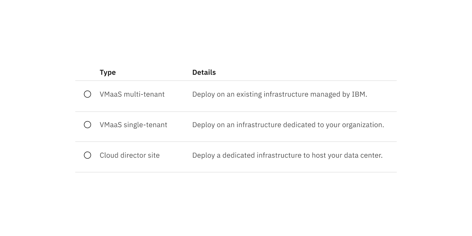
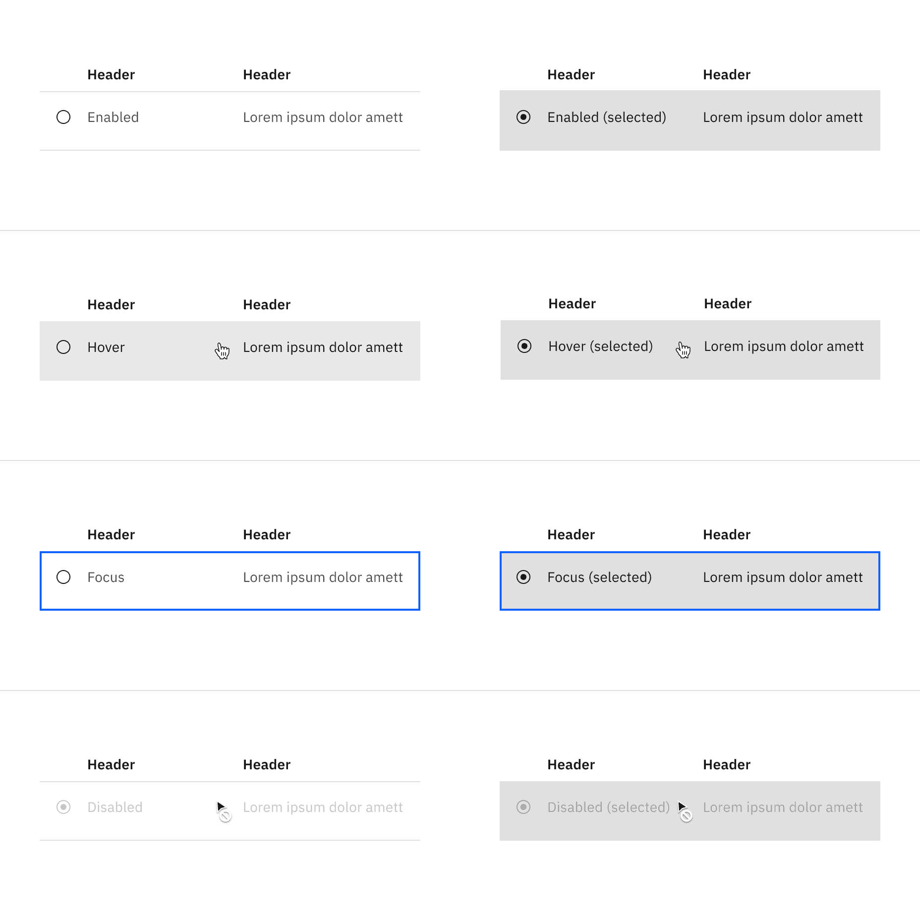
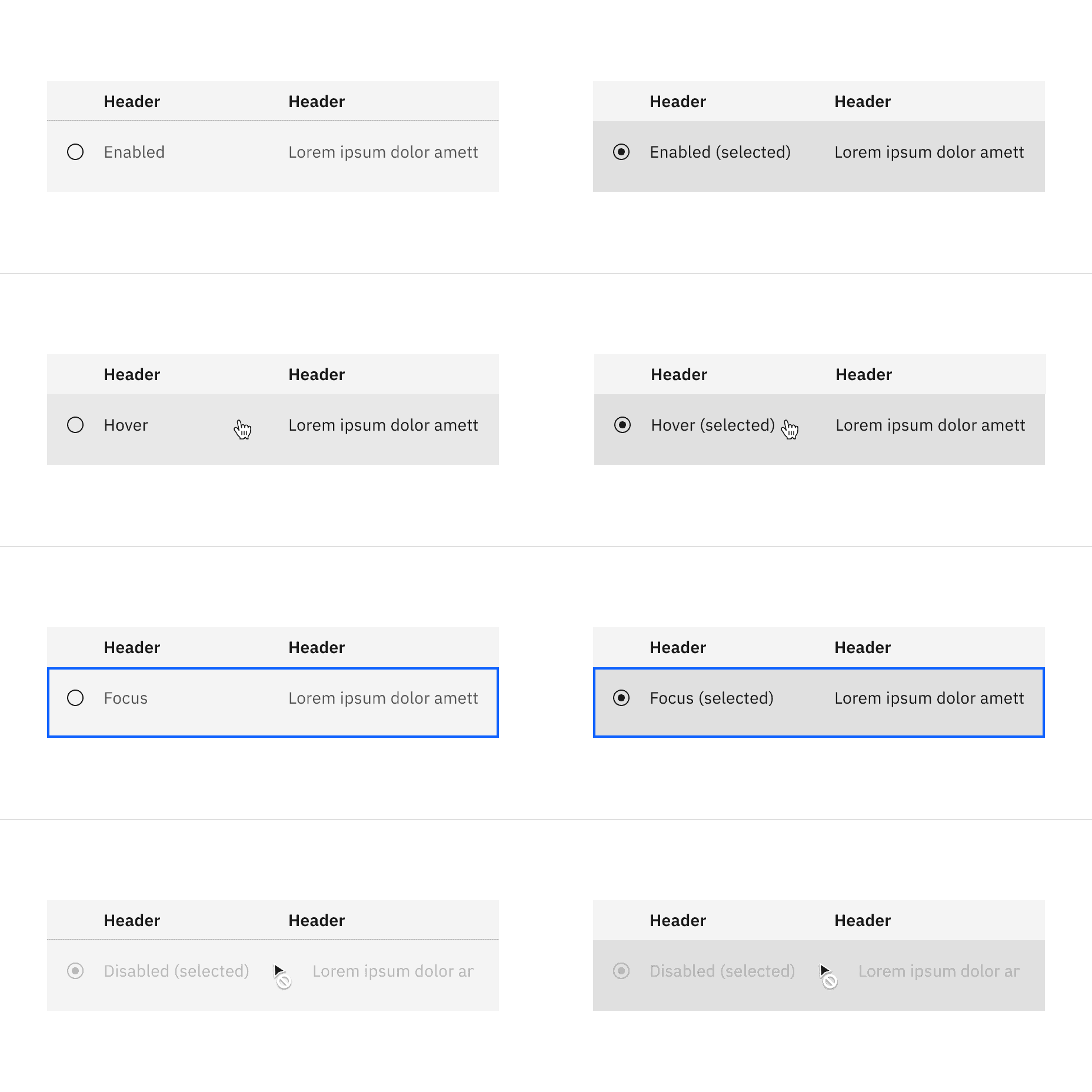
State | Element | Property | Color token |
|---|---|---|---|
Enabled (selected) | Row | background-color |
|
Row: text | text color |
| |
Hover | Row | background-color |
|
Row: text | text color |
| |
Hover (selected) | Row | background-color |
|
Row: text | text color |
| |
Focus | Row | border |
|
Focus (selected) | Row | background-color |
|
Row: text | text color |
| |
Border | border |
| |
Disabled | |||
Row: text | text color |
| |
Icon | svg |
| |
Disabled (selected) | Row | background-color |
|
Row: text | text color |
| |
Icon | svg |
|
* Denotes a contextual color token that will change values based on the layer it is placed on.
Element | Property | Color token |
|---|---|---|
Header | background-color |
|
Row | background-color |
|
* Denotes a contextual color token that will change values based on the layer it is placed on.
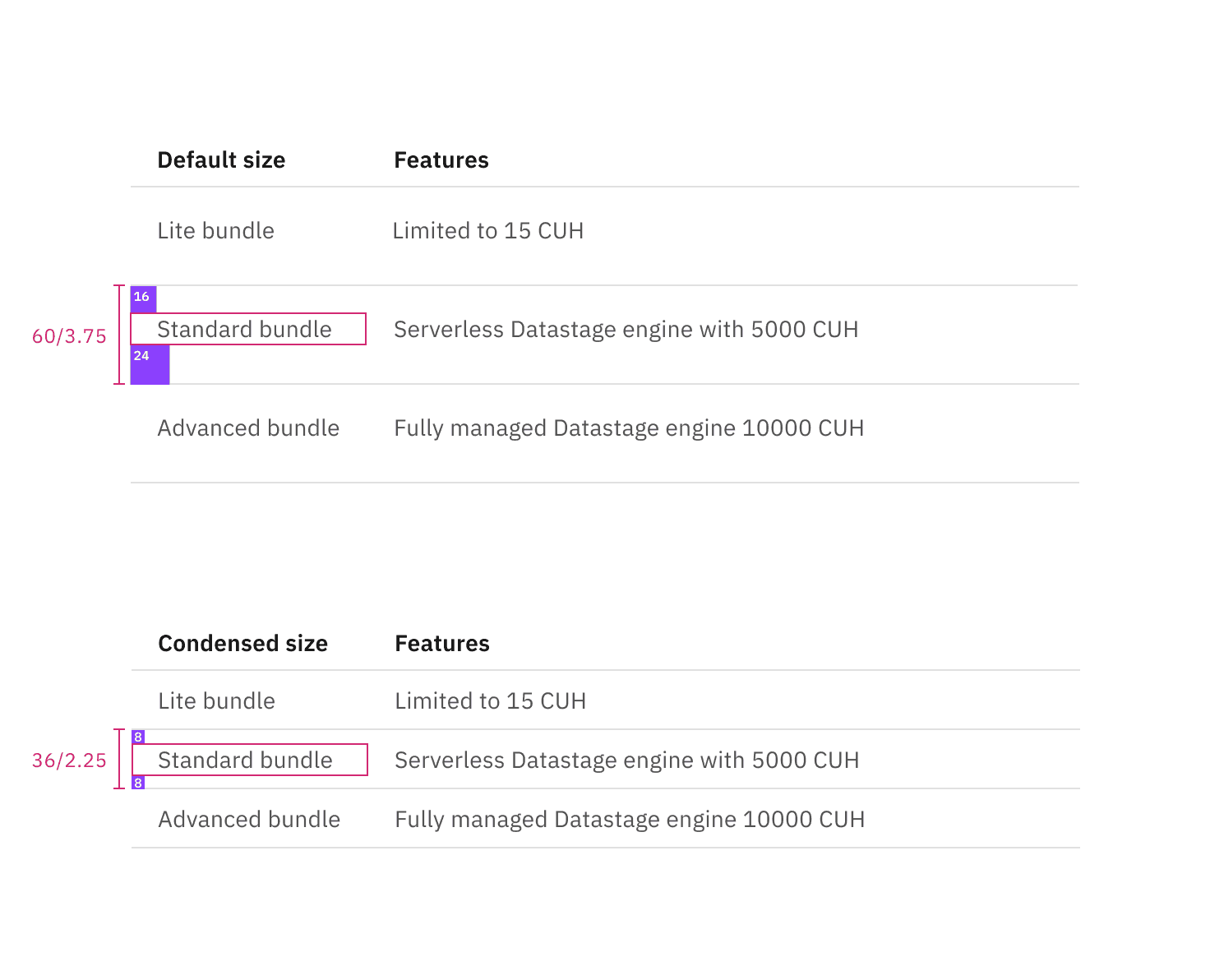
Element | Property | px / rem | Spacing token |
|---|---|---|---|
Container | min-width | 500 / 31.25 | – |
Header: text | padding-top | 16 / 1 |
|
padding-bottom | 8 / 0.5 |
| |
padding-right | 16 / 1 |
| |
padding-left (hang) | 16 / 1 |
| |
padding-left (flush) | 0px | – | |
Row: text | padding-top | 16 / 1 |
|
padding-bottom | 24 / 1.5 |
| |
padding-right | 16 / 1 |
| |
padding-left (hang) | 16 / 1 |
| |
padding-left (flush) | 0px | – |
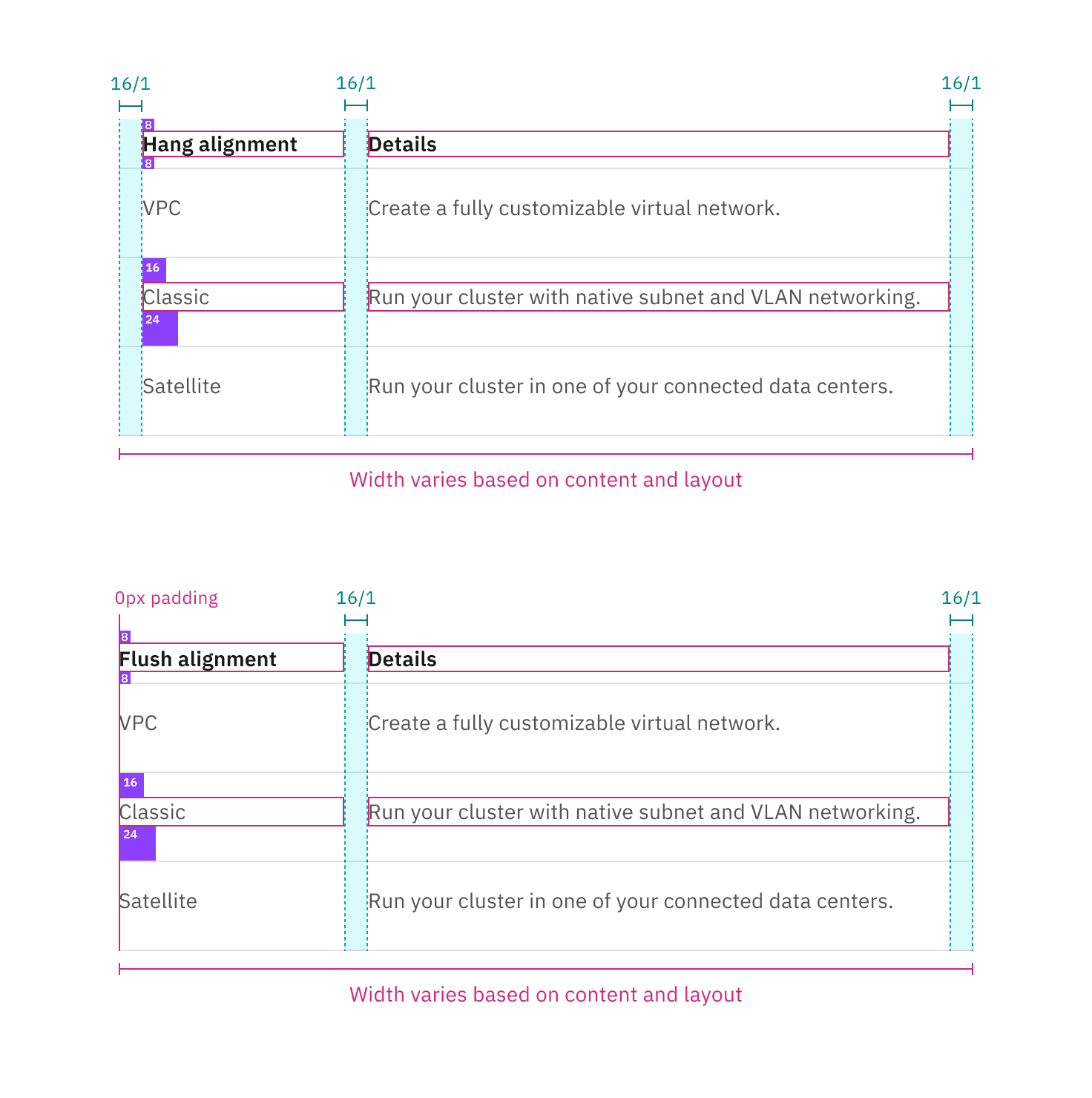
Spacing and measurements for default structured list with hang and flush alignment | px / rem.
Element | Property | px / rem | Spacing token |
|---|---|---|---|
Container | min-width | 500 / 31.25 | – |
Header: text | padding-top | 16 / 1 |
|
padding-bottom | 8 / 0.5 |
| |
padding-right | 16 / 1 |
| |
padding-left, padding-right | 16 / 1 |
| |
Row: text | padding-top | 16 / 1 |
|
padding-bottom | 24 / 1.5 |
| |
padding-left, padding-right | 16 / 1 |
| |
Icon | height, width | 16px | – |
padding-left, padding-right | 16 / 1 |
|
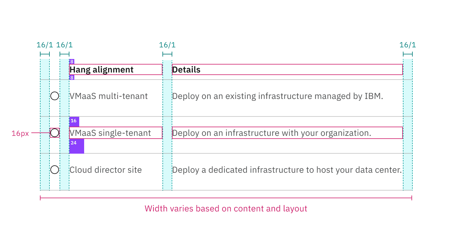
Structure and spacing measurements for selectable structured list with a feature flag | px / rem.