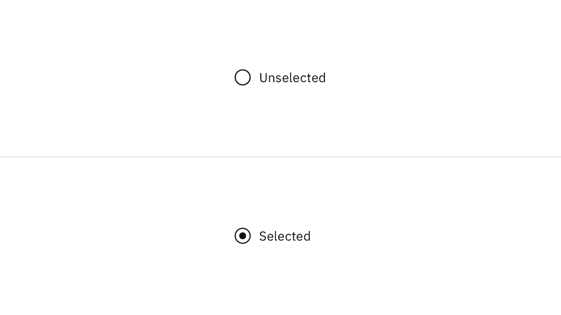
Radio button states: unselected (top) and selected (bottom)
State | Element | Property | Color token |
|---|---|---|---|
Focus | Radio button | border |
|
Disabled | Label | text color |
|
Radio button | border |
| |
inner fill |
| ||
Read-only | Label | text color |
|
Radio button | border |
| |
inner fill |
| ||
Error | Label | text color |
|
Radio button | border |
| |
Error message | text color |
| |
Error icon | svg |
| |
Warning | Label | text color |
|
Radio button | border |
| |
Warning message | text color |
| |
Warning icon | svg |
| |
inner fill |
|
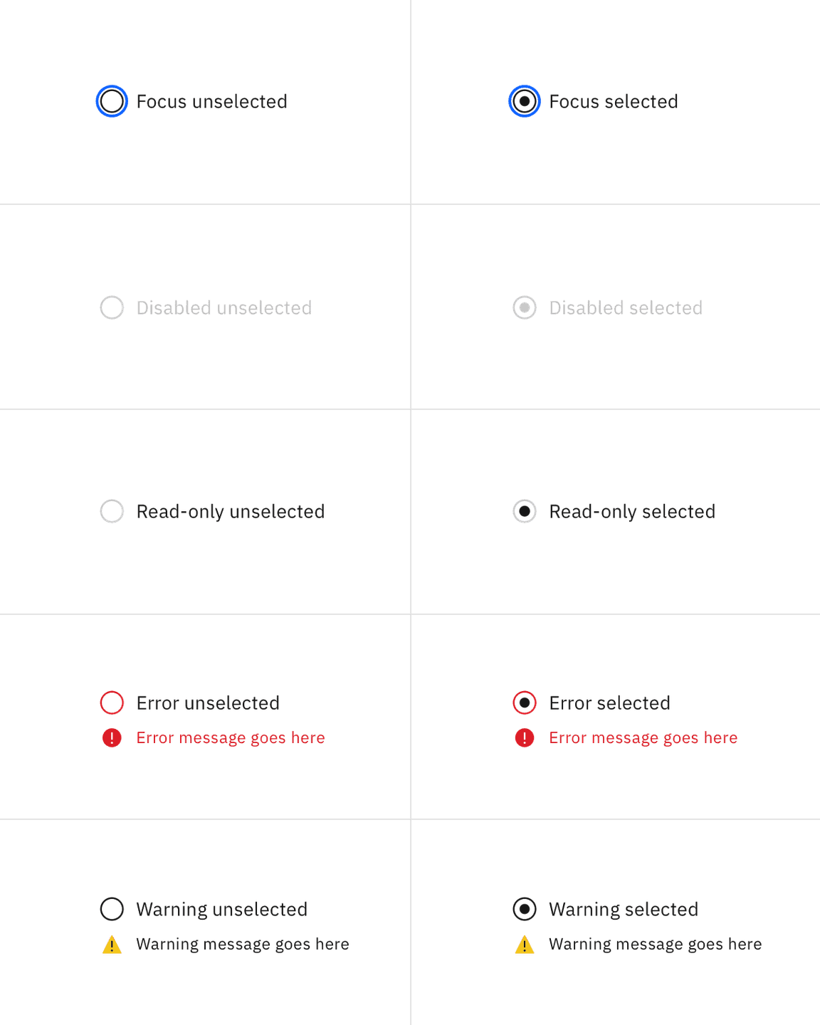
Selected and unselected radio buttons across focus, disabled, read-only, error, and warning states.
Element | Font-size (px/rem) | Font-weight | Type token |
|---|---|---|---|
Group label | 12 / 0.75 | Regular / 400 |
|
Radio button label | 14 / 0.875 | Regular / 400 |
|
Helper text | 12 / 0.75 | Regular / 400 |
|
Error message | 12 / 0.75 | Regular / 400 |
|
Warning message | 12 / 0.75 | Regular / 400 |
|
Element | Property | px / rem | Spacing token |
|---|---|---|---|
Radio button icon | height, width | 20 / 1.25 | – |
margin-right | 8 / 0.5 |
| |
Dot | height, width | 8 / 0.5 | – |
margin-right | 8 / 0.5 |
| |
Group label | margin-bottom | 8 / 0.5 |
|
Horizontal group item | margin-left | 8 / 0.5 |
|
Vertical group item | margin-bottom | 8 / 0.5 |
|

Structure and spacing measurements for radio button | px | rem
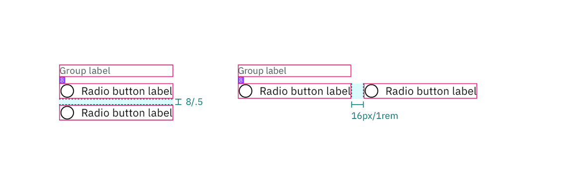
Structure and spacing measurements for radio button | px | rem
AI presence
The only style modification an AI variant of the radio button has is the addition of the AI label. All other tokens in the component remain the same as the non-AI variants.
For more information on the AI style elements, see the Carbon for AI guidelines.
Element | Property | Token / Size |
|---|---|---|
AI label | size | mini |
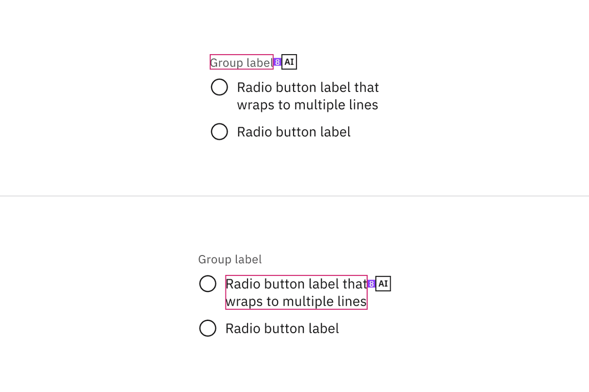
Structure and spacing measurements for radio button with AI presence
Feedback
Help us improve by providing feedback, asking questions, requesting features, or leaving any other comments on GitHub.