Carbon Design System

Popover

Stable
Last updated Sep 30, 2026

A popover is a layer that appears above page content to provide additional information, context, or actions without leaving the current view.

Popover

Color

Element

Property

Color token

Container

background-color

$layer *

background-color

$background-inverse

* Denotes a contextual color token that will change values based on the layer it is placed on.

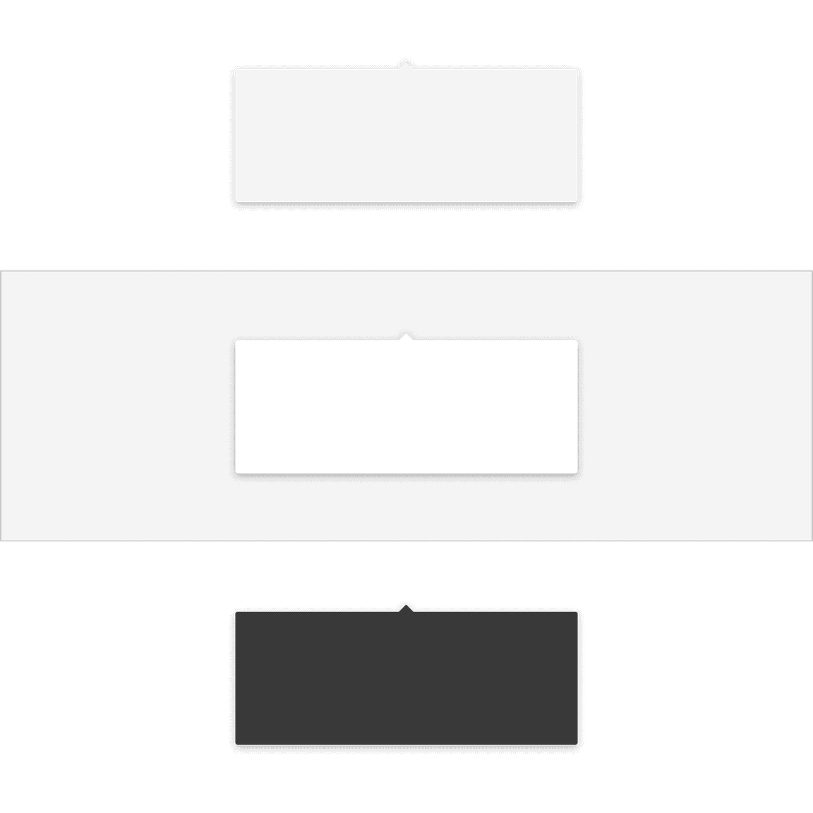
Popover container colors. (style)

Structure

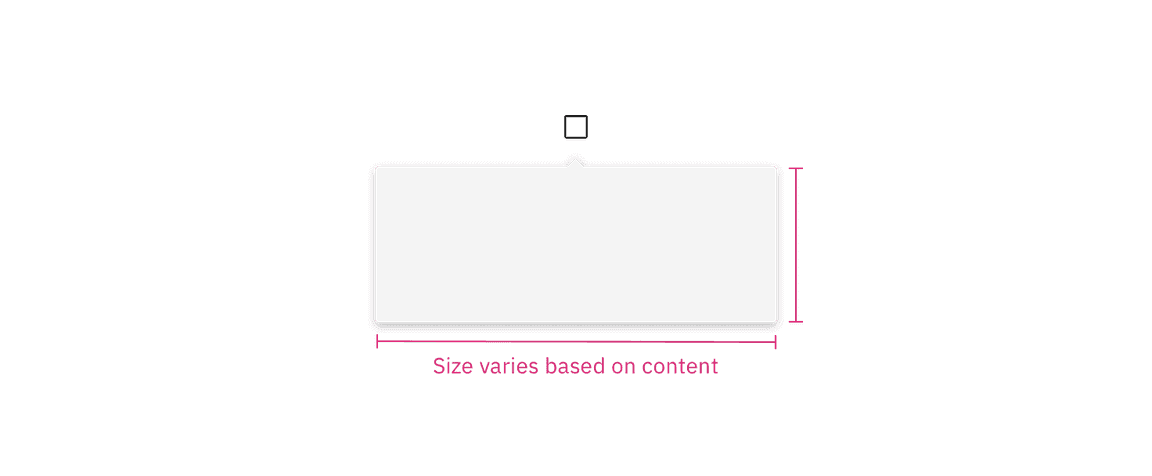
The width and height of a popover container can vary depending on the amount of content within it. We recommend to not exceed a popover width size of four columns.

Element

Property

px / rem

Spacing token

Container

max-width

352 / 22

–

padding

16 / 1

$spacing-05

Caret tip

height, width

8 / .5

–

margin-top

4 / .25

$spacing-02

Structure and spacing measurements for a popover container.

Structure and spacing measurements a popover container. | px / rem
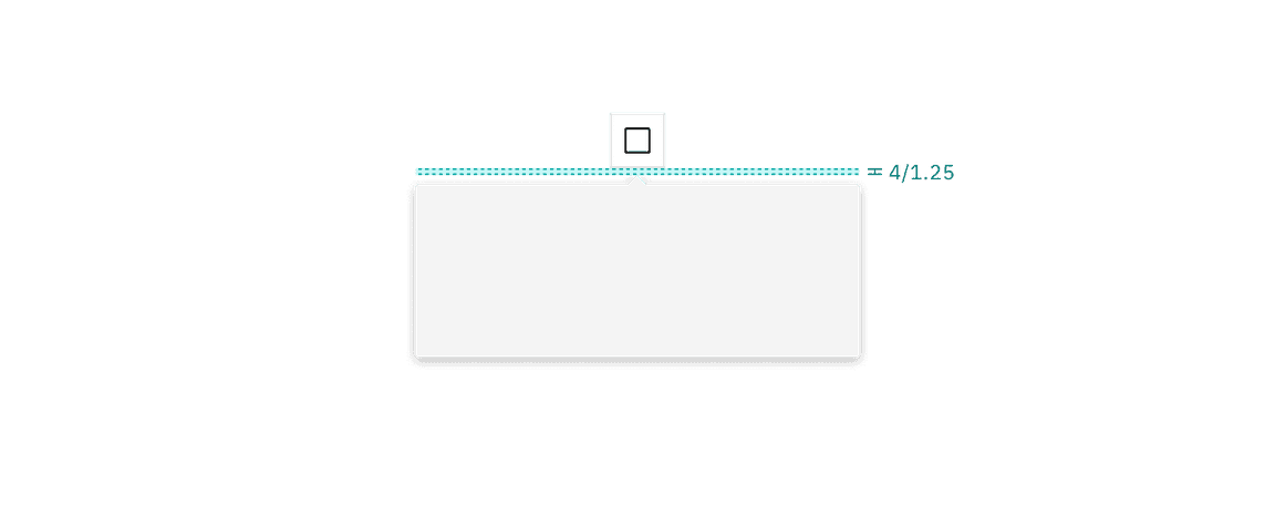
Structure and spacing measurements between a popover container and trigger button.

Structure and spacing measurements between a popover container and trigger button. | px / rem

Feedback

Help us improve by providing feedback, asking questions, requesting features, or leaving any other comments on GitHub.

Popover | Carbon Design System