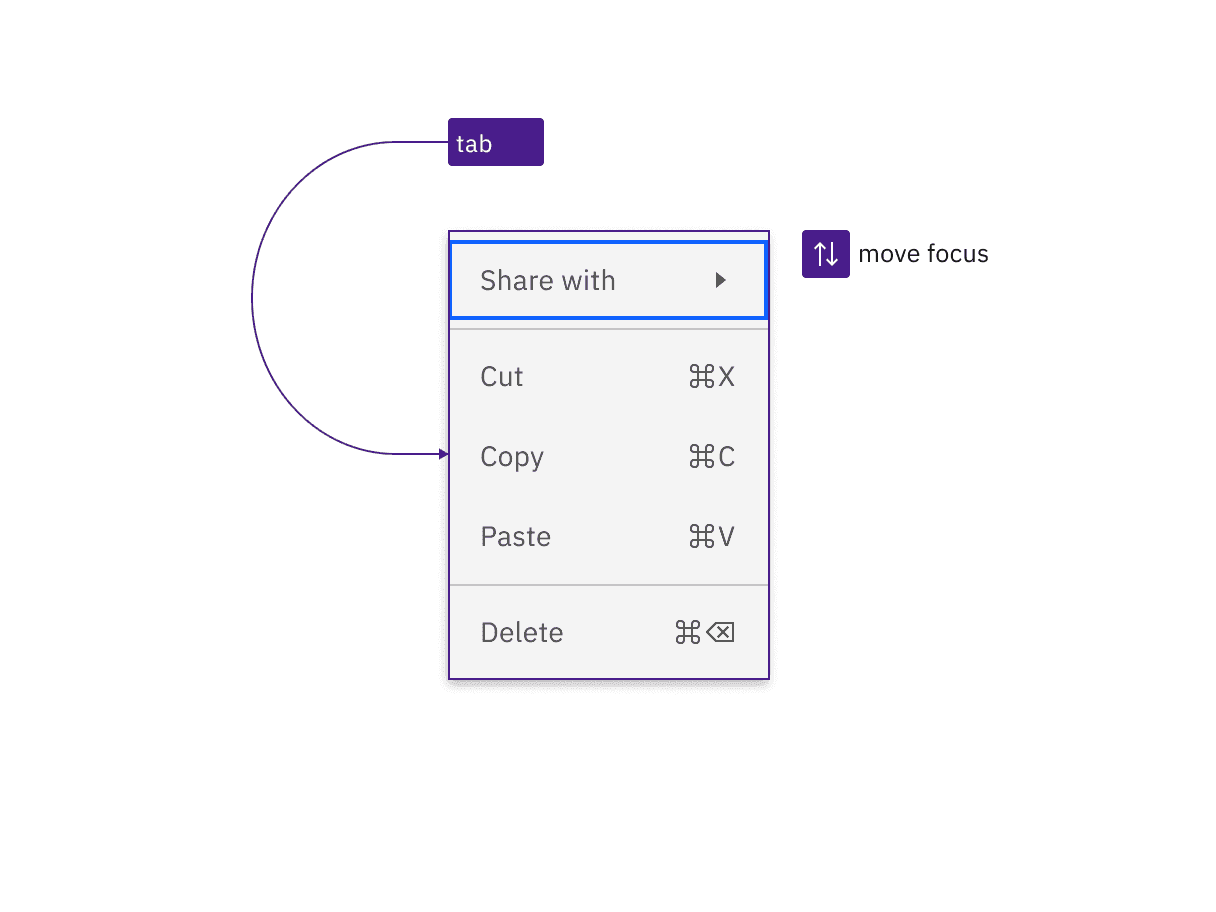
Menu is reached by Tab and when opened, the first menu item takes focus. Arrow keys move focus.
Pressing Space or Enter on a focused menu item activates it and collapses the menu. Pressing Space or Enter on a submenu opens it. A submenu can also be opened and closed using the right and left arrow keys respectively. When the menu or submenu is open, the first item takes focus. An activated menu item can have different results depending on its functionality. If the item is a link, it launches the selection. If the item is selectable, it selects or deselects the item. The menu item retains its selected or unselected state when the menu is opened again.
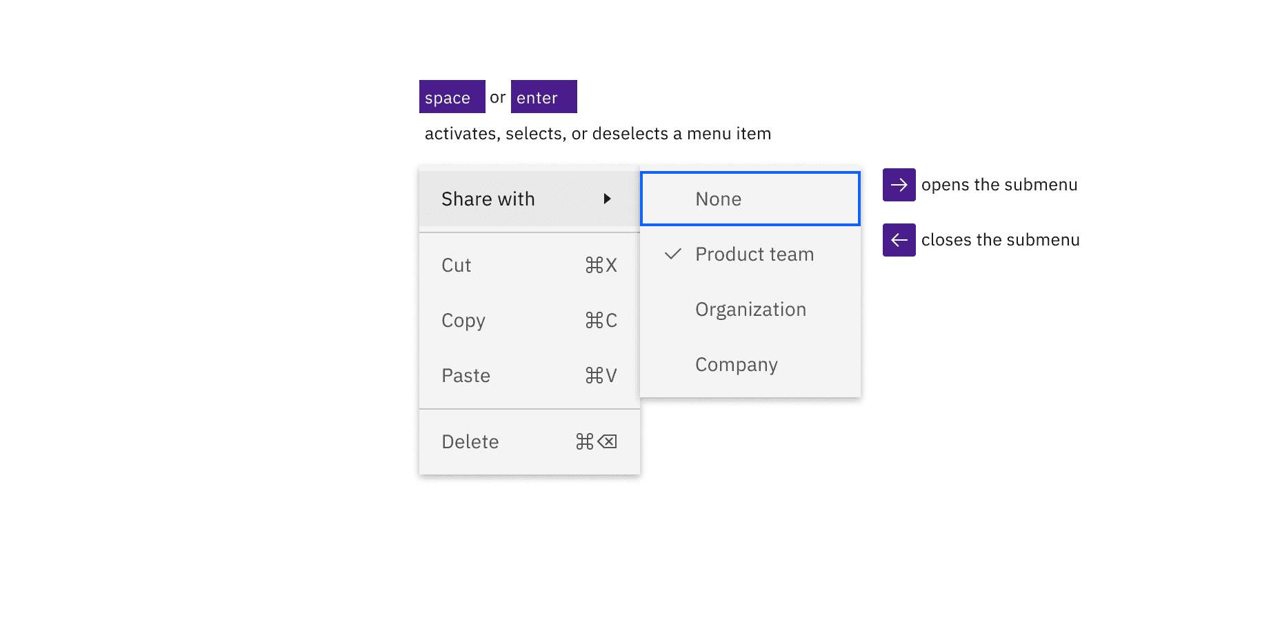
Space and Enter keys activates, selects, or deselects the menu item with focus. A submenu is opened and closed with the right and left arrow keys respectively.
Development considerations
Keep these considerations in mind if you are modifying Carbon or creating a custom component.
- Each menu, including nested menus, are
ulelements withrole="menu". - Menu items are
lielements withrole="menuitem". - If a Menu item contains a sub-menu, it is given
aria-haspopup="true"andaria-expandedof true or false depending on if the sub-menu is open/visible. - Selectable menu items are given
role="menuitemcheckbox". - Menu item groups are
lielements withrole="group". - Menu item radio groups get
role="menuitemradio". - Menu items with really long labels can get truncated depending on the screen size. This label will be exposed by a browser rendered tooltip on hover or focus.
- Menu implements the menu design pattern defined in the ARIA Authoring Practices Guide (APG).
Accessibility testing status
Latest version: 1.114.0 | Framework: React (@carbon/react)
| Component | Accessibility test | Status | Link to source code |
|---|---|---|---|
| Menu | Test(s) that ensure the initial render state of a component is accessible. | Passes all automated tests with no reported accessibility violations. | GitHub link |
| Tests that ensure additional states of the component are accessible. This could be interactive states of a component or its multiple variants. | Automated or manual testing has been temporarily deferred. | ||
| Tests that ensure focus is properly managed, and all interactive functions of a component have a proper keyboard-accessible equivalent. | Some tests are incomplete, in progress, invalid, or temporarily skipped. | ||
| This manual testing ensures that the visual information on the screen is properly conveyed and read correctly by screen readers such as JAWS, VoiceOver, and NVDA. | A human has manually tested this component, e.g. screen reader testing. |
Feedback
Help us improve by providing feedback, asking questions, requesting features, or leaving any other comments on GitHub.