Menu button
The menu button is set in the tab order and is activated by Space or Enter. When the menu is open, the first item takes focus. Focus is moved between menu items with the Up and Down arrow keys. Space or Enter activates the item with focus, which causes focus to go somewhere else and the menu to close. Esc collapses the menu and puts focus back onto the menu button.
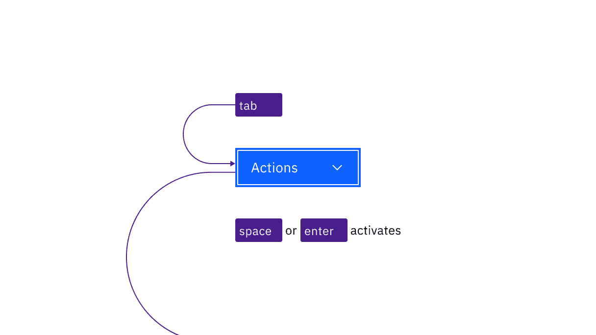
Menu button is reached by Tab. Space and Enter keys open the menu as well as activating menu items with focus.
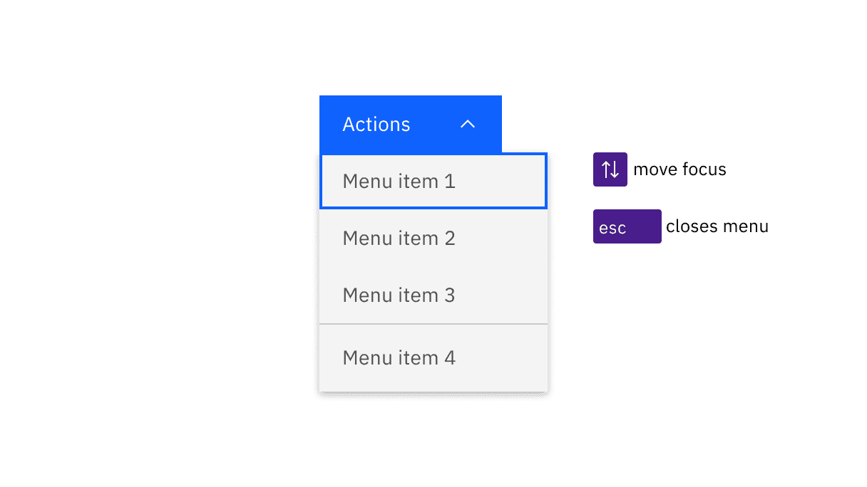
When opened, the first item in the menu takes focus. Arrow keys move focus and Esc closes the menu.
Combo button
The combo button is set in the tab order where the first tab brings focus on the primary button and the second tab brings focus on the icon button that contains the menu. The respective buttons are activated by Space or Enter. When the menu is open, the first item takes focus. Focus is moved between menu items with the Up and Down arrow keys. Space or Enter activates the item with focus, which causes focus to go somewhere else and the menu to close. Esc collapses the menu and puts focus back onto the icon button.
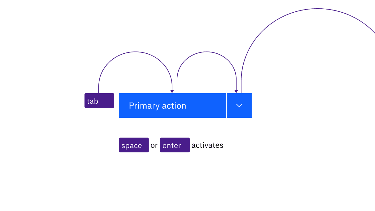
Combo button items are reached by two Tab stops. Space and Enter keys open the menu as well as activating menu items with focus.
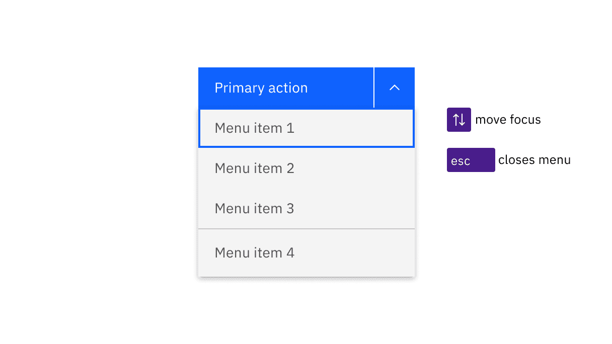
When opened, the first item in the menu takes focus. Arrow keys move focus and Esc closes the menu.
Overflow menu
Each overflow menu is in the tab order and is activated by Space or Enter. When the menu is open, the first item takes focus. Focus is moved between menu items with the Up and Down arrow keys. Space or Enter activates the item with focus, which causes focus to go somewhere else and the menu to close. Esc collapses the menu and puts focus onto the menu button.
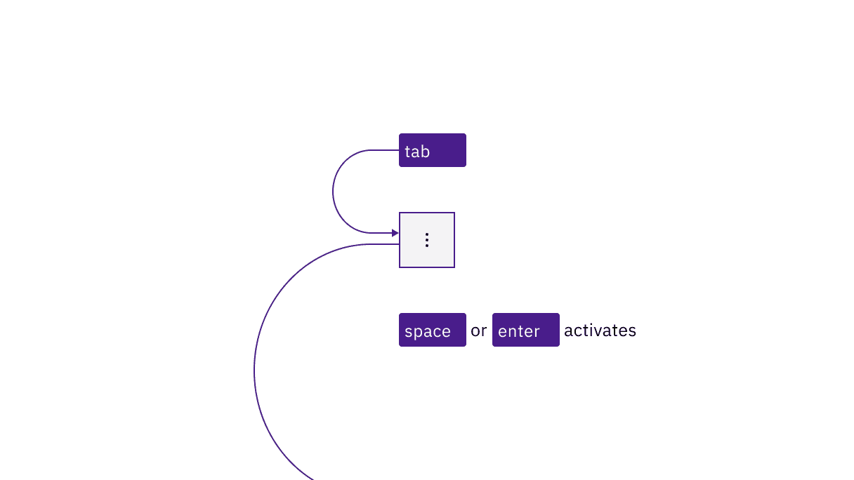
Overflow menus are reached by Tab. Space and Enter keys open the menu as well as activating menu items with focus.
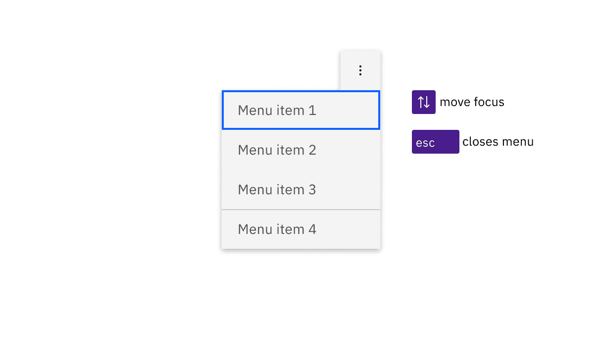
When opened, the first item in the menu takes focus. Arrow keys move focus and Esc closes the menu.
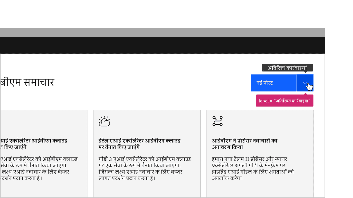
Annotate the label for combo button so the proper tooltip appears, which should only be used for translation purposes.
Overflow menu
Overflow menu’s custom icon variant has a prop that can be used to change the tooltip label. If the tooltip label is changed, they must be annotated with a label that will be exposed on hover or focus.
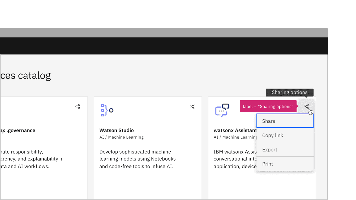
Annotate the label for overflow menu’s custom icon variant so the proper tooltip appears.
Development considerations
Keep these considerations in mind if you are modifying Carbon or creating a custom component.
- Menu button, combo button, and the overflow menu are buttons with
aria-haspopupset to “true”. - The menu button, combo button, and the overflow menu is named with
aria-label. - Each menu item across menu button, combo button, and overflow menu is an
liin aul. - Each list item across menu button, combo button, and overflow menu contains a button with
role="menuitem"andtabindex="-1". See the ARIA authoring practices on menubutton for more considerations. - Combo button and overflow menu has an
iconDescriptionprop that can be used to change the tooltip label. See the design recommendations for more guidelines on tooltip labels. - For combo button, the menu is given an
id. When the menu is open, the icon button is givenaria-controlswith a value of the menuid.aria-expandedis also set based on the open state. - When the combo button menu is open, the element (
div) wrapping the entire combo button is givenaria-ownswith a value of the menuid.
Accessibility testing status
Latest version: 1.113.0 | Framework: React (@carbon/react)
| Component | Accessibility test | Status | Link to source code |
|---|---|---|---|
| Menu Button | Test(s) that ensure the initial render state of a component is accessible. | Passes all automated tests with no reported accessibility violations. | GitHub link |
| Tests that ensure additional states of the component are accessible. This could be interactive states of a component or its multiple variants. | Passes all automated tests with no reported accessibility violations. | ||
| Tests that ensure focus is properly managed, and all interactive functions of a component have a proper keyboard-accessible equivalent. | Passes all automated tests with no reported accessibility violations. | ||
| This manual testing ensures that the visual information on the screen is properly conveyed and read correctly by screen readers such as JAWS, VoiceOver, and NVDA. | A human has manually tested this component, e.g. screen reader testing. | ||
| Combo Button | Test(s) that ensure the initial render state of a component is accessible. | Passes all automated tests with no reported accessibility violations. | |
| Tests that ensure additional states of the component are accessible. This could be interactive states of a component or its multiple variants. | Passes all automated tests with no reported accessibility violations. | ||
| Tests that ensure focus is properly managed, and all interactive functions of a component have a proper keyboard-accessible equivalent. | Passes all automated tests with no reported accessibility violations. | ||
| This manual testing ensures that the visual information on the screen is properly conveyed and read correctly by screen readers such as JAWS, VoiceOver, and NVDA. | A human has manually tested this component, e.g. screen reader testing. | ||
| Overflow Menu | Test(s) that ensure the initial render state of a component is accessible. | Passes all automated tests with no reported accessibility violations. | |
| Tests that ensure additional states of the component are accessible. This could be interactive states of a component or its multiple variants. | Passes all automated tests with no reported accessibility violations. | ||
| Tests that ensure focus is properly managed, and all interactive functions of a component have a proper keyboard-accessible equivalent. | Test data is either not available or not applicable for this component state. | ||
| This manual testing ensures that the visual information on the screen is properly conveyed and read correctly by screen readers such as JAWS, VoiceOver, and NVDA. | A human has manually tested this component, e.g. screen reader testing. |
Feedback
Help us improve by providing feedback, asking questions, requesting features, or leaving any other comments on GitHub.