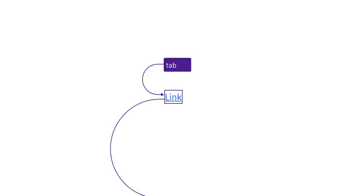
Links are reached by Tab key and activated with the Enter key.
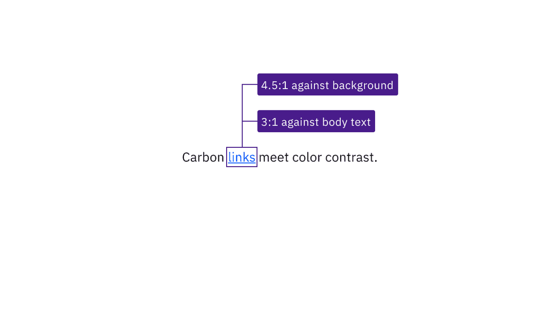
Link text has sufficient contrast with both its background and surrounding body text.
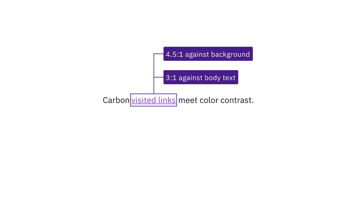
Visited link text has sufficient contrast with both its background and surrounding body text.
Ensure link context
If your design uses generic link names such as "read more," consider making them unique. Otherwise, annotate a connection with other text in the design that provides context. This will allow developers to implement in a way that increases accessibility. See the Equal Access Toolkit link text topic.
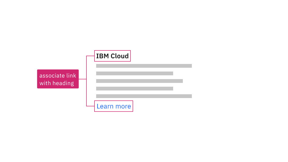
Annotate the connection between generic links and text that gives context.
Associate generic links such as "read more" with other contextual text, using either
aria-describedbyoraria-labelledby(to concatenate multiple text strings). See the Equal Access Toolkit guidance for more details.See the ARIA authoring practices for more considerations.
Accessibility testing status
Latest version: 1.114.0 | Framework: React (@carbon/react)
| Component | Accessibility test | Status | Link to source code |
|---|---|---|---|
| Link | Test(s) that ensure the initial render state of a component is accessible. | Passes all automated tests with no reported accessibility violations. | GitHub link |
| Tests that ensure additional states of the component are accessible. This could be interactive states of a component or its multiple variants. | Passes all automated tests with no reported accessibility violations. | ||
| Tests that ensure focus is properly managed, and all interactive functions of a component have a proper keyboard-accessible equivalent. | Test data is either not available or not applicable for this component state. | ||
| This manual testing ensures that the visual information on the screen is properly conveyed and read correctly by screen readers such as JAWS, VoiceOver, and NVDA. | A human has manually tested this component, e.g. screen reader testing. |
Feedback
Help us improve by providing feedback, asking questions, requesting features, or leaving any other comments on GitHub.