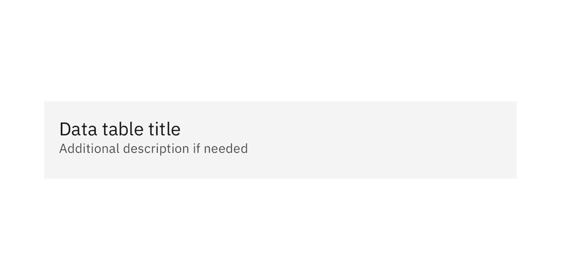
Element | Property | Color token |
|---|---|---|
Table header | background-color |
|
Title | text-color |
|
Description | text-color |
|
* Denotes a contextual color token that will change values based on the layer it is placed on.
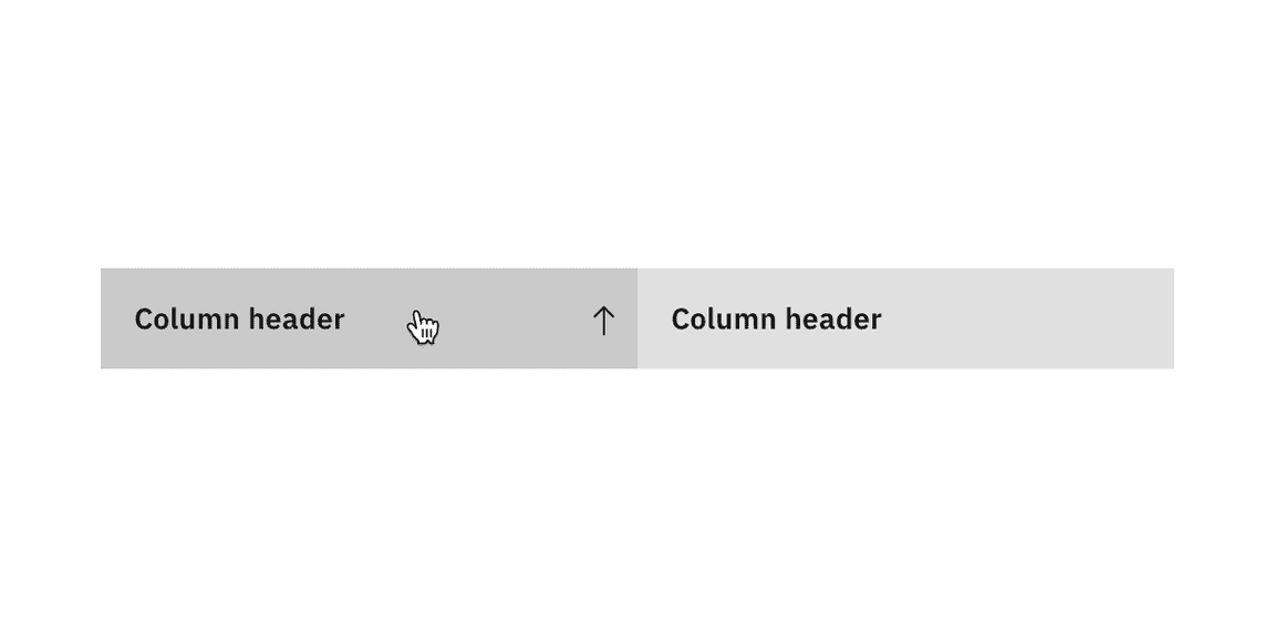
State | Property | Color token |
|---|---|---|
Enabled | background-color |
|
text-color |
| |
svg |
| |
Hover | background-color |
|
text-color |
| |
Focus | border |
|
Active | background-color |
|
* Denotes a contextual color token that will change values based on the layer it is placed on.
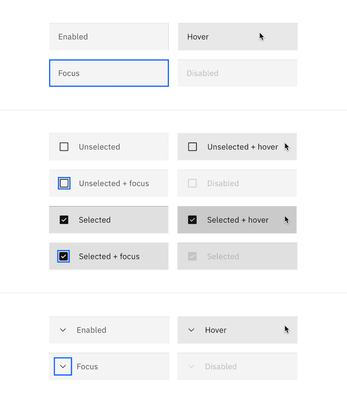
State | Property | Color token |
|---|---|---|
Enabled | background-color |
|
text-color |
| |
border-bottom |
| |
svg |
| |
Hover | background-color |
|
text-color |
| |
Focus | border |
|
Selected | background-color |
|
text-color |
| |
border-bottom |
| |
svg |
| |
Selected + hover | background-color |
|
Expanded | background-color |
|
svg |
| |
Zebra | background-color |
|
* Denotes a contextual color token that will change values based on the layer it is placed on.
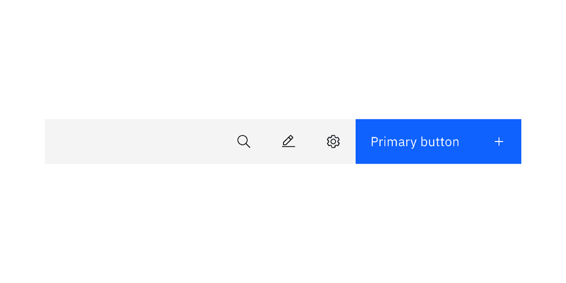
Element | Property | Color token |
|---|---|---|
Toolbar | background-color |
|
Icon button | See ghost button | |
Button | See primary button |
* Denotes a contextual color token that will change values based on the layer it is placed on.
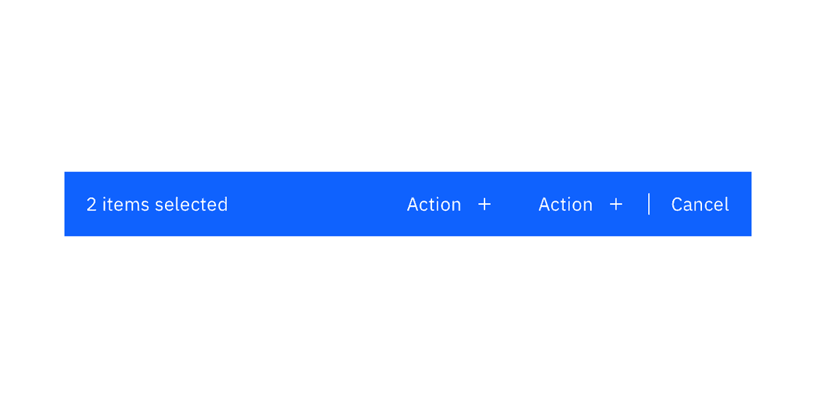
Element | Property | Color token |
|---|---|---|
Bar | background-color |
|
Summary | text-color |
|
Button | See primary button |
Element | Property | px / rem | Spacing token |
|---|---|---|---|
Table header | margin-top | 16 / 1 |
|
margin-bottom | 24 / 1.5 |
| |
padding left, padding right | 16 / 1 |
| |
Sort icon | padding | 8 / 0.5 |
|
Before and after text | padding-left, padding-right | 16 / 1 |
|
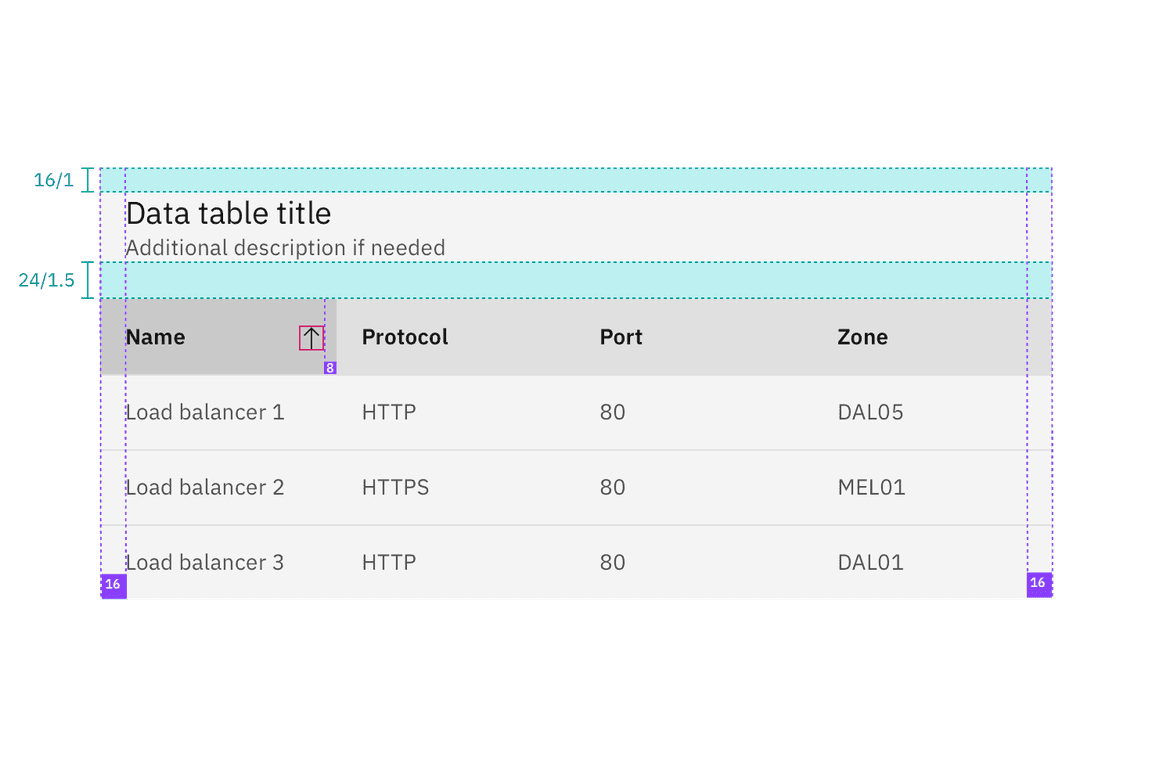
Structure and spacing measurements for a basic data table | px/rem
Spacing between | Property | px / rem | Spacing token |
|---|---|---|---|
Columns | padding | 16 /1 |
|
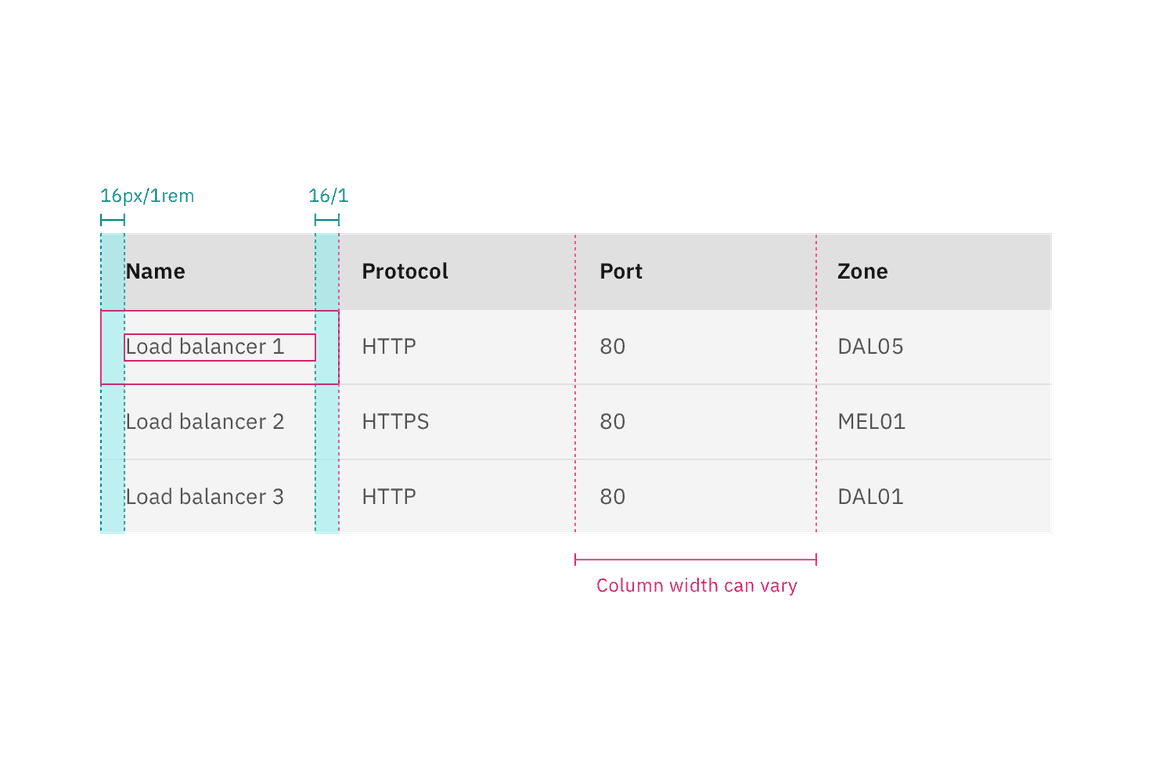
Structure and spacing measurements for columns in a data table | px/rem
Rows
Row sizes are customizable. The column header row should always match the row size of the table. Column header and row text is always centered in the row with the exception of the extra large which is offset by padding-top: 16px. Extra large row heights are only recommended if your data is expected to have two lines of content in a single row.
Size | Height (px / rem) |
|---|---|
Extra small (xs) | 24 / 1.5 |
Small (sm) | 32 / 2 |
Medium (md) | 40 / 2.5 |
Large (lg) | 48 / 3 |
Extra large (xl) | 64 / 4 |
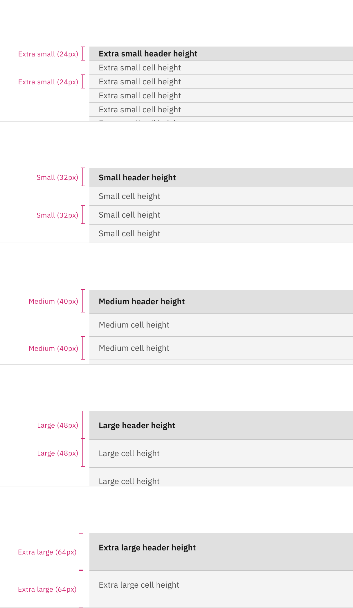
Data table row and header heights: extra small, small, medium, large, and extra large.
Element | Property | px / rem | Spacing token |
|---|---|---|---|
Checkbox | height, width | 20 / 1.25 | – |
padding-left, padding-right | 16 / 1 |
| |
Radio button | height, width | 20 / 1.25 | – |
padding-left, padding-right | 16 / 1 |
| |
Overflow menu (sm) | height | 32 / 2 | – |
Chevron icon | svg | 16 / 1 | – |
click target | 32 / 2 |
| |
padding-left, padding-right | 16 / 1 |
| |
Expanded panel | padding-top, padding-right | 16 / 1 |
|
padding-left | 48 / 3 |
| |
padding-bottom | 24 / 1.5 |
|
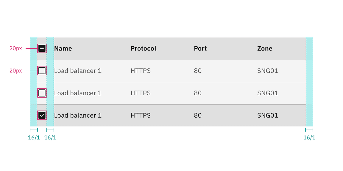
Structure and spacing measurements for selected row | px/rem
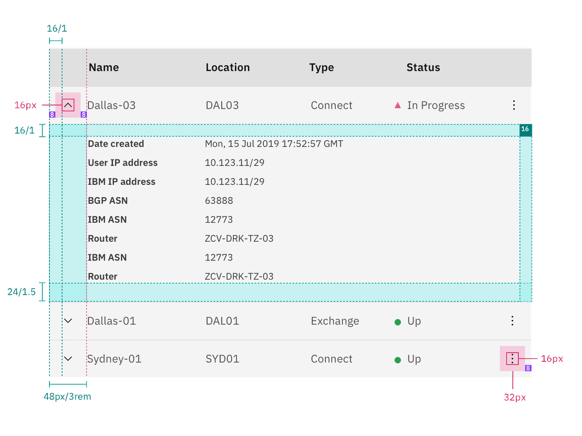
Structure and spacing measurements for expanded row | px/rem
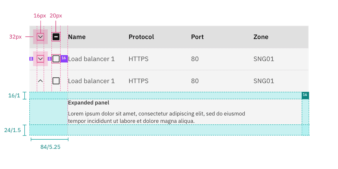
Structure and spacing measurements for expanded and selected row | px/rem
Element | Property | px / rem | Spacing token |
|---|---|---|---|
Toolbar: extra small | height, width | 24 / 1.5 | – |
margin-top, margin-bottom | 8 / 0.5 |
| |
Toolbar: small | height, width | 32 / 2 | – |
margin-top, margin-bottom | 4 / 0.25 |
| |
Toolbar: large | height, width | 48 / 3 | – |
margin-top, margin-bottom | 16 / 1 |
|
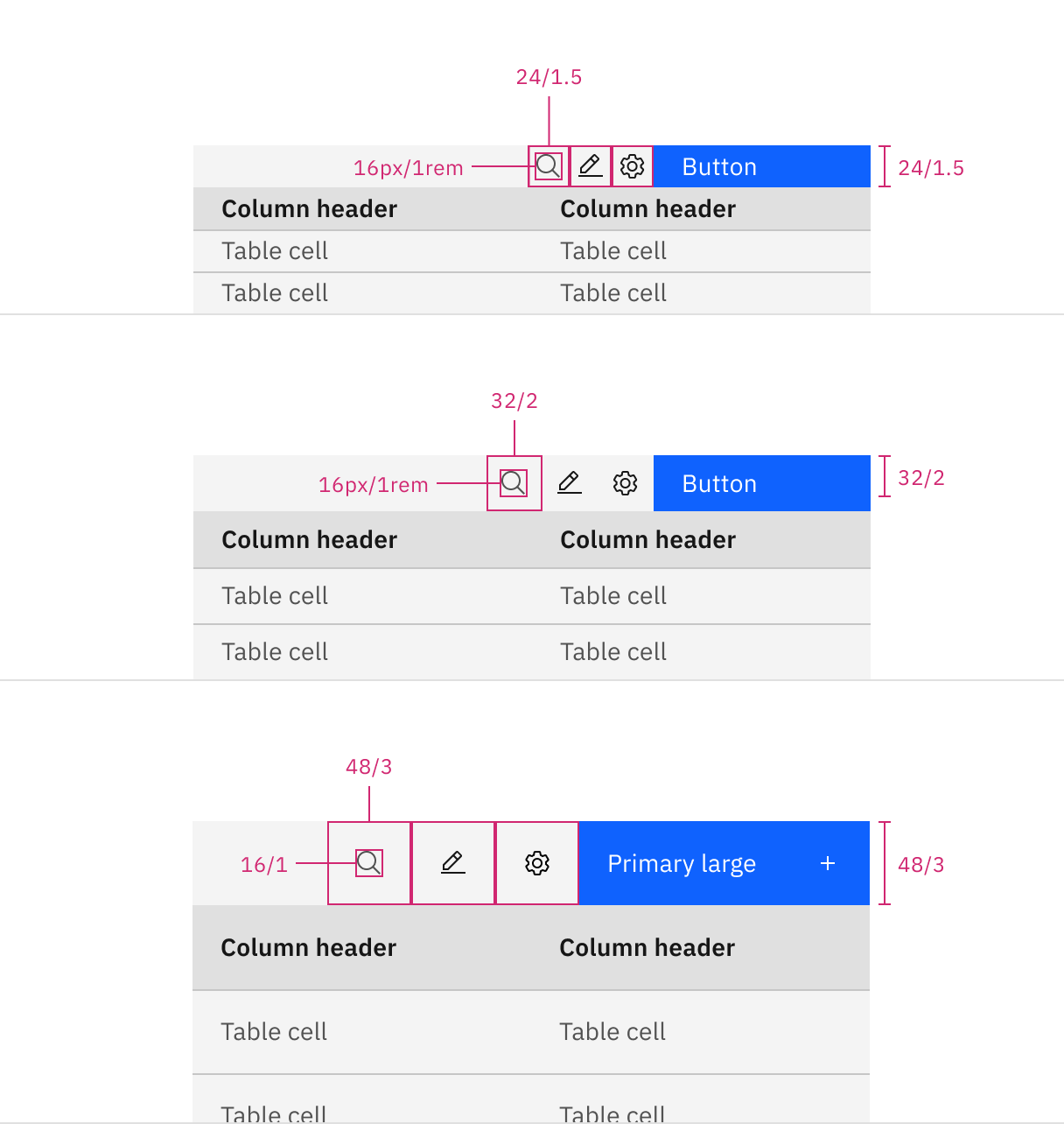
Structure and spacing measurements for toolbar | px/rem
Element | Property | px / rem | Spacing token |
|---|---|---|---|
Batch action bar: extra small | height | 24 / 1.5 | – |
Button | size | 24px | – |
Batch action bar: small | height | 32 / 2 | – |
Button | size | 32px | – |
Batch action bar: large | height | 48 / 3 | – |
Button | size | 48px | – |
Before and after text | padding-left, padding-right | 16 / 1 |
|
Button: icon | padding-right | 16 / 1 |
|
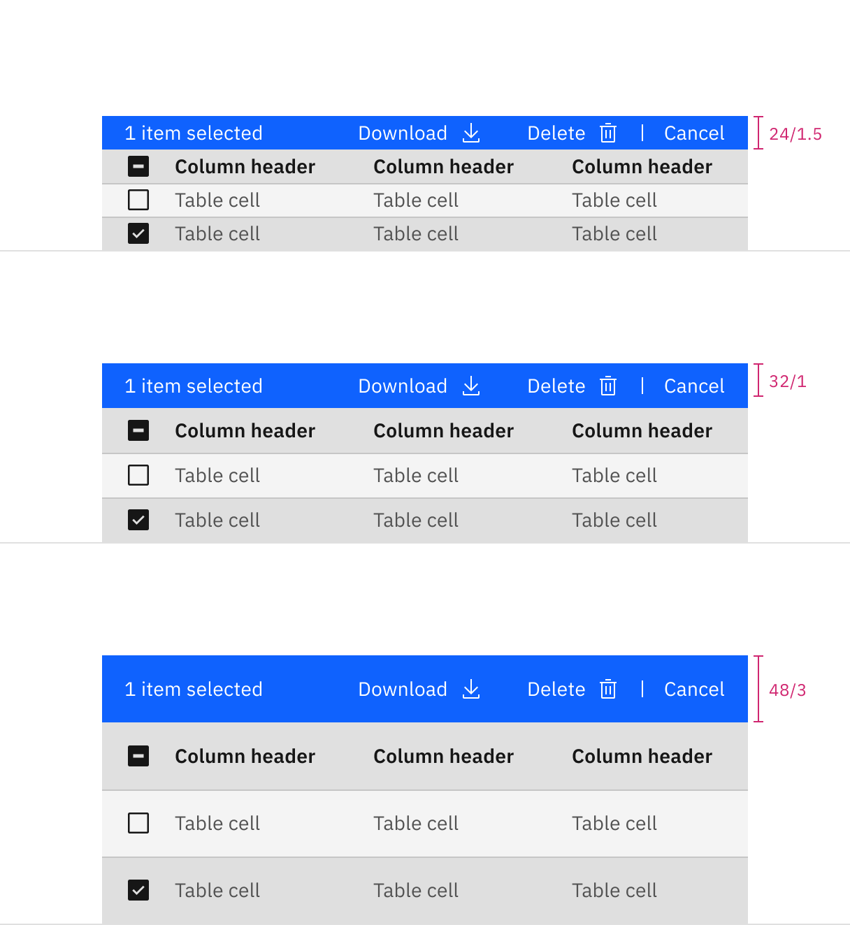
Structure and spacing measurements for batch action bar | px/rem
Size | Height (px / rem) |
|---|---|
Extra small (xs) | 24 / 1.5 |
Small (sm) | 32 / 2 |
Medium (md) | 40 / 2.5 |
Large (lg) | 48 / 3 |
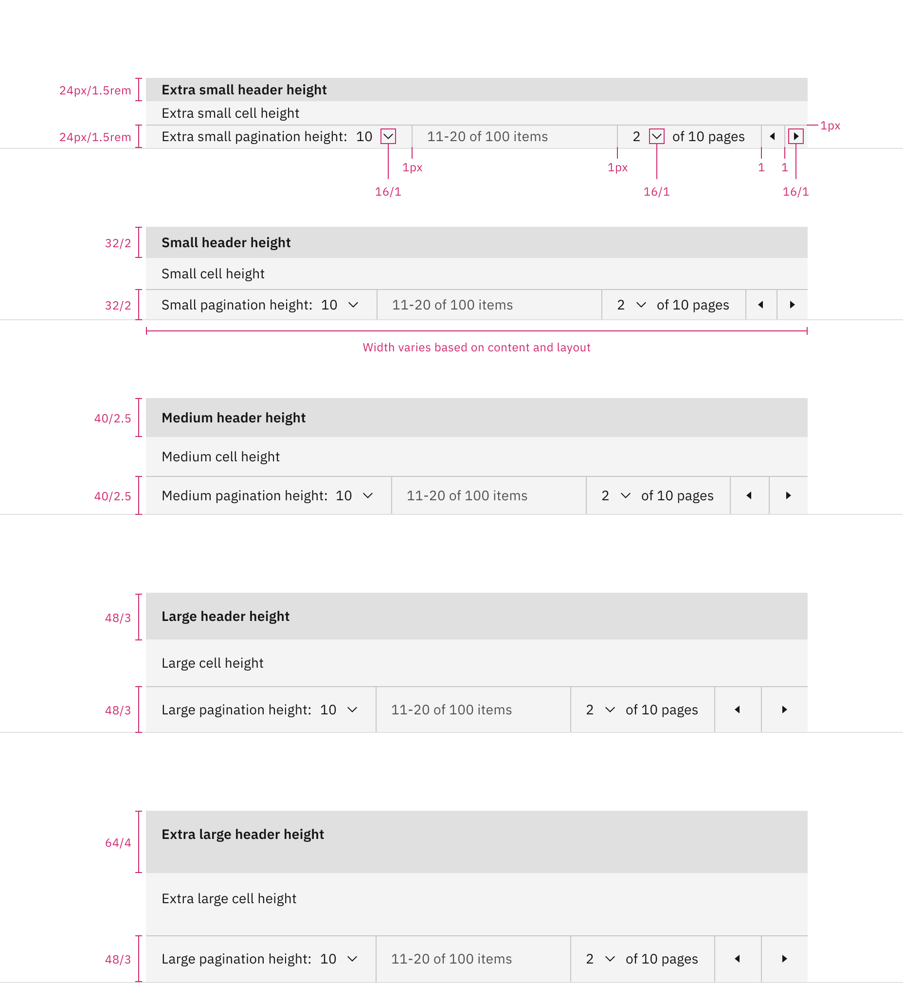
Data table pagination heights: extra small, small, medium, large, and extra large.
AI presence
The following are the unique styles applied to the component when the AI label is present. Unless specified, all other tokens in the component remain the same as the non-AI variant.
For more information on the AI style elements, see the Carbon for AI guidelines.
Element | Property | Token / Size |
|---|---|---|
Data table:background | background-color |
|
box-shadow |
| |
inner-shadow |
| |
Linear gradient:background | start |
|
stop |
| |
Linear gradient:border | top |
|
bottom |
| |
AI label | size | large |
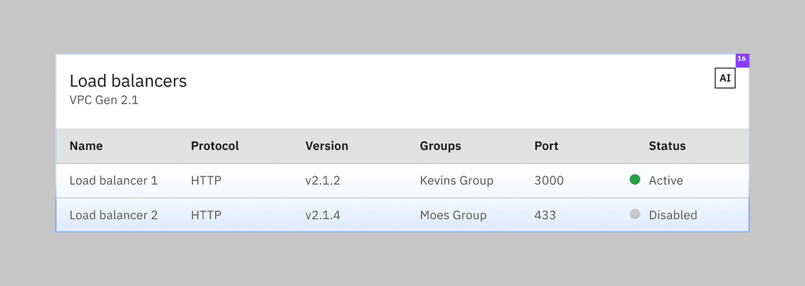
Structure and spacing measurements for entire data table generated by AI.
Element | Property | Token / Size |
|---|---|---|
Inline AI label | size | medium |
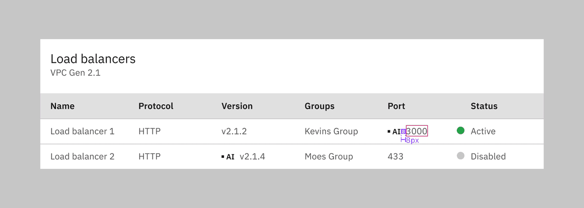
Structure and spacing measurements for individual cells of a data table generated by AI.
Element | Property | Token / Size |
|---|---|---|
Linear gradient:background | start |
|
stop |
| |
Linear gradient:border | left, top |
|
AI label | size | mini |
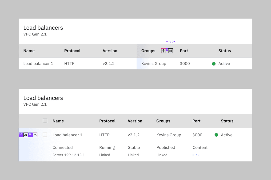
Structure and spacing measurements for rows and columns of a data table generated by AI.
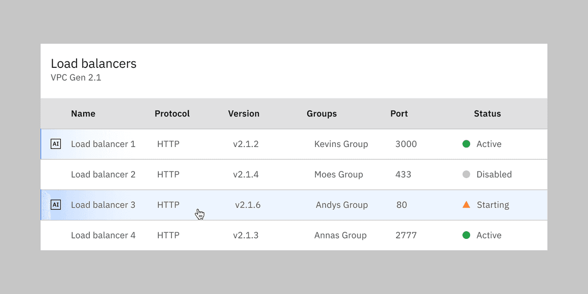
Hover interaction for an AI generated row.
Feedback
Help us improve by providing feedback, asking questions, requesting features, or leaving any other comments on GitHub.