Element | Property | Color token |
|---|---|---|
List title: on-page | text color |
|
background-color |
| |
List title: disclosed | text color |
|
background-color |
| |
List item | text color |
|
background-color | transparent | |
Icon (optional) | svg |
|
Row divider | border-bottom |
|
* Denotes a contextual color token that will change values based on the layer it is placed on.
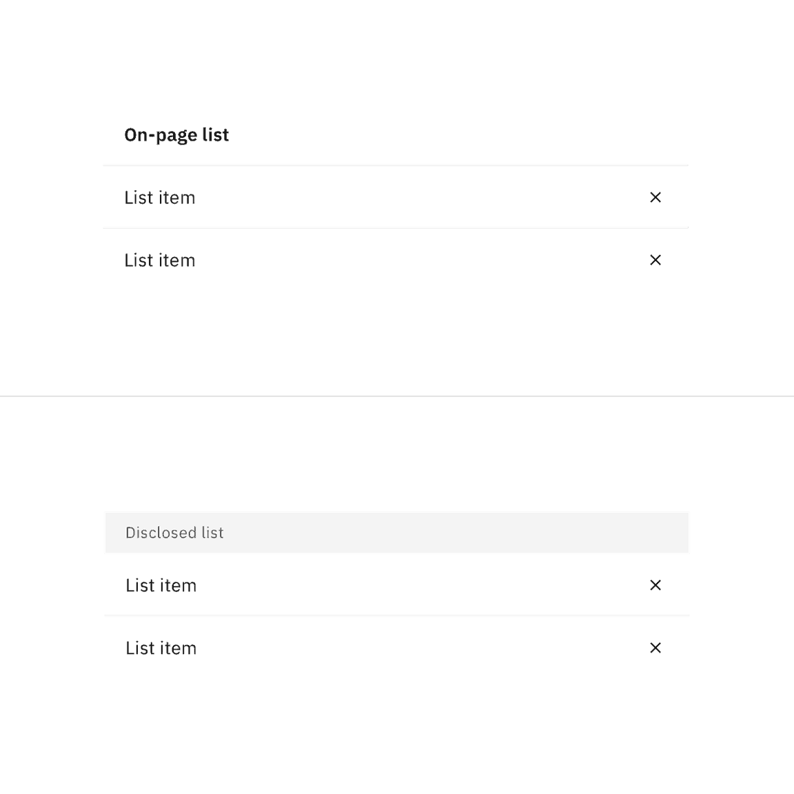
Example of enabled states for contained list variants
Element | Property | Color token |
|---|---|---|
Hover | background-color |
|
Focus | border |
|
Active | background-color |
|
Disabled | text color |
|
border |
|
* Denotes a contextual color token that will change values based on the layer it is placed on.
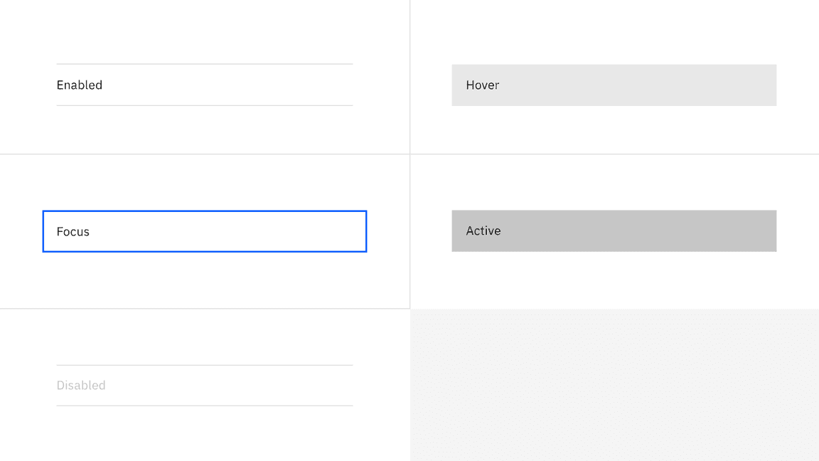
Example of interactive states for contained list item rows
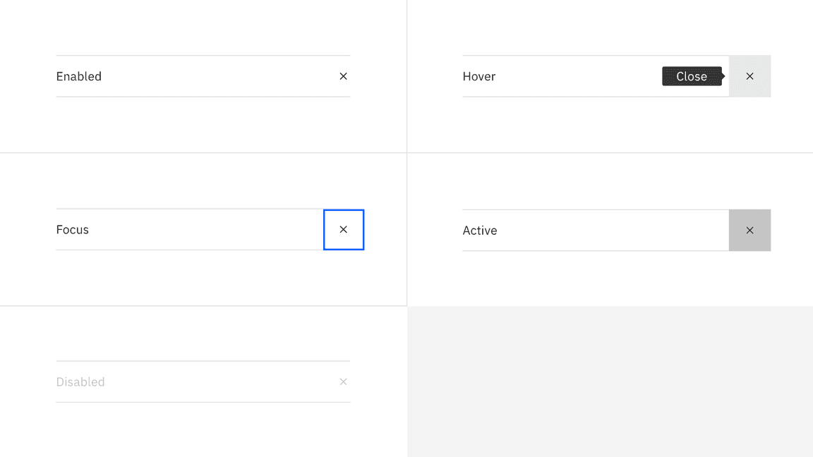
Example of interactive states for contained list inline actions
Element | Font-size (px/rem) | Font-weight | Type token |
|---|---|---|---|
List title: on-page | 14 / 0.875 | SemiBold / 600 |
|
List title: disclosed | 12 / 0.75 | Regular / 400 |
|
List item | 14 / 0.875 | Regular / 400 |
|
Element | Property | px / rem | Spacing token |
|---|---|---|---|
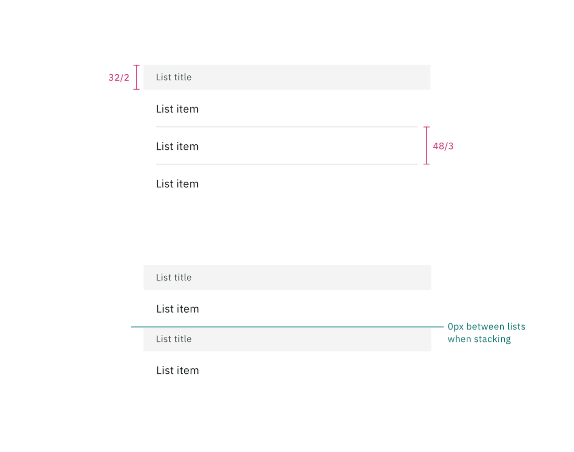
List header area: on-page | height | 32 / 2 |
|
padding-left, padding-right | 16 / 1 |
| |
List header area: disclosed | height | 48 / 3 |
|
padding-left, padding-right | 16 / 1 |
| |
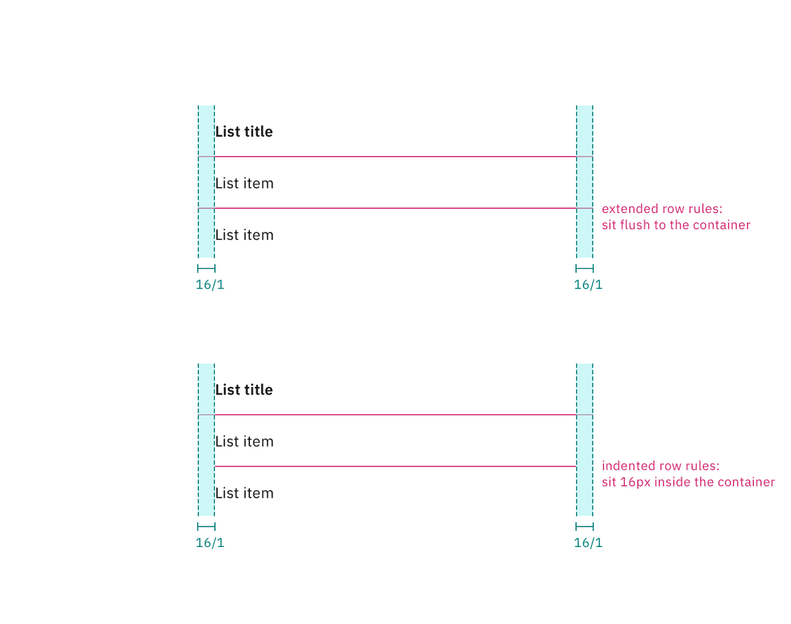
List item | padding-left, padding-right | 16 / 1 |
|
Non-interactive icon (optional) | height, width | 16px | — |
padding left, padding-right | 16 / 1 |
| |
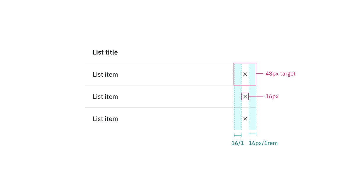
Inline action icon button (optional) | height, width | 16px | — |
padding left, padding-right | 16 / 1 |
| |
Search icon button (optional) | height, width | 16px | — |
padding left, padding-right | 16 / 1 |
|
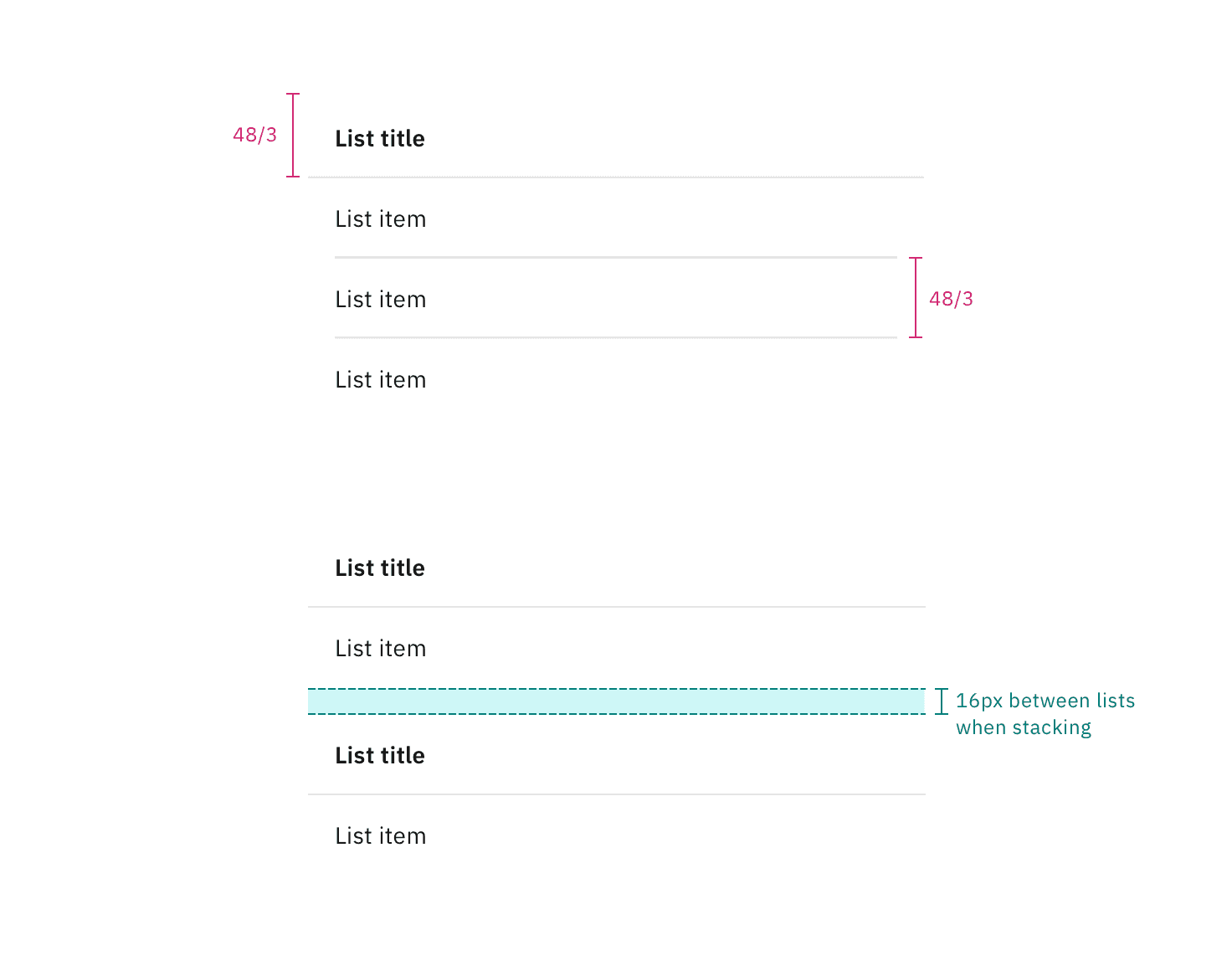
Structure and spacing measurements for the on-page list variant | px / rem
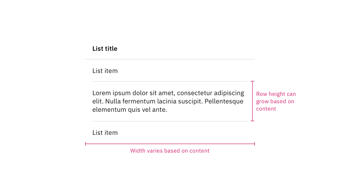
Structure and spacing measurements for the disclosed list variant | px / rem
Structure and spacing measurements for height and width of row content | px / rem
Structure and spacing measurements for padding and rule alignment | px / rem
Structure and spacing measurements for inline actions | px / rem
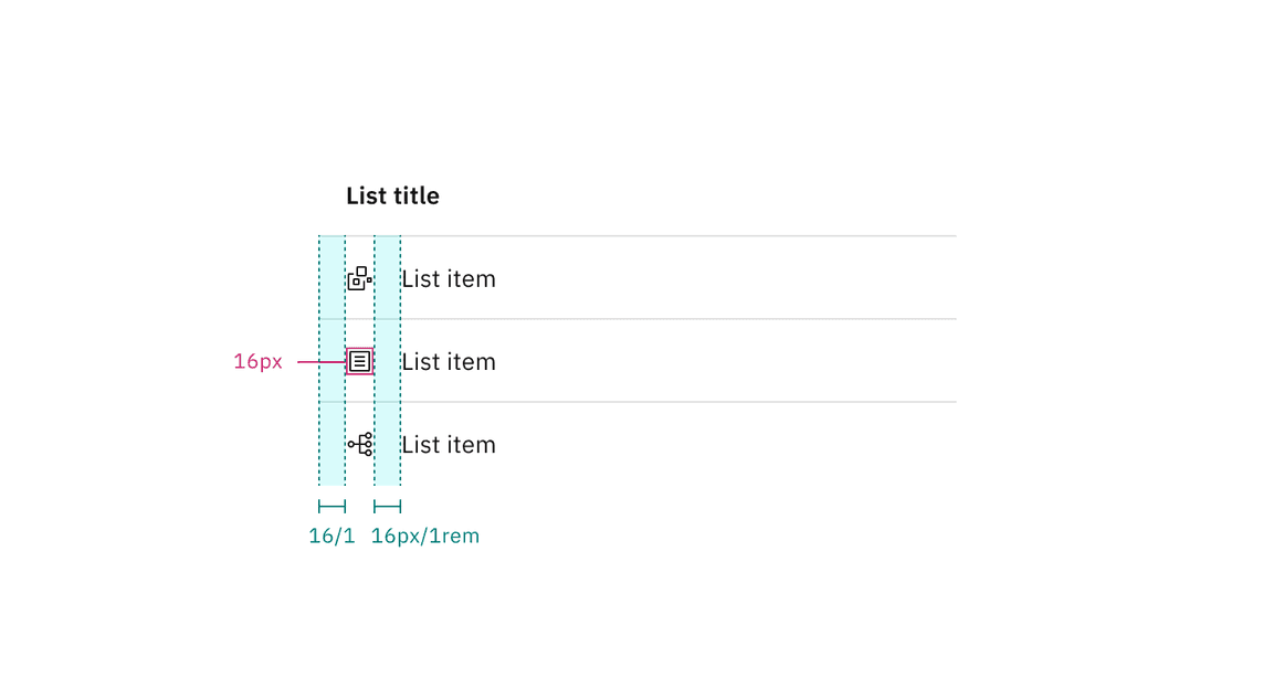
Structure and spacing measurements for non-interactive icons | px / rem
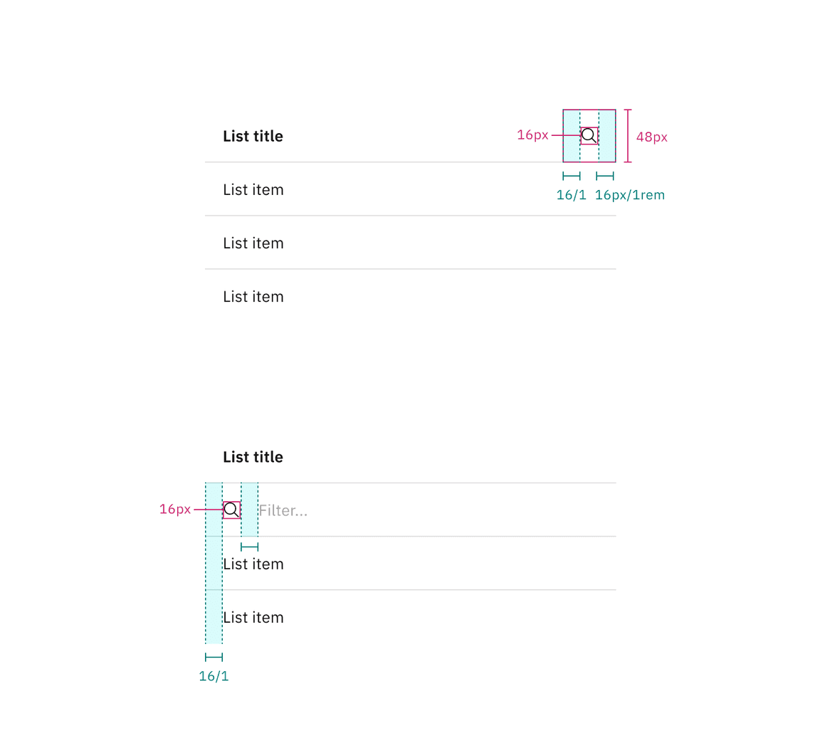
Structure and spacing measurements for search and filtering | px / rem
Size | Element | Height px / rem |
|---|---|---|
Small (sm) | Header and row | 32 / 2 |
Medium (md) | Header and row | 40 / 2.5 |
Large (lg) | Header and row | 48 / 3 |
Extra large (xl) | Header | 48 / 3 |
Row | 64 / 4 |
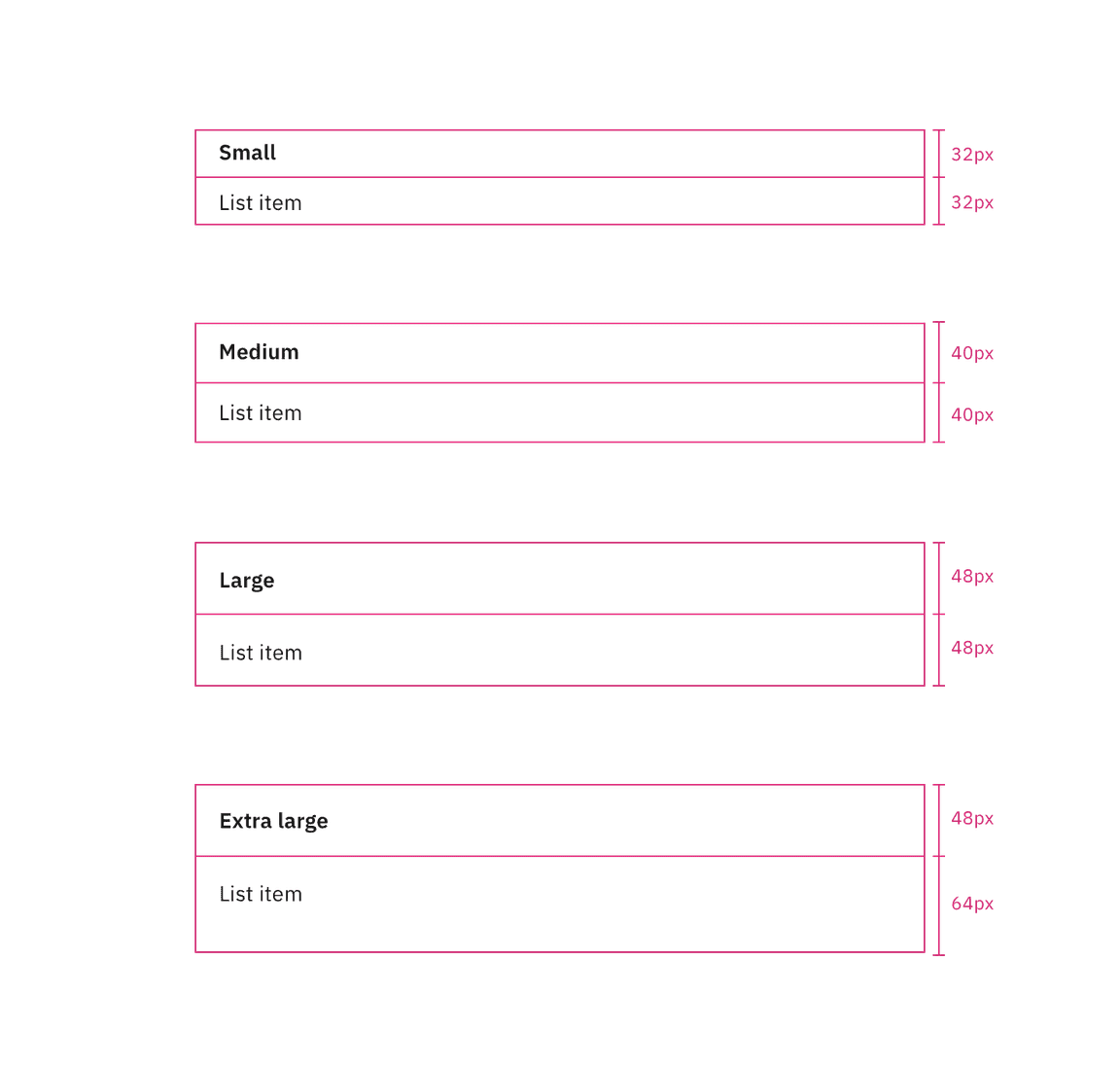
Sizes for contained list on-page variant | px / rem
Size | Element | Height px / rem |
|---|---|---|
Large (lg) | Header | 32 / 2 |
Row | 48 / 3 |
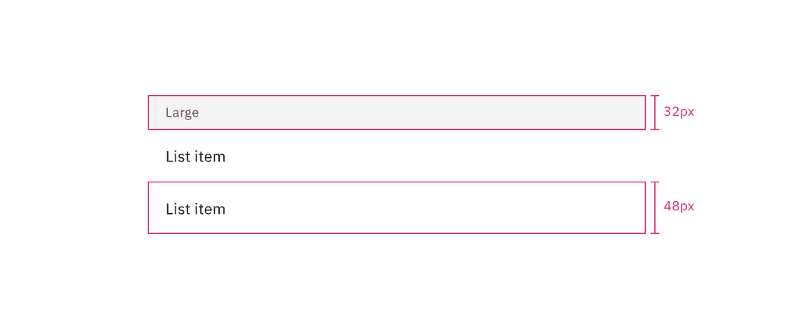
Sizes for contained list disclosed variant | px / rem
Feedback
Help us improve by providing feedback, asking questions, requesting features, or leaving any other comments on GitHub.