What Carbon provides
No accessibility annotations are needed for breadcrumbs, but keep these considerations in mind if you are modifying Carbon or creating a custom component.
Carbon bakes keyboard operation into its components, improving the experience of blind users and others who operate via the keyboard. Carbon incorporates many other accessibility considerations, some of which are described below.
Keyboard interactions
Each page link in the breadcrumb is reached by Tab and activated by Enter. The current page, if listed in the breadcrumb, is not a link. If the breadcrumb is truncated, the ellipsis button for the overflow menu is in the tab order. See overflow menu for details on its keyboard operation.
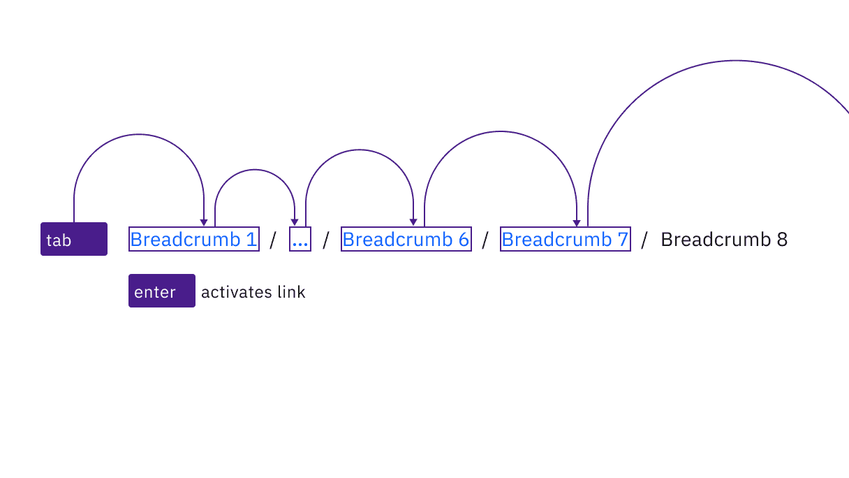
The breadcrumb’s links are reached by Tab and activated by Enter.
Labeling and regions
Carbon implements each page link as a list item inside a navigation region named “breadcrumb.” The ellipsis symbol is a button called “more breadcrumbs” which opens the overflow menu.
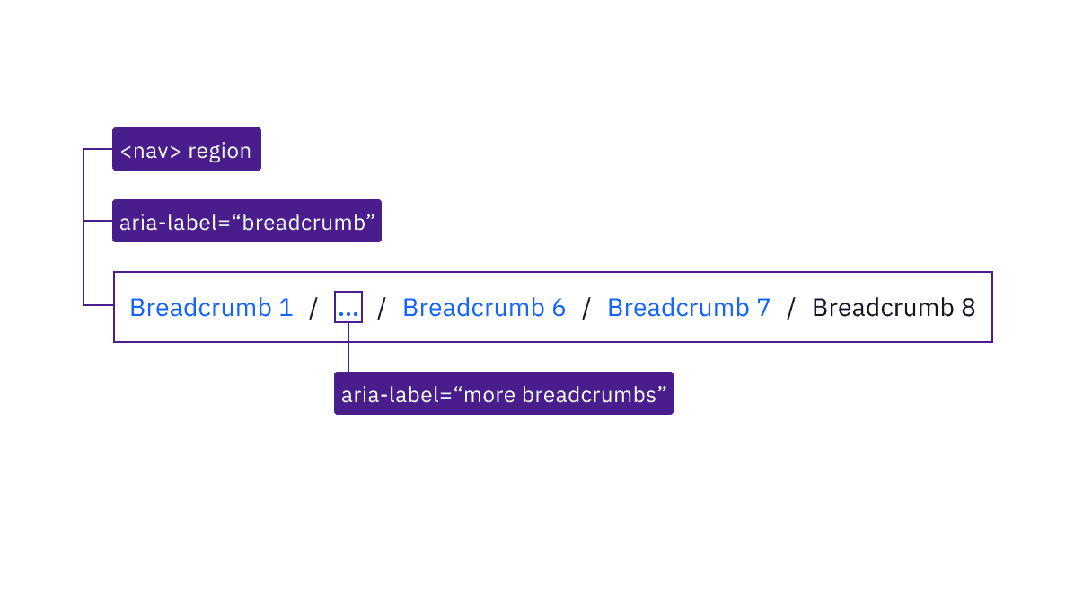
Carbon provides the accessibility information about the breadcrumb’s structure.
Development considerations
Keep these considerations in mind if you are modifying Carbon or creating a custom component:
- The Carbon implementation uses an html5
<nav>element; this could also be achieved with a “navigation” landmark on a<div>. - Each link in the breadcrumb is implemented as an unordered list item so that screen readers provide more context.
- The visual / separators do not need to be text (Carbon uses CSS) and are not intended to be navigable.
Accessibility testing status
Latest version: 1.113.0 | Framework: React (@carbon/react)
| Component | Accessibility test | Status | Link to source code |
|---|---|---|---|
| Breadcrumb | Test(s) that ensure the initial render state of a component is accessible. | Passes all automated tests with no reported accessibility violations. | GitHub link |
| Tests that ensure additional states of the component are accessible. This could be interactive states of a component or its multiple variants. | Passes all automated tests with no reported accessibility violations. | ||
| Tests that ensure focus is properly managed, and all interactive functions of a component have a proper keyboard-accessible equivalent. | Passes all automated tests with no reported accessibility violations. | ||
| This manual testing ensures that the visual information on the screen is properly conveyed and read correctly by screen readers such as JAWS, VoiceOver, and NVDA. | A human has manually tested this component, e.g. screen reader testing. |
Feedback
Help us improve by providing feedback, asking questions, requesting features, or leaving any other comments on GitHub.