Keyboard interactions
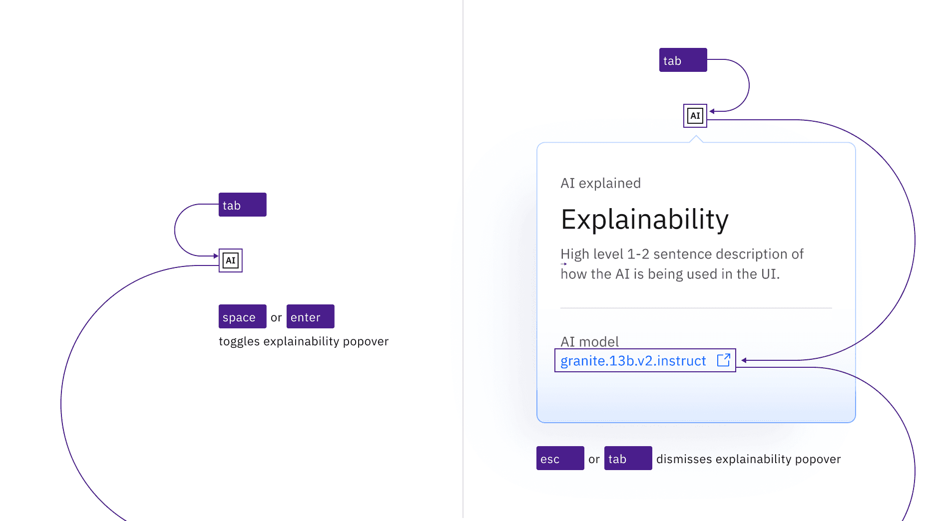
The AI labels is the trigger button. The AI label is in the tab order and is activated by pressing Enter or Space. The activation toggles the explainability popover open and closed, and focus remains on the trigger.
When the popover contains interactive elements, pressing Tab will move focus to the first component in the popover. When the popover only has non-interactive text, or when the focus is on the last component in the popover, pressing Tab will close the popover and move focus to the next tab stop on the page. Pressing Esc in an open popover closes it and returns focus to the trigger.
Input interactions
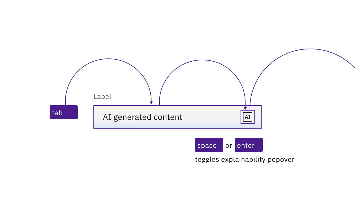
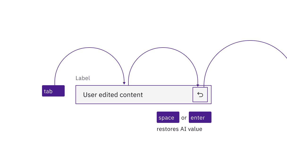
The AI label can appear inside user inputs, where it adds an additional tab stop. For example, a text input will take focus as normal (the existing value will be selected), and then the AI label will take a second tab stop. If the user clears the existing AI-supplied value, (with the Delete key), then the AI label becomes a revert icon, which on activation will restore the AI-supplied value in the input.
The icon button has
aria-label="AI - Show information".The button uses
aria-expandedto set toggletip visibility andaria-controlsto handle navigation to the content.
Accessibility testing status
Latest version: 1.114.0 | Framework: React (@carbon/react)
| Component | Accessibility test | Status | Link to source code |
|---|---|---|---|
| AI label | Test(s) that ensure the initial render state of a component is accessible. | Passes all automated tests with no reported accessibility violations. | GitHub link |
| Tests that ensure additional states of the component are accessible. This could be interactive states of a component or its multiple variants. | Passes all automated tests with no reported accessibility violations. | ||
| Tests that ensure focus is properly managed, and all interactive functions of a component have a proper keyboard-accessible equivalent. | Test data is either not available or not applicable for this component state. | ||
| This manual testing ensures that the visual information on the screen is properly conveyed and read correctly by screen readers such as JAWS, VoiceOver, and NVDA. | A human has manually tested this component, e.g. screen reader testing. |
Feedback
Help us improve by providing feedback, asking questions, requesting features, or leaving any other comments on GitHub.