Login
The login page allows a user to gain access to an application by entering their user ID and password, or by using another method of authentication.
Overview
Login is often the first interaction a user has with your product. This entry point experience is an important moment in establishing your product’s brand and experience and sets the tone for their overall experience with the product.
Anatomy of a basic login screen

- Title: Located at the top of the log in flow. For consistency, the title should include the words “Log in” rather than “Sign in” or another variant. The title can also include the product name if that makes sense for your situation. If necessary the title can wrap to the next line.
- Create account (optional): Link to URX form to create an account; location of this element can vary with layout.
- Required fields: The user ID and password fields are both required although, in IBM’s preferred log in flow, the password field is progressively disclosed, because it has a dependency on the user ID. User IDs are usually in the form of an email address. Depending on the product, this area may also include a filter to specify the ID type.
- Forgot username/password link: Takes users to a page where they can recover their username and/or password.
- Remember ID (optional): Saves the user ID and presents the completed input field the next time the user logs in; it is located under the required field. Clarify what is being remembered (that is, “user ID”) to avoid confusion.
- Alternative logins (optional): Displays alternative login methods in order.
- Continue button: Button label should be “Continue” for the primary call to action. When clicked, the email address is validated and routes the user to either the single sign-on or password flow.
- Need help? (optional): Help link specifically for user ID questions and issues.
- Background image (optional): Check your product team’s guidance and choose an asset accordingly; all product team guidance should adhere to the IBM Design Language. Brand and sub-brand guidance can be found on IBM Brand Center.
When to use
The login page is presented to users in the following scenarios:
- When a user wants to gain access to an app.
- When a user has logged out voluntarily. They will see a confirmation message after which they will be automatically redirected back to the login page.
- When a user has been logged out due to inactivity. In this scenario, when the user logs back in they should be redirected to the last page they were on, before being logged out.
Behavior
Progressive authentication
IBM defaults to progressive authentication for logging into products. This decreases the user’s cognitive load by eliminating non-essential distractions and automatically directing them to the necessary login flow.
As illustrated below, the user ID should be requested upfront with a “Continue” button to move forward. This allows the system to distinguish which path the user needs to take in the background instead of making the user read through options and choose. From this point the user will either continue to a single sign-on (SSO) flow or they’ll be presented a password field.
SSO
Single sign-on (SSO) enables users to log into multiple, unrelated products through one authentication portal, rather than using a unique username and password for each product. Many companies use SSO to give their employees access to a suite of unrelated tools with only one login.
When users input an SSO email and click “Continue” they are taken to their organization’s SSO flow. If it is not possible to determine whether a user is using an SSO email in the backend, provide users with a button to take them to their SSO flow.
Username and password
If a user enters an email that does not use SSO, they are taken to the password flow. The password page includes a way to return to the previous page in case the user makes a mistake while filling out their user ID, as well as a “Forgot password” button.
Do not give users an error if they enter an email or username that is not valid until after they have clicked “Log in” on the password page. This protects valid email addresses and usernames from being exposed and helps keep your product secure.

Multi-factor authentication
Multi-Factor Authentication (MFA) requires a user to present more than one credential, in order to verify their identity. This method provides an added layer of security, while still maintaining ease of use. This often includes a password and an additional credential, like an SMS code or known backup code.
Carbon does not have consolidated guidance around multi-factor authentication. Since it’s something that products approach in different ways, we’d like to conduct more research with a view to offering more robust, centralized guidance in the future.
Separate authentication methods
If distinguishing between the authentication methods in the background is not technically feasible, provide users buttons to the various paths upfront. Consult your product team’s guidance to determine which alternative logins your platform or product offers.
Default text inputs and buttons should be used for this design so that the primary button can maintain its position next to the input field. See the Fluid vs. default style inputs section below for more specific usage guidance. Also, please refer to brand guidelines when using logos for alternative logins. Examples of brand guidelines for a few commonly used alternative logins include:
Example of a login form with alternate login options
Errors and validation
Effective error messaging is important for creating great experiences. Not being able to log into an application is frustrating and blocks users from accomplishing their tasks.
Always present error states on the login screen, and use inline errors whenever possible. The error state you use will depend on whether the validation happens on the client or the server.
Content guidelines
Error messages should be clear and concise. They should help users understand what went wrong and give users steps to resolve the error. Be as specific as possible in your error messages. If the message is written as a complete sentence always use a period. If the message is a short fragment then feel free to omit the period.
Client-side validation
Validate as much of the user’s data before submission as possible. This real-time validation should happen when the input field loses focus and checks for input errors like invalid characters and empty fields. This helps users easily identify mistakes and fix them before submitting the login form.
Common client-side errors:
- Empty required fields
- Invalid characters
- Incorrect input format

Examples of client-side errors
Whether you are using default or fluid text inputs in your login flow, inline error messages should be displayed below any required field that is empty once the field loses focus or an action button (“Continue” or “Log in”) is clicked. See the fluid text input specs for more information on error states. Once the field is filled, the error message should disappear.
The following error messages are suggested:
| Use case | Message |
|---|---|
| Empty username field | IBMid or email is required |
| Empty password field | Password is required |
| Invalid character in an IBMid or email address | Enter a valid IBMid or email address |
| Incorrect formatting of an IBMid or email address | Enter a valid IBMid or email address |
Server-side errors
If there are server-side errors when the user submits the login form, the page should be reloaded, the password field cleared, and the user returned to the username input field. Use an inline notification to display the errors and provide clear direction on how users should resolve the issue. If there are multiple server errors, the inline notifications should stack.

Example of a server-side notification on a login flow
Incorrect username and/or password are the most common server errors. The application should wait until both the username and password have been submitted before checking they are valid. The same generic error message is suggested for incorrect usernames or passwords. As mentioned earlier, this protects valid email addresses and usernames from being exposed and helps keep your product secure.
The following error messages are suggested:
| Use case | Message |
|---|---|
| Wrong username | Incorrect IBMid or password. Try again. |
| Wrong password | Incorrect IBMid or password. Try again. |
Design and layout
Fluid vs. default components
Many product teams have expressed a preference for using the fluid inputs for Login and Sign up flows. What we have presented above is the ideal state of the login pattern using the fluid styles.
However, teams may choose to proceed with the default style inputs. Below are several alternate examples illustrating the login flow with default inputs.
Fluid buttons and inputs require floating containers, whereas default buttons and inputs can either sit on the page, without a container, or sit in a side-aligned full bleed container (much like a panel).

Example of a log in flow using the default style text input components
Designing for multiple alternate logins
As mentioned above, we prefer that the system distinguishes the path a user needs to take in the background rather than making them choose in the UI. However, with certain products, that’s not an option. In order to present multiple alternate logins to the user up front, designers must use default text inputs and default buttons so that the primary button can remain close to the input field.
Be mindful of the hierarchy and avoid layouts that emphasize alternate logins over the preferred login path.

Keep the primary button closest to the text input when presenting multiple alternate logins.

Do not put alternate login buttons between the username input and the primary button.

Do not put alternate login buttons at the top of the login form.
Position
Carbon provides best practice advice on the login pattern but will leave more specific design guidance to the product teams. For instance, decisions like where to position the login flow on a page (i.e. left, right, or center), or whether to use fluid or default inputs, can be made at the product team level as long as the fields remain on the grid. Designers can also choose whether to incorporate brand-approved background textures, illustrations and/or marketing content. Visit the IBM Brand Center for specific guidance and approved assets relating to your brand and/or sub-brand.
Centered layout
Placing the fluid login form in the center of the screen creates a simple entry point for users. Without any distractions on the page, users can focus on their primary goal of logging in to the application or product. Through navigating to the login page, users have already shown intent to log in so additional content about the product isn’t necessary.
This type of login is often paired with a solid color background or a brand-approved background texture. Because the form is the focal point, complex illustrations are not appropriate in this situation.

Example of centered login forms paired with a background texture
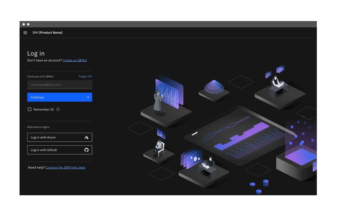
Split-screen layout
The split-screen page is an alternate design that can be used to include some marketing content or other visual treatment related to the product. The login portion of this layout uses the same design and behavior as the centered layout but is confined to one part of the page.
Any additional content on this page should be minimal and easy to scan. It shouldn’t distract from the login form. The user’s primary goal is logging in and that should be reflected in the visual design and emphasis on the page.
Brand-approved background textures or illustrations are appropriate for use with the login form as long as the pairing is accessible and enhances the experience. When choosing colors for your illustrations, consider their association with your particular product or communication. Lean on IBM Design Language layout principles along with the type scale to achieve a clear hierarchy.
Please note that the fluid login form can also be side-aligned to create space for marketing content or an illustration.

Example of split-screen login forms paired with an illustration
There may be a need to include some marketing content on this page. When including additional content, be sure to keep the marketing and login content separated. Testing has shown that users don’t look outside of the login region to find related actions such as create account or SSO buttons, and often miss those actions if they are embedded in the marketing content.

Keep marketing content, including links and CTAs separate from the login.
Spacing
Since login forms can appear as the central focus of the screen or in conjunction with marketing content in a split-screen layout, margins and vertical spacing can vary according to context.
Fluid style login form
The fluid login form has consistent margins regardless of its width on the grid or whether it uses fluid or default inputs. When the password input appears in place of the username input, all of the spatial relationships remain the same, even though certain options (for example, “Remember ID” and alternate logins) disappear. This prevents an awkward resizing or jumping during the animation.

Specs for margins and vertical spacing in a centered login form with fluid input

Specs for margins and vertical spacing in a centered login form with a default styled input
Default style login form
The default login form may or may not appear within a container and margins will vary according to its location on the grid. Adhere to the vertical spacing in the specs below regardless of the container.
If teams choose not to use “Remember ID” (which is optional), they can simply remove the 24px margin top along with it, to adjust the spacing.

Specs for margins and vertical spacing in a split-screen login form with a default style input
Accessibility
Ensure that users can tab through the login form and navigate the page using only a keyboard. Use landmark regions to designate the login region and allow screen readers to skip directly to the input fields. This is especially important if you are using the split-screen layout or have additional content on the page.
Related
References
- Raluca Budiu, Login Walls Stop Users in Their Tracks (Nielsen Norman Group, 2014)
- Lee Munroe, Login vs Sign in, (2010)
- W3C, Using AIRA landmarks to identify regions of a page
- Susan M. Weinschenk, Ph.D., 100 Things Every Designer Needs to Know about People (New Riders, 2011)
Feedback
Help us improve this pattern by providing feedback, asking questions, and leaving any other comments on GitHub.