Design kits
Rapidly build beautiful and accessible experiences. The Carbon kit Sketch contains all resources you need to get started.
Get the kit
1. Install Sketch.
To design with Carbon you must have the most recent version of Sketch installed.
2. Choose a theme.
There are four Carbon themes, two light (White and Gray 10) and two dark (Gray 90 and Gray 100). Each theme lives in its own Sketch library. You can subscribe to as many libraries as you’d like.
3. Bring in additional colors and icons.
Additional color collections live in the IBM Design Language library. Icons live in two different libraries separated by size.
4. Download the grid templates.
Visit the Sketch library page and choose
Download Document
Open the file in Sketch. Navigate to
File → Save as Template
File → New file from Template
Start designing
To get started with Carbon, familiarize yourself with the contents of each library.
Start with the grid.
At the top of your screen, navigate to
File → New file from Template
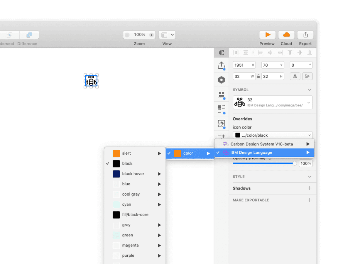
Icons and color swatches.
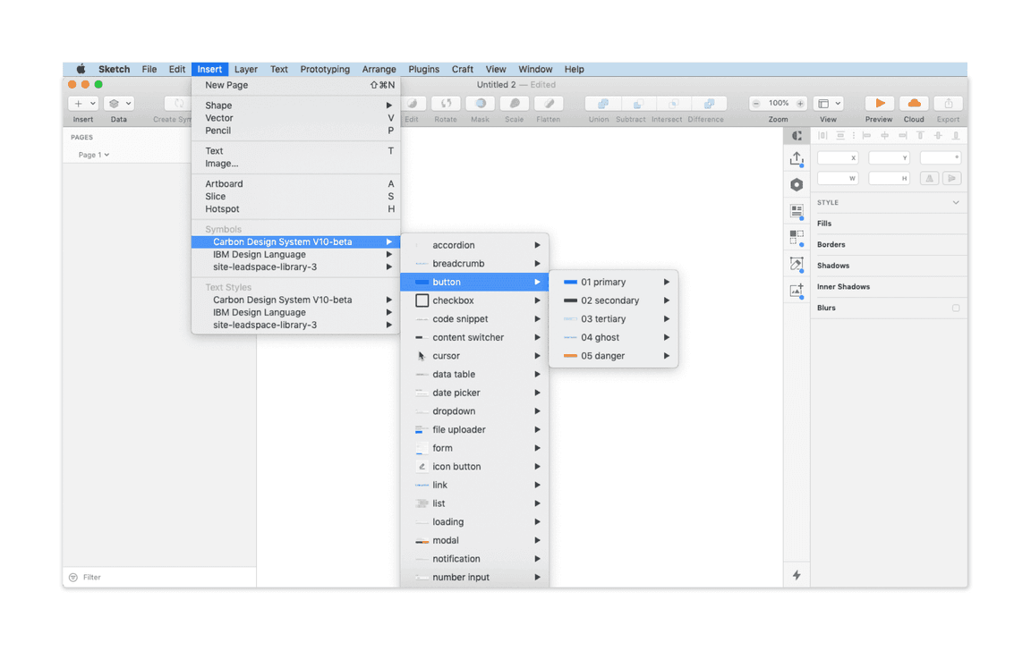
Symbols from both the IBM Design Language library and the Carbon library are accessible from any Sketch document. Navigate to
Insert → Symbols → Carbon Design System
IBM Design Language
You’re all set.
Refer to the content below for a more detailed breakdown of the kit, or head to Sketch to begin designing.
How to use
Grid
The IBM 2x Grid is fundamental to everything we design. It is the geometric foundation of all the visual elements in the IBM Design Language, from typography to columns, boxes, icons, and illustrations. The grid provides structure and guidance for all creative decision-making.

2x Grid overview
Getting started
All designs should start with the 2x Grid. Once you have saved the grid as a template, in Sketch navigate to File → New file from Template and select the
IBM Grid template
Layout
The grid layout feature controls and shows the 2x grid columns, gutters, and page margins. To create or edit the layout go to View → Canvas → Layout Settings….
To toggle seeing the 2x grid columns on an artboard go to View → Show layout or use the keyboard shortcut
Control+L
Grid
To toggle seeing the mini unit grid go to View → Show grid or use the keyboard shortcut
Control+G
Breakpoints
The layout settings change depending on which size screen you are designing for. See breakpoints.
Basic grid
This basic grid is not affected by any influencers and would simply react to the product’s breakpoints. Every layout and break points are included in the grid template on the page labeled “Basic grid”.
Grids with an influencer
An influencer is a component that affects the content on the page. It can either appears on a page as the result of a user action or be part of your product’s page. These influencers effect the layout grid by scaling and resizing the columns and its content. You can find an assortment of examples of grids with an influences in the grid template file on the page labeled “Grid influencers”.
Calculating the Sketch grid
Sketch layout settings
Slide-in panels influence the page layout grid; below are some of the specifications for panel combinations and how they impact the grid at all sizes.
- Breakpoint width* = Artboard width
- Breakpoint gutter* = Left and right outside margins
- Total panel width (“sidebar nav”) + Left outside margin + Right outside margin = Total margins
- Artboard width - Total margins = Total width
- Total panel width + Left margin = Offset
*Since we are following the Carbon Design responsive guidelines, we referenced this table to determine our common breakpoint widths and respective gutter specs.
Example
Let’s say we want to create a custom grid for a new design that uses the extra small panel (256px wide) on our x-large 1312px breakpoint. Applying the formula above, your calculations would look like this:
- Breakpoint width (1312px) = 1312px wide artboard
- Breakpoint gutter (32px) = 32px Left outside margin and 32px Right outside margin
- Total panel width (256px) + 16px Left + 16px Right = 288px Total margins
- Artboard width (1312px) - Total margins (272px) = 1,056px Total width
- Total panel width (256px) + 16px Left = 272px Offset
*If the grid influencer would cause the content view size to be smaller than 1056, then it would follow the next grid breakpoint setting the columns to 8. Which also avoids columns that are smaller than 32.
Symbols
Carbon components, add-ons, and icons live in the design kit as Sketch symbols.
Library menu navigation
There are two kinds of symbols — library symbols and document symbols. Library symbols are available in any Sketch document, while document symbols are specific to the document in which they are found.
From the main menu select Insert → Symbols → Carbon Design System then select the desired symbol to add onto your page.
Carbon symbols are built to be flexible, and designers should not detach symbols from the library. Once a symbol is detached, you will no longer receive updates as they are released.
Structure
Symbols are organized by component; after selecting a component, you’ll see the variations and states of that component.
-
To add the whole component, select the desired variant and place it on your artboard.
-
For even more configurability, use the individual building blocks found under the
folder within the symbol. Be sure your custom design adheres to our design guidelines.Items
Text styles
Text styles are based on typography rules defined by the IBM Design Language.

Library menu navigation
From the main menu select Insert → Text Styles → Carbon Design System to insert a Carbon type token text style.
Text styles within components are carefully considered. We do not recommend detaching the symbol to change default styles.
Structure
Carbon text styles in Sketch are organized similarly to symbols.
- The first text style level displays theme options (i.e., white theme).
- The second level shows the Carbon type tokens (i.e., body-long-01).
- The third level selects the type color, which is labeled with a Carbon color token name.
Layer styles
Layer styles are color selections for any shape in Sketch.
Use predetermined overrides when possible
Library menu navigation
Color in Carbon is carefully considered, and we discourage custom layer styles.
The first layer is the theme selection (i.e., 01 White theme). The second layer is core Carbon color tokens (i.e., field-01) for the selected them. The interaction state tokens are nested in a third layer under “state.”
Explore additional kits
Data visualization
The Data visualization Sketch file includes basic and complex chart assets, along with usage guidance, theming guidance, palettes, and sample layouts. You’ll find even more guidance and assets in this file than on the site.
Gatsby theme
The Gatsby Sketch kit has all the components, patterns, and sample layouts that have been developed by teams within the IBM ecosystem. The Gatsby theme site includes the components, guidelines, and everything you need to create and contribute to Carbon sites.
Image production guidelines
For anyone interested in contributing to the Carbon Design System website, or making images for their own Pattern Asset Library (PAL), we follow a set of guidelines to ensure consistency across the content in the Gatsby ecosystem. The image production guidelines Sketch kit includes guidance, symbols and templates to help designers with every aspect of image creation and component specs.
Native mobile
These Carbon native mobile Sketch resources include everything you need to get your iOS or Android project underway. Install the grid template, be inspired by the patterns and examples, and get started with either the Light or Dark theme.
Accessibility
The IBM Accessibility kit includes checklists, bite-sized guidance, and handoff assets to make sure your designs are accessible for implementation.
Carbon Mid-Fi Sketch kit
This kit provides designers with a way to visualize concepts and test them out before committing to high-fidelity designs.
Text toolbar pattern library
Info
If you’re brand new to Sketch, they offer some great tutorials and help docs.
Updates
We make small adjustments and bug fixes to the kit on a regular basis. When we make a change to any of the libraries, you will be notified via a red pop-up in the top right corner of the Sketch window.
The updates are opt-in, however we recommend you keep your kit as up to date as possible. Once a change is accepted, you will not be able to revert to the previous version.
Migration
The Sketch libraries work on a continuous migration strategy. The v11 updates were made in the same libraries that were used in v10. If your Carbon Sketch libraries are up to date then they are using v11. If you do not wish to use v11 yet then do not accept the library update pushed on 31 March 2022.
Support
Can’t find an answer to your question? Open up an issue on GitHub.