Axes and labels
Axes and labels provide critical context for the information within a chart. Use simple, easy-to-understand descriptors and metrics to label your chart and axes.
Starting at zero
To start at zero, or not to start at zero. This is potentially history’s longest debate. As a charting library, we would like to support both directions, with the following recommendation.
When starting at non-zero is bad
Always start numerical axes at zero for part-to-whole and comparisons charts, such as bar and area chart. Truncating the Y axis can distort the perception, making a small difference look big and significant.
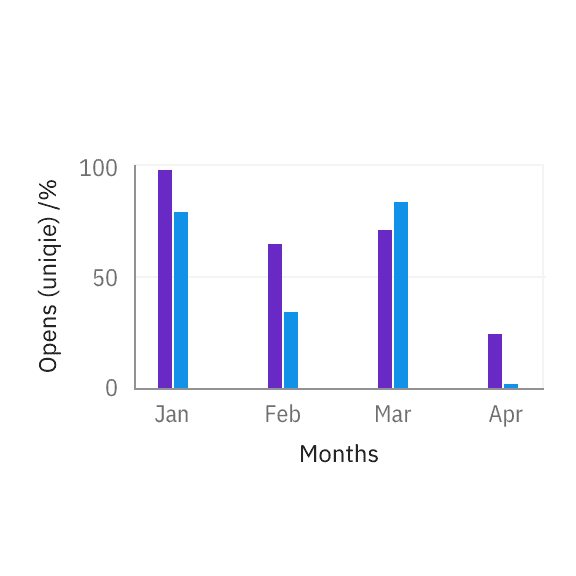
For bar charts, the numerical axis should start at zero.
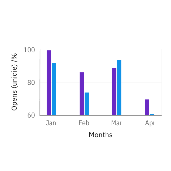
When an axis starts at non-zero, percentage differences between bars are exaggerated.
When starting at non-zero is good
Line charts and scatter plots are less sensitive to this distortion because they are intended to communicate trends and not the relative size of the difference. In these cases, cropping the Y axis helps users more easily identify the direction of change.
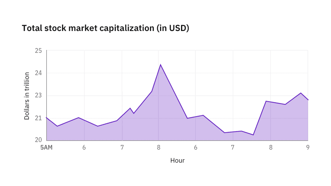
For line charts showing stock market activities, the existence of peaks and valleys in trends is more important than the true size of the change.
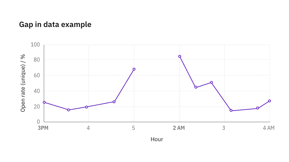
Gaps in data
Never interpolate between periods when data is unavailable. Always label both the start and end point during which data is not available.
Breaks in axes
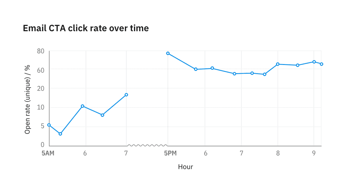
Sometimes it is useful to skip part of the axis to bring data on the extreme ends into view without distortion. When the axis contains a break, use a sinusoidal line to replace the straight axis line.
On the X axis, the break can be fluid with graph area size, with a minimum width of 16px. On the Y axis, we recommend using a fixed distance of 16px for the break.
If data is available during an axis break, re-style line segments to use 0.5px stroke and hide circles representing data points.
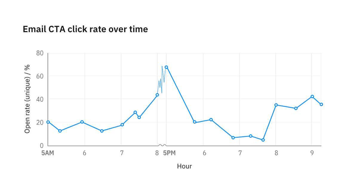
If data isn’t available between axis breakpoints, leave the area empty.
Time series
Consistent increments
Never change axis ticks increments to accommodate data availability. If any form of axis compression is required, use the provided axis break styling to visually denote the compression.
Localization
In time series, X-axis labels reflect the time increment in the data. When possible, use localized date and time format, or user preference. Otherwise, the chart defaults to the format presented below.
Landmark labels
Whenever data crosses into a new time cycle, such as a new day, month, or year, semibold the label to make it a “landmark” label to provide additional context for the labels following it.
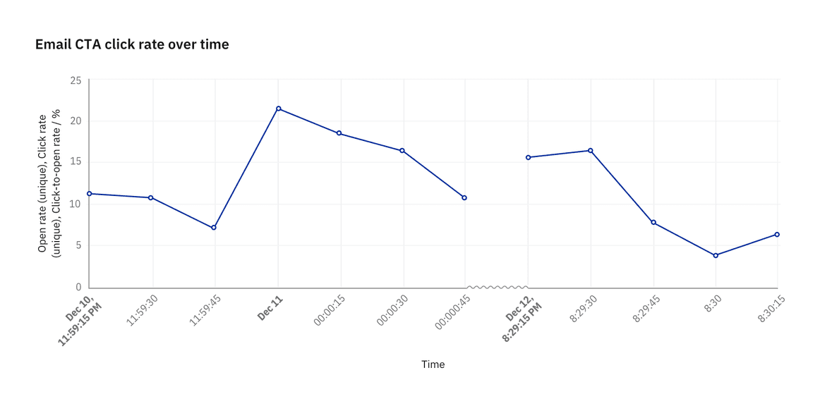
Example of a time series plotted at 15 seconds intervals