Checkbox
Design annotations are needed for specific instances shown below, but for the standard checkbox component, Carbon already incorporates accessibility.
What Carbon provides
Carbon bakes keyboard operation into its components, improving the experience of blind users and others who operate via the keyboard. Carbon incorporates many other accessibility considerations, some of which are described below.
Keyboard interactions
Each checkbox can be reached by
Tab
Space

Carbon checkboxes retain expected interactions.
Grouping
For groups of checkboxes, Carbon already provides the code for screen readers to properly detect the set of checkboxes and announce the group label.
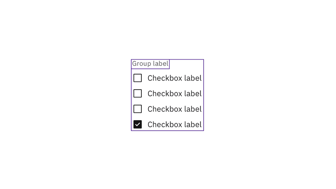
Carbon handles the accessibility of grouped checkboxes.
Design recommendations
Design annotations are needed for the following instances.
Meaningful order
Checkboxes can appear in multiple columns. If there is a meaningful order to the items (such as days of the week), annotate whether the tab order is by row or by column. See Specify the tab order.

Annotate if there is meaningful navigation order in rows of checkboxes.
Development considerations
Keep these considerations in mind if you are modifying Carbon or creating a custom component:
- Checkboxes are grouped using and<fieldset>.<legend>
- A tri-state checkbox that is partially checked (indeterminate) has
set toaria-checked. See Behaviors on the Usage tab for details."mixed"
- See the ARIA authoring practices for more considerations.
Accessibility testing statusFor every latest release, Carbon runs tests on all components to meet the accessibility requirements. These different statuses report the work that Carbon has done in the back end. These tests appear only when the components are stable.
For every latest release, Carbon runs tests on all components to meet the accessibility requirements. These different statuses report the work that Carbon has done in the back end. These tests appear only when the components are stable.
Latest version: | Framework: React (@carbon/react)
| Component | Accessibility test | Status | Link to source code |
|---|---|---|---|
| Checkbox | Test(s) that ensure the initial render state of a component is accessible. | Passes all automated tests with no reported accessibility violations. | GitHub link |
| Tests that ensure additional states of the component are accessible. This could be interactive states of a component or its multiple variants. | Passes all automated tests with no reported accessibility violations. | ||
| Tests that ensure focus is properly managed, and all interactive functions of a component have a proper keyboard-accessible equivalent. | Passes all automated tests with no reported accessibility violations. | ||
| This manual testing ensures that the visual information on the screen is properly conveyed and read correctly by screen readers such as JAWS, VoiceOver, and NVDA. | A human has manually tested this component, e.g. screen reader testing. |