UI shell left panel
This left panel is part of the Carbon UI shell. A shell is a collection of components shared by all products within a platform. It provides a common set of interaction patterns that persist between and across products.
Live demo
This live demo contains only a preview of functionality and styles available for this component. View the full demo on Storybook for additional information such as its version, controls, and API documentation.
Accessibility testing statusFor every latest release, Carbon runs tests on all components to meet the accessibility requirements. These different statuses report the work that Carbon has done in the back end. These tests appear only when the components are stable.
For every latest release, Carbon runs tests on all components to meet the accessibility requirements. These different statuses report the work that Carbon has done in the back end. These tests appear only when the components are stable.
Resources
General guidance
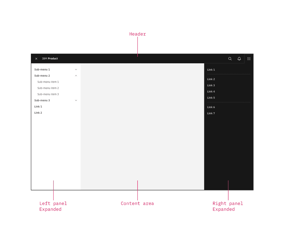
The UI shell is made up of three components: The header, the left panel, and the right panel. All three can be used independently, but the components were designed to work together.
| Shell UI component | |
|---|---|
| Header | The highest level of navigation. The header can be used on its own for simple products or be used to trigger the left and right panels. |
| Left panel | An optional panel that is used for a product’s navigation. |
| Right panel | An optional panel that shows additional system level actions or content associated with a system icon in the header. |
UI shell components
Anatomy
The left panel contains secondary navigation and is positioned below the header and fixed to the left. Both links and sub-menus can be used in the side-nav and may be mixed together.
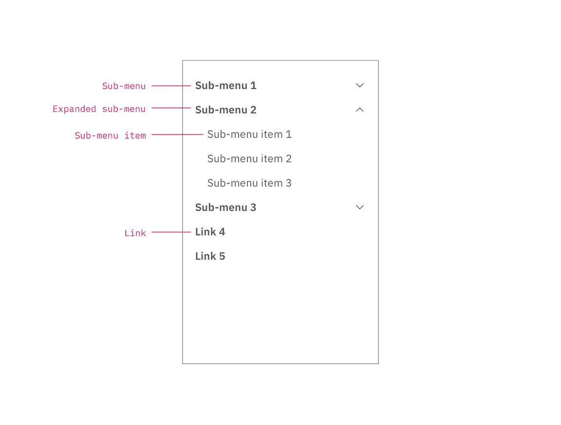
Left panel with nested sub-menus.
Behavior
Use the left panel if there are more than five secondary navigation items, or if you expect a user to switch between secondary items frequently. Sub-menus are denoted with a chevron and expand when clicked, pushing the other items down in the panel. To collapse the sub-menu, the user must again click the menu header in the left panel.
The left panel does not support three tiers of navigation. If you have additional content to display beneath a sub-menu, use tabs within the page.