Create flows
Maintainers:
The Create pattern offers simple (single step) and complex (multistep) variations in one of the following formats: Modal, Side panel, Narrow tearsheet, Wide tearsheet, and Full page.
- Overview
- Inline creation
- Modal
- Side panel
- Narrow tearsheet
- Wide tearsheet
- Full page
- Designing with creation flows
- Related use cases
- Accessibility
- Related
Overview
Users often need to create different types of assets, and they can have simple or complex requirements.
To create is to generate a new resource. Creating is distinct from adding, but the two are often confused. To add a resource is to include a resource that already exists. Editing a resource is also different from creating a new one. This pattern focuses on how to place the user in a flow when there’s a need for creating a new resource.
Do not use this pattern for adding or editing a resource.
| Type | Usage | Context |
|---|---|---|
| Inline | Use with quick, simple creations like that of an item. | On-page content can be seen and interacted with. |
| Modal | Use with simple or transitional creations with no more than a couple of form fields. | On-page content is obscured. |
| Side-panel | Use with medium complexity creations if the user needs page context. | On-page content can be seen and interacted with. |
| Narrow tearsheet | Use with medium complexity creations. | On-page content is obscured. |
| Wide tearsheet | Use with complex or interactive creations. | On-page content is obscured. |
| Full page | Use with creations that must be completed in order for a service to be usable. | N/A |
Inline creation
When to use
With quick, simple creations like that of an item, it is usually preferred to keep the flow inline. This is especially true when the user could benefit from seeing context in the page while creating. The inline create pattern is under construction, as it needs to account for many different use cases. Below is an example of an inline creation.
When not to use
Another factor to consider with quick, simple creations is whether or not the flow is transitional. Use a Modal if the user is being taken to a different page than the one where they initiated the create. For example, if the newly created asset is being opened or if the user is taken to a confirmation screen.
For complex creation flows, such as that of a large system object, use the Narrow or Wide tearsheet variations for single or multistep options, respectively.

Example of an inline create
Modal
When to use
- Use a modal for simple creations with one or two form fields to be filled out.
- Use for transitions when the user will be taken to a different page after creation.
When not to use a modal
- Don’t use a modal in place of an inline create.
- Don’t use a modal if there are more than four form fields or if there is scrolling inside the modal.
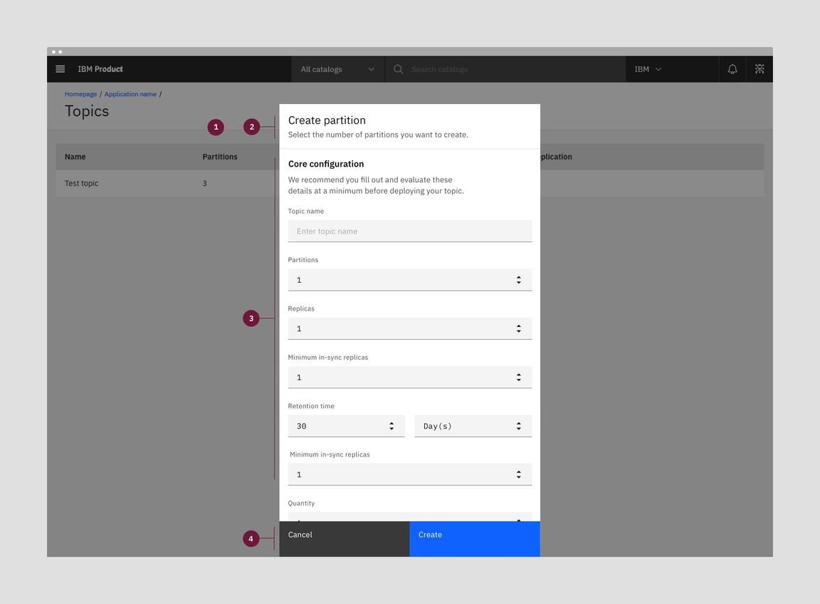
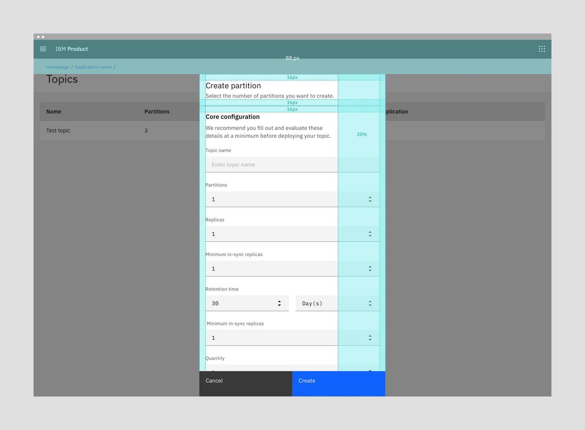
Anatomy of a modal
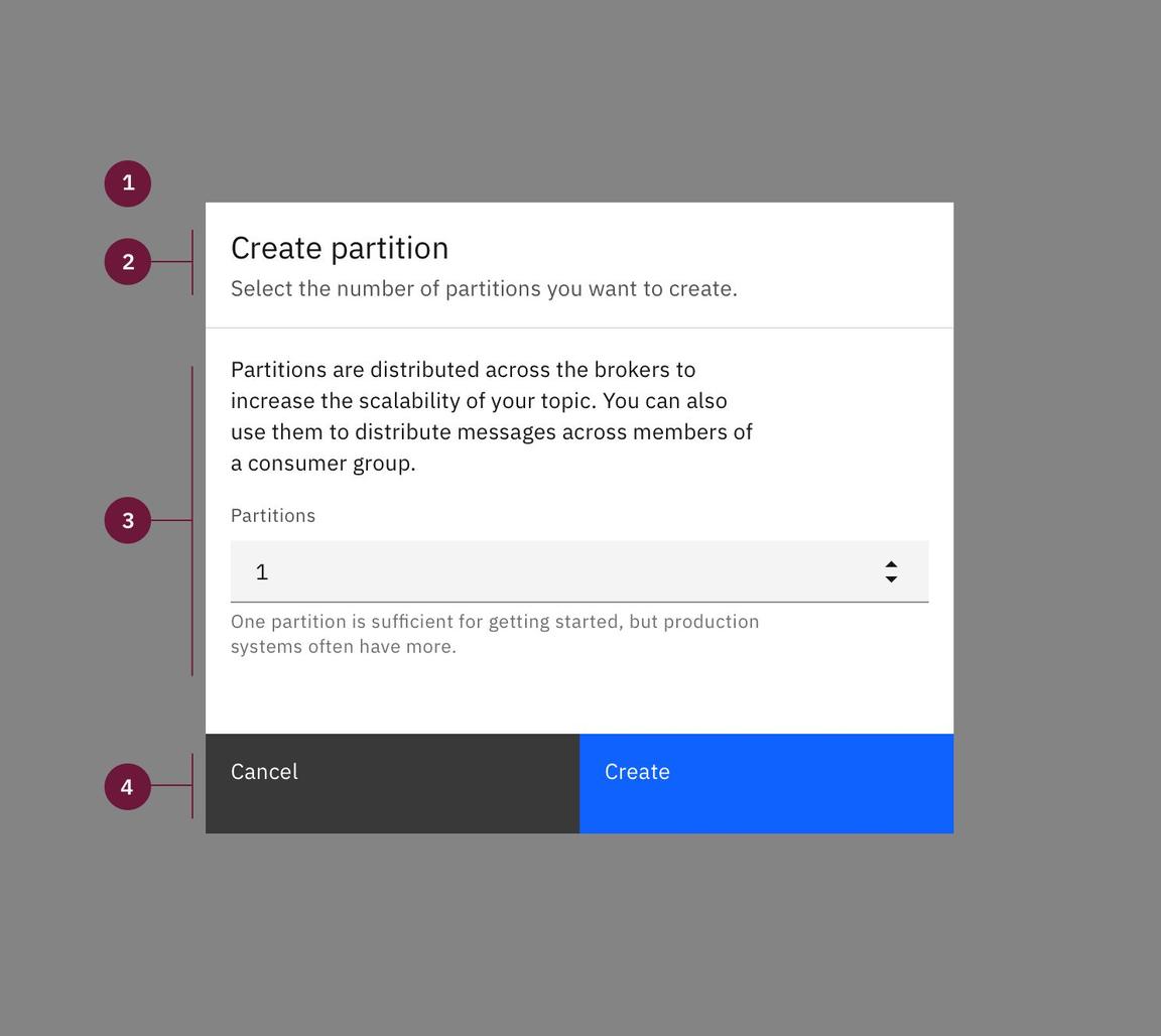
- **Modal size & overlay: ** Small Modal. Screen overlay that obscures the on-page content.
- Create title: Title line for the create flow with an optional subtitle.
- Body: Contains the information and/or controls needed to populate the task. It can include message text and components.
- Buttons: The primary and secondary buttons are “Create” and “Cancel”, respectively.
Side panel
When to use
- Use a side panel when the user needs to have page context while populating the side panel.
When not to use
- Don’t use when the flow has high complexity and the user would benefit from having a visible progress indicator.
Anatomy of a side panel
- Panel size & non-focus state: Side panel is 480px wide and has no overlay. This option supports a non-focus state execution. The user can create while still referencing on-page items.
- Create title: Title line for the create flow with an optional subtitle.
- Body: Contains the information and/or controls needed to populate the task. It can include message text and components.
- Buttons: The primary and secondary buttons are “Create” and “Cancel”, respectively.
Alignment
Narrow tearsheet
When to use
- Use a narrow tearsheet as an alternative to a modal when there is scrolling.
- Use when the form fields can be broken down into sections using section headers.
When not to use
- Don’t use if the flow has high complexity and the user would benefit from having a visible progress indicator.
Anatomy of a tearsheet
- Tearsheet & overlay: Narrow tearsheet component with screen overlay that obscures the on-page content.
- Create title: Title line for the create flow with an optional subtitle.
- Body: Contains the information and/or controls needed to populate the task. It can include message text and components.
- Buttons: The primary and secondary buttons are “Create” and “Cancel”, respectively.
Alignment
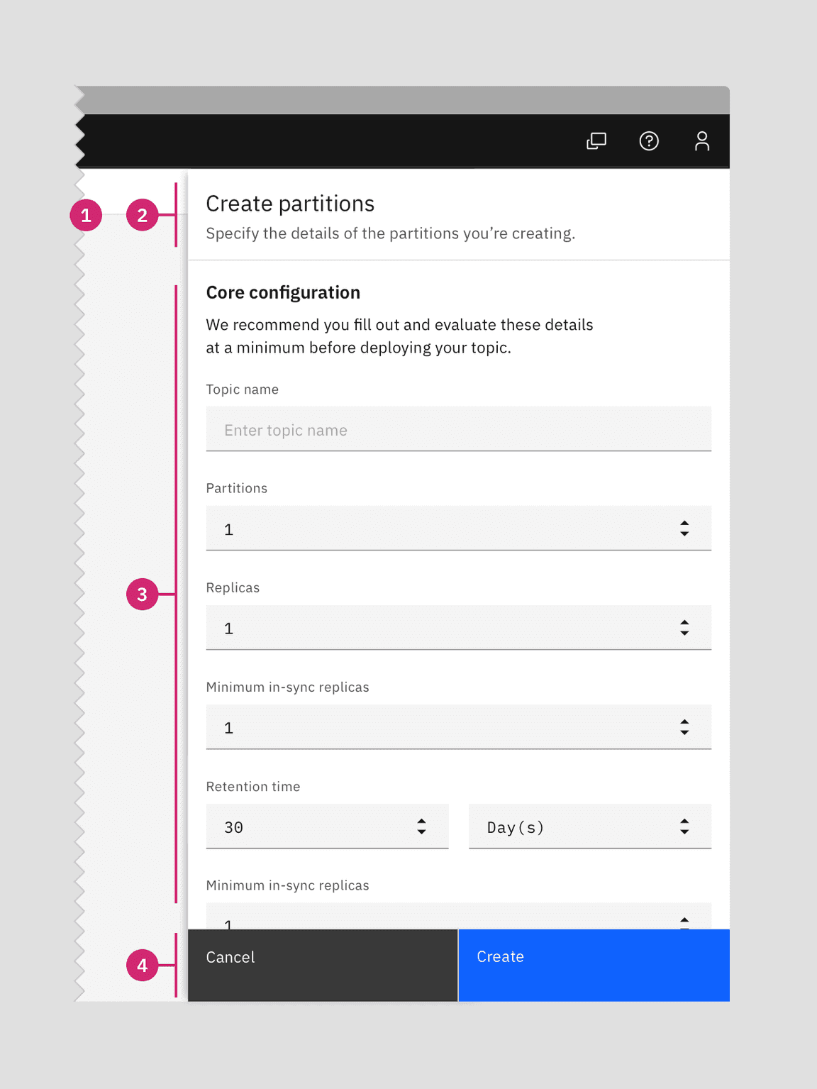
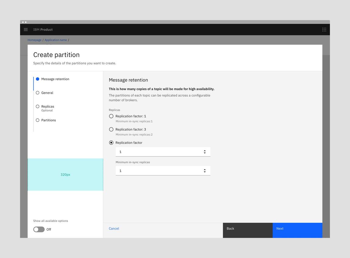
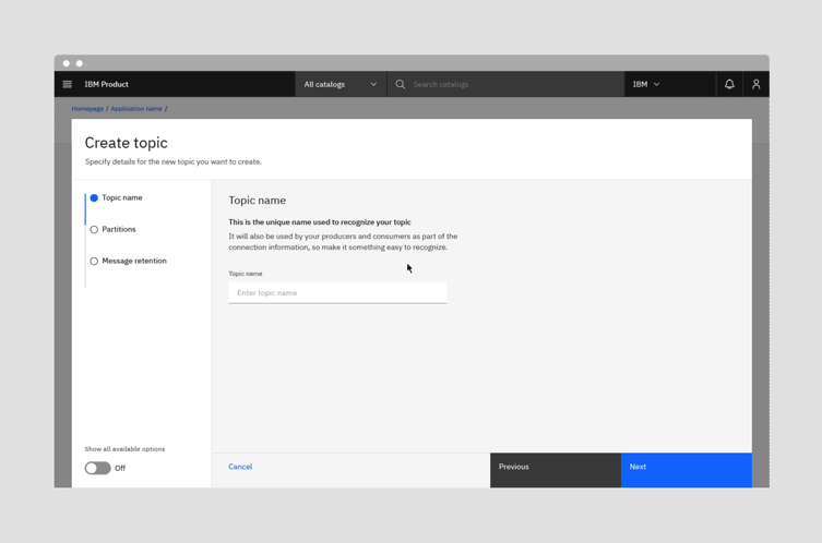
Wide tearsheet
When to use
- Use a wide tearsheet with creations that have two or more distinct steps.
- Omit the progress indicator to use with single step creations that require more space, such as those with interactive selections, diagrams, or tables.
When not to use
- Don’t use the wide tearsheet for low complexity create flows with only one step.
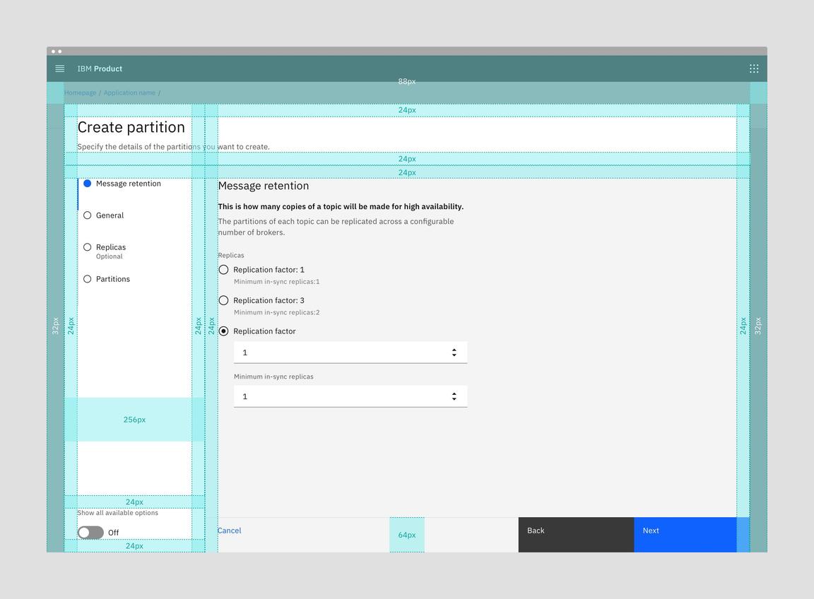
Anatomy of a wide tearsheet
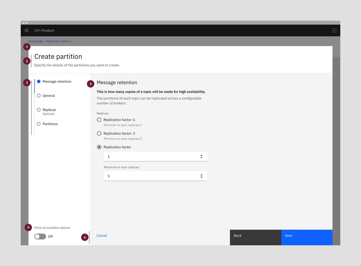
- Tearsheet & overlay: Wide tearsheet component with screen overlay that obscures the on-page content.
- Create title: Title line for the create flow with an optional subtitle.
- Progress indicator: Vertical progress indicator lets the user know what step they are on. The default left panel width is 256px. An option of 320px wide is available for use cases where step labels are very long.
- Toggle (Optional): Optional toggle allows the user to view all available options in one scrolling page with anchor links.
- Body: Contains the information and/or controls needed to populate the task. It can include message text and components.
- Buttons: The primary, secondary, and ghost buttons are “Next”, “Back” and “Cancel”, respectively. The “Back” button will be disabled on the first step. The “Next” button will change to “Create” on the last step of creation. “Cancel” closes the tearsheet and cancels the create action.
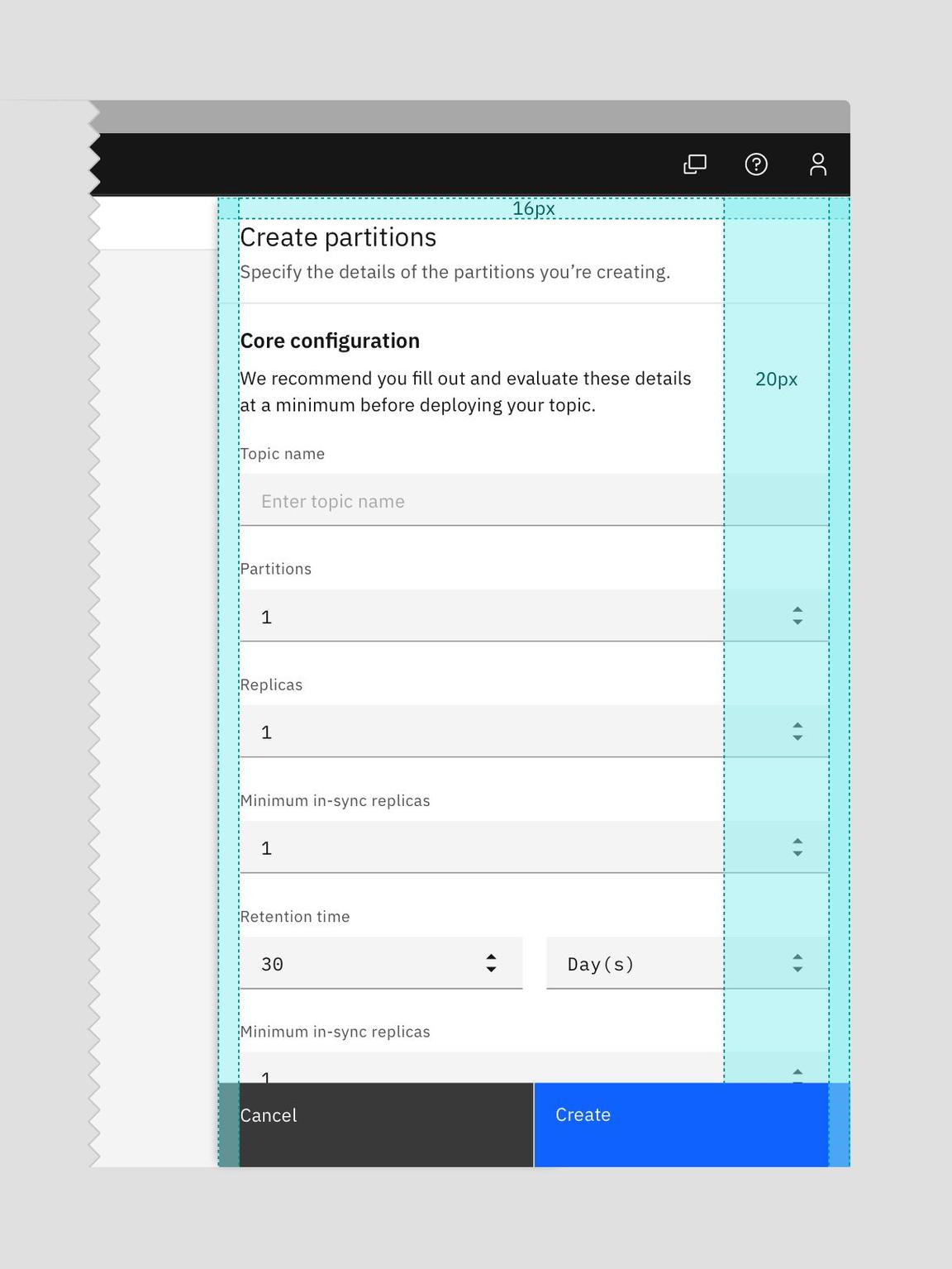
Alignment
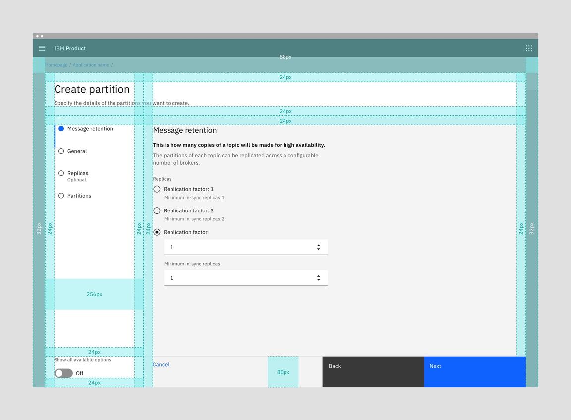
Upcoming 80px fluid button height in the wide tearsheet
Behaviors

Wide tearsheet create flows can include an optional toggle to show all the steps on a single scrolling page with anchor links. Toggling to “Show all available options” will replace the progress indicator with the In-page navigation anchor links. Depending on your use case, you may choose to persist the toggle to show all options for a particular Create flow if it will enhance the user experience.
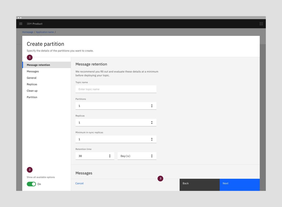
Toggle view - show all available options
- In-page navigation: Side panel switches from progress indicator steps to In-page navigation anchor links that scroll the form content to the corresponding section.
- Toggle: The toggle switches to the “On” position when the user clicks on it.
- Footer & scrolling: The button footer is sticky and has a dividing line on top. The form content appears from underneath the sticky footer. There is no gradient.

Animated illustration of the “Show all available options” toggle behavior
If the user toggles off the advanced options and there could be destructive consequences, show a modal alerting them that the changes won’t be saved.
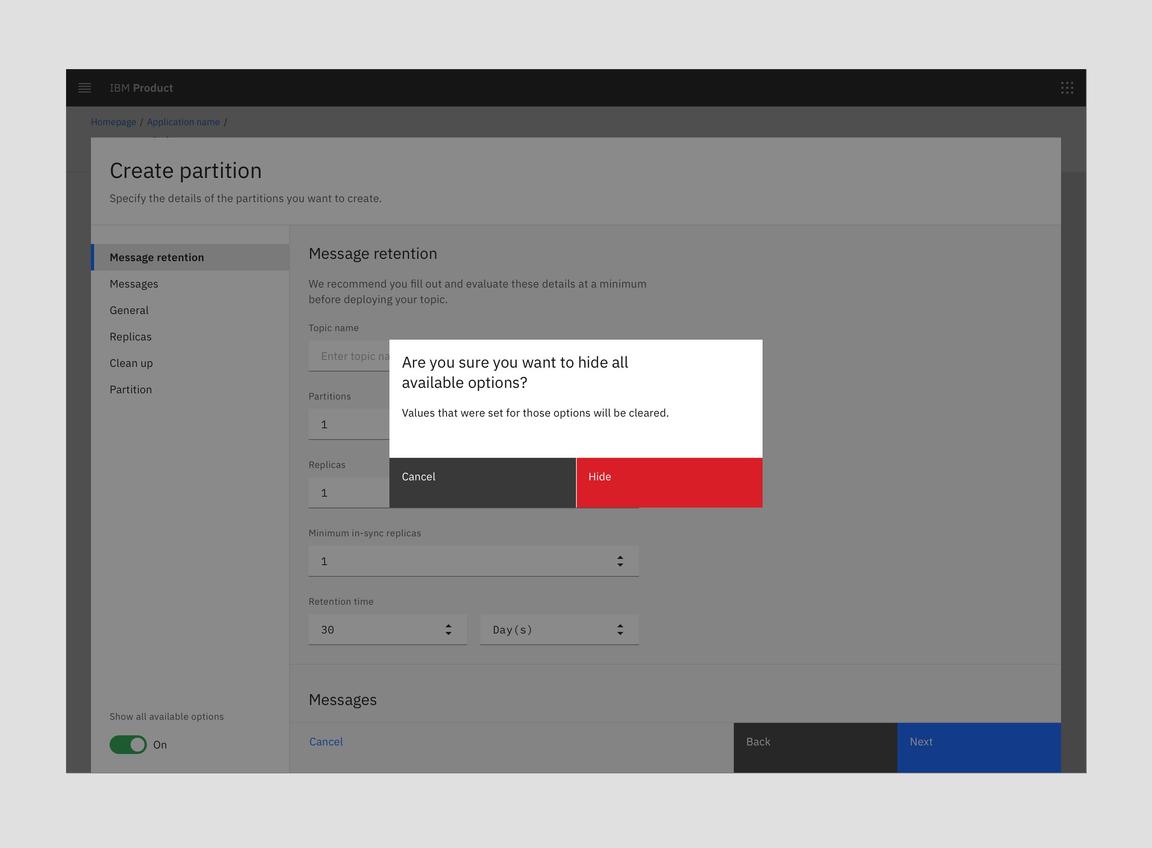
Toggle view - hide all available options warning modal (when needed)
Full page
When to use
- In Cloud and Cognitive, the Full page create flow is the process the user must complete in order to use a product or service.
- In IBM Cloud public, it is the alternative to the Provisioning flow for a non-billable service.
When not to use
- Don’t use the Full page option when the product or service is usable before the current creation flow is initiated.
- For IBM Public Cloud, do not use this when provisioning a service directly from the Catalog, or when creating a non-billable resource that could happen in a side panel/in context.
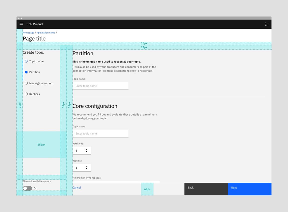
Anatomy of a full page
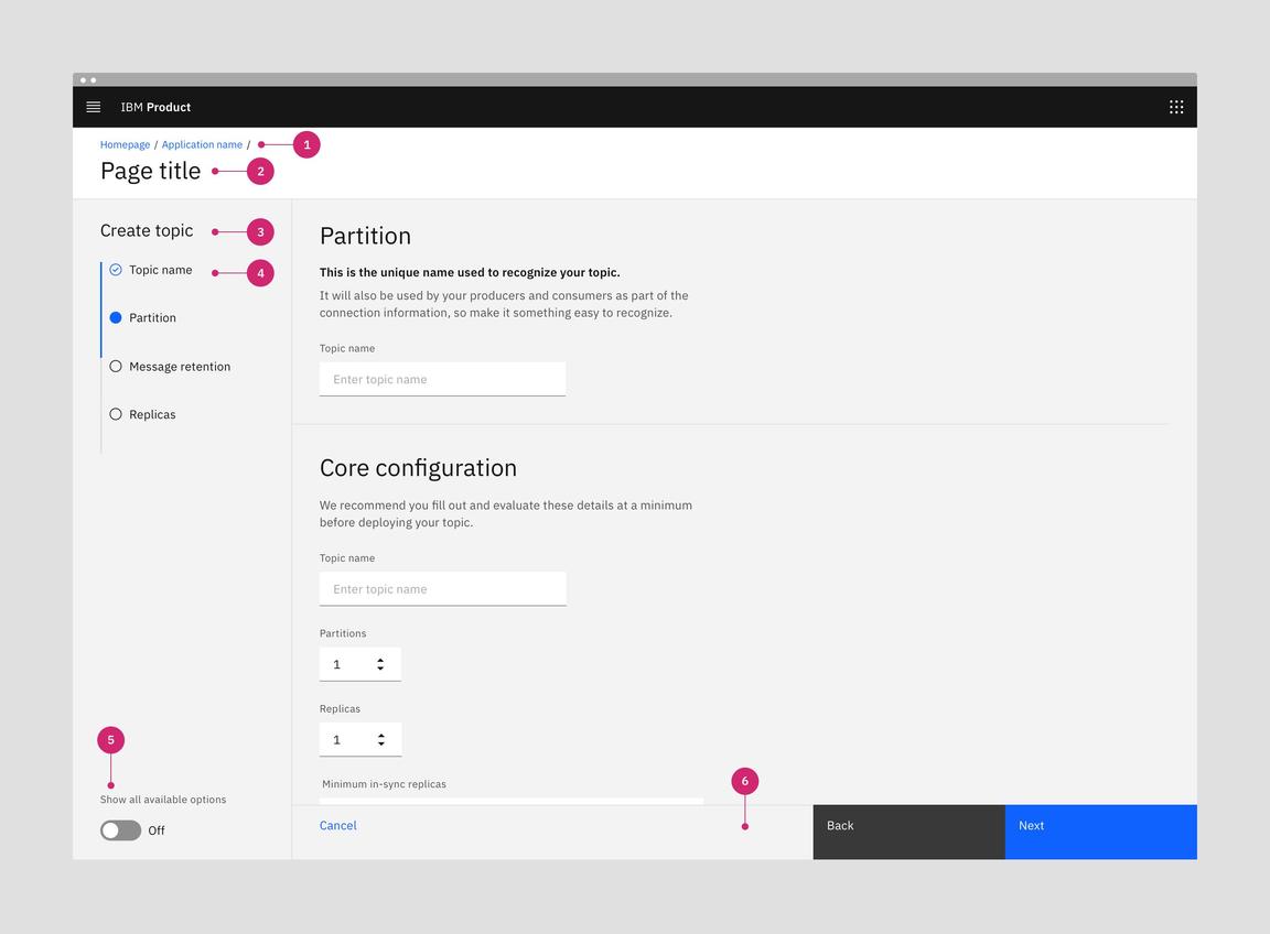
- Breadcrumbs (optional): Use location-based breadcrumbs when appropriate.
- Page title: The page title will not necessarily be “Create “.asset type
- Create title: This title will usually be “Create “.asset type
- Progress indicator: Vertical progress indicator lets the user know what step they are on. The default left panel width is 256px. An option of 320px wide is available for use cases where step labels are very long.
- Body: Contains the information and/or controls needed to populate the task. It can include message text and components.
- Toggle (optional): Optional toggle allows the user to view all available options in one scrolling page with anchor links.
- Buttons: The primary, secondary, and ghost buttons are 64px tall fluid buttons. They are “Next”, “Back”, and “Cancel”, respectively. The “Back” button will be disabled on the first step. The “Next” button will change to “Create” on the last step of creation. “Cancel” takes the user to the previous page and cancels the create action.
Alignment
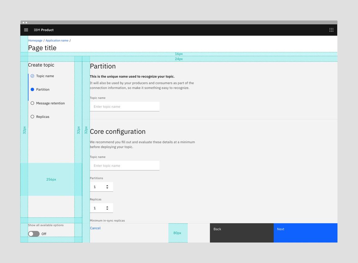
Upcoming 80px fluid button height in the Full page flow
Optional toggle
Full page create flows can include an optional toggle to show all the steps on a single scrolling page with anchor links. Toggling to “Show all available options” will replace the progress indicator with the In-page navigation anchor links.
Leaving the Create flow
Full page create flows can be exited not only by clicking on “Cancel”, but also by navigating away by clicking on breadcrumbs or other page navigation. When the user tries to exit the Create flow by any means other than explicitly clicking on the word “Cancel”, we must show a confirmation modal.
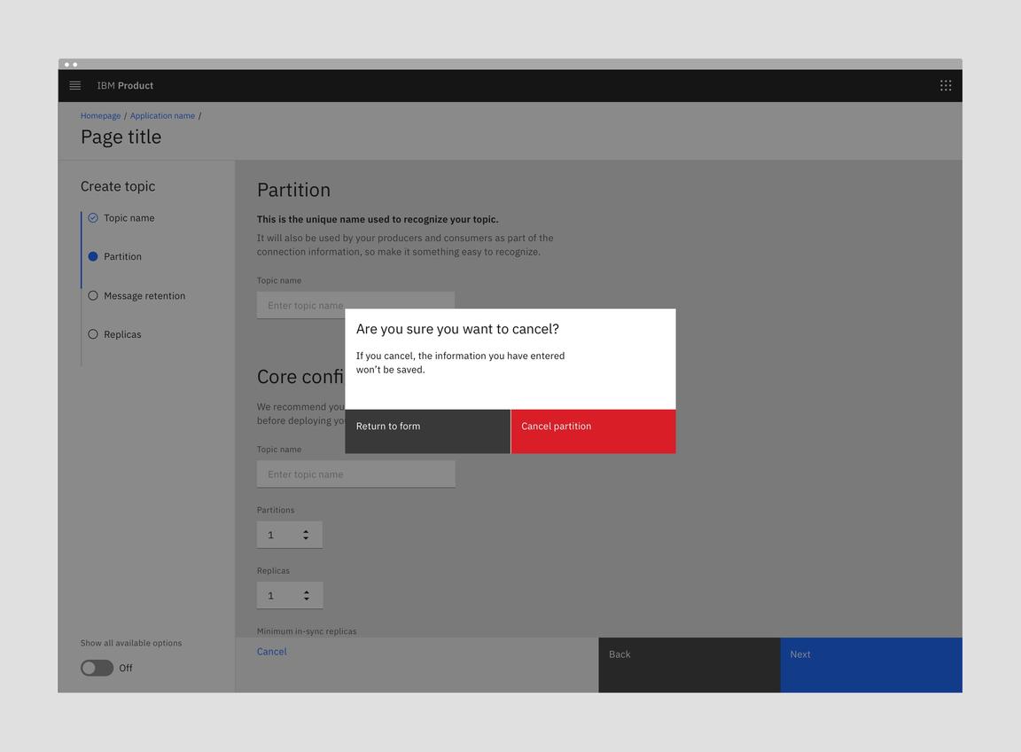
With Full page flows, show a confirmation modal when the user navigates away.
Designing with creation flows
Behaviors
Triggers
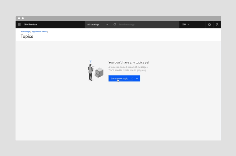
A create flow is usually started when the user clicks on a “New
asset type
After clicking on the new button, the user then fills out a form in one of the above formats with one step or multiple steps. With multiple steps, the “Back” button is disabled in the first step. In the last step, the text of the primary button changes from “Next” to “Create”. The “Next” and “Create” buttons should be disabled until the user has entered all required fields.
Dismissing flows
The Modal, Side panel, Narrow tearsheet and Wide tearsheet components in a create flow will not have a close icon in the top right. This is to enforce the user’s decision to exit the create flow by clicking on the word “Cancel”.
Flow completion & loading
When the user clicks “Create” there should be an indication of loading or submitting. See Carbon’s Loading pattern. Also, see specific guidance for loading in the Modal component. Once the loading is complete, the user should see a success or error notification. For success, one option is to open the newly created asset or the asset’s details page. When the user stays on the same page, show a success banner notification. For errors, you must show an error notification.
Related use cases
Add
- While the Create and Add patterns are similar, and ideas can certainly be drawn from this pattern, it does not cover Add use cases.
- The Add pattern should be looked at and worked on separately.
Edit
- Similarly, while there are similar concepts in both Create and Edit, this pattern does not cover Edit use cases.
- The Edit pattern should be looked at and worked on separately.
Accessibility
Follows accessibility guidelines for Modal, Side panel, Narrow tearsheet, Wide tearsheet, Forms, and Progress indicator.
Related
Feedback
Help us improve this pattern by providing feedback, asking questions, and leaving any other comments on GitHub.